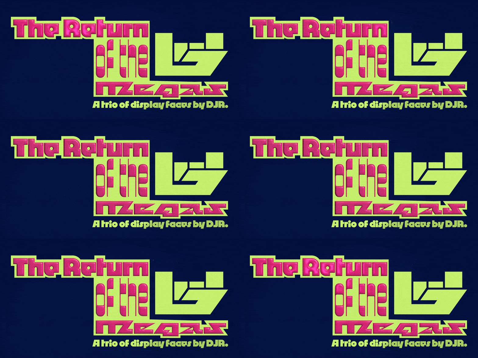
DJR’s Megafaces
Through his Font of the Month Club, DJR sends subscribers 12 new faces per year. They’re “display faces, experimental designs, and exclusive previews,” most of which never receive retail releases. After TN's customary and intense tech review, three of his more eccentric and exciting faces–Megabase, Megavolt, and Megazoid–are ready for your mega-designs!
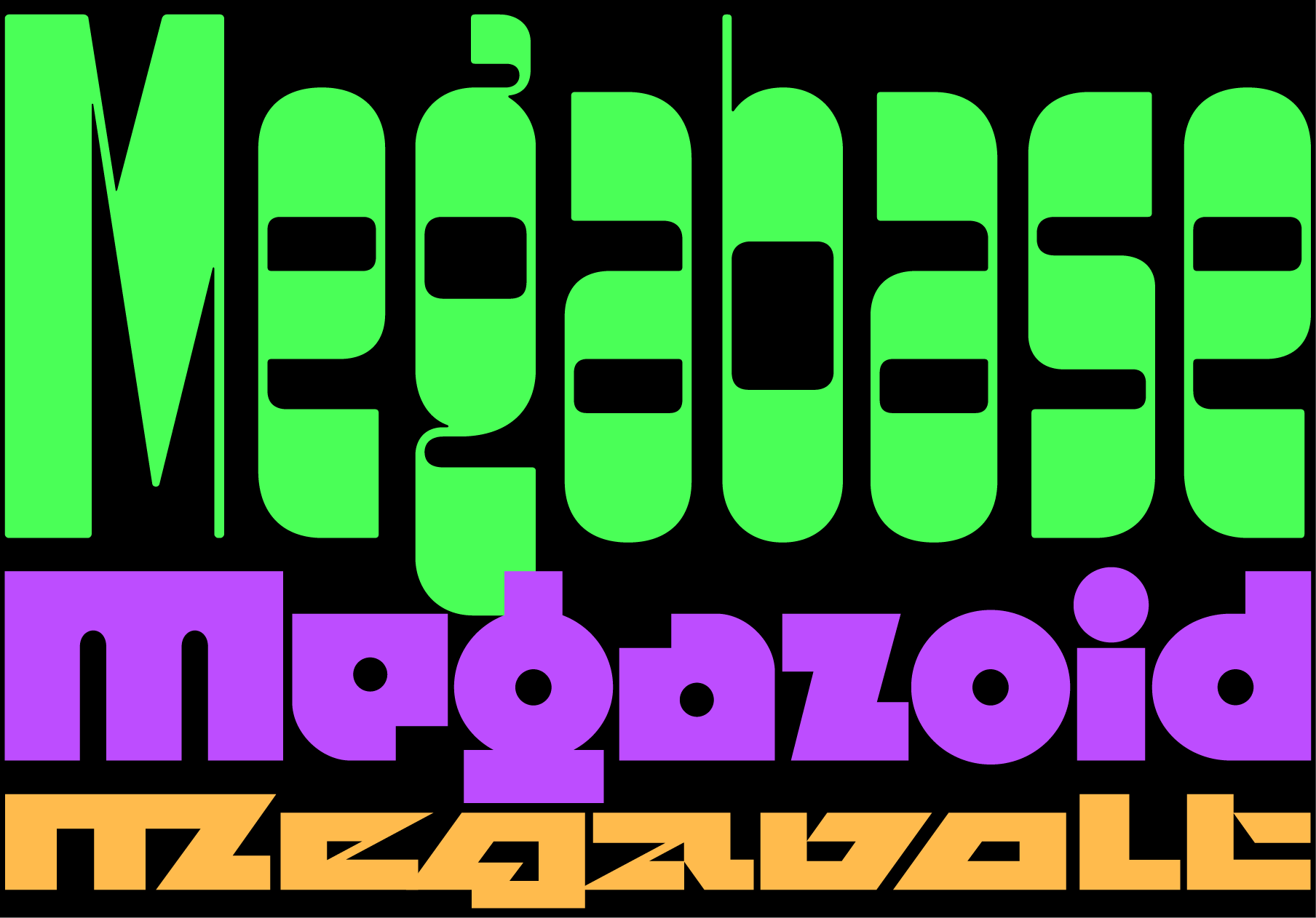
Megabase, Megavolt, and Megazoid are siblings with different personalities and appearances, but the same DNA. In fact, the Megafaces didn’t start as a series at all. It started disparately, with DJR looking to 19th century wood type, ’60s psychedelic geometrics, and pixel fonts for puzzles to solve. He cracked these problems with oddly thick strokes, reversed contrast, and razor-sharp counters, fixing them into place with firm, measured spacing.
Megabase
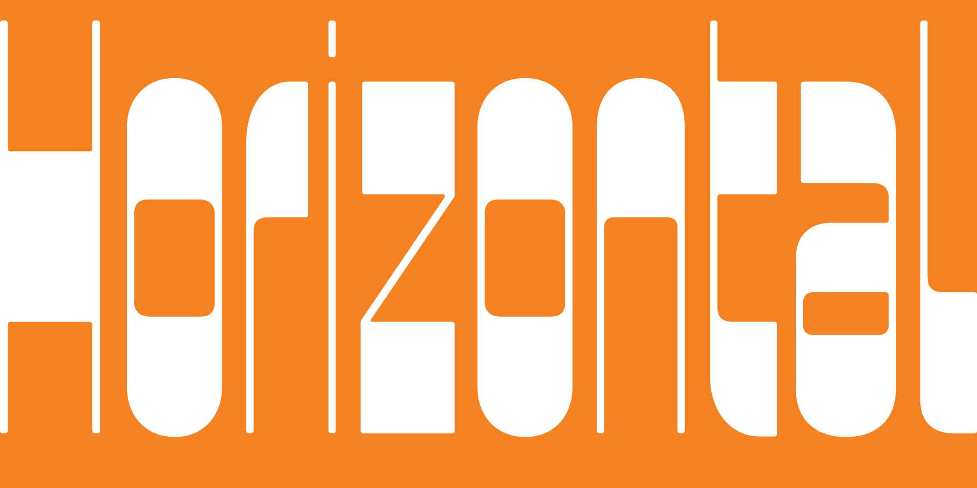
The first of the Megafaces, Megabase disregards the usual goal of consistent typographic color by embracing horizontal stress. The result is an off-kilter texture, awful for text and brilliant for display. DJR writes:
I forced myself to embrace Megabase’s uneven color, allowing top-heavy, bottom-heavy, and diagonal forms to stick out like sore thumbs and interrupt the flow of reading. Some words will have unsightly gaps in them, and others will feel way too heavy. The overall texture is punctuated by black bands at irregular heights.
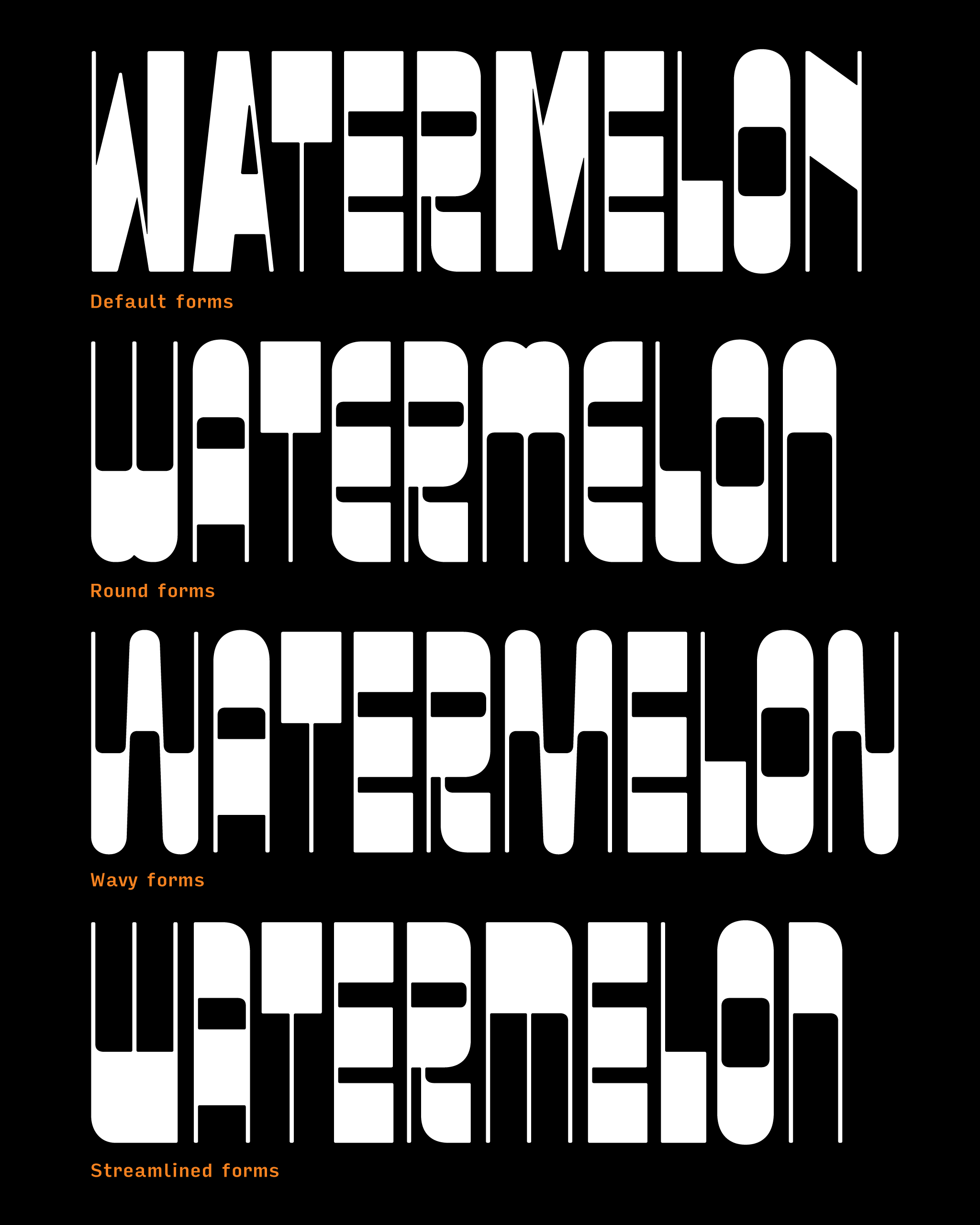
Megabase isn’t DJR’s first experience designing typefaces with horizontal (“reverse”) stress. Two of his other Font of the Month Club faces (Pappardelle and Tortellini) employ the same effect, though they achieve it with thick serifs. For Megabase, DJR constructed the horizontal strokes with varying thicknesses. They’re all thick, but “T (one horizontal stroke) is thicker than O (two horizontal strokes), which in turn is thicker than E (three horizontal strokes).”
The face’s alternate sets give designers a degree of customization, substituting round, wavy, or streamlined forms to produce entirely different word shapes. At home on a poster, in an ad, and as a logomark, Megabase is DJR’s chaotic entry to the horizontal stress sans category.
Megavolt
DJR’s first class project in his type design course at Massachusetts College of Art & Design involves designing a pixel font. Drawn on a small grid, pixel fonts offer students the opportunity and challenge of learning how to make letters that work together, without the smoothness of bezier curves.
At the start of the Spring 2021 semester, DJR put himself in his students’ shoes. Setting out to create a quick font as an exercise, DJR was surprised to find that he couldn’t put his pixelated creation away. The problem of diagonals seduced him:
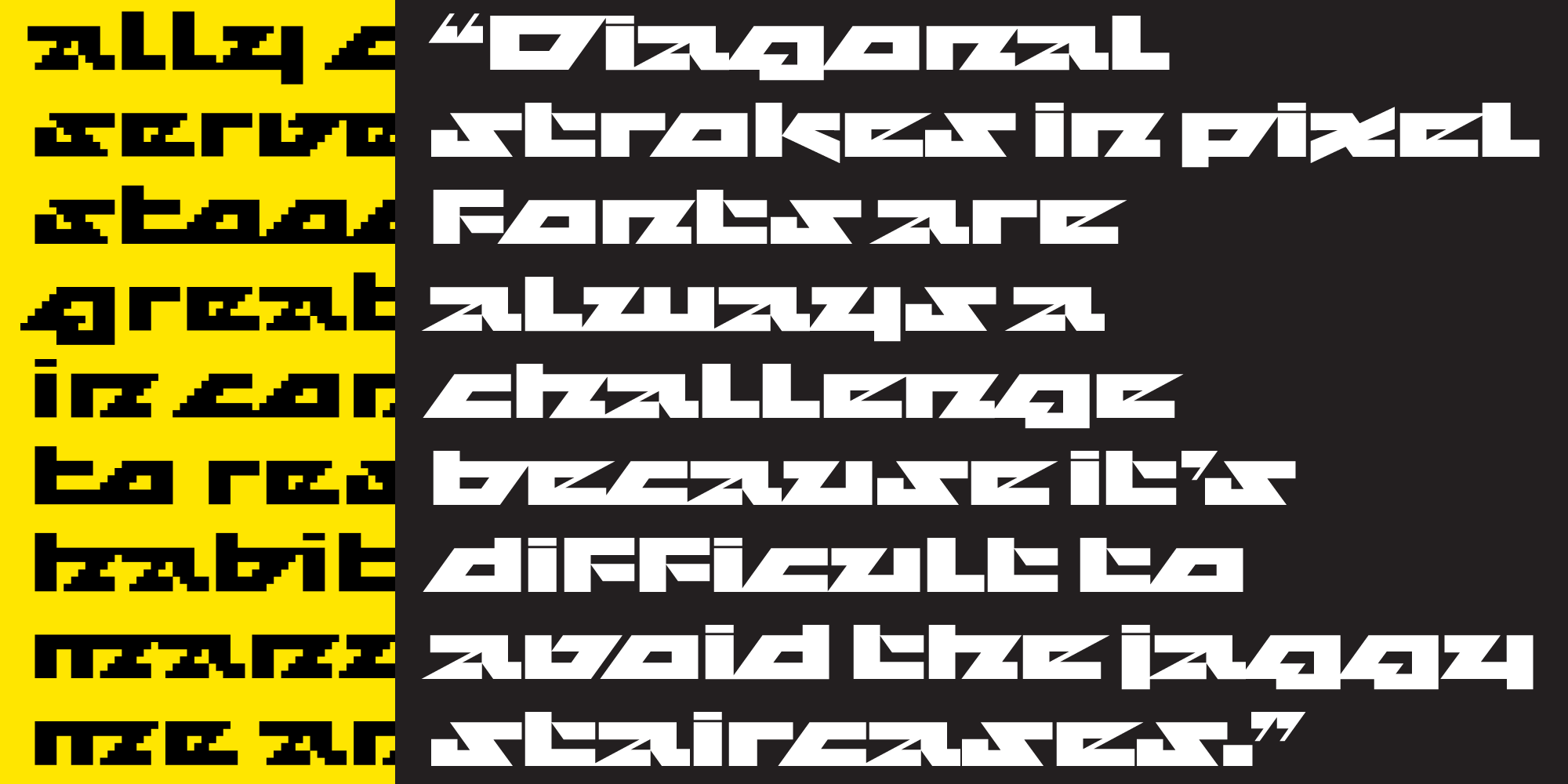
Diagonal strokes in pixel fonts are always a challenge because it’s difficult to avoid the jaggy staircases created by going against the grain of the pixel grid. But rather than avoiding those staircases, I leaned into them, adding diagonals to letterforms wherever I possibly could.
After flirting with the idea of leaving Megavolt as a pixel font, DJR converted “the pixely blocks into outlines.” He optically corrected the stroke widths and spacing, adjusted proportions, and “changed the 45° staircases to sleek 54° diagonals.” After moving, rotating, and rearranging the triangular and trapezoidal counters, DJR’s Megavolt was finished.
Megazoid
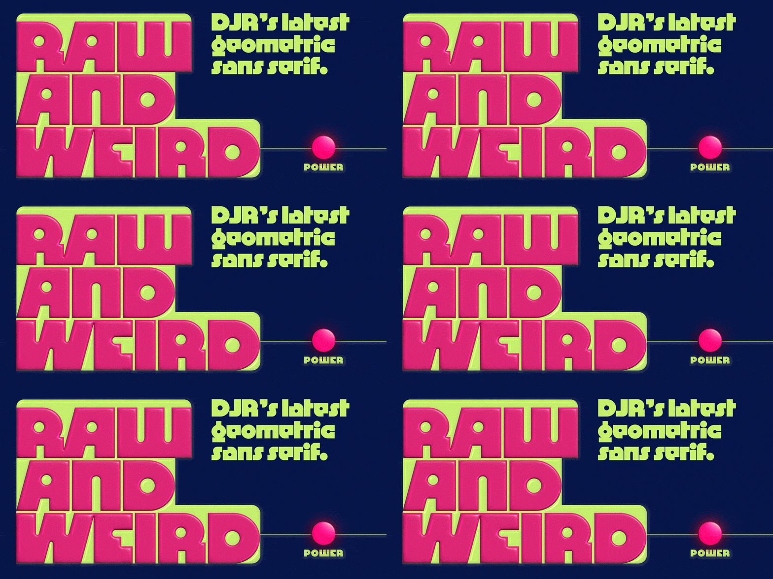
The geometric sans category is full. Some might say there’s no room for another one, or that new iterations are derivative. DJR’s Megazoid calmly (and loudly) objects.
After resisting the genre for so long, he found inspiration in conflict:
On a conceptual level, geometric shapes endow letters with a timeless beauty, transforming them from handmade marks into emblems of mathematical ideals. But on a practical level, building up letters out of circles and squares is just really, really awkward. [...] Megazoid pits square and circle against each other, contrasting blocky exteriors with counterforms that are mostly circular and cylindrical.

While Megavolt might shine through its triangular shapes, Megazoid eschews them, donning instead a palette composed almost entirely of the other two basic shapes. Still, within such limitations, DJR deftly managed to avoid the overly figurative pitfalls of many other chunky geometric sans, “essentially functioning in the space between the super-literal Futura Extra Bold and the hyper-stylized Futura Black.”
An oddly enticing family
Equally unexpected in their creation as they are in their use, the Megafaces scratch some stylistic itches left unattended by other display faces. How else can you walk the line between futurist and psychedelic? Where else can you find horizontal stress, sans serifs? The puzzles that led DJR to design these faces are puzzles that designers face every day:
I didn’t plan this, but I’m really happy that Megabase, Megavolt, and Megazoid have formed a family of sorts, each one exploring a different mode of sans serif with heavy science fiction connotations. They all have plenty of non-sci-fi potential as well, not to mention a link to the phototype and dry-transfer typefaces of the 1970s.
From guitar amps to sci-fi films, from broadsides to logomarks, Megabase, Megavolt, and Megazoid’s off-kilter rhythms and surprising shapes reject mass-market appeal in favor of specific tones. Couldn’t you see any one of them emblazoned on the side of a pinball machine? Reset any boring display text in one of these, and witness the tone of your design transform. With a power like that, the Megafaces certainly deserve the name.
Like all DJR fonts, Megabase, Megavolt, and Megazoid can be licensed for print, web, mobile apps, and ePubs. Webfonts may be tested for thirty days and desktop trials are available upon request.
Have a licensing question? Check out our support page or get in touch.