
Design Essentials #1 - #28
Dear designers,
Starting in November 2014, 100 e-mails were made for a dedicated group of design students and other desigers who expressed their interested in updates of their profession.
The reason for collecting the Essentials was to keep students thinking about new aspects of (graphic) design, during a period in the year without lessons or meetings. Essentials were picked for present day (2014) subjects as well as promising topics interesting for the near future. Subjects related to the profession of design. Essential. Small items and big issues. Tips about details but also generic good-to-know topics.
The timing and choice for some Essentials was related to student assignments. That relation no longer is visible. However, the value of the information – in most cases — is not less because of that.
The Essentials e-mail list no longer exists, but the reason why it started is more important than ever. Therefor the original set of mails is now available here, covering the first batch of 28 mails.
New Essentials will be posted on my twitter account. Follow @petrvanblokland if you want to see updates.
Let me know if you find any of the links in this archive not working anymore.
By Petr van Blokland and others
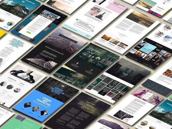
#1: The Grid
#2: Grids
#3: Mike Parker
#4: Calligraphy
#5: NYCTA Graphics Standards Manual
#6: Knuffingen Airport
#7: Mother of All Demos
#8: CSS3+
#9: Logo in 30 minutes...
#10: Digital newspaper design (in 2011)
#11: Institutional memory
#12: UK Government Design Principles
#13: The end of apps as we know them
#14: Color fonts and SVG
#15: Liz Danzico - Frames: Notes on Improvisation and Design
#16: CSS3, more of it...
#17: Vaccination, a little game
#18: The making of color
#19: Humility Threshold
#20: Paper robot
#21: Typophile
#22: The science of shopping
#23: An hour of code for every student
#24: 3D printing math
#25: Should designers code?
#26: Typography for Lawyers
#27: Spiking
#28: KISS
Essentials #1: The Grid
Oct 13, 2014 Today is the first one. A new project that makes the promise to create a system that will automatically generate websites, using artificial intelligence. If that is a threat for you, then it is. Start thinking about how to respond. If you see it as an opportunity, then what is the best way to know as much about it as you can an explore the possibilities.
http://www.wired.com/2014/10/publishing-tool-builds-websites-powered-ai
Essentials #2: Grids
Oct 14, 2014 Different from #1 (about the new upcoming application called "The Grid") here are 3 existing examples of the relation between grids and online publishing.
Cedvel
Cedvel is designed and programmed by Fahri Özkaramanlı, a visual communication designer living in İstanbul, interested in exploring the interrelation between people and technology through design. As a graphic design student, he made this program as part of his study. It is far from finished, but it is an interesting approach of the topic. It would be very useful if the program could save to HTML/CSS, but currently it only stores pixel images. I think he'd be interested getting your responses.
Besides the application itself, the website is also an example how to communicate about technical details in graphic design. And finally he added a number of interesting book titles about typography in general and grids in particular.
Golden Grid System: A folding grid for responsive design.
Getting a bit dated (it's a couple of years old now), the "Golden Grid System" (nothing to do with the Golden Section, it's just a name) offers an interesting view how multiple columns fold into single columns, if pages dynamically change size. The best example of this is the website itself. Change the window size and see what happens with the illustrations.
Note that the techniques for (and opinions about) responsive design are constantly changing. A lot has been written about it and things move forward in high speed. Nevertheless this is an interesting approach of responsive layouts. Other approaches will follow in later issues of this series of essentials.
The 892 unique ways to partition a 3x4 grid
Also dated (2009) is the project to make the permutation of possible grid layouts. Patch Kessler designed algorithms to generate all the possible variations, identify unique ones, and sort them—not only for 3 × 4 grids but also for any n × m grid. He instantiated the algorithms in a MATLAB program, which output PDFs, which Thomas Gaskin imported into Adobe Illustrator to design the poster.
Again, note the different layers of the information presented here: the topic itself, the article about it, the poster presentation and the scientific explanation of the algorithm. http://www.dubberly.com/concept-maps/3x4grid.html The theoretical paper behind it is here:
http://www.mechanicaldust.com/Documents/Partitions_05.pdf
Note (2017): Info about CSS grid functions to be added here.
Essentials #3: Mike Parker
Oct 15, 2014 Here is Essentials #3. It is dedicated to Mike Parker, typographer and type designer. Mike unfortunately died in february of this year, 2014. He worked at Linotype as Director and was responsible for the development of a large part of the type library, including the support of type designers such as Matthew Carter (many designs, including Georgia and Verdana) and Adrian Frutiger (many design, including the Universe, Frutiger and Avenir).
After leaving Linotype, Mike was co-founder of Bitstream and he was involved in many developments in the type industry over the years. He was a great supporter of all that goes on in Fontbureau.
Here is the Fontbureau tribute to Mike, including stories and the timeline of his life. http://www.fontbureau.com/mikeparker/
Also see the TDC (Type Directors Club) interview with him: http://opentype.info/blog/2012/07/03/mike-parker-type-is-my-life
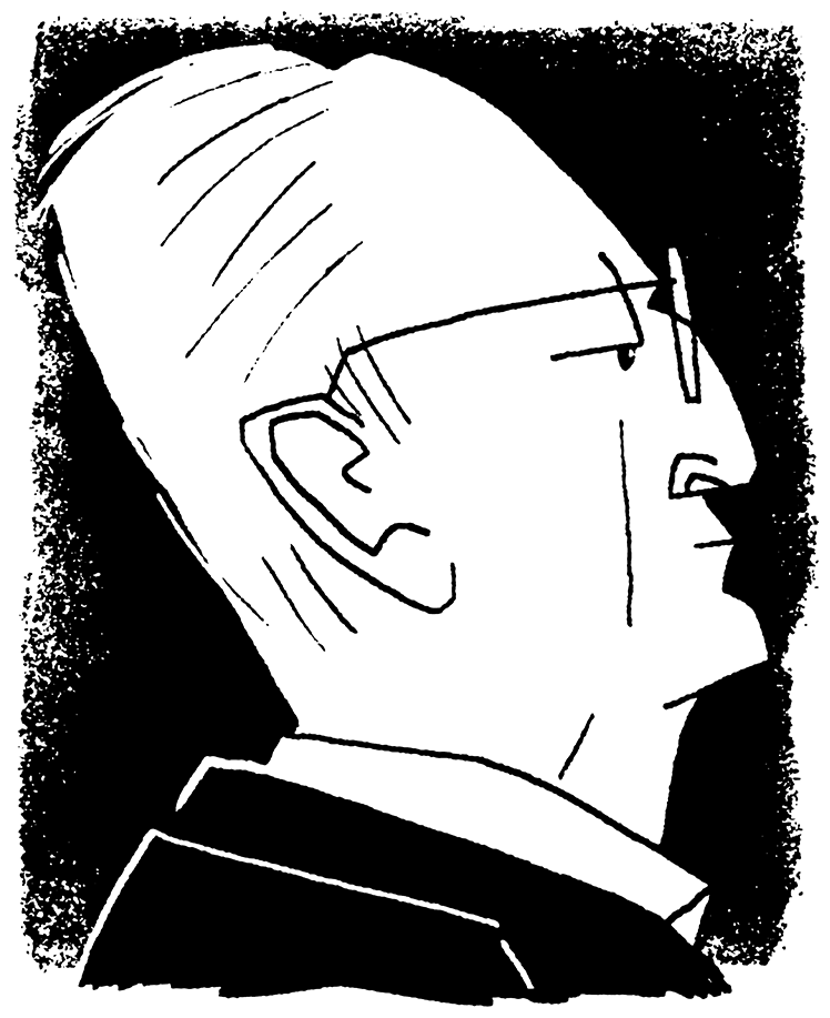
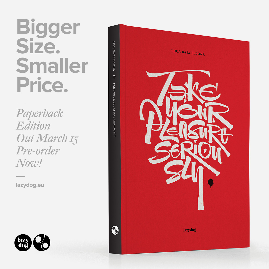
Essentials #4: Calligraphy
Oct 16, 2014 Various types of pencils create different types of contrast in letters, if you write them. One of the tricks in making most of the lower case letters, is to keep the angle of the broad nib pencil or brush the same all the time. Around 30° for roman letters and around 45° for italics. Capitals are a bit different, because their contrast can only be written by changing the angle: rotating the pencil or brush.
That is another point of view than “calligraphy”. There the aim is to make unique pieces of artwork, where all letters can be different and respond to the position on the sheet and the relation to each other. The esthetics of the shapes is often more important than the readability of the text. Nevertheless, it is a skill that needs to be developed. It only works by practicing over and over. Learning from each mistake. Training muscle memory. And getting the fluent curves by controlling speed and angle of the brush.
Here are three short videos.
The first one is about calligraphy as an art form. Probably not something you will have time for during you study, but good skills are always interesting to watch. The movie is from the writings of Luca Barcellona (http://www.lucabarcellona.com) calligrapher and lettering artist in Milano.
More videos are here:
http://vimeo.com/user4097013/videos).
The writing of one piece of artwork. Notice the usages of the brush. Angles. Connections. Thin and thick lines
An overview of various writing techniques and materials. Everything that draws a line can be used.
The last video is about brush rotation in particular, shot by Erik van Blokland. You can see how manipulating the angle gives solutions to solve details in capital letters that otherwise cannot be written in one stroke.
http://www.flickr.com/photos/letterror/3476874675/
Essentials #5: NYCTA Graphics Standards Manual
Oct 17, 2014 Here is Essentials #5. A week ago, the Kickstarter pledge ended, to reprint the NYCTA Graphics Standards Manual. The total amount reached almost 8 times more than the $108.000 goal. The manual was found in the archive of Pentagram and it was decided to reissue it as a full-size book.
“If you found yourself in the New York City subway in the 1960s, you were probably lost.
Signs didn’t help you find your way, standards didn’t exist, even handmade lettering was common. Mass confusion was the status quo. In 1970, the Standards Manual changed everything. In 1967 the New York City Transit Authority hired Massimo Vignelli and Bob Noorda of the design firm Unimark International to design a signage and wayfinding system that would solve the problem underground.
The work they delivered, the 1970 New York City Transit Authority Graphic Standards Manual, succeeded in that goal and, perhaps unintentionally, the Standards Manual became one of the world’s classic examples of modern design.”
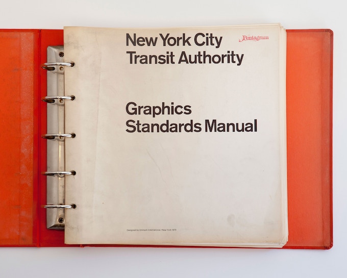
Watch the interesting promotion video.
The full HD photographed version of the book was here: http://www.thestandardsmanual.com
The design of signing systems will be the topics of one the upcoming assignments was part of student assignments.
Essentials #6: Knuffingen Airport
Oct 18, 2014 A light weighted topic for the weekend. Extreme modeling in Knuffingen Airport.
Different from the kind of models that we talked about so far (where the reduction of details is the tool to make fast representations of the real world without building everything), the model in Hamburg aims for the opposite: How to reach as much functions of reality inside the reduced scale. With 150.000 of building hours, the amount of moving parts is mind boggling. It is interesting to see, that with this extreme amount of details, one almost feels disappointed that there are not really firemen stepping from their trucks. Also notice the ingenious mechanism to make planes really take off and land.
If you are interested, it sure is worth going there. I haven’t been there myself, but I know people who did.
Two videos. The first is an “official” presentation of the airport. The second one is made by a visitor (you’ll find dozens of these on Youtube).

Another interesting layer is to compare the difference between the two registrations, both from the same source. Different messages. In order to see the context – and scale – the visitor’s version may even be more interesting that the official one.
https://www.youtube.com/watch?v=Qz4NcTnQedo
https://www.youtube.com/watch?v=JqwMyEUB24g
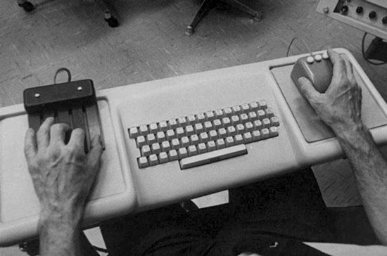
Essentials #7: Mother of All Demos
Oct 19, 2014 The Mother of All Demos, presented by Douglas Engelbart (1968)
“The Mother of All Demos is a name given retrospectively to Douglas Engelbart's December 9, 1968, demonstration of experimental computer technologies that are now commonplace. The live demonstration featured the introduction of the computer mouse, video conferencing, teleconferencing, hypertext, word processing, hypermedia, object addressing and dynamic file linking, bootstrapping, and a collaborative real-time editor.”

At that time this was a revolutionary presentation. The mother of all your available tools, which you take for granted now. Everything has been invented at some point. And not so long ago. This happened only 46 years ago. Compare it with where we are today. Then try to imagine what will happen in the upcoming 46 years. You can’t. Yet it is in the range of your working life. What will your role be then, as graphic designer? From what position will you look back on today, as we now look back on what Engelbart did? What part can you have in that development?
Try to watch the whole video, if you have time. It may seem too technical here and there. But remember that in the beginning everything had to be created from scratch. Programming, files, databases, protocols, standards, interaction and conventions. Just like “swiping” had a totally different meaning, only 5 years ago.
https://www.youtube.com/watch?v=yJDv-zdhzMY
If you don’t have time to see all, here is a good summary:
https://www.youtube.com/watch?v=VScVgXM7lQQ&list=PLCGFadV4FqU2yAqCzKaxnKKXgnJBUrKTE
Read more about this presentation on Wikipedia (one of the many other sources): http://en.wikipedia.org/wiki/TheMotherofAllDemos
Essentials #8: CSS3+
Oct 20, 2014 Back to work again. Topic of today is CSS3. It is the workhorse for graphic/interaction designers online. Although online publications always needs to be constructed from 3 separate parts: HTML5, CSS3 and Javascript, most of the CSS content is related to the design. Roughly separated: HTML5 defines structure of the content. And Javascript is used to describe user response.
Showing how this all works together is too much at this moment, but we’ll spend time about it in some of the assignments to come. As said, CSS describes the style of a web page. There are thousands of sites that explain how it works. One does a better job than another.
Three sites I want to mention here. Not to get you up and running in a day, but to show the scope of what is possible. It is complex matter for sure, but if you – graphic designer in the upcoming 40 year – doesn’t know about this, then who will? Even if you have a programmer doing the coding for you, how do you know what to ask? And in what language?
School
W3Schools is the standard site, where most of the web standards are explained, including a testing environment where you can try variations of the presented code. This link leads directly to the CSS area. http://www.w3schools.com/css/css3_intro.asp
Animation
Since CSS3 got accepted by the latest browser versions as their main standard, CSS is it no longer just describing static styles of a page. Animation and transformation are now part of the language as well. Here is an overview of the different kinds of animations that can be part of you interaction design. Note that it is done by style description alone. Not by any programming in Javascript. http://leaverou.github.com/animatable/
3D
And here a set of 22 examples what can be done with the new 3D functions in CSS3. (Beware that some of the examples are cutting edge, and may not work on all versions of all browsers). http://www.creativebloq.com/css3/animation-with-css3-712437
Think of it. Where do you connect to the possibilities? How would you know to ask your programmer for them. Or is it worth while to invest time and to figure out for yourself how they work? All code is available. It is not magic.
Essentials #9: Logo in 30 minutes...
Oct 21, 2014 No comments today.
http://www.logoin30minutes.com/
Essentials #10: Digital newspaper design (in 2011)
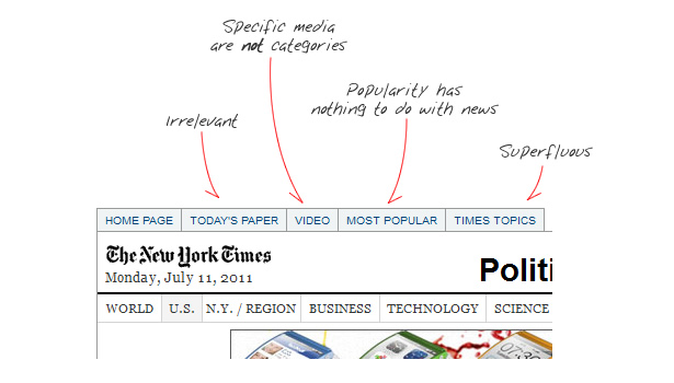
Oct 22, 2014 Here is a blog article from 2011 by Andy Rutledge (designer), presenting his view about the design of digital newspapers. You probably won’t agree with his political views or his hobbies, the article may still worth noticing.
As you read through (and compare with the way some papers and magazines look today) it becomes clear how much has changed already since 2011. Although publishers slowly tried to adapt to the new media in the early days of smartphones and tables, quite some did catch up (where others just went out of business).
On the other hand, his critique (and recommendations) are still as valuable as they were in 2011. Many publishers of websites (including e-newspapers and e-magazines) didn’t even start thinking about solutions in this direction as of today. And many designers still think that a website should be designed in Photoshop with a fixed screen size of 600 x 800 pixels.
To your advantage. More like these will follow in this sequence of Essentials. I said something similar before, but it never hurts to repeat: if these changes only took place in a period of 3 years, what changes can you expect in the rest of your professional life?
http://andyrutledge.com/news-redux.php
Essentials #11: Institutional memory
Oct 23, 2014 Here an anonymous blog, written by “An engineer”, 2011-12-04. The topic is “Institutional memory”. Designers, developers, programmers and engineers are looking into the future. That is their job. Making stuff that is not there yet. But with their professional focus on the future, it is tempting to forget about what already exists. What works. Archives. Manuals. In the past, when information was physical, it just was a matter of conserving the paper or film. But in the digital age, the practice of building an archive dramatically changed.
Any design studio today has a usable archive that doesn’t go back more than a couple of years. To be exact, the oldest version of InDesign (or Quark Xpres, or PageMaker) that still works on the oldest computer in the office. The one that survived all previous upgrades. Any older file in the archive can no longer be opened. The information is lost for ever. Customers, who need a reprint of a 10 year old folder, just ran out of luck.
How about building an archive of websites that you design today? Can you be sure they still look the same on browsers 10 years from now? Building an archive from screen dumps alone, doesn’t do the job.
Maybe the non-design of the blog has the best chance to survive the future of the web. Much better than modern CSS3 and responsive page layouts.
Essentials #12: UK Government Design Principles
Oct 24, 2014 Today the page about the 10 design principles, as defined for the identity of gov.uk, the UK Government Digital Services, made in 2012.
It is a clear document, that easily can be used as model for other design projects. It is a structured list running through the design process, especially for large and complex assignments, where the right solution is not clear from the start. Each of the 10 principles can be used as a starting point to define the requirement of a design solution. In any order.
- Start with needs
- Do less
- Design with data
- Do the hard work to make it simple
- Iterate. Then iterate again.
- Build for inclusion
- Understand context
- Build digital services, not websites
- Be consistent, not uniform
- Make things open: it makes things better
Also notice the design of the interface of the page. Fully responsive to screen size. And a clear hierarchy of information. Enjoy.
https://www.gov.uk/design-principles
Essentials #13: The end of apps as we know them
Oct 25, 2014 The response of users to available media and in reverse the adaptation of media to the expectations of users moves rapidly.
Today a blog that introduces a new direction of “apps” on your mobile desktop: they’ll disappear. Nothing against more friendly usage. But where will the graphic designer go in all this?
http://blog.intercom.io/the-end-of-apps-as-we-know-them/
Relate this to an upcoming lecture by Pieter Jongerius (Fabrique): “Success in e-commerce is determined by laws of conversion and conventions, so profitable online fashion stores look more and more the same.”
http://www.emerceeday.nl/speakers/jongerius
(“conversion” in web-term is the ratio between the amount of people that come to a website and the amount of people that actually buy a product).
Essentials #14: Color fonts and SVG
Oct 26, 2014 With the coming of icons, emoticons and corporate logo’s, the request for color fonts has increased. Several companies (including Apple and Microsoft) are experimenting to define an extension to the current TTF and OTF format of fonts, to allow color layers. This especially useful if the color of the type should not be left to the OS or application using it. Unfortunately, there hasn’t been a global standard defined yet.
This blog, by designer Johannes Lang (Vienna) addresses the need for color fonts and gives some useful directions how designers can use fonts for color separation, without these standards to be defined yet. We have done this for years: make the different parts of a logo into different glyphs, and set the spacing in such a way that they exactly match. He is using RoboFont for scripting the type.
http://colorfonts.langustefonts.com/howto.html
Essentials #15: Liz Danzico - Frames: Notes on Improvisation and Design
Oct 27, 2014 You often hear me make the comparison between design and music. There is a lot of overlap. Both get better if you if more, a skill to develop.
In her presentation form 2010 on Vimeo, Lis Danzico (designer, educator and editor in New York) makes similar comparisons. If you wouldn’t know that her definition of improvisation (18:03 in the movie) is directed towards music, it could just as well fit on graphic design.
Attributes of improvisation are:
- Present: Involves the audience
- Detectable: Requires no pre-knowledge
- Responsive: Defines parameters
- Additive: Accepts all offers.
Also especially notice the distinction between the traditional design of project and the emerging design for a purpose.

“We don’t think in individual pieces of information. We think about what is coming next. What can we imagine into the future.”
Here is a great interview with Liz Danzico https://thegreatdiscontent.com/interview/liz-danzico
Essentials #16: CSS3, more of it...
Oct 28, 2014 More CSS3 examples. Although the web is overloaded with thousands of website offering help on HTML and CSS, not so many of them are really worth looking. Here is a cool one (from 2010, just after CSS3 was released), showing examples of CSS3 features, with the relative simple code next to it.
Buttons (run the demo links in the article to see them work in real) http://simurai.com/projects/2011/01/26/zen-player/ http://simurai.com/umbrUI/
And typographic variations: http://simurai.com/lab/2010/06/14/carve-me/ http://simurai.com/lab/2010/07/26/tilt-shift
No matter how impressive these examples look, working as a designer – the other way around – is still hard: what code do you need and how is it possible to implement, to achieve a certain effect that you are looking for.
Essentials #17: Vaccination, a little game
Oct 29, 2014 Today a little game. And several levels how you can look at it as designer.
The game is about vaccination and the spreading of diseases in a network. The program builds a network of nodes that have a random amount of connections. This can be used as model for interactions and the spreading of a disease, but it also is a model for many other processes. In information structures there are only 2 different types: trees and networks. Trees have a clear one-to-many structure. Nodes can only be reached by one path. Networks are more complex. Multiple paths often lead to the same solution. As you will find out in the game, it is hard to see the most efficient strategy. Networks are complex beasts.
Imagine each circle to be one of your sketches in your identity project. One sketch leading to others. How can you prevent bad critique and opinions to spread through your entire design process?
- Do the tour if you want to find out how it works: http://vax.herokuapp.com/tour
- This application is written in JavaScript. The syntax looks a bit like Processing, with the difference that it runs entirely in a webbrowser. It is not my intention that you read through the code itself, but it gives you an idea about what is possible as interface using JavaScript. Technically this is just an HTML page, like any other website. In what way could this be applied to interacting with online information, e.g. a newspaper page?
- How would a Processing program look like, that shows a simplified version of this game?
Vaccination/outbreak game http://vax.herokuapp.com/game
Essentials #18: The making of color
Oct 30, 2014 We almost forgot, living in our digital work. Something completely different. But definitely not less interesting.

http://www.youtube.com/watch?v=Fypi6dAJB8E
Essentials #19: Humility Threshold
Oct 31, 2014 Five years old this blog already is, but not a bit less essential.

http://gadgetopia.com/post/6819
If you want to read more and deeper, see also: http://www.talyarkoni.org/blog/2010/07/07/what-the-dunning-kruger-effect-is-and-isnt/ http://en.wikipedia.org/wiki/Dunning–Kruger_effect
Essentials #20: Paper robot
Nov 1, 2014 Is it industrial design? Is it robotics? Is it graphic design?
Isn’t it funny?

http://www.fubiz.net/2014/10/31/paper-robot-prototype/
(You can choose the English version of the page, if your French is not good enough)
Essentials #21: Typophile
Nov 2, 2014 Today a simple url, with a lot of information inside. One of the most influencial discussion sites about typedesign and type technology. Facts and gossip, mixed with relevant questions and answers by students and famous designers. Essential input.
Essentials #22: The science of shopping
Nov 3, 2014 Here is an analysis on the science of shopping, a presentation by Alan Penn (UCL Bartlett School of Architecture) from 2011. You’ll recognize many aspects of what we are doing: the difference in point of view from sender and receiver. Expected behavior and real behavior. Projected experience and the real experience of viewers.
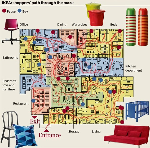
The difference between an exhibition (=shopping area) as map or as real viewed perspective. You’ll see graphs of streets, not so different from the vaccination game in essentials #17. You’ll see ways of analysis of customer behavior. You’ll see the usage of graphs and infographic to present correlation. It is about identity and competition as result of location and the benefit of aggregation. The analysis of spatial structures. “What makes money is not necessary an obvious thing”
Can you relate this to graphic design?
https://www.youtube.com/watch?v=NkePRXxH9D4
Essentials #23: An hour of code for every student
Nov 4, 2014 This is not about you. You already got your hour of programming. Many. And many more to come. This is about every other student in the world. 90% of the schools don’t have programming classes.They cannot afford it. http://code.org wants that to change. And this is the crowdfunding site that does the $$$ part. Only 5 million. And they’re half way. Spread the word.
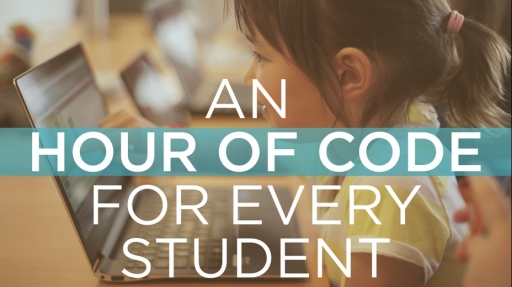
https://www.indiegogo.com/projects/an-hour-of-code-for-every-student
Read also here:
https://go.indiegogo.com/blog/2014/10/campaign-highlight-hour-code-every-student.html
The hour of code: December 8, 2014 was on http://code.org
Essentials #24: 3D printing math
Nov 5, 2014 3D printing may not seem directly related to graphic design, there is a lot of overlap. Even if you skip the mathematics, this article is very illustrative how to bridge the gap between 2D patterns (=typography) and 3D surfaces, by dividing it into a large – but finite – amount of triangles, “meshes”.
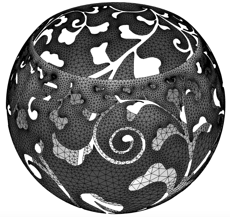
To some extend is the technique similar to the translation of graphic curves (=letters) into a number of straight lines into pixels on a screen.
http://jasmcole.com/2014/11/01/stereographic-lampshades/
Essentials #25: Should designers code?
Nov 6, 2014 Should designers code? Yes, but not like developers.
Essentials #24 is a good article about the difference between writing programs as a profession (being a programmer, or developer, how it is called more often) and how designers can use coding to their benefit.
It gives some possible answers for the Master2 students, preparing for the Bachelor lessons that we start next week: “Why do you need to learn programming as a graphic designer?” Even if you don’t want to make programming be part of you design practice, still you will need to talk to people who will do that for you.
Note that there is a number of other development platform and languages mentioned in the article, other than Python and Processing. Swift is for writing OSX applications, and it did not exist 2 years ago. Ruby is comparable to Python, but younger. Sketch in an interactive drawing tool, not a programming language. Paintcode is something in between.
But no matter what environment you will dive into and build as your main skill, there are two things you can be certain about:
- Learning to think in algorithms is the hardest part. Learning a syntax of a specific language, is the easy part. In other words, it doesn’t make much of a difference what programming language you start with. You will see that learning the second language is much easier, because so much of the patterns are the same.
- No matter what you learn today, you can be sure that fashion and technology will be very different in 5 years time. Part of your design life will be dedicated to keep up your skills with the latest development. Use it or loose it.
“Developers are becoming better collaborators. They’re just waiting for designers to do the same.”
https://medium.com/learning-xcode-as-a-designer/designers-code-differently-e163a354d6cc
Thanks to Kirsten Langmuur for sending this link and other links from this series of essentials. Kirsten worked in our studio for 12 years, and started her own design studio some years ago. (http://www.kirstenlangmuur.com)
Essentials #26: Typography for Lawyers
Nov 7, 2014 I may have sent it already to some of you before, but it is important enough to send it to everyone on this list. Matthew Butterick is type designer and typographer, but at some point in his life also decided to study law. Now he also is lawyer (how about the value of mastering multiple professions at the same time?) and with that knowledge he wrote this book. Explaining the role of typography to non-designers. But is also contains very valuable information for designers, who want to learn the basics about typography.
The kindle version is only $9.99
http://typographyforlawyers.com

Next he wrote the online book about typographic basics. He is trying a new way of writing books, to get people actually pay for the work it took. Find his suggested ways of payment at http://practicaltypography.com/how-to-pay-for-this-book.html and spread the word.
http://practicaltypography.com
Essentials #27: Spiking
Nov 8, 2014 Spiking is Sketching!
‘A “spike” is a development term for a quick exercise that lets you explore solutions without the burden of writing good code, then throwing it all away so you can do it the right way with confidence.’
http://robots.thoughtbot.com/design-spiking
Essentials #28: KISS
Nov 9, 2014 There are many books, articles and blogs about the topic. KISS:
Keep it simple, stupid!
Here is one of them. If you compare two way of communication (two principles for a logo, two info-graphics about the same topic, two theories) it is a good initial rule of thumb that the simplest one of the two is better. Better to make, easier to maintain and more clear in communication.
Designers are creators of models, of symbols. They design simplifications of reality (icons, interfaces, graphs, ...), so people can understand specific aspects of it better.
http://en.wikipedia.org/wiki/KISS_principle
http://www.forbes.com/sites/amyanderson/2014/02/27/keeping-it-simple-doesnt-mean-youre-stupid/
This was the last of the series of 28 essential. The amount was arbitrary. It could have been 7. It could have been 9989. The amount of interesting subjects and adjacent topics to graphic design is infinite. Keep on studying.