Inspired by the jaunty flow of an Italian bicycle maker's logo, Richard Lipton's latest script promises a sweet ride.
By Type Network Staff
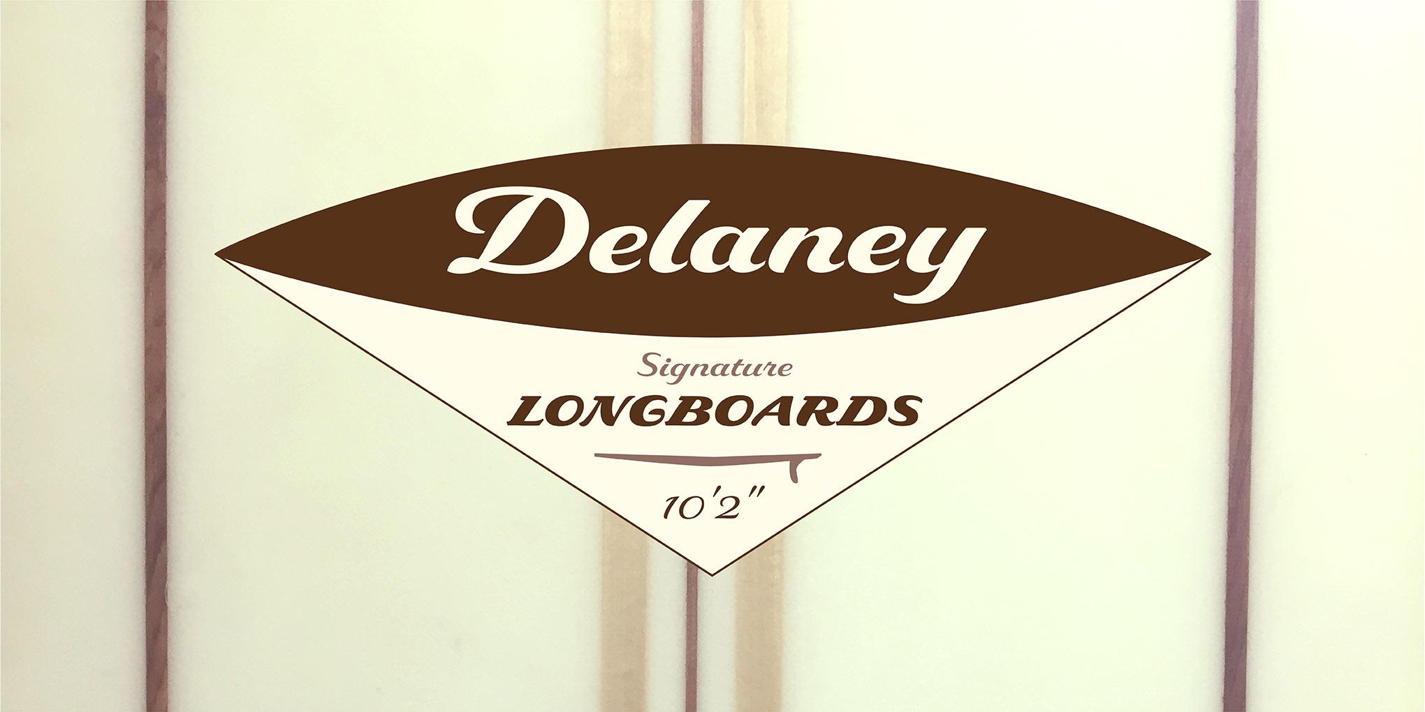
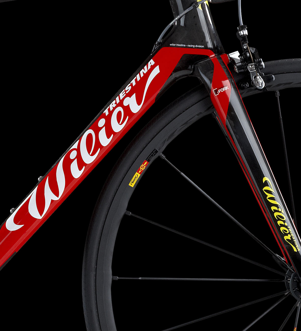
Richard Lipton is an avid cyclist and sees a lot of high-end bikes where he rides. “Bike frames have always provided a really interesting palette for graphic lettering that needs to be quickly recognizable and preferably super cool,” Lipton said. His latest typeface, Delaney, was inspired by the logotype for Wilier, an Italian maker of racing bikes.
Echoing the exuberance of the Wilier logo and the adrenaline-tinged freedom of cycling, Lipton gave Delaney—a five-weight family—a springiness and movement reminiscent of the brush. Every stroke is thoughtfully modulated yet given license to roam. Delaney's swelling curves are most obvious at the heaviest weights, gracefully but forcefully pushing letterforms to their limits. Delaney's lightest weight, with its almost monoline feel, displays design details rendered with a light, deft touch.
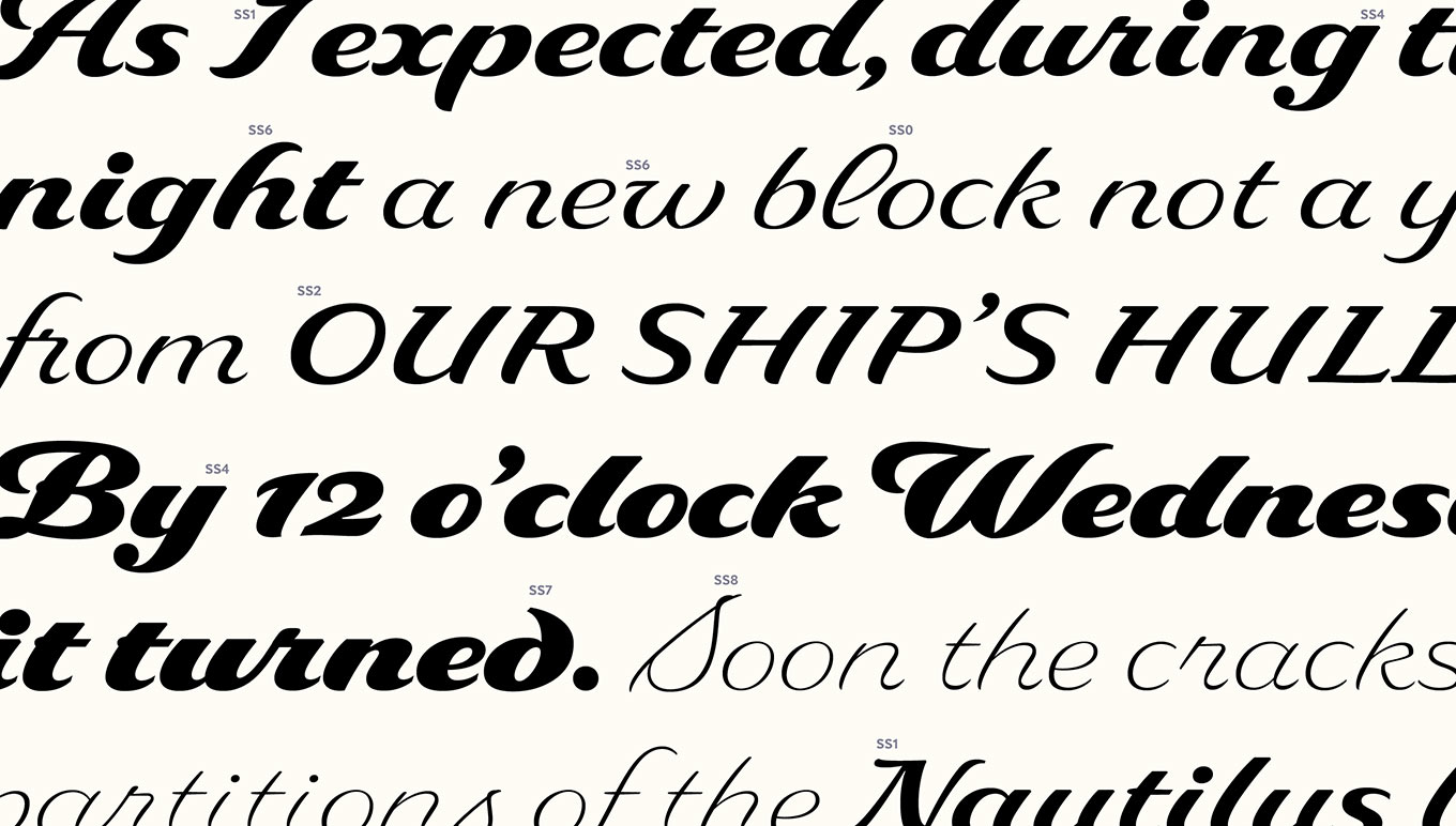
As you might expect in a Lipton script typeface, Delaney features a number of alternate forms for some letters and numerals. Since they fit so well with the flowing lowercase, Lipton gave Delaney swash capitals by default. He also created a set of smaller "subdued" caps, with slight flourishes, and a set of unornamented “simple” caps.
Delaney's simple caps are designed to work together in an all-caps setting. When All Caps is applied to a string of text, the typeface's Case-Sensitive Forms feature will substitute simple caps for the default forms, and replace any numerals in the string with slightly larger forms designed to work well with the caps. Working with Delaney's multiple caps styles is as easy as mixing caps and lowercase: for instance, a subdued cap will work beautifully as an initial letter on a word set in simple caps. Subdued capitals can add subtle swing without drawing the attention a showier swashed cap would.
Delaney's varied range of weights, capitals, stylistic sets, and alternate letterforms afford designers a wealth of typographic options.
Delaney's structure appears almost malleable, lending itself well to tiny changes in direction or form. Optional ball terminals on the lowercase c f g j y play off the dots on i and j, giving words a subtle bounce. A swooping h and a back-swooping “uncial” d—also optional—break up the expected angles. An open-looped l can appear both by itself and in a double-l ligature. Delaney sports three different lowercase variants of v and w, and it has an alternate s with a cursive form in both upper- and lowercase.
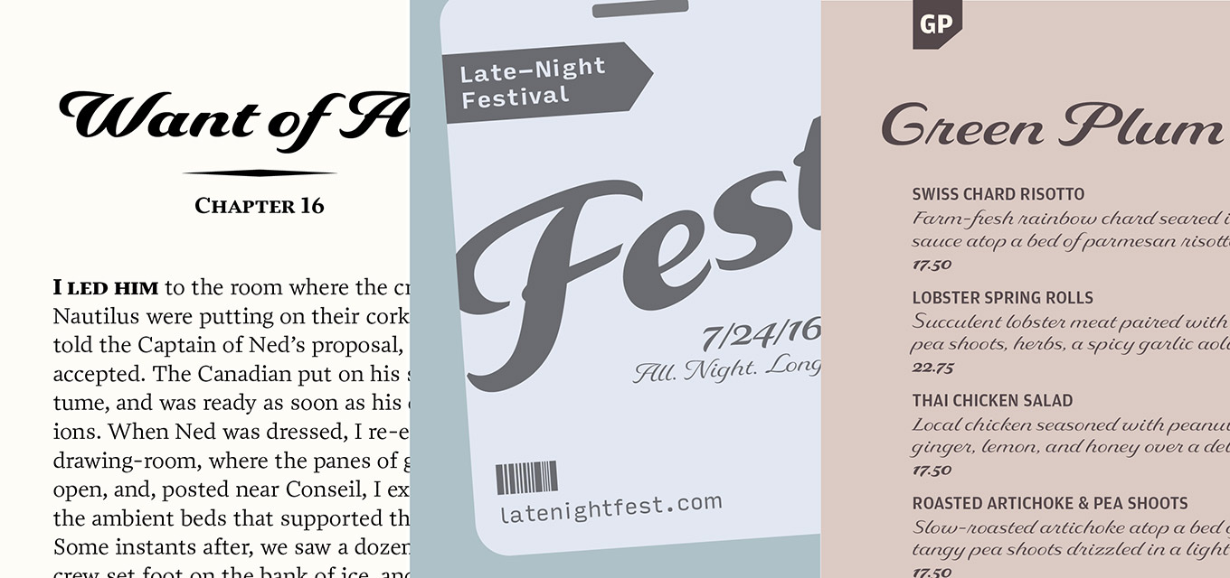
While many scripts are too delicate or abstract to work well in text settings, Delaney's range of weights and carefully crafted forms are fine in subheads and short blocks of dense copy. Delaney's versatility also offers plenty of opportunity for contrast—it pairs nicely with other types.
From left to right: Delaney with Prensa (Occupant Fonts), Input Sans (DJR), and Amplitude (Font Bureau).
Make your own great pairings with Lipton's latest creation. Set the black weight super-sized—imagine it going down the highway on the side of a truck. Try the lighter weights on clothing hangtags (for a new line of athletic apparel, perhaps.) Take Delaney for a spin—this script is ready to be road tested.
Richard Lipton can often be found riding the East Bay bike path from Bristol to Providence. You'll find him on a 2001 Lemond Alpe D'Huez—a pretty nice ride.