Richard Lipton took off from an old bicycle logo and hasn’t stopped since, pushing the weights and fine details of a dynamic script to their limits. In a relaxed manner, of course.
By Type Network Staff
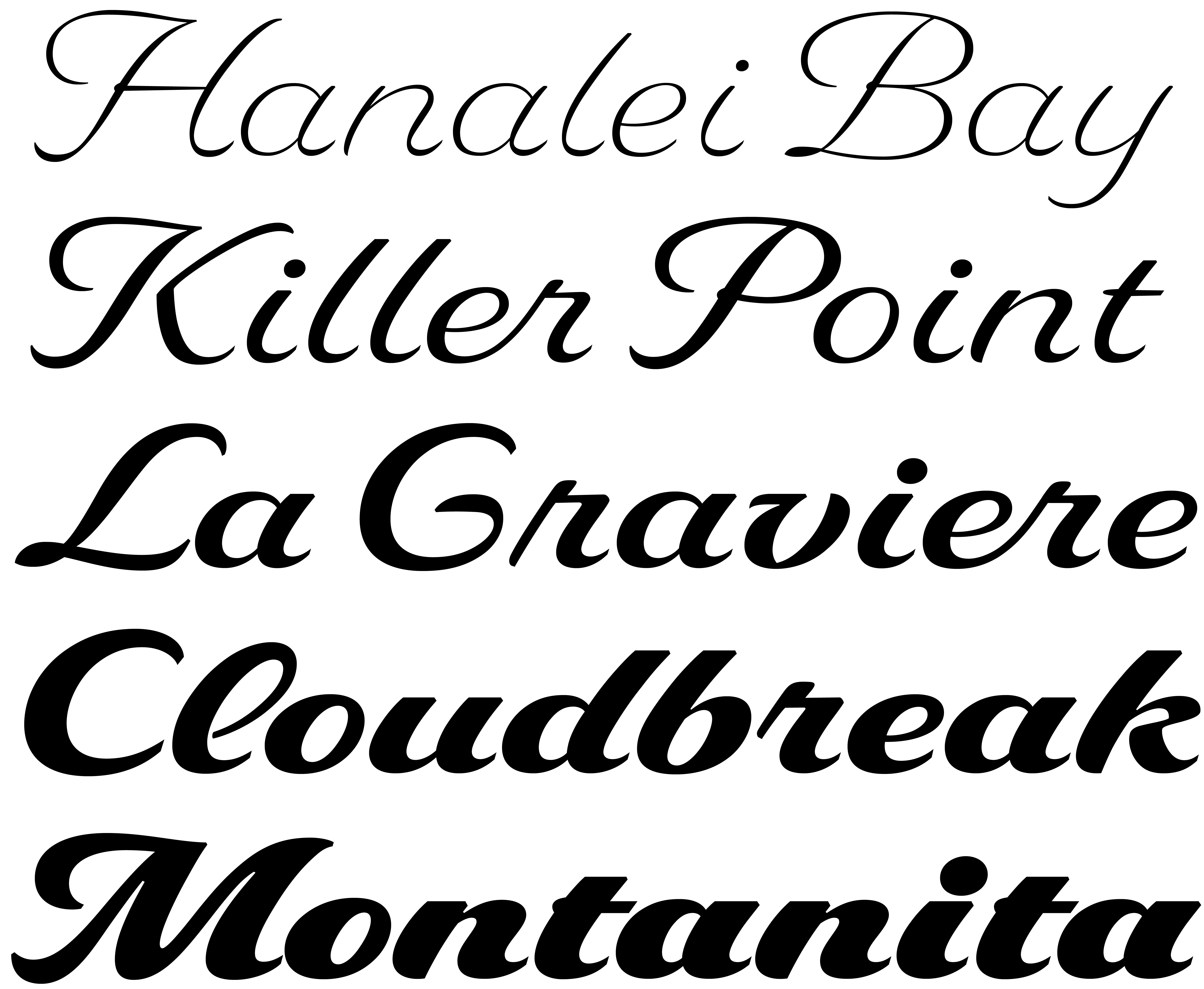
Delaney is a new five-weight script family from the hand of Richard Lipton. As he has so often accomplished in the past with designs like Sloop, Avalon, Tangier, Savanna and Bickham, Richard here brings wide-ranging historical script forms into practical contemporary use.
The Bold and Black weights stand on their own at very large sizes, while the three lighter weights can pair well with an endless variety of bolder serif and sans families. As in the world of fashion, mixing and matching can be a design challenge, but one that is made easier with the dynamic attributes of this typeface. Delaney shines at 24 point and above, but it is surprisingly tolerant of depths down to 14 point.
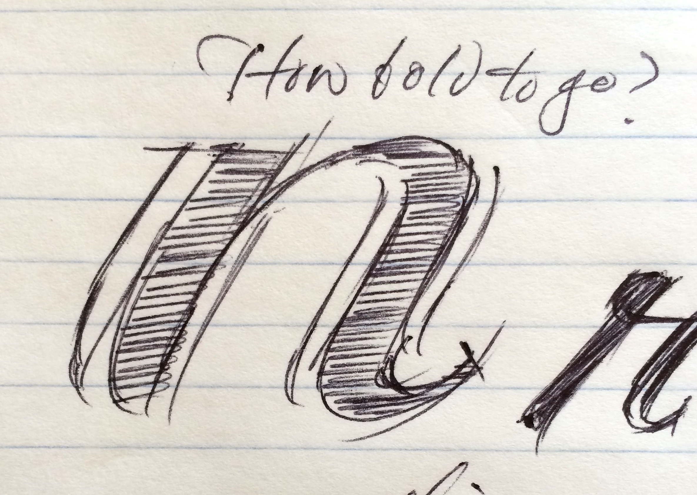
Richard took his initial inspiration from the lettering style of an updated early 20th-century bicycle logo. “I first drew a weight similar to the logo,” he said, “but continued adding more and more weight just to push the boundary, keeping the contrast relatively high. I feel the black weight encompasses the real drama of the family.”
Next, he drew a very light version, “pushing the weight lighter and lighter until I felt it could maintain the design without getting washed out.” It was a challenge to keep the level of detail despite the lower contrast. He then worked with the shapes in the interpolated weights between Black and Light, “trying to decide if the inherent differences between the two poles yielded pleasing middle weights.” They did.
“My general aesthetic for the family is, of course, always trying to reveal some sense of the hand in the design,” Richard said. “Though Delaney is not strictly a calligraphic hand, it is certainly influenced by it. I tried to find a typographic design space between the two, calligraphic and typographic.”
Delaney lends itself to large and small display use, for any commercial purpose, ranging from menus to billboards. The character set in each weight includes three sets of alternate caps, as well as alternate lowercase forms, ligatures, and figures, which make it possible to fine-tune the message and its presentation.