Cyrus Highsmith upgrades two of his classics
After 25 years of periodic updates, Cyrus Highsmith’s hit faces Dispatch and Stainless are receiving overhauls. Rebuilt from the ground up to be more consistent, complete, variable, and technically perfect, Dispatch 2 and Stainless 2 are ready for the next 25 years. Here, Highsmith and TN font engineer Guido Ferreyra discuss the new typefaces.
Lucas Czarnecki: How and when did you get the idea to upgrade Dispatch and Stainless?
Cyrus Highsmith: I think it was 2020. That makes it sound like we worked on it the whole time, which is not how it works, of course. But that’s when it was originally planned. They’re pretty popular typefaces, and they were pretty out-of-date, in terms of their character sets and their features, so I thought designers would appreciate a refresh.
LC: How did you decide which aspects of them to update?
CH: Well, we plan all our new releases as variable fonts. So, whenever we do an update, that’s part of it. It’s always easier to make a variable font into a static OpenType font; it’s harder to go the other direction, right? So, if we’re updating something or creating a new typeface, we tend to think in terms of variable fonts.
Beyond that, there never were italics for Dispatch, so we finally got around to that. Also, the character sets were different from each other, and we wanted to expand the language support. That was a big thing. Oh, and I wanted to round out the design spaces a little bit better! Dispatch started just as four styles. Later, I added different weights, and Stainless got some lighter weights that didn’t exist in Dispatch. They’re related designs, of course, but I didn’t think of them as a pair; they both grew at their own pace, based on what my clients needed. This was a chance to make things a little bit more organized and a little bit more uniform. It will make them easier to use.

Occupant Fonts
Cyrus is a letter drawer, teacher, author, and graphic artist. He teaches type design at Rhode Island School of Design (RISD). He wrote and illustrated the acclaimed primer Inside Paragraphs: Typographic Fundamentals. In 2015, he received the Gerrit Noordzij Prize for extraordinary contributions to the fields of type design, typography, and type education. In 2017, he became Creative Director for Latin Type Development at Morisawa USA.

Founded by Cyrus Highsmith in 2015, Occupant Fonts is relatively young compared to his 20+ years of experience as a type designer.
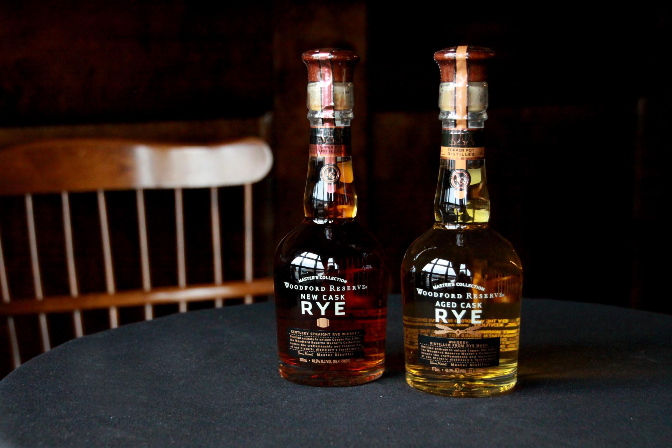
Woodford Reserve Whiskey using Stainless and Baskerville for a strong, elegant label. Source: Fonts in Use License: All Rights Reserved.
LC: You have described Stainless as originally derived from Dispatch; in what ways does it depart from Dispatch?
CH: Stainless started by just cutting the Slabs off. You can do that in a systematic way, so that the presence of slabs is the only difference… Or you can do it in a more refined way. You cut off the slabs and then you respond to how that changes its appearance. That’s what I did with Stainless: I cut the slabs off, and then I responded to it. The contrast changes and some of the waistlines change because the slabs aren’t filling up so much space.
LC: To what degree did Type Network play a role in the upgrade process?
Guido Ferreyra: Type Network doesn’t do the hard part. We are here for the foundries during their process, and we share as much information as we can about how to solve specific issues. These are huge, complex families. So, we have a back and forth during the process. We try to give as much input as possible and be another pair of eyes for our partners.
CH: I would agree with that, mostly; although, I would say that Type Network does do the hard part, because those technical details are important and hard to catch. And the standards and tools are hard to keep up to date with because they’re always changing. It’s a huge family, and we’re creating the static fonts at the same time, so we really rely on Type Network to help us get these typefaces across the finish line. The last 10% is difficult.
Type Network
Guido Ferreyra is a designer and font engineer. With his knowledge and skills on type and coding, he helps to improve productivity through streamlined workflows and ad-hoc tools. He is passionate about everything that involves type, from diving into its history to learning how modern, evolving technology applies to its development. Guido lives in Argentina and has given lectures and workshops throughout the Americas.
Dispatch 2
Variable
Starting at $40
BuyLC: Feel free to get in the weeds if you want: What is it about the last 10% that makes it difficult?
CH: When I’m testing the fonts myself, I don’t notice the issues. I’m using relatively high-level typesetters like InDesign and applications like that. It’s not until you’re doing complex stuff, deep in browsers, or having to support various apps on Windows or other platforms when these technical details become more critical. Testing the fonts in PowerPoint on Windows 98 or something like that—or maybe not even that far back—but we want them to work on all the platforms. And it’s awesome when it does.
LC: How important is it to know that the fonts will work for any kind of person doing basically any kind of thing?
GF: You know, I struggle with this all the time. I’ve been working on that “last 10%” for ten years, probably. Sometimes I think maybe it’s not necessary, but on the other hand, you find users on different platforms or with use cases where they are accustomed to fonts that are really, really well made.
For instance, fonts that come with your operating system are generally perfect in terms of software quality. So, imagine a user who is used to those fonts: When they get a retail font, they expect the same level of quality in terms of the usage and function. Sometimes you think the important thing is the design, but from the user standpoint, any small technical issues become huge problems. It’s something banal most of the time; you don’t even notice it until you get the failure.
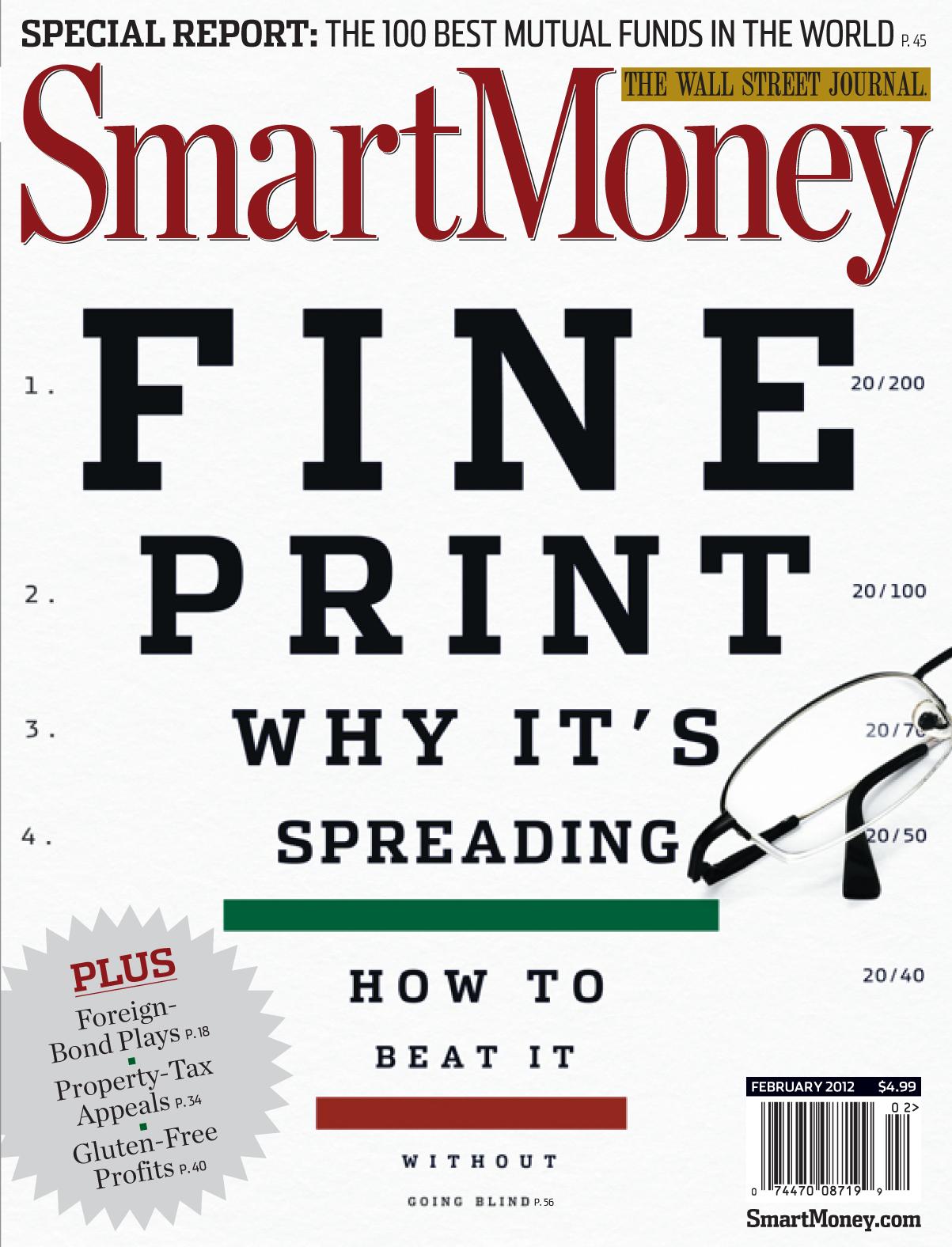
Smart Money uses Dispatch and Stainless on its covers to instill confidence and excitement. Source: Fonts in Use. License: All Rights Reserved.
Stainless 2
Variable
Starting at $40
BuyLC: Cyrus, how much of a better type designer are you now than when you designed Dispatch and Stainless the first time?
CH: That’s a good question. I hope I am a better type designer now. Dispatch and Stainless were my first major typefaces, and Dispatch I drew as part of a proposal for a newspaper. They said they wanted a slab serif option. This is when I was working with David Berlow and Tobias Frere-Jones; they said, Cyrus, you sketch the slabs, because no one thought the client would go for it. And, in fact, they didn’t. That was probably good because—to be honest—if it had happened, I would have been in way over my head. I had never finished a typeface at that level. I had done some display faces and had been an assistant for other people. But to do my own original design… that would have would have been like, oh shit, now what do I do?
But I liked the design, and I liked slab serifs. I had learned when I was a student that slab serifs were for westerns: Wanted posters, narcotic elixirs, and things like that. They weren’t for real typography or serious typography. Baskerville and Bodoni wouldn’t use a slab serif! We were taught to look down on them. I was curious to see, could you do something cool with a slab serif? And could you make it look like something that’s not from a spaghetti western. Of course, there are slab serifs like that already, and more were coming out around the same time. Around the turn of the century, slab serifs suddenly became a big part of the editorial typographic palette in a way that they weren’t before. I think Dispatch played a role in that change. That’s why it became a popular design: It was the right moment. That was amazing for me as a young type designer.
When I look at the drawings now, I see these squarish, really tense curves, and I think that really reflects my state of mind when I was drawing it. I was pretty wound up and pretty tense. I was putting myself under a lot of pressure to become a type designer. So, I see the design as a reflection of my own state of mind 25 years ago.
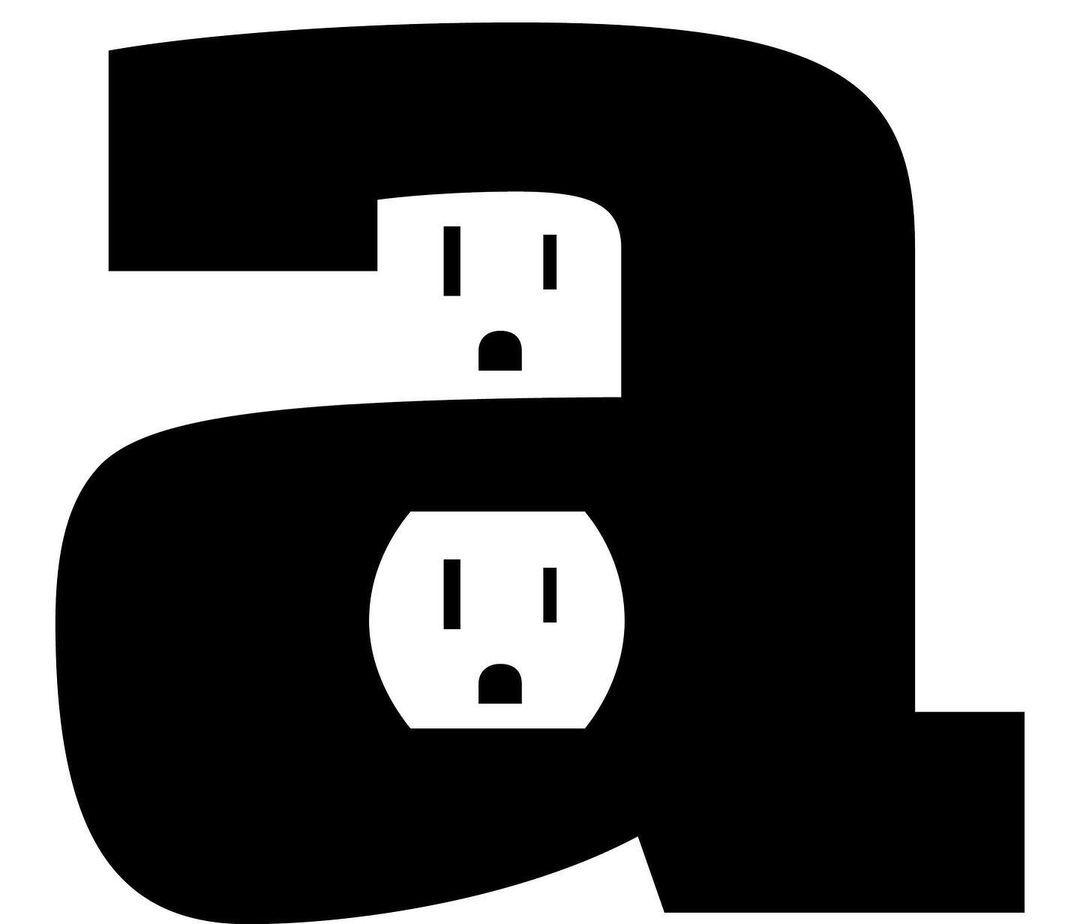
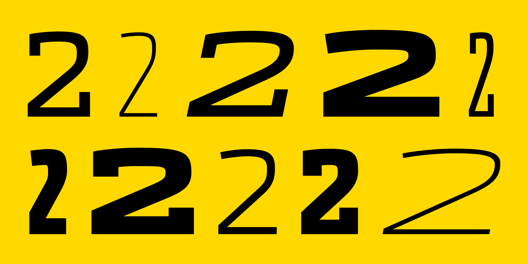
“Dispatch 2 comes with its own power supply.” Source: Occupant Fonts Instagram.
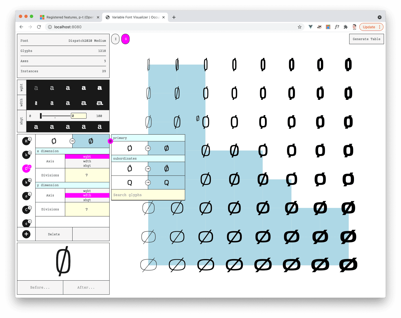
Occupant Font’s Variable Font Substitution Mapper, which allows for rapid and intuitive variable font character substitutions. The project is open source and available on GitHub. Watch their Typographics TypeLab presentation of it on Vimeo.
LC: Was it nostalgic at all to crack the files open?
CH: I’m lucky because my coworker Cem Eskinazi helped me. And he did a lot of the heavy lifting to get them going, especially with Stainless. It was also helpful to be working on them with him because they were fresher to him. He brought some new perspectives and a new energy and would ask questions. If I had to do them all by myself, I think it would have been much harder. But, you know, the other thing that happened, of course, was the pandemic was in the middle of all this. To be honest, I was not feeling super creative and super energetic during most of the pandemic, so in some ways, it was nice to have a big project that didn’t require a lot of new ideas. I could wake up and say, okay, I know what this is and I can improve it.
Occupant Fonts
Cem is a Turkish graphic designer, type designer and educator. He holds a BS in Marketing Communications from Emerson College and an MFA in Graphic Design from RISD. He teaches at both undergraduate and graduate levels at RISD. Outside of Occupant Fonts, he continues his own studio practice as a member of the Design Office.
LC: To what degree was this different from a normal type design in terms of balancing art and science?
CH: There were parts of the process where we did have to innovate. For example, we wrote a whole tool for mapping glyphs substitutions in variable fonts. Think of the classic issue with the dollar sign: as it gets bolded, the stroke through the dollar sign has to disappear in the middle. Typically, that’s pretty simple. It gets harder when you’re doing it in more than one dimension, though, because there’s axes for weight, width, and italic, and an x-height axis in Dispatch. But then, in Dispatch, we had to do that same process with serifs on around two dozen glyphs, and there were no easy ways to do that.
Our team made me a tool called TK. It’s open source, so everyone can use it. But it’s basically a grid, where you could say, oh, do the substitution here, here, here, and here. And then it does all the complicated coding for you.
That was a brand new problem to solve. I wasn’t so involved in that, except just trying to articulate my inability to do what I needed to do. But that was huge, and we’ve used it for a lot of other projects since.
I had been worried. I thought to myself, if we don’t have an easy way for doing what we need to do in terms of design while making variable fonts, it’s going to impact our designs. Sometimes technical limitations inspire you to do something interesting and creative, but when technical limitations just mean tedium, you’re going to start simplifying your designs to avoid it. It’s important to overcome these technical limitations early, before the overall practice changes.
GF: You need to push the boundaries of the tools and the format to allow things that were common in the past. That’s a challenge. That’s why I like designers from before the era of interpolating everything, because they could think more simply about how the design needs to be. To me that’s really visible in designs from young—I don’t want to call you old, Cyrus—designers: Sometimes I see designs from students, and from day zero, they are thinking about interpolation. But they don’t think outside those tools. Occupant designs the typeface you are trying to design and then creates the tools to accomplish it. That’s really valuable.
CH: Thanks. Yeah, that’s a good point. The age difference is interesting.
The other thing that happens with variable fonts is—we’ve been interpolating fonts for a long time—but with variable fonts, you have to be a lot more precise with your points. That way every instance on the slider interpolates correctly.
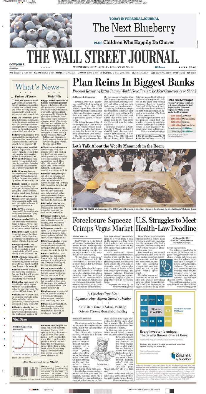
Wall Street Journal (2007) using Dispatch, Escrow, Exchange, and Retina, all by TN foundry partners. Source: Fonts in Use License: All Rights Reserved.
LC: What happens if someone is using a variable font that was imprecisely made?
CH: The main thing will happen is you’ll get a kink in the outline. So, for some reason, getting a curve to go smoothly into a diagonal in a variable font is very difficult. So, we made some tools to help us with the math. You’re balancing getting the shapes to look the way you want them to and getting the math to interpolate the way it the way it needs to.
LC: Is this a new problem that arose with variable fonts?
CH: Kind of, because if you’re making static instances, the chances are that mathematically, you just don’t see the kinks. They’re not going to happen at every instance, so it’s not until you’re moving through them with a slider that you see the outline go wonky. Mathematically it’s not new. We just never noticed them.
LC: I am all out of questions. Thank you both for your time. And to our readers: License Dispatch 2 and Stainless 2 to put Cyrus’s years of expertise to use in your designs.
CH: Thank you! I’m looking forward to seeing what everyone creates with these typefaces. Also, thank you Guido and Glenda [Bellarosa, Type Network’s library manager] for all the help getting these over the finish line.
Dispatch 2 and Stainless 2 can be licensed for print, web, mobile apps, and ePubs. Webfonts may be tested for thirty days, and desktop trials are available upon request. Have a licensing question? Check out our support page or get in touch.