Type design is to some extent an anticipatory, predictive art. Designers can never know with complete certainty how their typefaces will fit into the world; they can only imagine. Sometimes, real-world uses lay bare the need for adjustments or additions—changes. Change is the leading thread running through a report from Cyrus Highsmith on some new work in the works from Occupant Fonts.
By Cyrus Highsmith
To design a typeface, you always have to think about different kinds of change. New work from the Providence Drawing office is a testament to that.
Allium Text
In an experimental version of Allium, the lowercase a has a tail in smaller optical sizes; the tail disappears when the optical size crosses the 20-pt mark.
I have been developing new versions of Allium, optimized for text. The harmony and balance that make the original series hum get in the way at smaller sizes. The transformations from headline to text include raising the x-height, loosening the spacing, and making the widths more regular. In addition, the relationship between the black and white shapes gets more dramatic, increasing their broadcast area.
Scout and Heron Serif updates
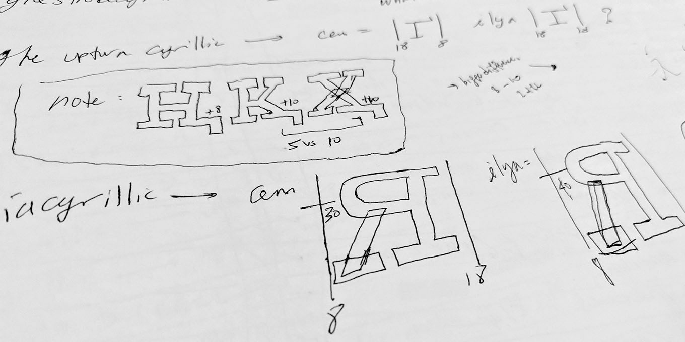
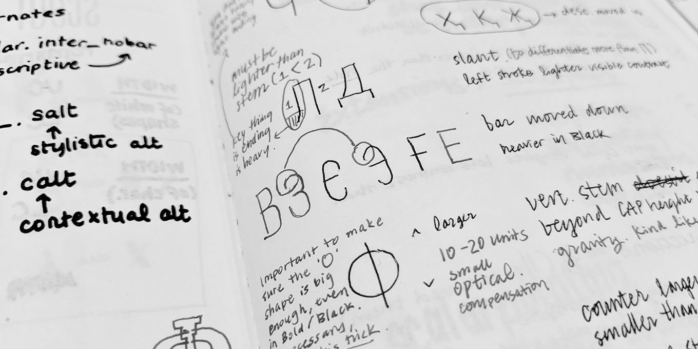
Sometimes pen and paper is still the best way. Cem Eskinazi made these notes to keep track of his spacing decisions, as well as comments from Ilya about his Cyrillic.Someday, I would like to write a book about type design. Or we could just publish June Shin’s beautifully clear notes and sketches and be done!
Meanwhile, Cem Eskinazi and June Shin have been hard at work broadening Scout and Heron Serif to the Greek and Cyrillic alphabets. Finding the sweet spot between maintaining the integrity of the original design and the requirements of different writing systems is always a challenge. We are grateful to Gerry Leonidas for sharing his knowledge of Greek. Ilya Ruderman, of CSTM Fonts, made critical contributions with some sharp comments on the Cyrillic.
Variations R&D
a
To interpolate smoothly between such extremes in width and weight, we had to draw with unconventional point structures and make multiple intermediate masters. And math. We had to do math. My goodness. Disclaimer: the sliders only work in browsers that support variable fonts.
Finally, like many of our colleagues, everyone at Occupant Fonts is excited about the possibilities of variable fonts. I’m experimenting with the limits of weight and width transformations within a single design. We are also investigating what it means to adapt our existing typefaces to work in this new environment. Variable fonts are all about change.
Stay tuned
Allium Text will be released this summer. The Scout and Heron Serif updates will follow later this year. Variable-font technology is not commercially viable quite yet, but things are moving fast. We look forward to the new possibilities.
All Occupant fonts are available for print, web, applications, and ePub licensing. Webfonts may be tested free for thirty days. To keep current with Occupant Fonts and other foundry partners, subscribe to Type Network News, our occasional email newsletter featuring font releases, foundry happenings, type and design events, and more. Occupant Fonts is a Morisawa brand.