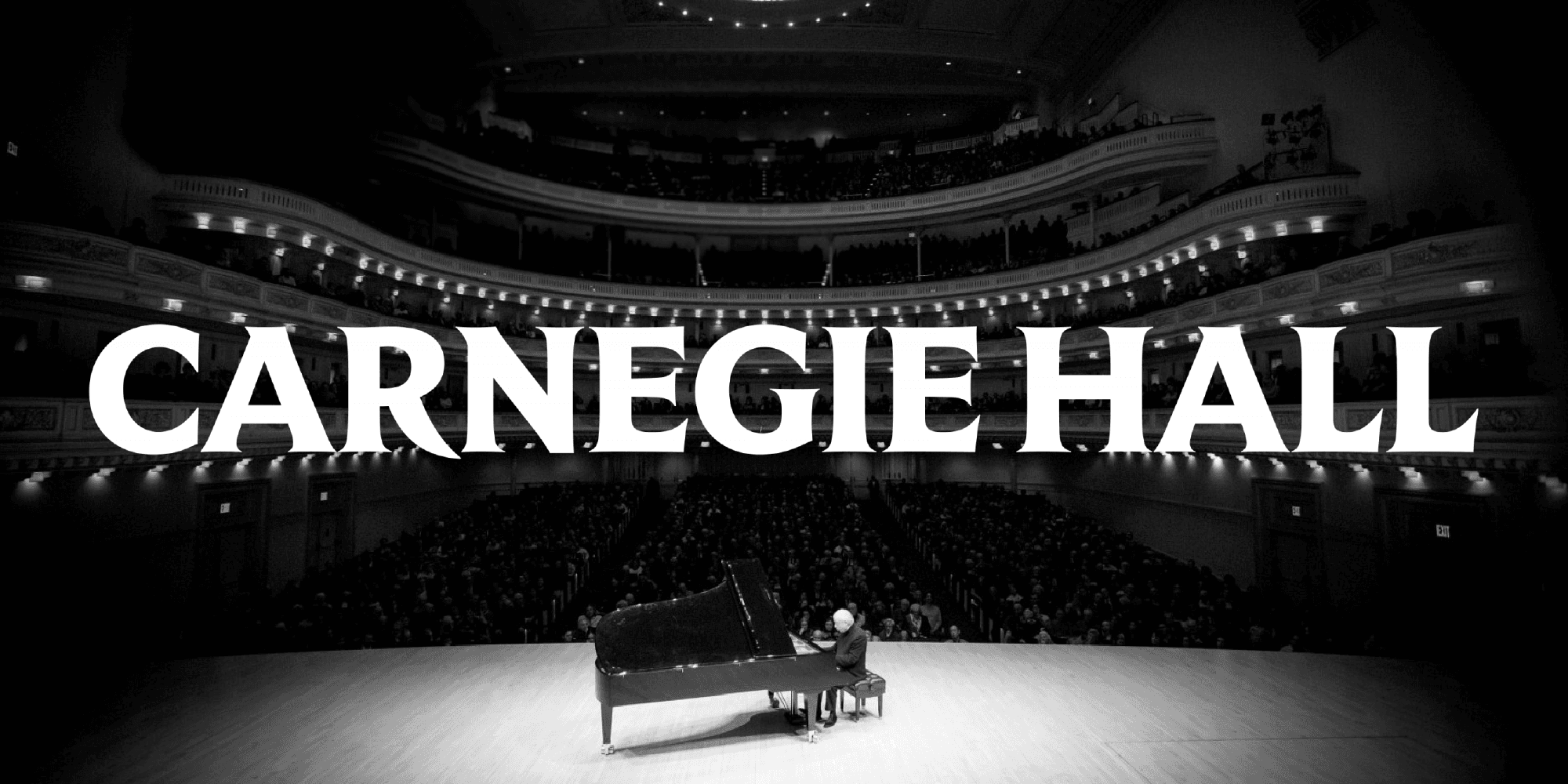
Source: Champion Design
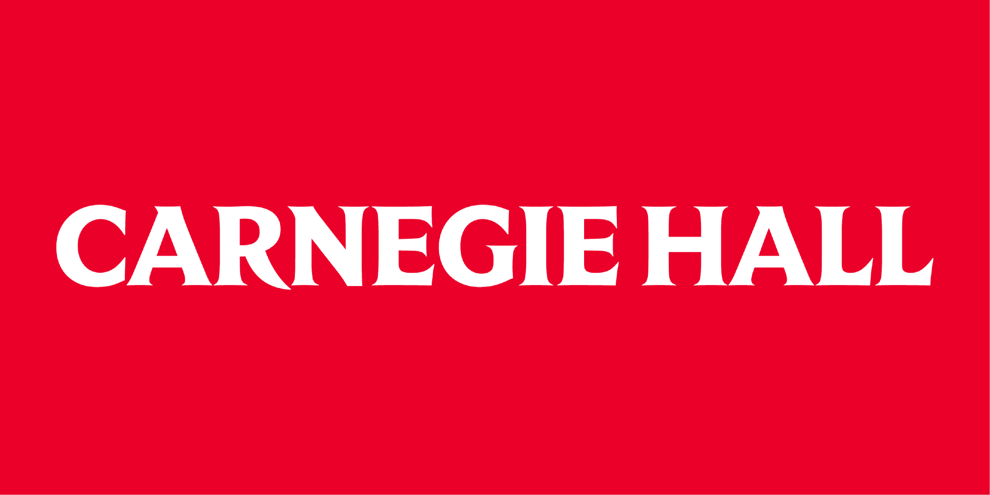
Carnegie Hall’s new wordmark and monogram
When rebranding the historic Carnegie Hall, Champions Design turned to Fred Shallcrass of Frere-Jones Type for the wordmark and Jesse Ragan of XYZ Type for the monogram. While the designs might look completely different, they both successfully reference the Hall’s 130-year past while bringing it into the future.
By Kate Beckwith
It’s no surprise to us that Champions Design enlisted Type Network partners and typographic stalwarts Frere-Jones Type and XYZ Type to help build out Carnegie Hall’s 130-year anniversary re-brand. As the old joke goes, "Could you tell me how to get to Carnegie Hall?"
“Practice!”
While neither foundry can boast the hall’s impressive 130-year history (yet!), there’s no denying that the designers at both Frere-Jones Type and XYZ Type are some of the most practiced and skilled in the industry. The challenge in this rebrand was to bring this refined excellence down to earth–into something inclusive and modern–something youthful yet classy.
Service: Custom licensing and consulting
Partners: Frere-Jones Type and XYZ Type in collaboration with Champion Design and Carnegie Hall
Date: 2021
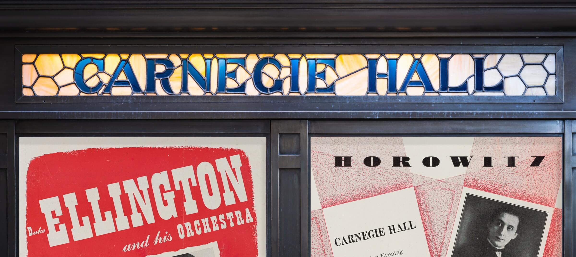
Originally named simply The Music Hall, Carnegie Hall was constructed between 1889 and 1891 and throughout its long history, it has proven one of the most admired performance venues in the world. Frere-Jones’s task was to create a wordmark that lived up to Carnegie Hall’s world-famous name. Designer Fred Shallcrass found inspiration in the large poster cases lining the iconic facade, constructed in 1919 by William Burnet Tuthill. The mark captures the distinctive features of the stained-glass poster case lettering and optimizes them for present-day needs.
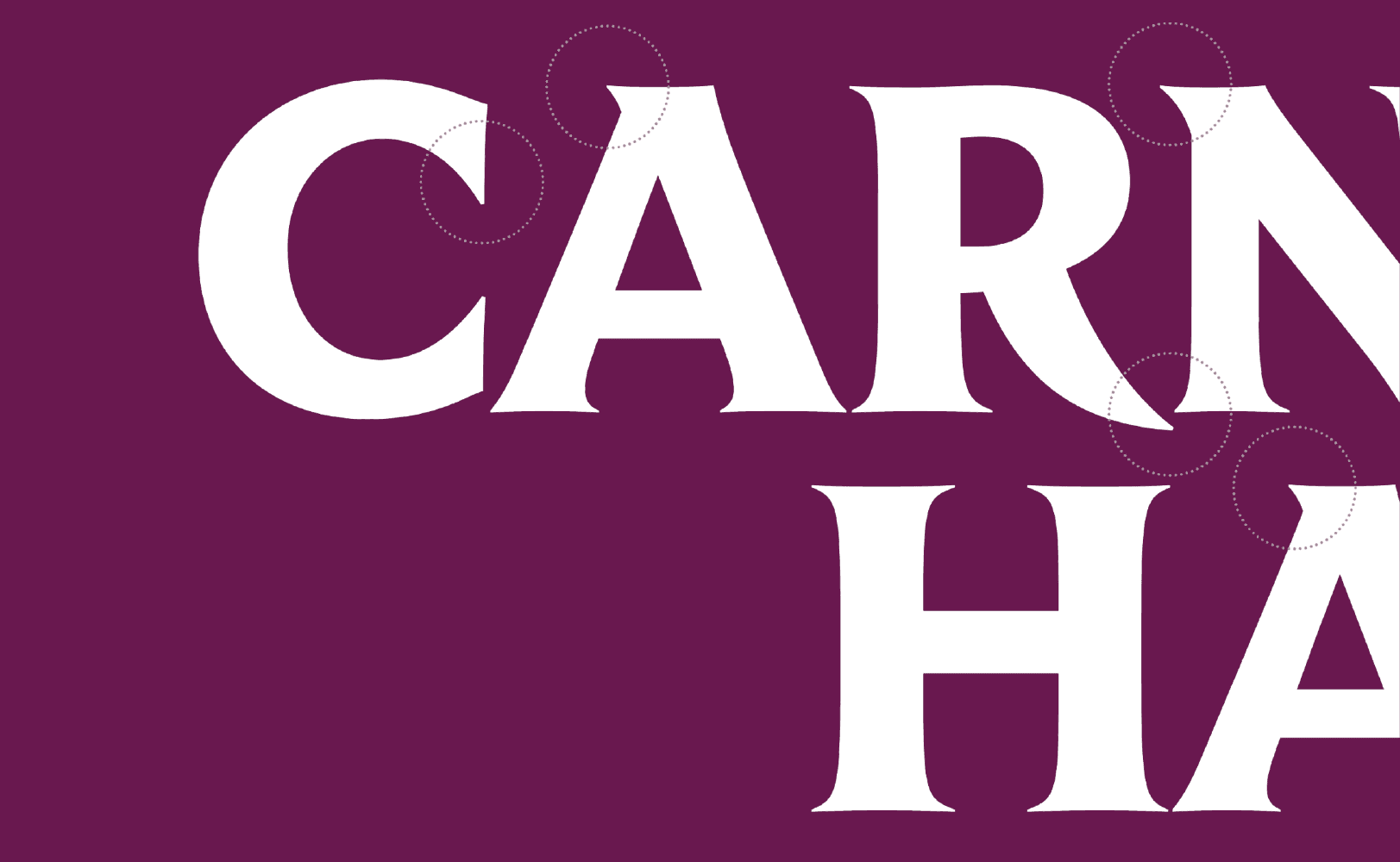
Analyzing even just a few of the design’s letters reveals Schallcrass’s consideration:
C – The upper terminal extends into negative space created by the diagonals of the A; the terminals also share a common angle.
A – The apex serif is softened, the crossbar lowered, and the foot serifs are shortened to create a more even overall color.
R – The leg descends below the baseline, and the serif is trimmed to allow for a better relationship with the following letterform.
From the Champions Design case study: “The venue’s long history brings with it a culture of storytelling and a museum-worthy visual archive. The new identity celebrates the past and readies for the future by assembling a graphic toolkit now prepared to stand the test of time.”
The cornerstone for the Hall was placed by Andrew Carnegie’s wife Louise in a ceremony on May 13, 1890, with Carnegie pronouncing that the Music Hall would be “built to stand for ages.” The Hall’s steel construction–an innovation at the time–lends continued truth to this ambitious proclamation. Almost 125 years later, when the upper floors of the building were renovated, a steel beam was discovered that had been embossed with the Carnegie name.

Frere-Jones Type is an independent type design studio in New York City, creating original typefaces for retail licensing and custom clients.
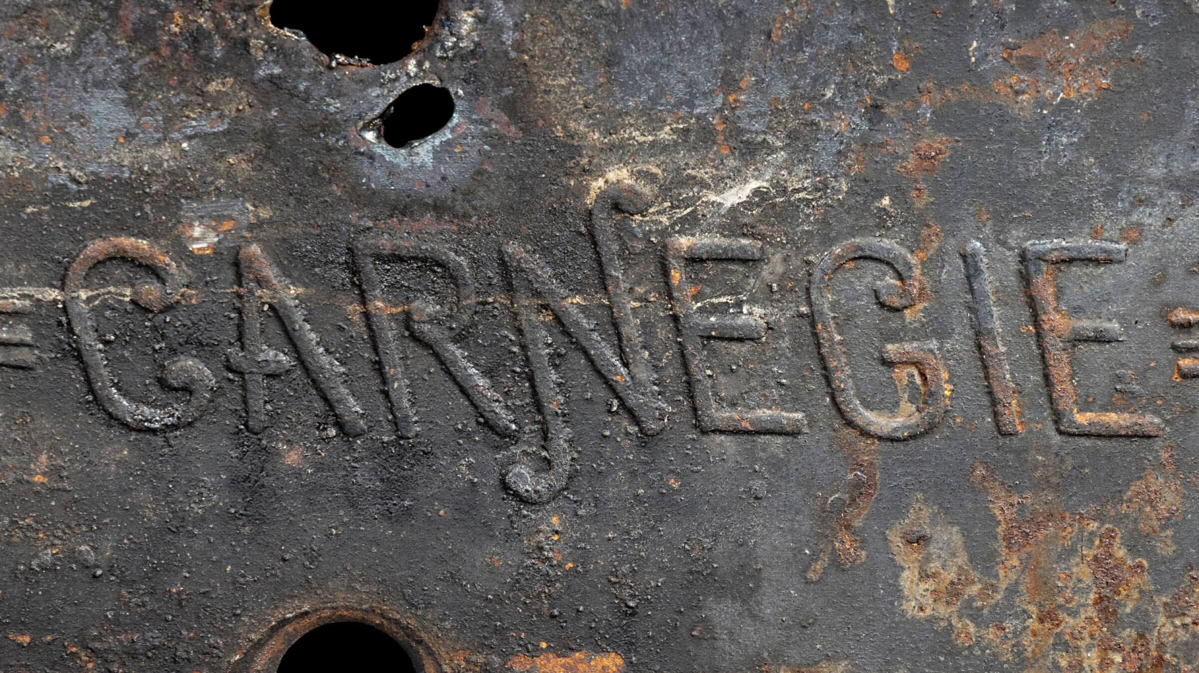
XYZ Type’s Jesse Ragan lifted the stamp in the steel to develop Carnegie Hall’s new monogram. Starting with a lockup of the full name “Carnegie Hall,” Jesse and Champions Design homed in on a simple monogram of “CH.” They explored a range of options to add unique personality to the mark—including a high-contrast version with dramatic ball terminals that directly referenced music notation.
They finally settled on a backslanted swash sans serif framework and included some subtle quirks (which invite close inspection). The monogram bears a charming levity in its ball terminals, balancing Victorian Era history with a simplified and affable open vision for the future.
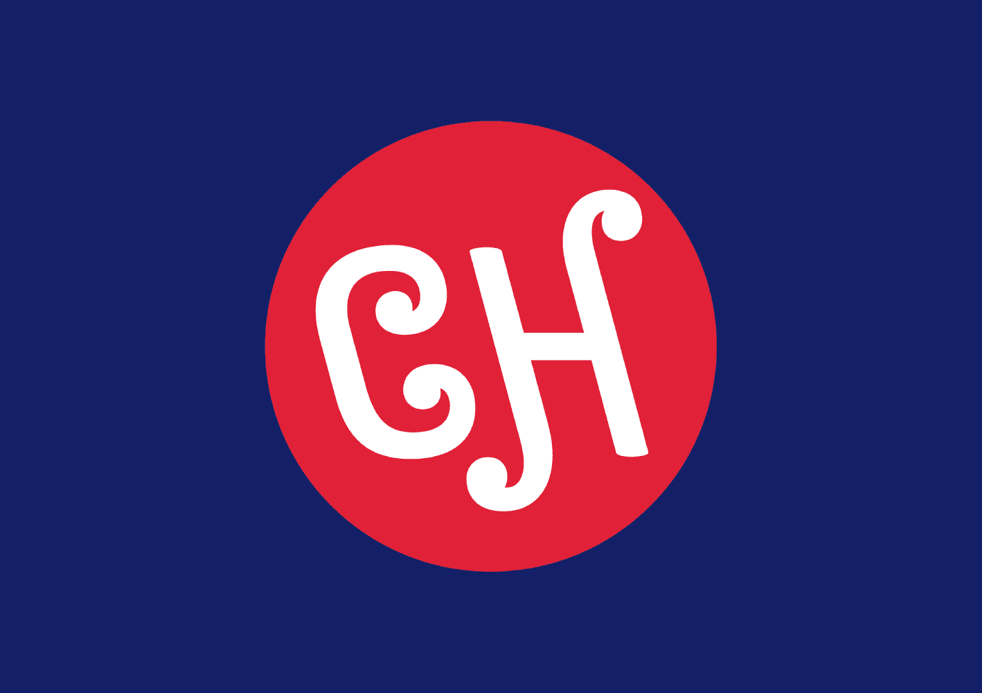
Ragan said that Champion’s move to use a monogram that has no direct visual relationship to the primary logotype was “gutsy.” The two marks certainly speak in different voices, but they also convey similar integrations of Carnegie Hall’s history with contemporary aesthetics, making the pairing successful. Further, on a practical level, they share some key characteristics:
- Medium contrast
- Nesting of letterforms (the dipping leg of the wordmark’s ‘R’ and the monogram’s swashes)
- Closed apertures and inward-looking shapes
- Unexpected elegance
- Straightforward sans structures with some fussiness on the terminals (could this be the sought-after “youthful-but-classy”?)
- A sense of heft
- An elusive, historic feel that references stone carving & engraving

Ben Kiel and Jesse Ragan make useful, quietly offbeat fonts at their independent digital foundry, XYZ Type, which operates in the interwebs between St. Louis and New York.
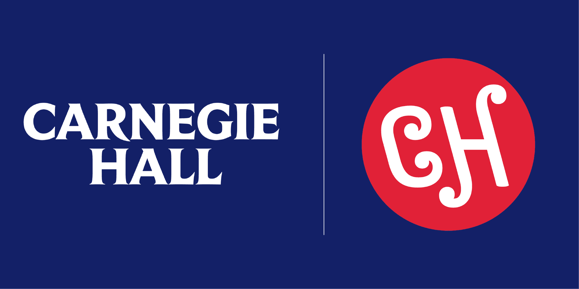
Carnegie Hall has been a bastion of musical artistry in every genre–from classical to contemporary pop music–for the length of its tenure. Through a thoughtful and engaged consideration of the Hall’s history, integrated with an eye to the future, Champions Design, Frere-Jones Type, and XYZ Type have developed a visionary re-brand we expect to remain relevant and iconic for another 130 years or more.
If your company wants to update its branding with a new wordmark or logo, contact us to start the conversation with the designers at one of our partner foundries.