Revitalizing Canal Brasil with a custom variable font
Creating custom type for a major television channel is a dream job for type designers. What better way to get millions of eyes on your work? Type Network partner Plau jumped at the chance to work with Brazilian agency Tátil to design a typeface for Canal Brasil. A unit of Grupo Globo, Canal Basil is a pay-television channel with more than 10 million subscribers.
Canal Brasil has been around since 1998 and occupies a well-established position in Brazilians’ minds. For years, the majority of the channel’s content was classic Brazilian feature films and documentaries. For the last few years though, Canal Brasil had started to show prestigious international films and an increasing number of originally produced series.
According to Camila Roque, Marketing Manager at Canal Brasil and Globo Group, the channel knew they were seen as “only for really smart people.” Globosat hired renowned branding agency Tátil to rejuvenate the brand from top to bottom, reinforcing the image of Canal Brasil as an entertaining and fun channel, a reflection of the diverse and dynamic culture of Brazil itself.
Service: Custom licensing and consulting
Partners: Plau in collaboration with Tátil and Canal Brasil
Date: 2022
The original sketches by Escudeiro used Sharp Sans (later used as a pairing font in the branding), modified type, and hand drawn letters.
Daniel Escudeiro, then Head of Design of Tátil, reached out to Rodrigo Saiani about developing a custom font. Rodrigo is the founder of Plau, which had designed the award-winning custom font for Globo's custom channel.
Saiani’s impression of Canal Brasil was rooted in the feeling that it was a bit dated, too niche, and highbrow. He also had a sense that it could be very creative and experimental. To Saiani, the pairing of the classic with the counterculture sparked a creative vision.
We like to call a brand's type identity its ‘type voice’. In this case, it's safe to say that Canal Brasil’s type voice is, really, an array of voices. Being so inspired by Brazilian art and culture, this typeface makes Canal Brasil truly speak to all.
— Plau
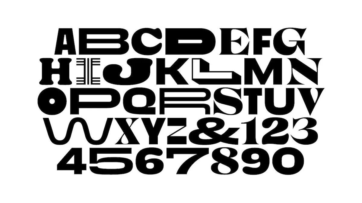
The plan was to develop a multi-style typeface that would reach into all aspects of the brand’s identity. Escudeiro and the Tátil team approached it as an exercise in combining typefaces. Early studies for the identity and on-air scenes involved mixing static typefaces, but things started to get interesting when these playful type combinations began to happen inside single words.
Escudeiro’s variations for the Canal Brasil logotype show the system’s flexibility was included from the start.
When Tátil pitched the first variable logo to Globosat, it had been animated in After Effects because the variable font didn’t yet exist. Globo Group’s interest was piqued, but they came back asking to see a more toned-down version with fewer variations. Escudeiro’s response was, “Oh, okay, they’re not seeing the full potential yet.”
Tátil came back to them with more variants of the logo, many more type styles, and far more individual glyphs. At that point, things clicked for the channel, and they got fully onboard with the vision.
Escudeiro’s sketches for the expansion and stylistic changes for certain glyphs made illustrating and animating the logo easy. When asked about the role Tátil played, Saiani says, “Tátil is the mind behind the project.”
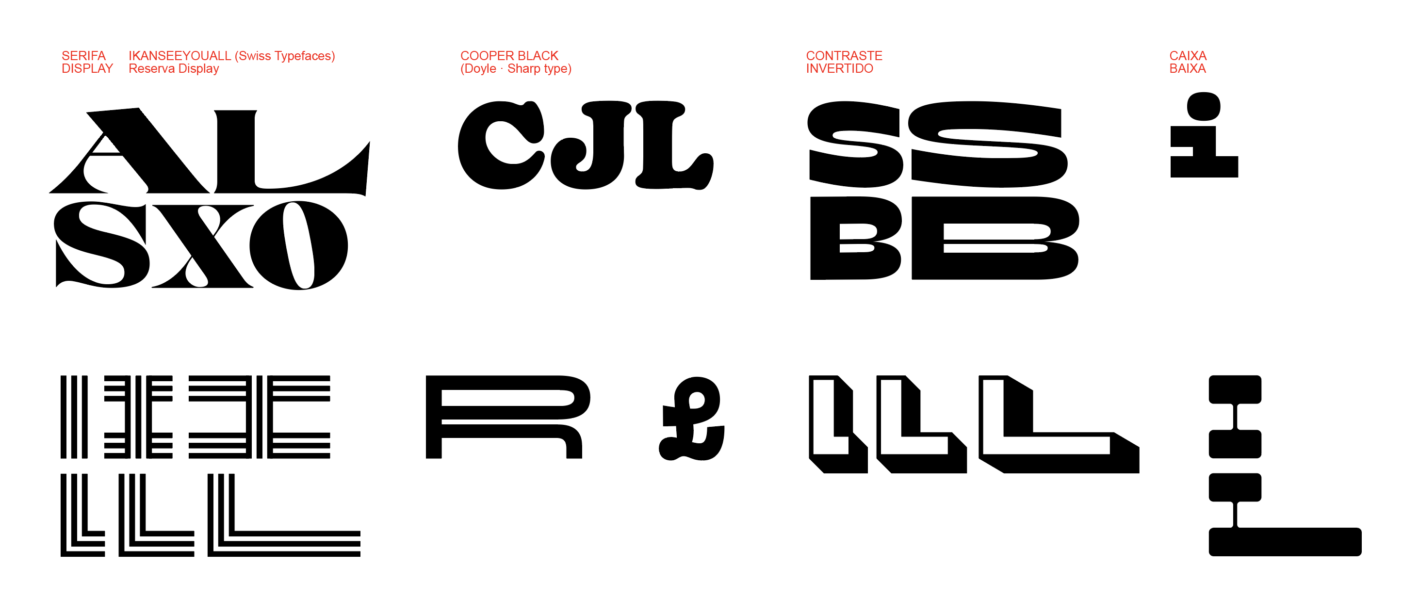
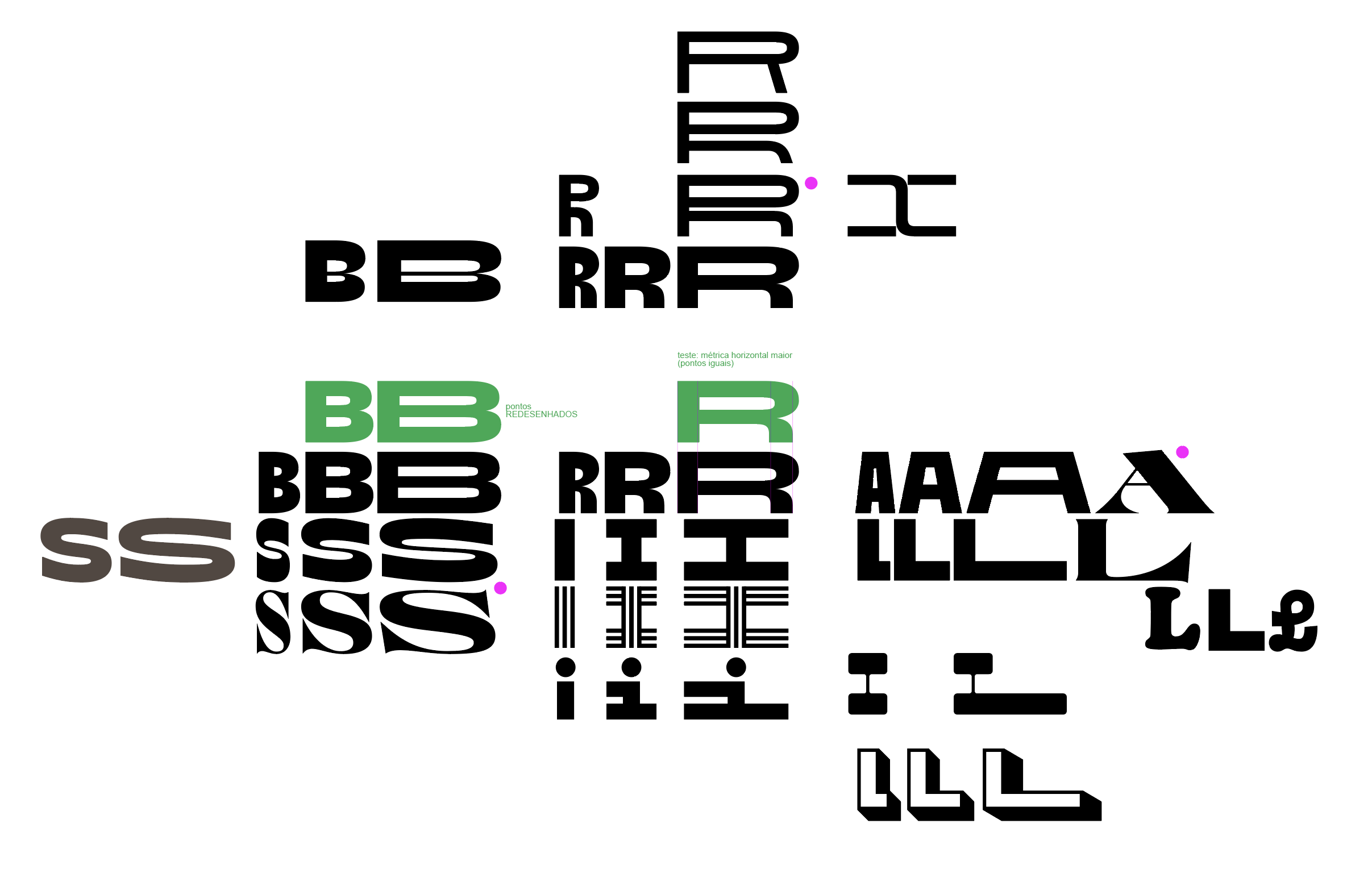
Plau started with Escudeiro’s chaotic Illustrator file full of letter sketches—both original and tweaked from different inspiration typefaces. Plau first distilled the chaos into the most neutral version of the typeface possible.
Saiani and his team then built upon the neutral grotesque sans, adding Plau’s own twist. One notable contribution: The squarish counter shape in the neutral versions of the typeface, inspired by beloved Brazilian comic artist Ziraldo, who often used Harold Adler’s Ad Lib in his work.
Plau ended up developing six different masters, and for each master there are seven or eight different styles. Styles within styles. One is a Cooper Black-esque style. Another has a very Latin, triangular shaped serif.
Plau and Tátil created the branding and typeface in a period of roughly three months. They bounced ideas and inspiration back and forth—from Tátil’s overall identity to Plau’s variable typeface—to create a single cohesive system.
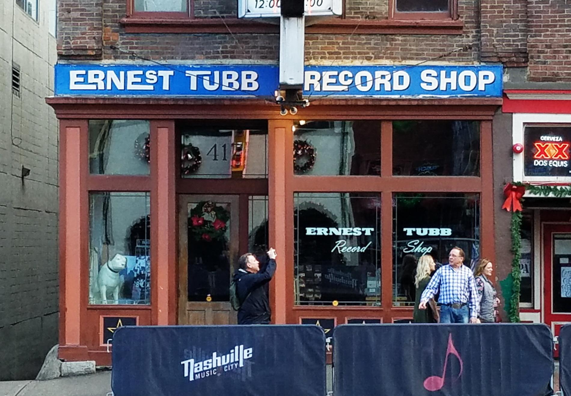
An interlocked version of Ad Lib used for the Ernest Tubb Record Shop on Nashville, TN. Photo: Lyle Dechant. License: Public Domain. Source: Fonts in Use.
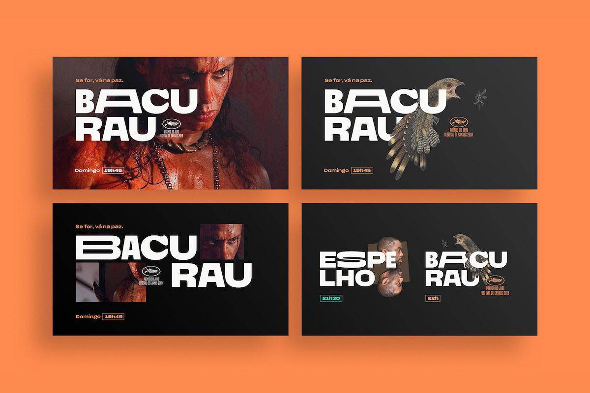
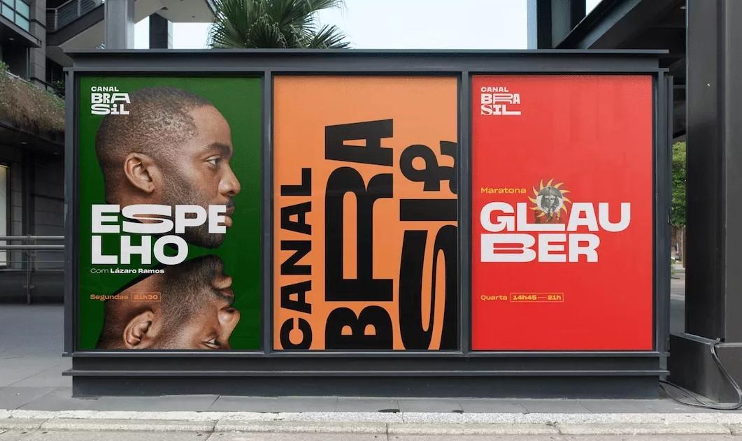
Final advertising screens for Canal Brasil show the strengths of the variable font format.
At first glance it might appear that the two teams did not make choices at all, but rather threw their drawings and inspirations into the pot and called it a day. That was not the case. Escudeiro called it “controlled chaos,” with hours of dedicated fine tuning for both identity and typeface.
The results speak for themselves. Canal Brasil has earned increased viewership and its new brand and typography took home two gold prizes and the grand prix at the prestigious Brasil Design Award.
The typeface and its story demonstrate variable fonts innate strengths for branding: Versatility, animation, recognizability, and nuance. If you’re interested in commissioning a custom variable font for your brand, contact us at Type Network.