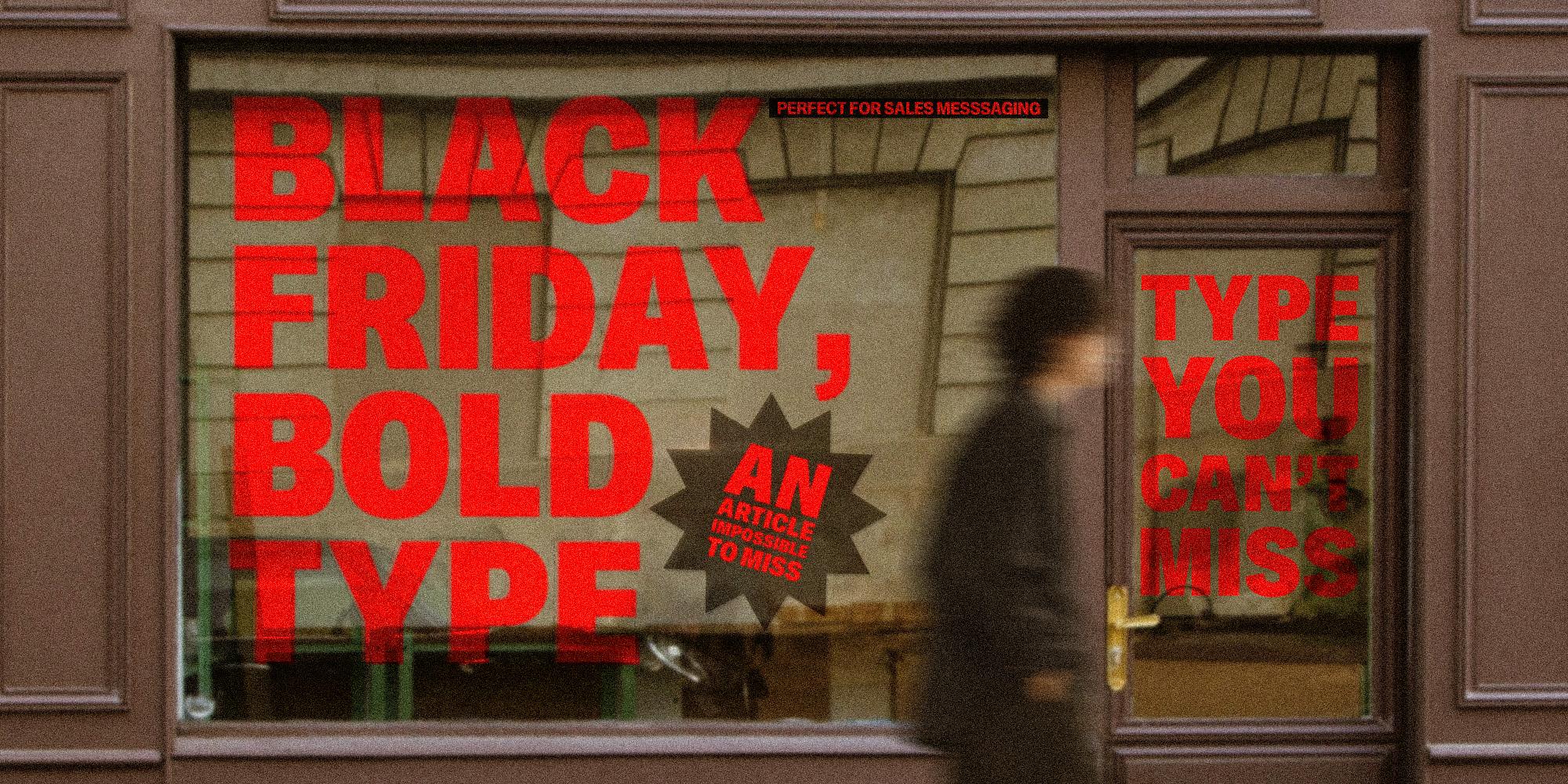
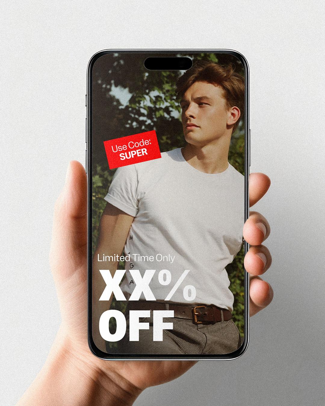
Banner: Makro · Tokotype
Featuring:RL Reklama · radluka, AdGothic · Manic Type,Chill Sans · Chill Type, Black Pack Variable · MTM, Makro · Tokotype
Black Friday, bold type: display faces that shout politely
Every brand gets loud the last week of November. Five heavyweight display faces that make the offer impossible to miss, without making the brand impossible to recognize.
Sale season is a shouting match, and the inbox is the arena. Every banner, email, and window cling is competing for the same split second of attention, and the instinct is to make everything bigger, bolder, and redder. The smarter move is to cast one loud voice and let the rest of the layout speak softly around it. Each face below comes with a restraint tip for exactly that reason. Volume is a tool, not a strategy.
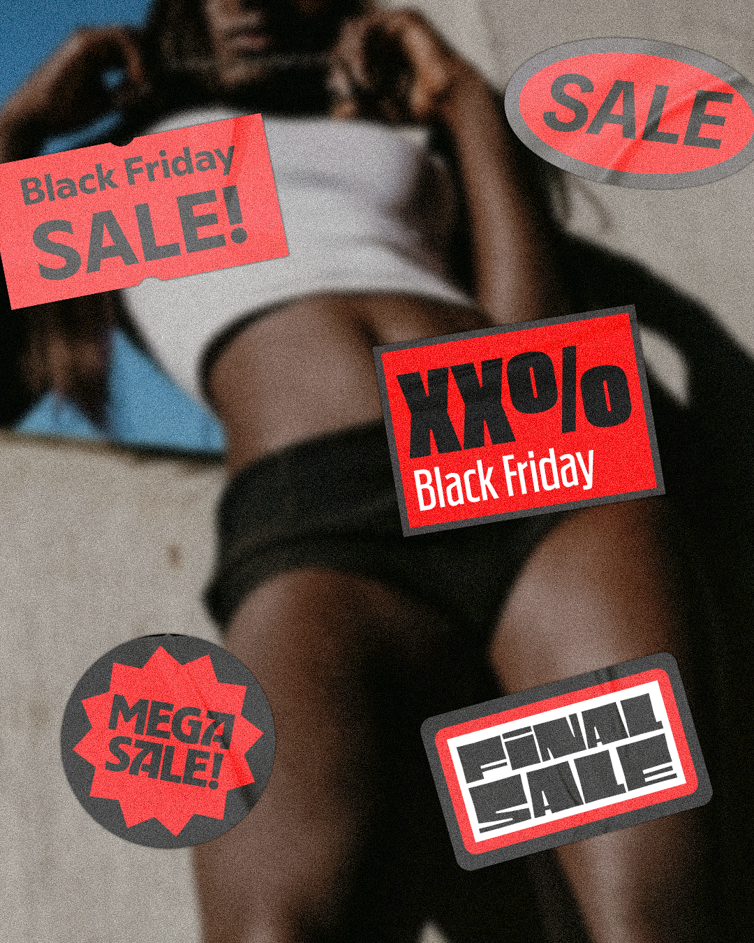
The Polish word for advertising and fits it perfectly
Radek Łukasiewicz drew RL Reklama in the spirit of the wood-cut display faces that once dominated type specimens, letters full of quirks, expressive details, and the occasional brutal flourish. It gets its compact look from open counters and terminals cut at varying angles, running from Regular to Black for big, attention-grabbing headlines that still save space. Reklama is the Polish word for advertising and fits it perfectly.
Restraint tip: let the Black weight carry the offer and the Regular carry the deadline, with nothing else in display type.
RL Reklama
Variable Regular
Starting at $45
Buy
Radek Łukasiewicz
With a degree in Printmaking from Nicolaus Copernicus University and an MA in Typeface Design from the University of Reading, he transitioned from graphic design to full-time type design, launching his own typeface shop in 2024.
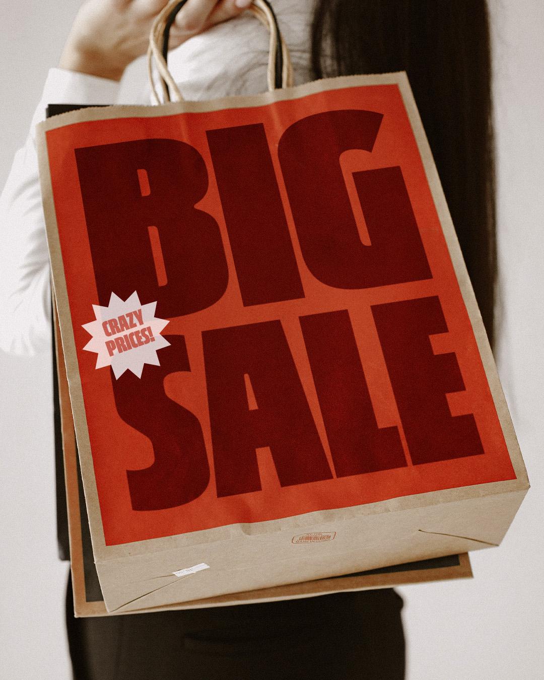
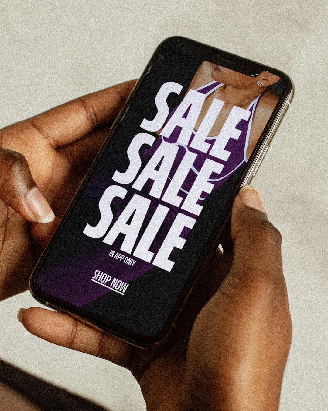
Over a century in advertising, and still on the clock
Jamie Chang built AdGothic for Toronto’s Manic Type as a variable-width take on Advertisers Gothic, Robert Wiebking’s bold 1917 design made for exactly what the name says. Chang kept the original’s distinctive short descenders and its quirky g, then brought the whole thing into the present with a width axis that lets one headline stretch across a banner or tuck into a mobile notification. Over a century in advertising, and still on the clock.
Restraint tip: pick one width per campaign and hold it everywhere, so the shout stays recognizably yours.

Jamie Chang
Jamie Chang, founder of Manic Type, is a Toronto-based type designer and letterer. A Type@Cooper and TypeMedia graduate, he explores expressive, textural typography while teaching at OCAD University and developing typefaces for his independent practice and studios like Canada Type and The Northern Block.
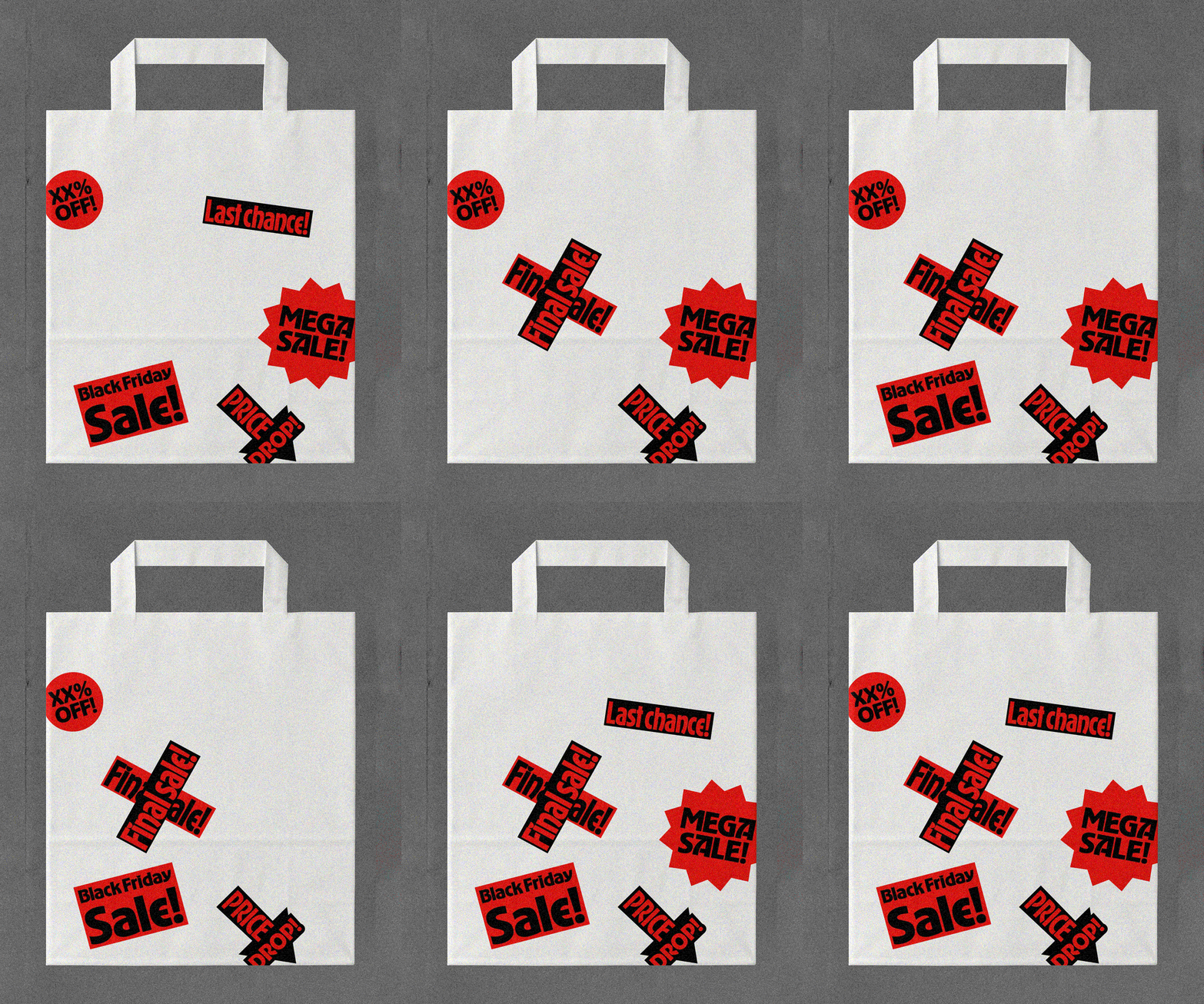
Big, round, and friendly to the core.
Vedad Siljak of Chill Type, the Salzburg foundry, drew Chill Sans on the belief that text should have character, running from light airiness to bold softness across eight weights with matching italics. At the top of that range sits Ultra, where the family’s warm shapes and easy balance turn up the volume without turning down the readability. The foundry describes Chill Sans as both gentle and cheeky, which is about the best mood a sale headline can strike. Big, round, and friendly to the core.
Restraint tip: let Ultra announce the deal, then drop to Regular from the same family for the details.

Vedad Siljak
Vedad Siljak is a type designer from Salzburg, Austria.
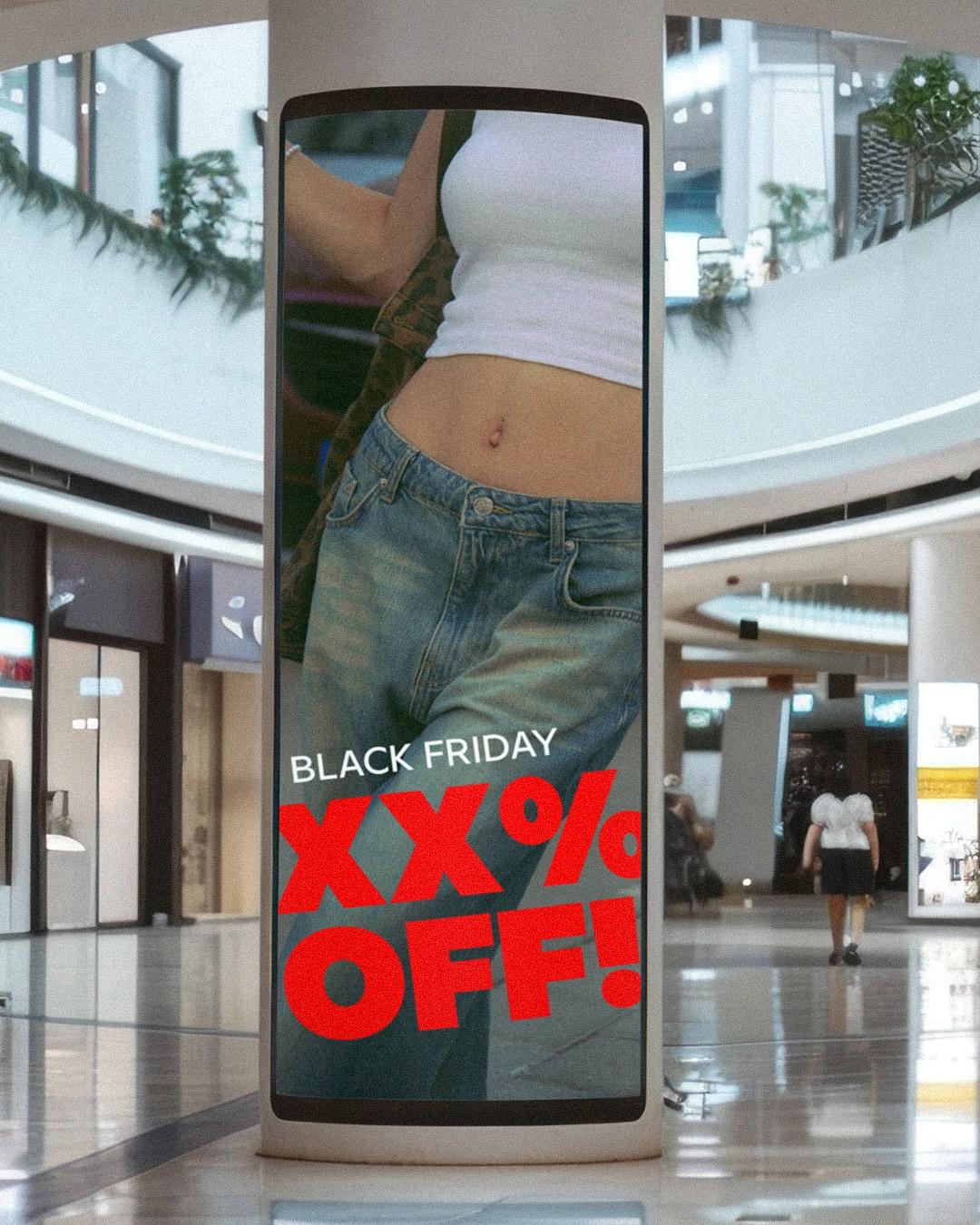
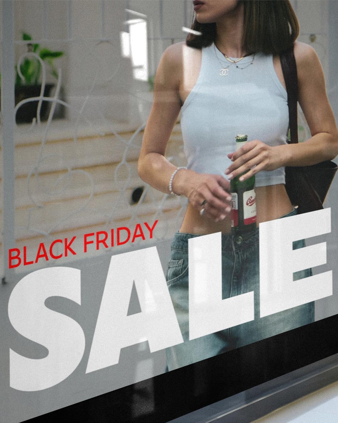
Built like a storefront
Juanjo López of Madrid’s MTM took loose inspiration from the bold plastic shop signs of the 1960s and 1970s for Black Pack, a block display face that began as a few curveless letters for practicing Python scripting. Calling himself terrible at coding, he started drawing instead, aiming for a really bold font that fits any copy into any layout. Now it has three variable axes: weight, width, and a stress axis that shifts the vertical weight. Built like a storefront.
Restraint tip: use the axes to fit one message into every format, not to pile five styles into one ad.
Black Pack Variable
Roman
Starting at $105
Buy
Juanjo López
A Madrid-based graphic and type designer and letterpress printer, he is passionate about vernacular typography, lettering, calligraphy, and traditional printing. He collaborates with Familia Plómez, Fetenletters, and Unostiposduros to explore and document typographic culture.
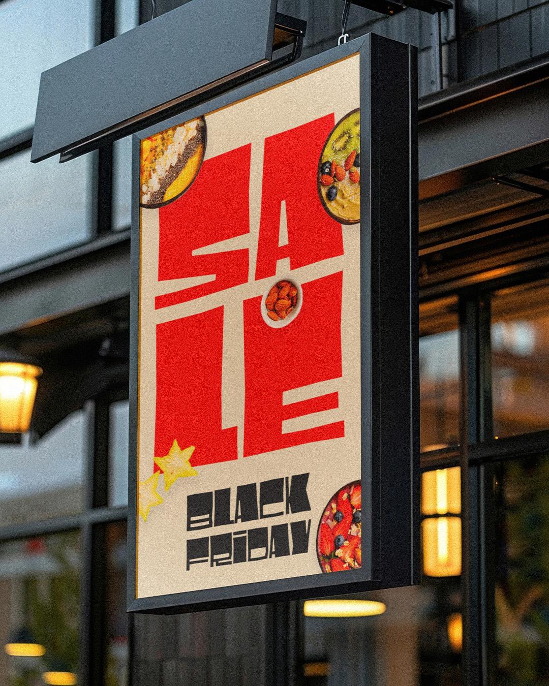
Loud by design, never sloppy about it
Faza Mufti and Gumpita Rahayu designed Makro for Tokotype primarily for large display use, the out-of-home graphics, headlines, and titles that need impact and room to breathe. Its defining move is the contrast between structured letterforms and organic, flared terminals, spread across three widths and seven weights, from ExtraLight to Black, with variable weight and width axes in its latest version. Loud by design, never sloppy about it.
Restraint tip: pair the Black with the ExtraLight from the same family, and the whole campaign stays in one voice.

Shouting is easy. Shouting politely, in a voice customers recognize long after the sale ends, is the real trick. Pick your one loud face, and meet the foundries behind these five, at
store.typenetwork.com.