Big Moore
Matthew Carter restores the authenticity of Isaac Moore’s 18th-century display face, in a design meant to be used, well, Big.
Matthew Carter’s Big Moore, like its cousin in spirit, Big Caslon, is a grand serif design. Offered in two styles, Regular and Italic, it is intended for the largest of sizes.
Nothing can stop a typographer from setting display type small. Not even common sense. And that’s not always a bad thing. For years, Titling Gothic FB has been used by magazines like GQ for instances of body text as well as the obvious titling purposes. Sans serifs have more flexibility in this regard, but Titling and Display serifs — especially Banner and Headline styles — want to be set as their name indicates. And perhaps no word does a better job at expressing exactly what it wants, than “Big”.

B is for Big.
So why is this Big Moore? It’s named for Isaac Moore, once the manager of Joseph Fry’s type foundry in Bristol, England. In 1766, Moore issued a type specimen under his own name. It shows a range of types that closely followed the designs of John Baskerville, which were then at the height of fashion.
Over a century later, in about 1910, when Stephenson Blake cut their 48-point Fry’s Baskerville, they gave it short descenders and lining figures to make it conform to a standard alignment. But lining figures are not historically appropriate to Baskerville-like faces. As in the types of Baskerville himself and of Moore, Matthew Carter remedies this by restoring oldstyle figures and full-length descenders in this regal serif.
- License Big Moore. Available in 2 Styles: Regular and Italic

Oldstyle figures restore an important characteristic of this design, and allow for more refined typography.

Alternate Q in Stylistic Set 1 (ss01).

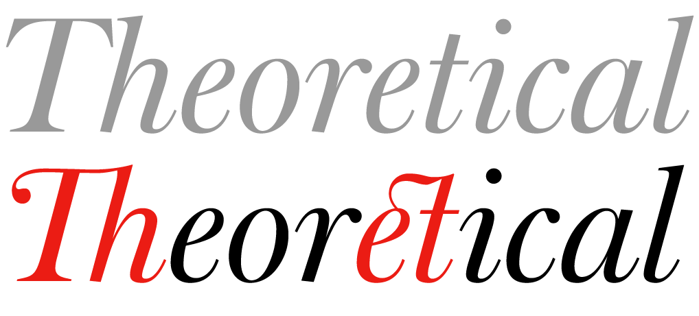
Big Moore has stylish swashes, like this 'Th' ligature, and four discretionary ligatures (in regular and italic), which add to the historical flair.