An expansion of Matthew Carter’s classic display serif into a three-weight family with striking italics and a host of flavorful features. Big Caslon Brochure
By Matthew Carter
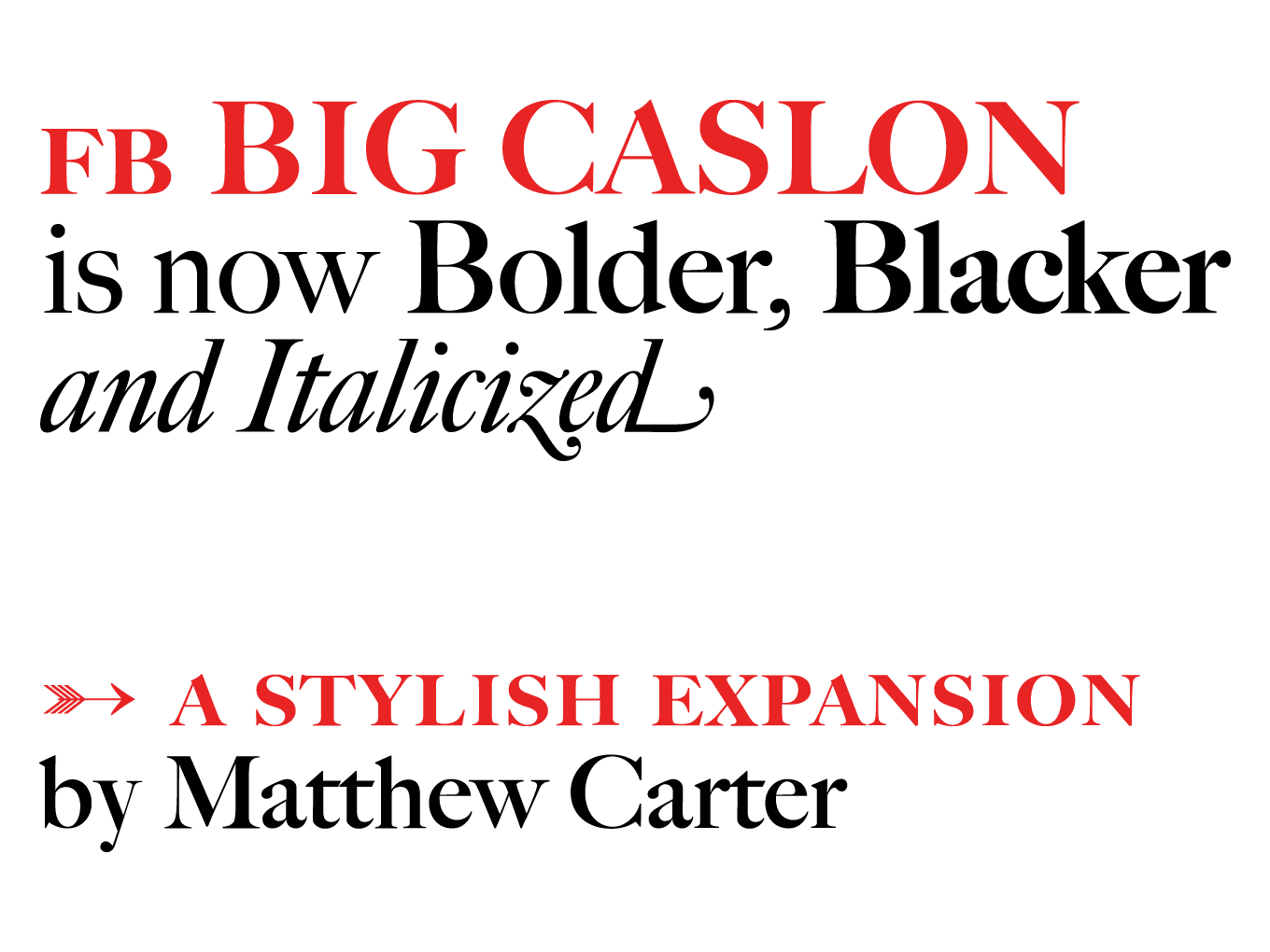
FB Big Caslon adds six new styles to Matthew Carter’s familiar and beloved typeface. In 1994, Big Caslon was released as a single style, with separate fonts for small caps, expert and alternate characters. Now it is a fully-featured OpenType family, simultaneously available as webfonts, in three weights (Regular, Bold, and Black). They each have italics, small caps, and plenty of striking alternates.
“Forceful and a touch eccentric”-that’s how the 1994 Big Caslon specimen described the faces that inspired Carter’s design. These new weights enhance its force, and amplify that dear eccentricity. But not for superficial gain, no, Big Caslon is still at its best in careful hands. Typographers who can sense the richness that Carter’s design offers will succeed by trusting these fonts.
Long bundled with Apple’s OS X, this display serif has befriended many designers. In the words of Carter himself, “It’s been around long enough to have been used on book jackets, in fashion magazines, advertising, and posters. It’s really a general purpose display face.”
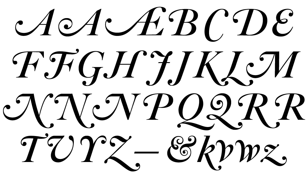
The fashionable swashes, set in Bold Italic. There are a number of swash ligatures that resolve cumbersome combinations, employed by default when ligatures are on.
In 2003, Paul Barnes redesigned Wallpaper magazine using Big Caslon and for that Carter drew an italic with swashes. The distinctive serif, with its new verve, did not go unnoticed. Years later, Boston magazine was redesigned by Patrick Mitchell using early versions of FB Big Caslon, paired with our own Williams Caslon Text, by William Berkson.
Big Caslon is in rare company. It was one of the 23 typefaces acquired by MoMA in 2011. Explaining the selections, which included six more of Carter’s typefaces. Senior curator Paola Antonelli wrote:
“Typography has a special relationship with its own past, with frequent redesigns and revivals, from among which we chose the ones that most inventively distill the essence of historical examples to give it new, contemporary life….”
Later that year, during a Type@Cooper talk called “Genuine Imitations,” Carter referred to his design of Big Caslon, which relies upon both 18th- and 19th-century versions of Caslons, as a “revival of a revival.”
So this release, two decades since Big Caslon’s arrival, revives it once more-the six styles breathe new life into Matthew Carter’s distinct design. FB Big Caslon expands the timeless nature of this vigorous display typeface and allows for a variety of new uses. •
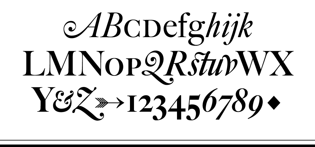
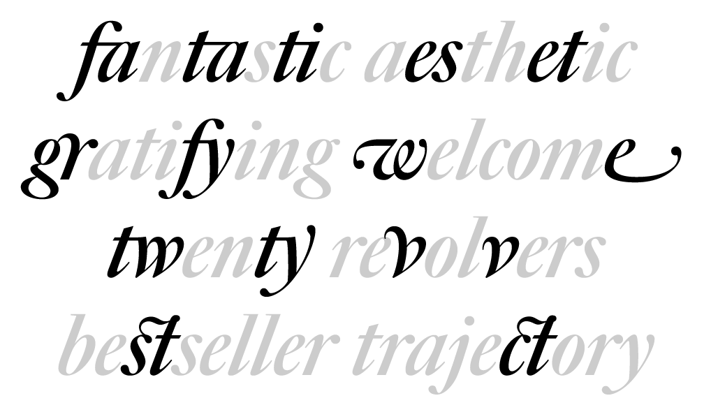
FB Big Caslon has many stylistic sets, from specific characters like the historical form of the h (stylistic set 8), to many flavorful ligatures, like the crossbar (ss10) and cursive (ss11) connections. A small sampling is shown above.