Featuring: Nawin · Letterjuice, Finlay · supertype, Bree · TypeTogether, Embury Text · Victoria Rushton, MVB Verdigris · MVB Fonts
Back-to-school type: faces that make reading easy
Back-to-school season means something different at every desk, so our suggestions grow up as they go: Five faces that trace reading life, from a toddler shaping their first letters to a college student staring down a semester of seminar reading.
First, the lesson. Readability is not magic, and it is not minimalism either. The faces that carry a reader through page 200 share a few habits:
- a generous x-height so lowercase letters stay open at small sizes,
- sturdy moderate contrast that survives real paper and real screens,
- and letterforms distinct enough that the eye never has to double back.
The five faces below have those habits down cold. Class is in session.
Nawin
Excellent letter recognition.
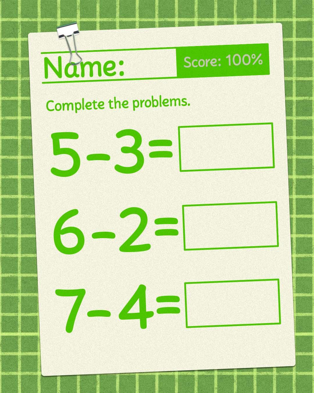
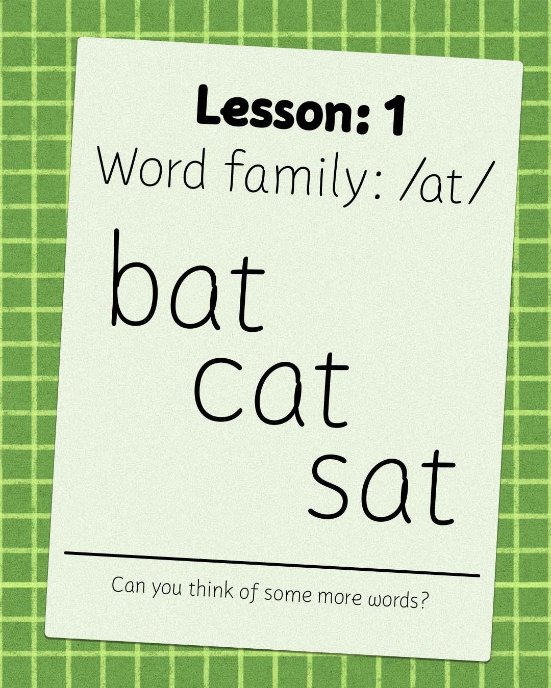
Pilar Cano and Ferran Milan designed Nawin for the very beginning, a family made to be attractive and ownable for children while keeping excellent letter recognition for reading. Its shapes emulate the movement of a pen, and a deep set of contextual alternates lets letters vary slightly as text flows, just like real handwriting does. With Latin, Greek, and Arabic coverage, it welcomes first readers in more than one alphabet. Kindergarten, covered.

Letterjuice, based in Barcelona and Buenos Aires, combines type design, typography, lettering, visual communication, branding, and teaching.
Finlay
Warm enough to trigger cheer and handshakes!
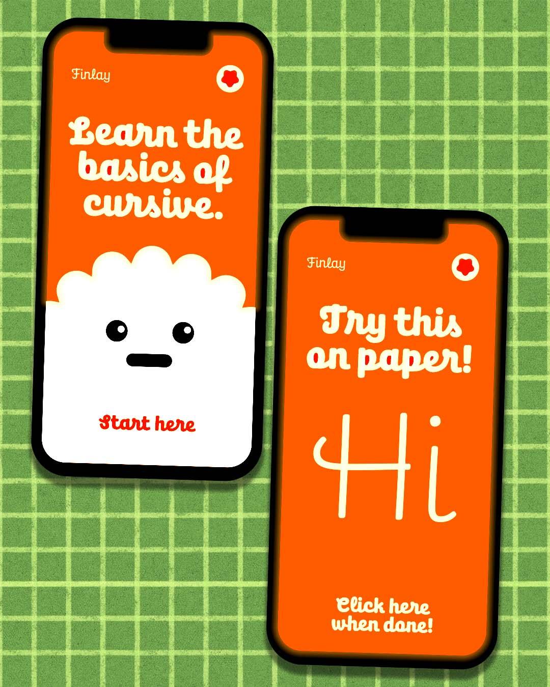
Jürgen Huber and Martin Wenzel developed Finlay from an idea pitched to a children’s TV program in Germany, so its kid credentials are official. Part script, part humanist sans, part upright italic, it reads like the confident classroom cursive every penmanship workbook promises, warm enough to trigger cheer and handshakes, in the foundry’s own words. (While you are in the handwriting aisle, Contrast Foundry’s CoFo Hand deserves a look as well.)

supertype is a partnership of type designers and font developers, working from Berlin. When they aren’t busy designing retail typefaces, they’re busy designing custom fonts.
Bree
The stage where the training wheels come off
Veronika Burian and José Scaglione grew Bree out of the lettering in TypeTogether’s own logo, and the result is handwriting with its homework done. The upright italic structure keeps the friendly, written warmth of the earlier grades, but the letterforms stand straighter and set cleaner, ready for headlines, posters, and the school newsletter masthead. This is the stage where the training wheels come off.

TypeTogether creates innovative and stylish solutions to the greatest problems in the professional typography market worldwide.
Embury Text
Firmly legible at small sizes.
Victoria Rushton trained at Font Bureau and studied illustration at RISD, and Embury Text is where those two educations meet. Firmly legible at small sizes, it reveals warm, surprisingly nimble curves as it grows, and its OpenType drawer is full of treats: swash italic capitals, alternate glyphs, and a set of ornamental borders for framing a page. A text face that does the reading homework, then decorates the folder.
Embury Text
Regular
Starting at $40
Buy
After learning to design type at Font Bureau, Victoria Rushton started her own foundry where she has published beloved faces like Gautreaux, Embury Text, and Marcia.

MVB Verdigris
Made to deliver beautiful typographic color at small sizes.
For the history elective, Mark van Bronkhorst looked to the great sixteenth-century French punchcutters, Robert Granjon for the roman and Pierre Haultin for the italic, then built a text face for the way we print and read now. Verdigris is not a museum piece but a sturdy, even-textured Garalde made to deliver beautiful typographic color at small sizes on modern paper and modern presses. Four hundred years of reading experience, ready for this semester.
MVB Verdigris Pro
Big Bold
Starting at $79
Buy
MVB Fonts is a digital type foundry established in the San Francisco Bay Area in 1991 by type designer Mark van Bronkhorst.
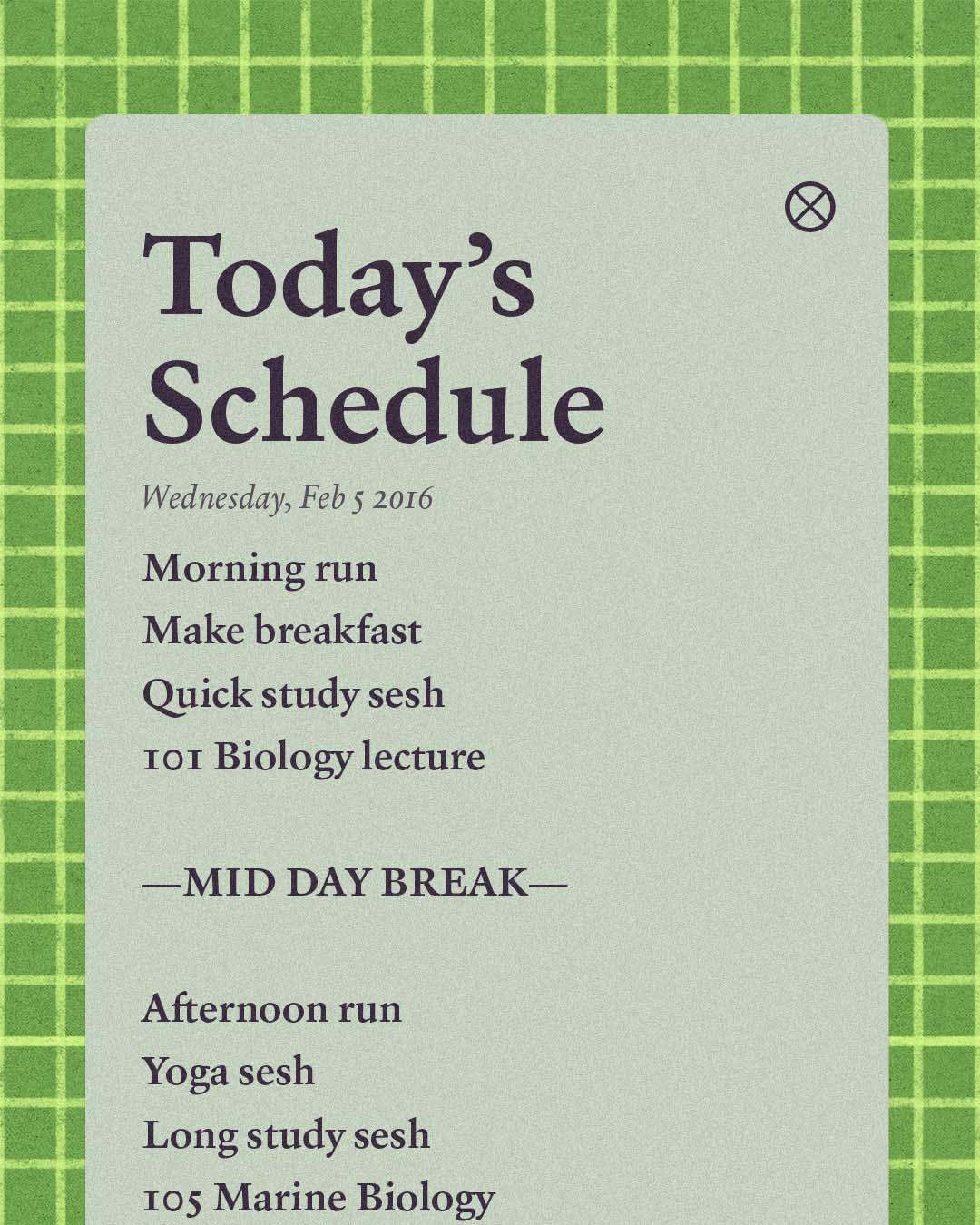
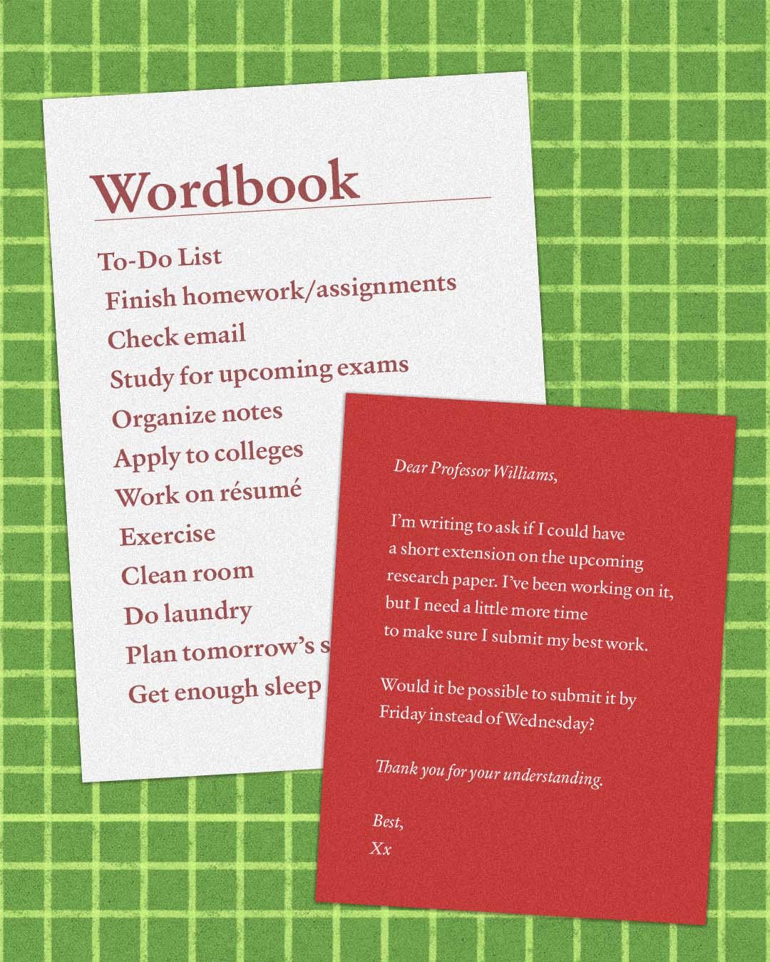
From first letters to final exams, that is reading life in five faces. Wherever your students or your projects are this fall, the full specimens and the foundries behind them are waiting at
store.typenetwork.com.