A clear and comfortable typeface from David Berlow, with a humanist geometric design
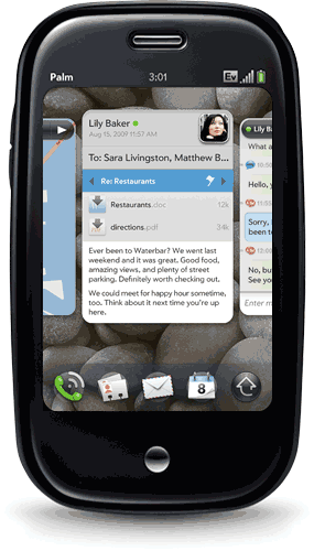
David Berlow and staff drew Apres as part of a series originally designed for the Palm Pre smart phone. It is available in five weights and four widths, with italics, for a total of 40 styles.
Simple, open letterforms and generous proportions provide an inviting experience for navigation and readability. The classical geometry is regular and balanced, without being static or mechanical, for a friendly and forthright familiarity.
In 2009, Roger Black commissioned Prelude, an original sans serif design by David Berlow, while consulting with the Palm smartphone manufacturer. Prelude was developed for the Palm Pre device and its WebOS operating system — a family of six fonts later expanded to 24 styles.
As the name implies, Apres followed Prelude. In a savvy move, Palm’s marketing team commissioned this complimentary typeface for packaging and advertising. Richard Lipton drew additional styles and Dyana Weissman assisted with drawing and kerning.
Apres and Prelude made for a fully-realized, unified system that years later still feels very ahead of the game. Eventually, Prelude was slightly modified and became Apres RE, which was released as part of the Reading Edge series of fonts for small sizes on digital screens.
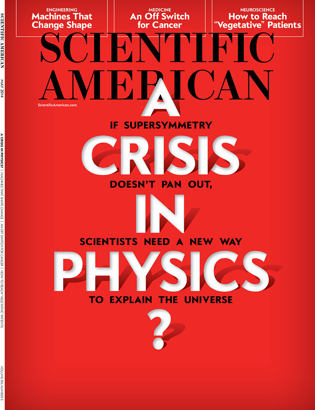
Since being developed for Palm, Apres has been used by several notable clients. On the web, Slate.com licensed Apres as part of their 2013 re-design and use several styles for their body text. In print, Scientific American uses Apres throughout the magazine, where it provides an easy visual experience to balance the content’s studious read. •
Update: The use of “geometric” is now more descriptive than categorical. Apres has many characteristics that veer away from strict geometric classification.