Anything you can do: Branding with variable fonts · Type Network
Anything you can do: Branding with variable fonts
From newspapers to ecommerce platforms, more companies are rebranding with variable fonts. This quick survey of recent identity projects reveals why.
By Dan Rhatigan
Finesse and express: That’s how Google’s Dave Crossland summarized the benefits of variable fonts. They can be used to accomplish unparalleled typographic precision, and they can be used to communicate nuanced messages.
For designing body text, finesse is key. For display needs, expression takes precedence. Where these practices overlap—where design and message combine—is the realm of brand design.
Operating with the classic Al Ries and Jack Trout definition of the term, a company brands an idea in the mind of the consumer through specific, consistent, reinforced communication. It’s more than just the visual components—but they’re vital.
Look in any brand standards manual—including the iconic NASA and NYC Subway books—and you’ll see these elements in the forefront: Logos, colors, and type. These are the visual building blocks for identity and brand design.
Most designers know the painstaking process of brand font. You need something high quality, unique, functional, and evocative. These don’t often come in one package. With variable fonts, they do.
Identity designers are starting to recognize the myriad appeals of using variable fonts. Refinement, panache, and native animation all come out of the box.
VTEX Trust's series of unique features add to its success as a brand typeface.
Variable fonts offer brand designers limitless flexibility, allowing them to stay “on-brand” even while appealing to different market segments or promoting nuanced messages. One company that knows this is VTEX, one of the world’s top ecommerce platforms.
Used by Coca-cola, Walmart, Samsung, Adidas, and others, traded on the New York Stock Exchange, and valued in the billions, it’s also one of Brazil’s most successful tech companies.
When VTEX rebranded several years ago, they tapped Plau to create their new, “universal” typeface. Plau started with the word “trust” and built around it a family of grotesque sans serifs, reminiscent of Berthold Standard.
The list of requirements for VTEX Trust—as it came to be named—matched the company’s size and ambition. Seven weights, plus italics, plus some other nifty features like splayed versus straight strokes: Plau’s Rodrigo Saiani decided to make VTEX Trust a variable font.
With offices on multiple continents and communications as varied as their clients, VTEX needed the flexibility that only variable fonts can provide, and VTEX Trust delivered it to them. Fun aside: It might also be the only variable font to have been printed multiple-stories tall and hung on the columns of the NYSE building.
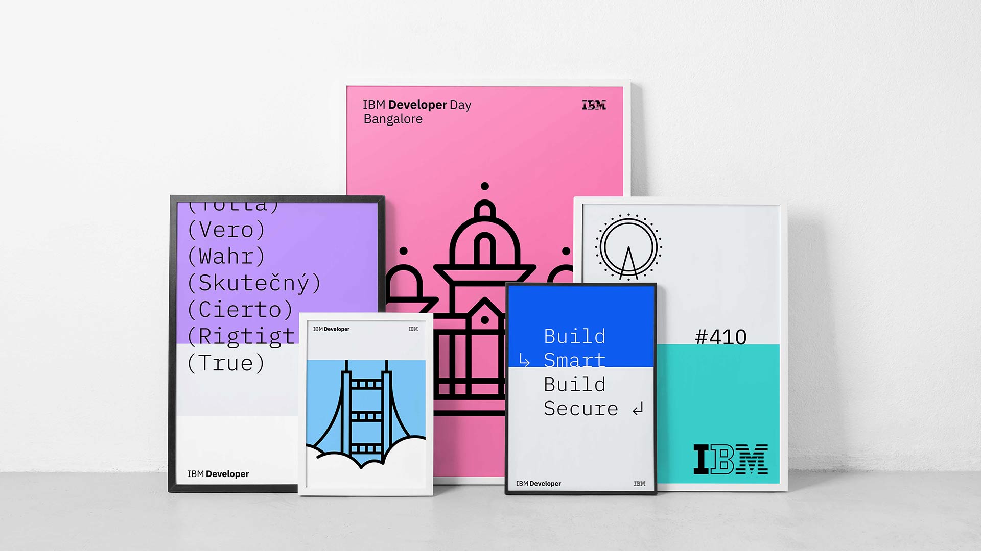
IBM might work mostly in digital, but its printed materials (even its experimental ones) demonstrate their design prowess, and IBM Plex helps hold it all together.
Sometimes, producing a branded variable font offers the means to save time and money, giving your employees and designers flexibility without overwhelming them with dozens of font files to choose from.
IBM Plex was designed with machines in mind, so the shapes are highly uniform.
The open-source IBM Plex typeface—designed for IBM by Bold Monday and Mike Abbink—sprang out of two complimentary desires. First, IBM wanted to give their 100,000+ employees a single typeface, unifying communication across the company. Second, they wanted to “create a typeface that was unmistakably IBM […] Between the natural and the engineered."
The family grew to include roman and italics for each of four subfamilies, each with eight weights. It also supports 100 languages. Quite the family!
Always on the cutting edge, three years ago, IBM released a variable version of their most popular plex subfamily: IBM Plex Sans, adding native animation, saving time for its employees, and making the open-source project even more appealing to outsiders. All a part of the IBM brand.
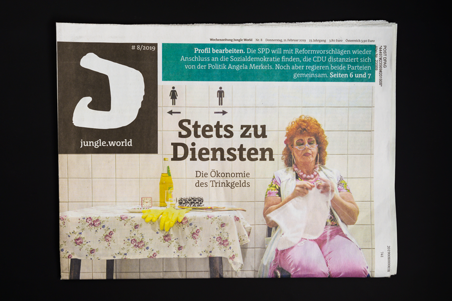
Jungle World's cover layout uses Floris in multiple locations, bearing the load of headlines, body text, marginalia, and more.
Learn about variable fonts
To learn more about variable fonts, subscribe to the Type Network Newsletter, where we’ll be sharing interviews, case studies and tutorials explaining everything designers should know about variable fonts.
Variable fonts, even if they aren’t animated—and even if the axes aren’t adjusted frequently—offer detailed control outside what is typically expected. “Instances” can be produced quickly and easily for each scenario, maintaining brand integrity even in print.
Luc(as) de Groot of LucasFonts has worked with German political weekly Jungle World since the late 90s, designing and refining their typographic palette. Luc(as) drew their custom typeface Floris JW in 2007 and refined and added to in with Jungle World’s latest redesign in 2016. On the LucasFonts site, he explains:
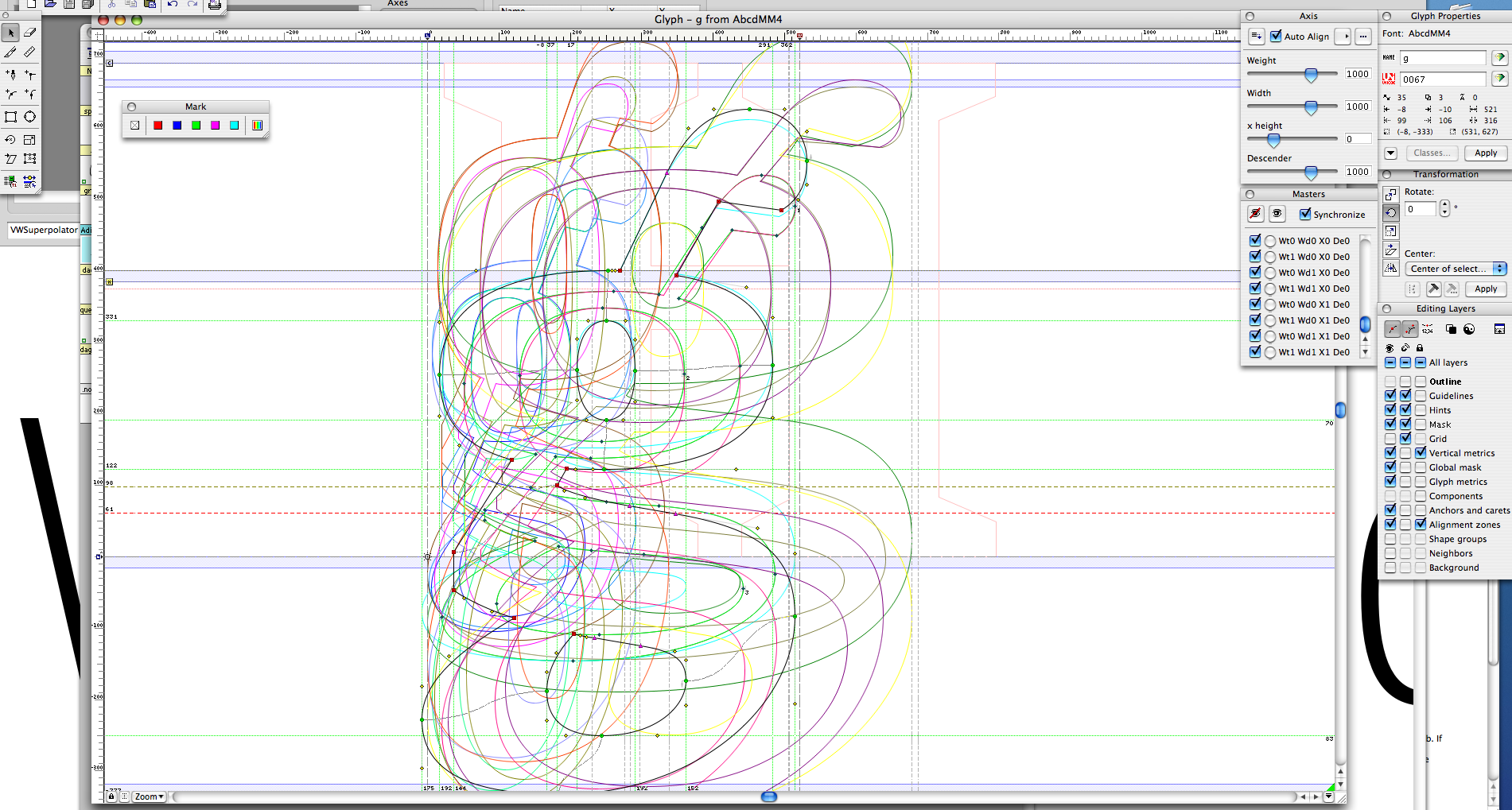
Floris was designed in FontLab Studio using four axes of parameters, each of which can be varied to obtain the perfect typeface for a specific job. In Floris, these axes are weight, width, x-height, and a more subjective variable which Luc(as) calls time axis and which defines the proportion of extenders and x-height:
In the 1920s, the relative x-height was at its smallest, in the 1970s at its largest. For a pocket bible, the x-height should be large, for a poem a small x-height is more appropriate.
Flrois JW's axes' endpoints overlaid shows the wide variety achieved with even just the lowercase g.
Branding is always a challenging exercise. Finding colors, layouts, imagery, and type to capture an organization’s meaning and purpose is a philosophical task as much as it is a design one. Type plays an outsized role in that process, and—when it comes to identity design—variable fonts are starting to sing: Anything you can do, I can do better.