Adobe Originals: More than just one collection
With a collection of typefaces so large and diverse as the Adobe Originals, it can be easy to overlook the conscious thought that went into cultivating it. There are good reasons to celebrate their most iconic families, but—over the years—the team at Adobe explored countless directions. Whether from its own designers or in collaboration with other talent, Adobe has always endeavored to meet the demand for new, well-made fonts. Here are just a few of the threads to be found in the overall fabric of Adobe Originals.
Wood Type Revival
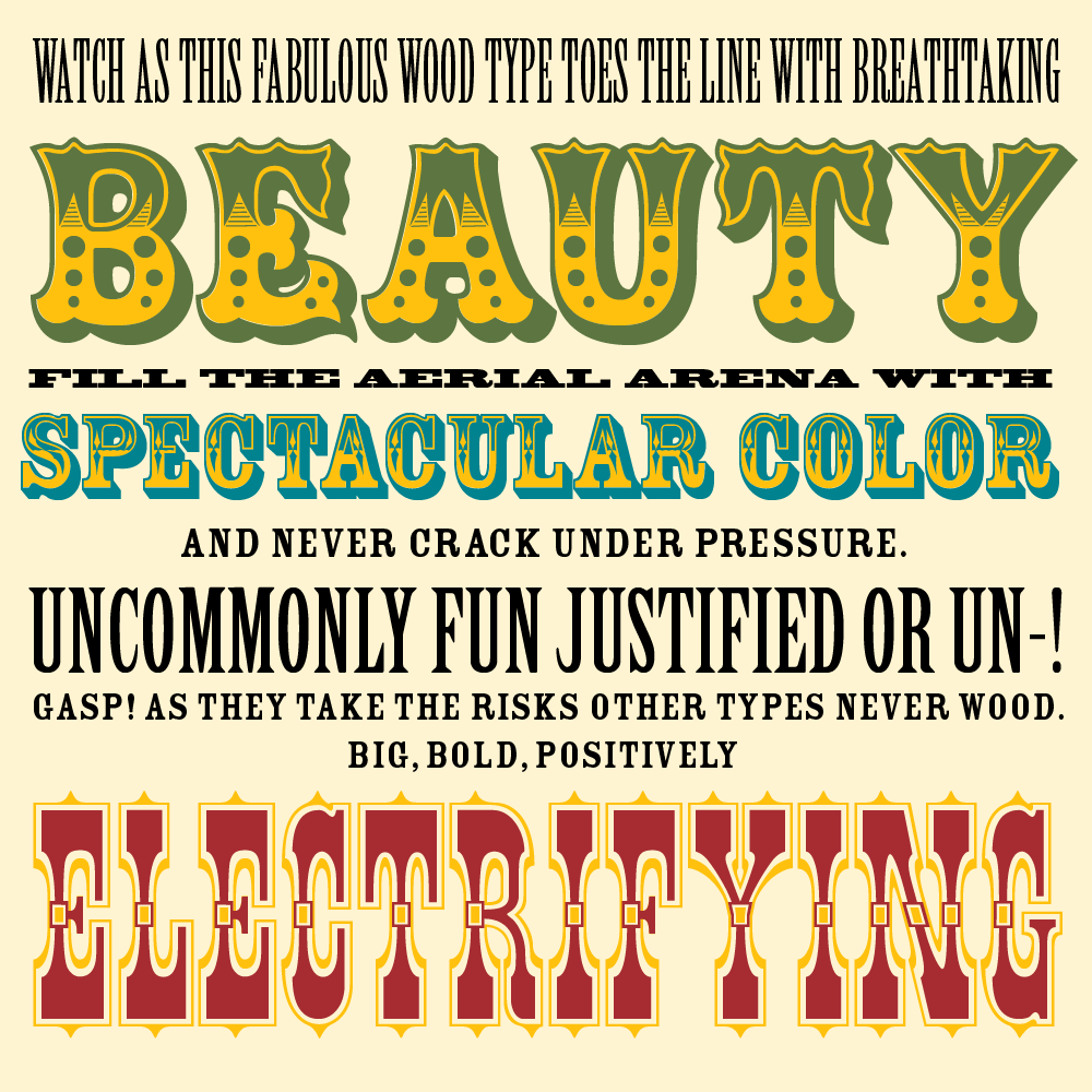
In the early 1990s, the Adobe Originals team set out to digitally revive a series of American wood type designs dating to the late 19th century. Working with printed specimens gathered by printer and educator Rob Roy Kelly, Adobe’s in-house designers (working under the direction of Carol Twombly and Fred Brady) selected an eclectic set of display styles to refine and expand into contemporary digital fonts. Particular care went into the preparation of three layered families—Pepperwood, Rosewood, and Zebrawood—so users could overprint layers to create chromatic effects. This vein of Adobe Originals includes:
- Birch by Kim Buker Chansler
- Blackoak by Joy Redick
- Cottonwood by Barbara Lind, Joy Redick, and Kim Buker Chansler
- Ironwood by Joy Redick
- Juniper by Joy Redick
- Madrone by Barbara Lind
- Mesquite by Joy Redick
- Pepperwood by Carl Crossgrove, Carol Twombly, and Kim Buker Chansler
- Ponderosa by Kim Buker Chansler
- Poplar by Barbara Lind
- Rosewood by Carl Crossgrove, Carol Twombly, and Kim Buker Chansler
- Willow by Joy Redick
- Wood Type Ornaments by Barbara Lind and Joy Redick
- Zebrawood by Carl Crossgrove, Carol Twombly, and Kim Buker Chansler
Casual and formal scripts
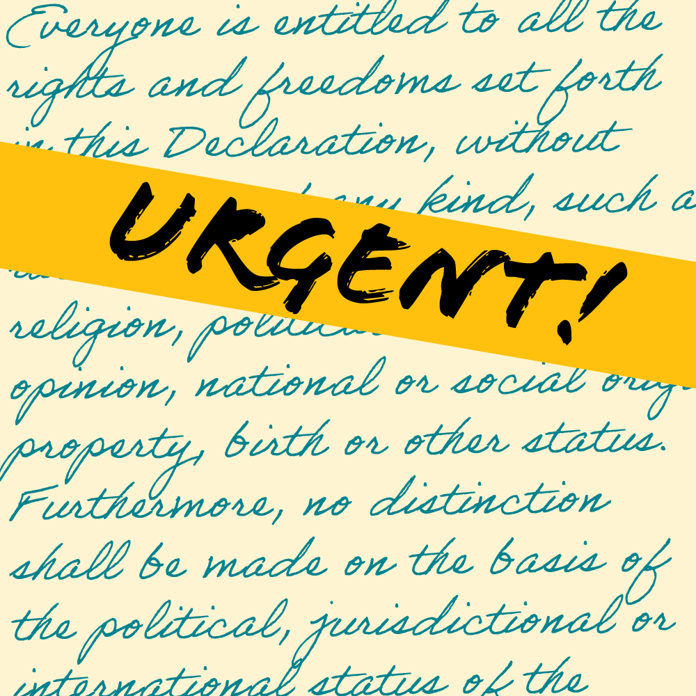
Over the years, Adobe has released a variety of script typefaces. One by one, they enhanced their collection with not only expressive, casual scripts like Flood and Giddyup, but also technical tours de force such as Richard Lipton’s elegant and feature-rich Bickham Script. From the lo-fi to the high-class, there’s a rich range of script choices, all prepared with the same care and precision as the rest of the Adobe Originals:
- Adobe Handwriting by Ernest March, Frank Grießhammer, and Tiffany Wardle de Sousa
- Banshee by Tim Donaldson
- Bickham Script by Richard Lipton
- Caflisch Script by Robert Slimbach (based on the handwriting of Max Caflisch)
- Caliban by John Benson
- Flood by Joachim Müller-Lancé
- Giddyup by Laurie Szujewska
- Leander Script by Viktor Solt-Bittner
- Voluta Script by Viktor Solt-Bittner

Digitizations
Before Adobe began to develop wholly original typefaces in-house, the font team created digital versions of some public-domain classics. The project started so that users could have a selection of typefaces compatible with PostScript, Adobe’s then-new page description language. Including faces from Matthew Carter, Adrian Frutiger, and others, these early designs pre-date the company, but Adobe’s versions—expertly digitized by its font developers—are still available alongside their own now-classic families.
- Bell Centennial by Matthew Carter
- Brush Script by Robert E. Smith
- Century Old Style by Morris Fuller Benton
- Cooper Black by Oswald Bruce Cooper
- Courier by Howard Kettler
- Hobo by Morris Fuller Benton
- Letter Gothic by Roger Roberson
- News Gothic by Morris Fuller Benton
- OCR-A by American Type Founders
- OCR-B by Adrian Frutiger
- Orator by John Schappler
- Prestige Elite by Howard Kettler
- Stencil by Gerry Powell
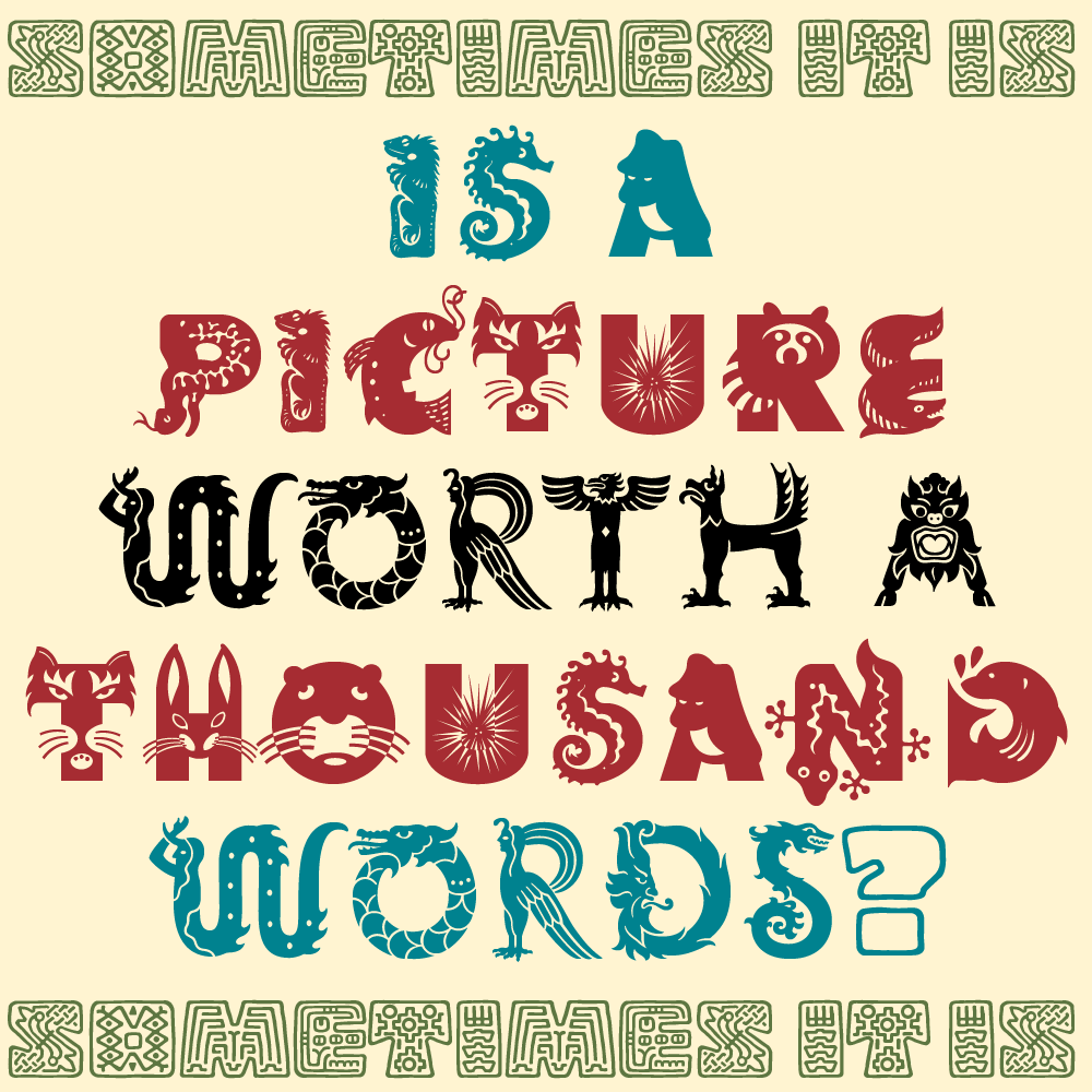
Illustrated
Throughout the years, as its type business was rapidly growing, Adobe made a concerted effort to expand the scope of its type offerings by adding many display and novelty fonts, including a handful of designs where each character is an illustrated letter. These are definitely not for everyday use, but they can certainly be a starting point for logos or icons . . . or just the thing for some packaging that needs some extra punch.
- Copal by David Lemon
- Critter by Craig Frazier
- Cutout by Gail Blumberg
- Giddyup Thangs by Laurie Szujewska
- Mythos by Jim Wasco and Min Wang
- Ouch! by Joachim Müller-Lancé
- Rad by John Ritter
- Toolbox by Brian Strysko
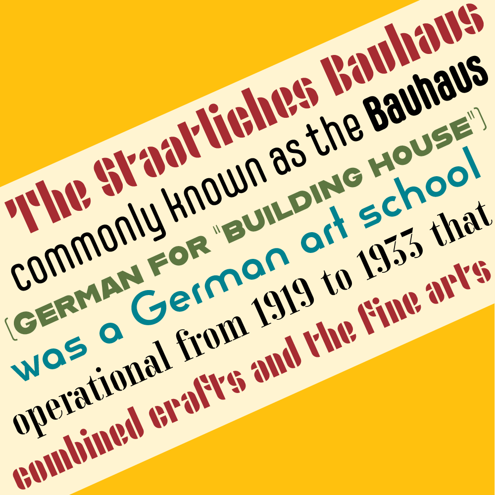
Hidden Treasures of the Bauhaus Dessau
A few years ago, the Adobe Originals team and designer Erik Spiekermann gathered a group of talented type-design students for a special project. Based on type and lettering projects from designers at the Bauhaus, the group developed a new set of typefaces. Using reference material from the school’s archive—sometimes no more than a handful of sample letters—the designers created digital works under the guidance of Spiekermann and Adobe’s type team. Originally developed to celebrate the centenary of the founding of the Bauhaus, these new designs have achieved respect and popularity in their own right.