
A good recipe mixes the finest ingredients
The most successful Adobe Originals typefaces have shown time and time again how versatile they can be, providing their users with readability and sophistication in projects from the mundane to the sublime. While many of these families have been created with a broad range of styles—whether those are weights, widths, or optical styles—pairing them with styles from other typeface families can add personality and flexibility.
Pairing typefaces can be a challenge, as the question of what combinations work best often leads to that maddening answer: “It depends.” The definition of success for mixing two typefaces together often comes down to the desired effect: Are you looking for just a dash of extra flair or functionality? Are you looking for a bold clash of personality that still maintains a bit of harmony? Or perhaps something in between?
Below are ten of the most popular Adobe Originals mixed with designs from other foundries in the Type Network library, showing a range of possible strategies.
Level 1: Just a pinch of something extra
The most straightforward way to pair one typeface with another is to identify type families that have a close visual relationship, often drawing upon similar influences. In most cases, you might begin with a design that works beautifully for longer passages of text but perhaps needs more vibrant touches for titles and headlines.
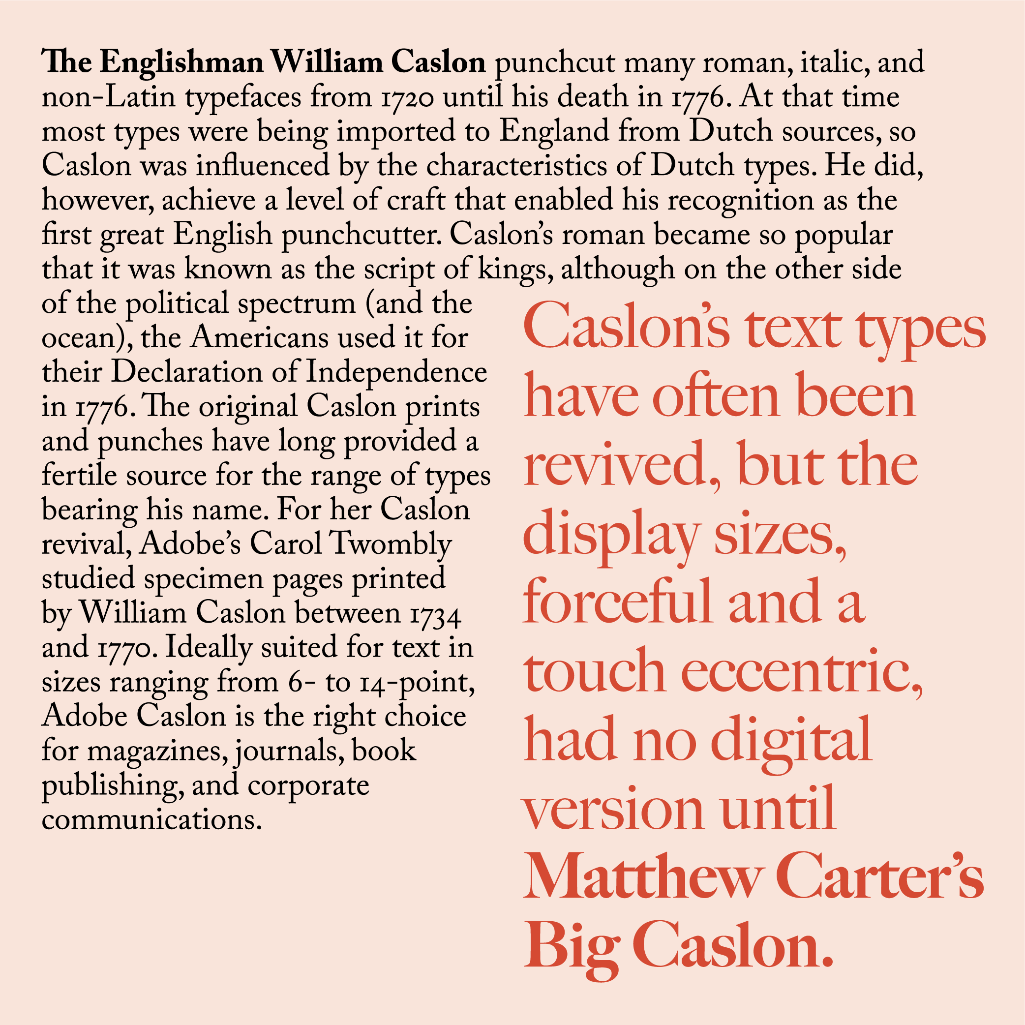
Adobe Caslon and Big Caslon from Carter & Cone
The similar names of these two families clearly indicate that they look back to a common heritage: the metal types cut in England by William Caslon in the 18th century. While Adobe’s Carol Twombly looked at Caslon’s popular text sizes for her digital revival, Matthew Carter’s interpretation draws from the larger sizes of Caslon type, with their greater contrast and eccentricity. Big Caslon is, as you might expect, just the right touch for a display type to work alongside body text set with Adobe Caslon.
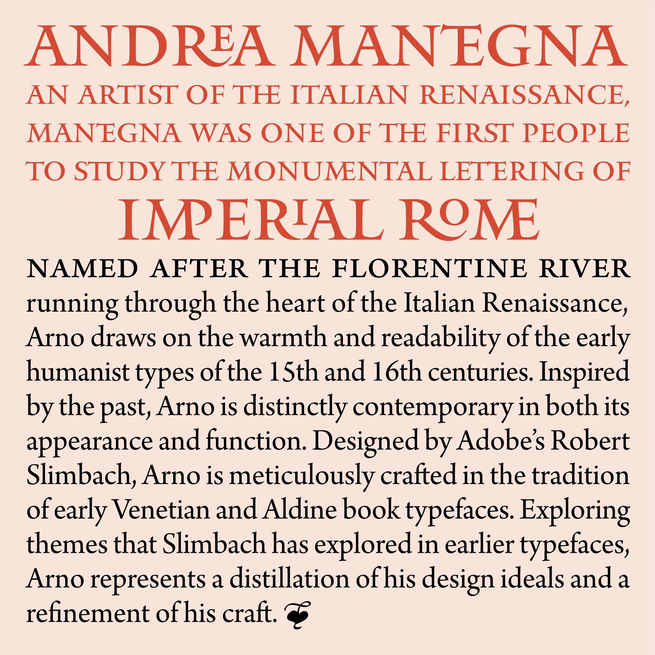
Arno Pro and Mantinia CC from Carter & Cone
A less obvious pair that again shares a historical pedigree is Robert Slimbach’s Arno family and Matthew Carter’s Mantinia CC. With Arno, Slimbach created a contemporary family of typefaces based on the warmth of the Aldine and Venetian book faces of the Italian Renaissance. Mantinia CC echoes the work of another Renaissance artist — Andrea Mantegna — who incorporated styles of Roman lettering in his own paintings and inscriptional work. With that shared point of origin, Mantinia’s elegant capitals provide a distinctive and slightly playful style that complements Arno’s sophisticated readability.
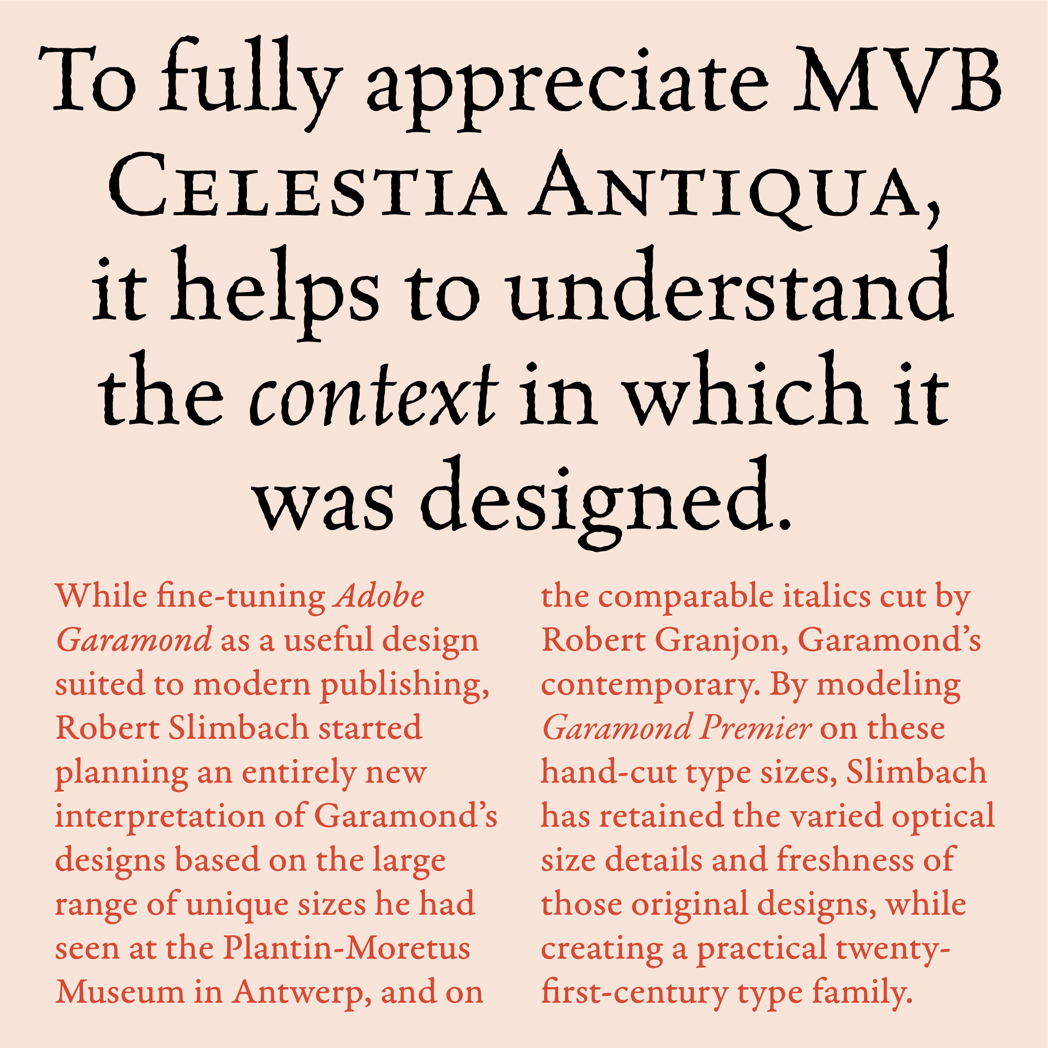
Garamond Premier and MVB Celestia Antiqua from MVB Fonts
Garamond Premier and MVB Celestia Antiqua have a subtler relationship. While both hearken back to the early classics of Roman type, each font family is also a response to the constraints of early attempts to digitize those typefaces. When designing Garamond Premier, Robert Slimbach returned to the sources that informed his Adobe Garamond — the first revival produced by Adobe in the early years of its type program. With Garamond Premier, he designed a Garamond with greater refinement and fidelity, taking advantage of the progress in both digital tools and output devices. On the other hand, Mark van Bronkhorst designed MVB Celestia Antiqua in response to the relative smoothness of early digital fonts, producing more rugged details to echo the texture of early printing. Mixed together, the two families speak a similar stylistic language with very different tones.
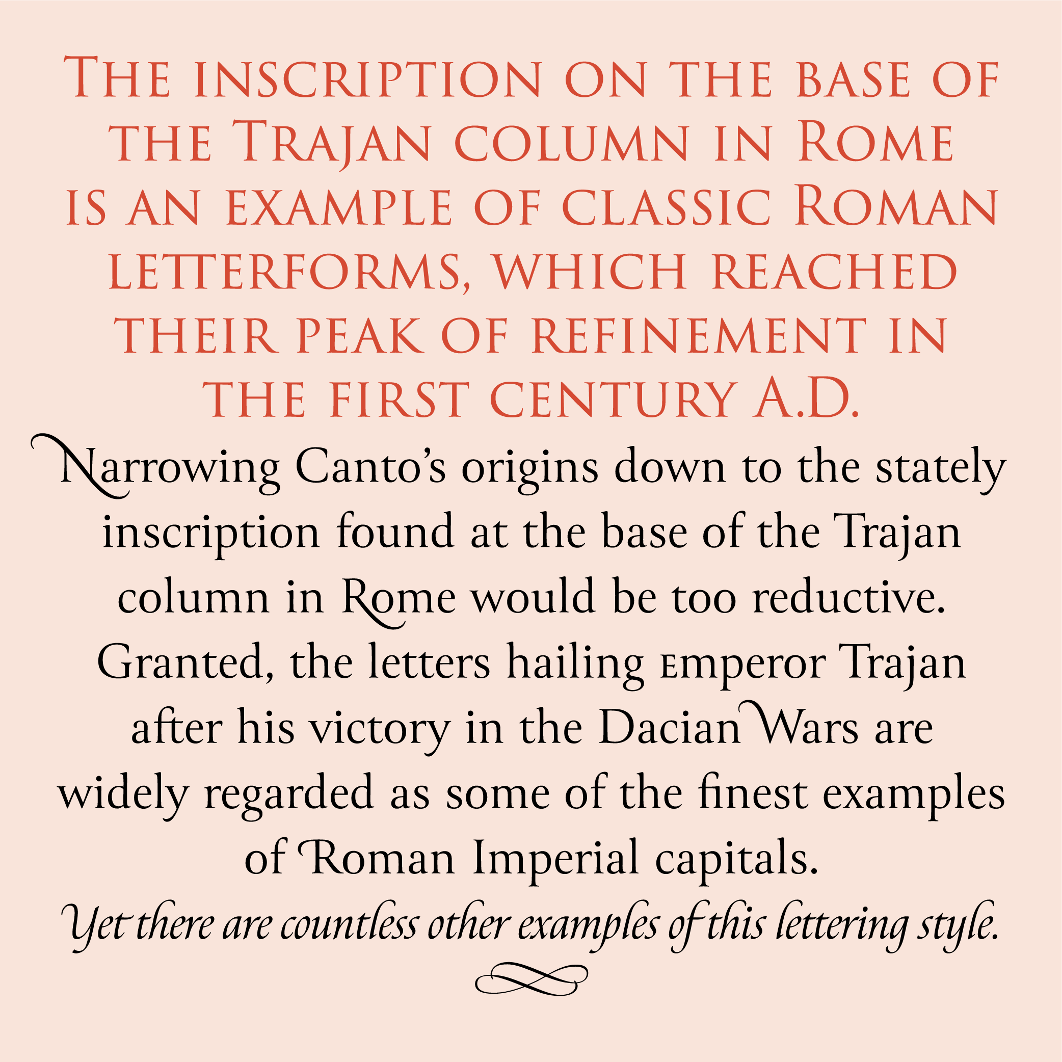
Trajan 3 and Canto from Lipton Letter Design
Among the most iconic typefaces of the Adobe Originals, Carol Twombly’s Trajan stands out as a successful design intended for display purposes, rather than a broader range of typographic situations. Richard Lipton’s Canto, also derived from the classical Roman letters found on the Trajan Column and elsewhere, addresses the challenge of providing lowercase forms to match those famous capitals. For those familiar with Lipton’s work, it will come as no surprise that he accomplished this by taking influence from calligraphy of the brush and of the pen, rather than directly from the letters inscribed in stone. The end result is a family with a range of styles that perfectly complements Trajan’s classical presence.
Level 2: Similar, but different
It can be a little more difficult to pair typefaces when you are seeking more tonal contrast to offset the elements in your design. The fonts chosen need to look different but still feel much the same in many ways. In cases like these, it helps to find qualities that link the two designs together, such as similar proportions or a similar degree of formality.
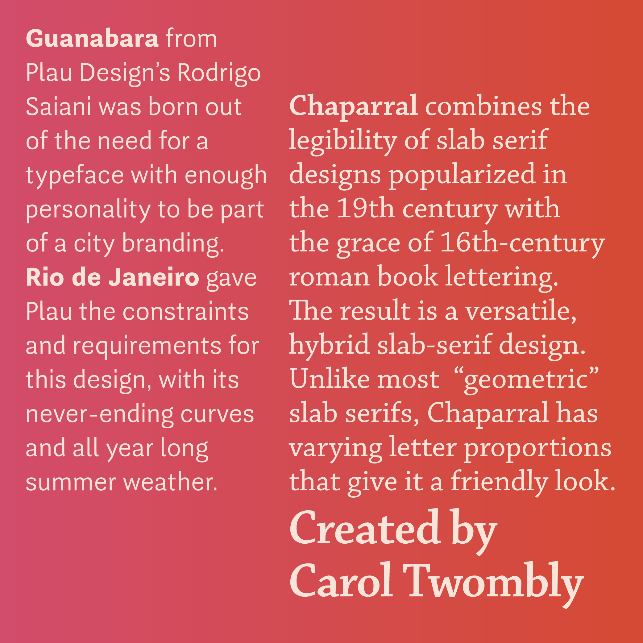
Chaparral and Guanabara Sans from Plau
Carol Twombly’s Chaparral is a slab serif whose freshness and friendliness works better for text than traditional slabs, which rely more on geometry and construction than readability. Similarly, Rodrigo Saiani’s Guanabara Sans was designed for wayfinding, yet amplifies a playful swing rather than a formal rigidity. Both families have that balance of liveliness and functionality that work at a variety of sizes, and their broad weight ranges make it easy to mix and match styles.
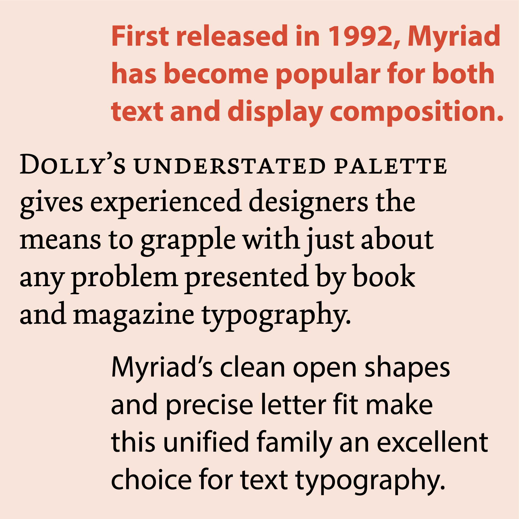
Myriad and Dolly from Underware
Myriad by Carol Twombly and Robert Slimbach and Dolly by Bas Jacobs, Akiem Helming, and Sami Kortemäki are both collaborative efforts from their respective foundries. Myriad is the crisper of the two, designed for a close, harmonious relationship across many weights and widths, yet still invitingly easy on the eyes. Dolly is softer and more calligraphic, with a restricted palette of styles but an equally inviting texture. The two families are quite distinct from one another, yet the warmth and subtlety of their forms share the same regard for the underlying gestures of the human hand.
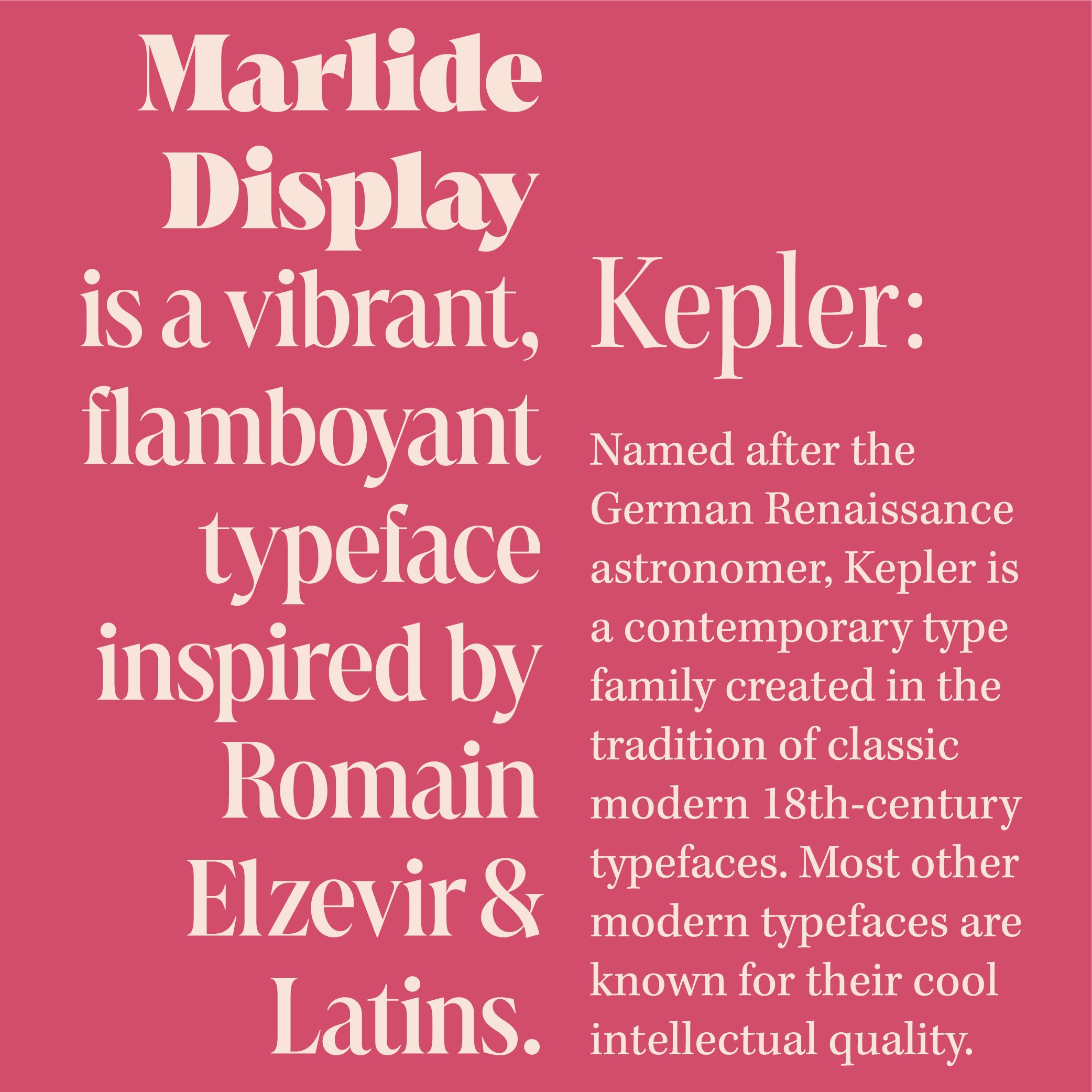
Kepler and Marlide Display from Kontour
Robert Slimbach’s Kepler family already provides an extensive palette of closely related variations of weight, width, and optical size to cope with a wide range of situations. However, when you need something extra to punctuate Kepler’s appearance, Sybille Hagmann’s Marlide Display features sharper details and a tighter fit, allowing for extremely crisp headings and titles with a bit more flair. Fortunately, the two families share some formal qualities that help them mix well: Both have a lot of contrast between thick and thin strokes, and both apply that contrast along a vertical axis, helping the textures of each family sit side by side.
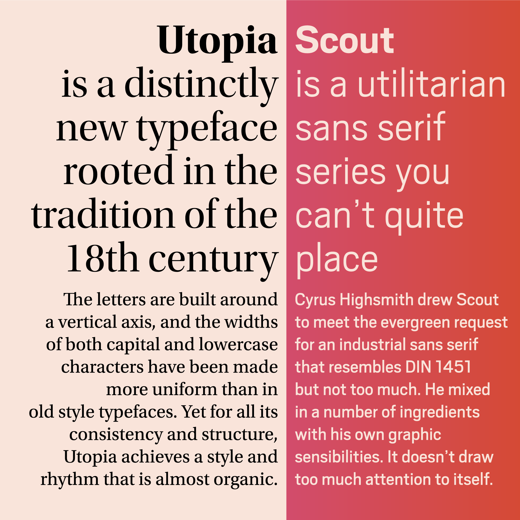
Utopia and Scout from Occupant Fonts
Utopia by Robert Slimbach and Scout by Cyrus Highsmith are a dissimilar pair of families that are unexpectedly easy to mix, thanks to their similar proportions and upright stance. Sturdy yet elegant, Utopia’s vertical stroke contrast is complemented by Scout’s down-to-earth rectangular structure and low-contrast sturdiness.
Level 3: Opposites attract
The trickiest approach to mixing typefaces—and the one that provides the most visual flair—is to find typefaces with very different personalities, linked by just enough to hold them together despite the contrast. This often means pairing a sans and a serif that can handle just about any text when used together. The best place to start is to find two families that are similarly readable but can change the tone of text dramatically from one to the other.
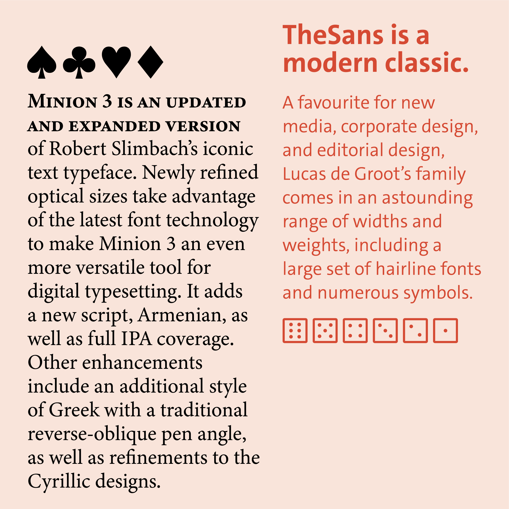
Minion 3 and TheSans from LucasFonts
Both Robert Slimbach’s Minion 3 and Lucas de Groot’s TheSans are extensive families with the rigor and sophistication to handle complex typography. They excel at setting lengthy material, especially material that calls for a mix of humanism and typographic precision, with TheSans providing a contemporary counterpoint to Minion 3’s refined spin on classic book typography. Both families also provide a few more surprises: TheSans has some unconventional swashes and quite an array of symbols, just as Minion 3 is loaded with its own symbols and ornaments.
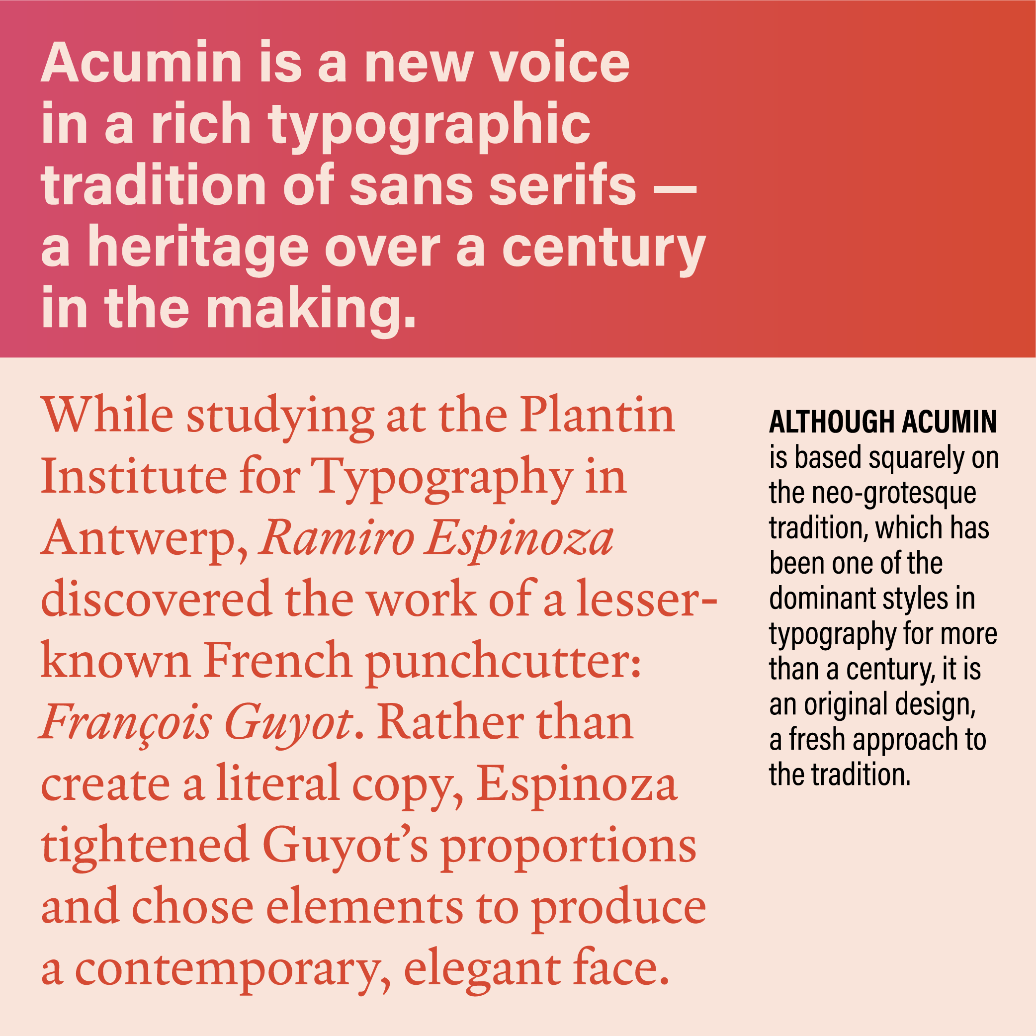
Acumin and Guyot from Retype
Robert Slimbach’s Acumin offers an unexpected degree of readability across the many weights and widths of its typographic palette, which is mid-century and contemporary at the same time. Ramiro Espinoza’s Guyot family is another modern approach to a traditional genre of text typeface: Its crisply detailed forms stand toe-to-toe with Acumin’s neo-grotesque clarity, even though their personalities are so distinct.
Learn about Adobe Originals
To learn more about Adobe Originals, subscribe to the Type Network Newsletter, where we’ll be sharing interviews, case studies and tutorials explaining everything designers should know about Adobe Originals and Adobe Fonts licensing.
Type Network will be diving deep into the Adobe Originals collection and Adobe Fonts. We'll explore the best of what Adobe has to offer, how to make the most of licensing options, best font pairings, and hidden gems in the library.
Type Network provides enterprise, app-embedding, and self-hosting licenses for Adobe Originals (and for all our partner foundries which have typefaces included in Adobe Fonts. Let us show you how to go beyond the single-user licenses that come with Adobe Creative Cloud.