Using all the axes: A conversation with Scott Kellum
Type Network: What’s wrong with web typography today?
Scott Kellum: There's plenty wrong. First, designers can't see what they're doing. We're designing for a fluid medium, but none of our tools thus far are fluid. The best we today are tools like Figma and Framer. These applications are good, with tools like Auto Layout, but as you scale things up and down, you're still working in fixed artboards.
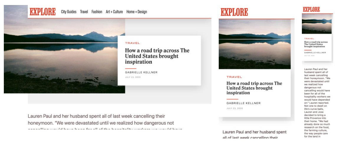
Second, Frank Chimero—in his wonderful post The Web’s Grain—talks about responsive web design and this conflict between fluid media and the text that flows around it. The text is a fixed volume, and he shows an example where a page scales up and down: The image shrinks and grows with the browser, but the text is incompressible.
With Typetura, we are trying to solve a few of those problems. We are producing design systems that are inherently and intrinsically fluid. We enable text to change size and spacing—as well as any other quality—as that compression and expansion is happening.

TN: People can use variable fonts on the web without plugins or JavaScript libraries, what does Typetura add?
SK: When I started Typetura, we were focused on creating a tool that lets people see what they were designing. As I mentioned, Figma has fixed artboards: How do you create fluid artboards? And how does that effect a design process, particularly when it comes to typography? A lot of designers and developers I was working with didn’t know about clamp and locks, which are two approaches to fluid typography.

What really irked me as variable fonts were coming out, that some of these pure CSS approaches don’t work with variable fonts. You could use these methods—and you could use them with a variable font—but it wouldn’t give you the results you need.
I started working on a JavaScript solution to enable a number of axes within variable fonts. Now, the current version of Typetura uses The Web Animations API for CSS, which means we support every axis of any variable font.
You can dial in the grade or optical size; you can adjust weight and width; all of these that are interlinked for parametric variable fonts. So as the user scales something up or down, you have control over those individual axes, creating rich, accurate typography in every context.

TN: I’ve read that Typetura allows more control over VF axes than a traditional CSS function might allow over point size; what does this mean?
SK: With clamp and locks, you have to write a function—usually something relating to X viewport units plus Y number of REMs—which is very much by feel, and always scales linearly. You can’t really set little points at which it staggers up. Of course, you could write more media queries, but then you’re still jumping from one linear scale to another, and it takes a lot of effort to create.
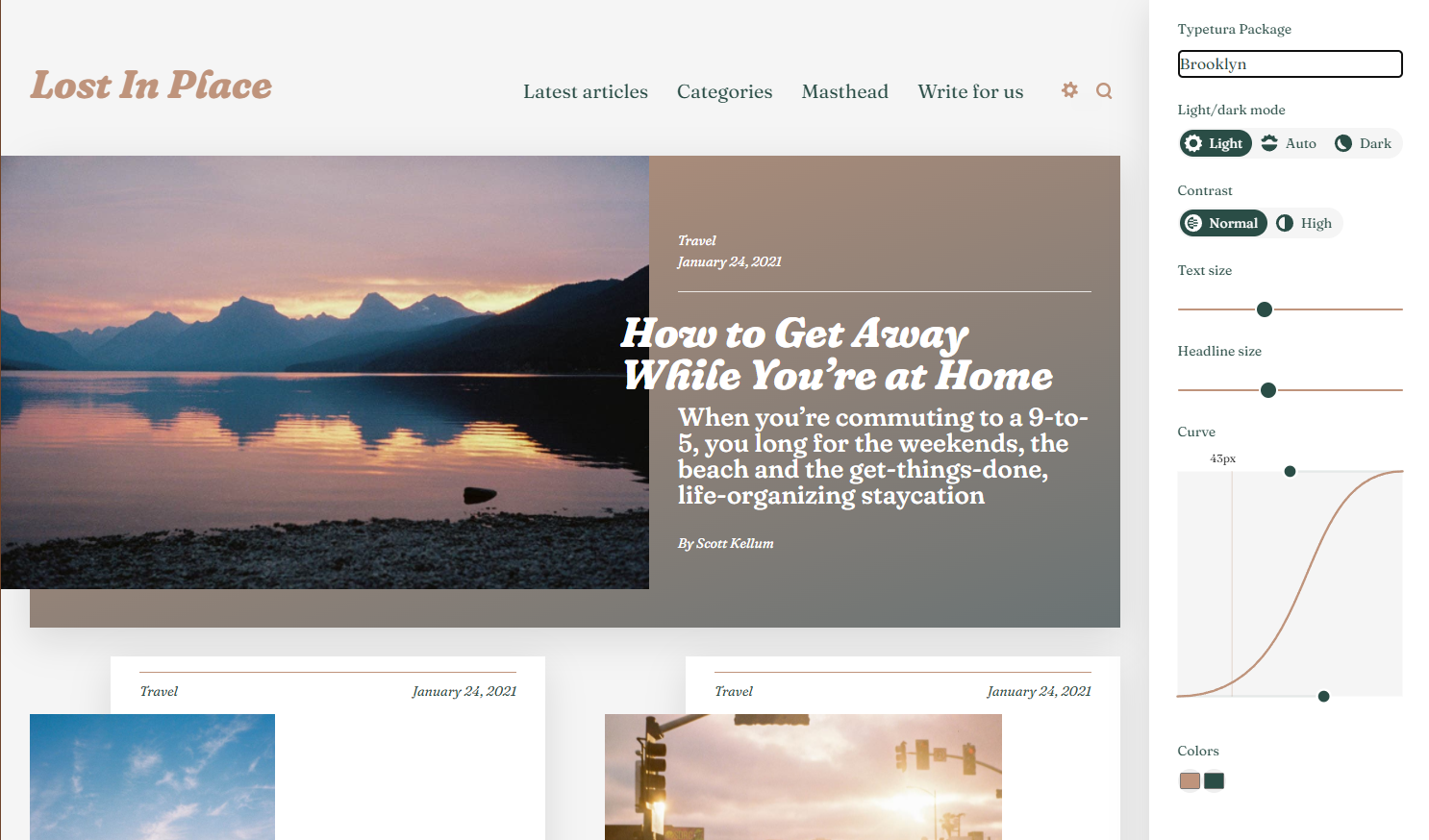
With Typetura, you can create Bezier curves for scaling adjustments. No CSS functions needed. Not to mention, you can do this with each variable font axis you want.
Outside of this technical differentiation, this also enables us to serve typographic systems to people without them having to know any extra code. They can just put a CSS class on something, like headline, and take a ready-made typographic system off the shelf and it just works. Since they’re context-dependent instead of viewport-dependent, it works with whatever layout you throw it into.
TN: How did you get the idea to create Typetura?
SK: I was on the launch team of vox.com and played a hand in the typographic palette that they use. When we redesigned SB Nation in 2012, we were trying to design a type system where users could know what kind of media they were clicking on: Is it an article? Is it a fan post? Is it a feature? We wanted users to know from the type, without a hundred labels. That’s one of the biggest problems on the web, is knowing where a link will take you.
We were working with a typographic palette that showed diversity, but just imagine: We had five different entry types with six potential homepage placements. That’s thirty combinations—for each breakpoint. Plus the body text faces and other type styles on the page. You need more than 72 different type styles. My thought was, what if we could do this with five or fewer?
In the face of that question, most might want to narrow the typographic diversity, but I wanted to capture that entire array of styles and make it possible. That’s when I started working on Typetura.

TN: What is your favorite execution of Typetura’s technology?
SK: We have a WordPress plugin which adds a typographic adjustment interface that people have used to make all kinds of wonderful websites.
Learn about variable fonts
To learn more about variable fonts, subscribe to the Type Network Newsletter, where we’ll be sharing interviews, case studies and tutorials explaining everything designers should know about variable fonts.
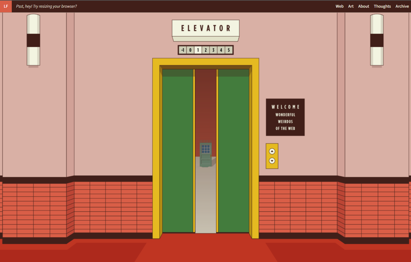
Gold’s Guide is one of my favorite implementations that we've done. It was fun taking something out of the box and seeing how far it could go. In terms of what other people have made, Lynn Fisher made a fantastic website. And it's not typographic at all. But she used Typetura to create this wonderful animation. And as you scale a browser up and down, the entire website just zooms in and out.
TN: How do these technologies—Typetura and variable fonts—impact web typography? Specifically, how do we get from the broken web typography we have today to something better?
SK: Through tools that make both design and implementation easier. Typography is such a vast practice. There's so much history, even in just the terminology and jargon it is so difficult to overcome for even trained designers. Making good typography easy for both designers to use and developers to implement is what we're after at Typetura, because the effective use of variable fonts is how we solve those two problems with web typography.