ScreenFonts_201901_2-1_lede.jpg

ScreenFonts: January 2019

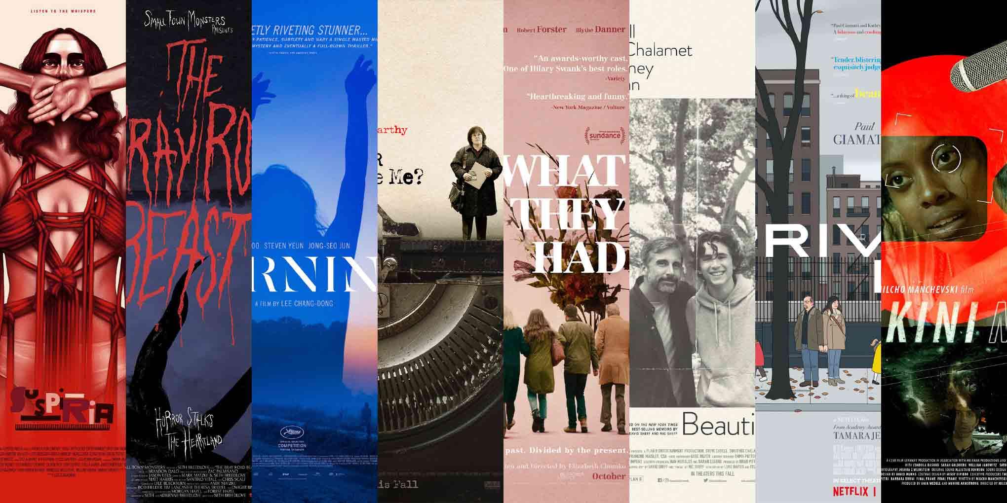
A lot of struggle surfaces in the posters for this episode. This time around, I look at art for Suspiria, The Bray Road Beast, Beoning (Burning), Can You Ever Forgive Me?, What They Had, Beautiful Boy, Private Life, and Bikini Moon.
Serendipity bookends this edition of ScreenFonts: I stumbled upon an unexpectedly charming one-sheet for an obscure crypotozoological documentary (of all things) and, just before closing off my selection, I discovered a poster by one of my favorite comic-book artists.

Suspiria

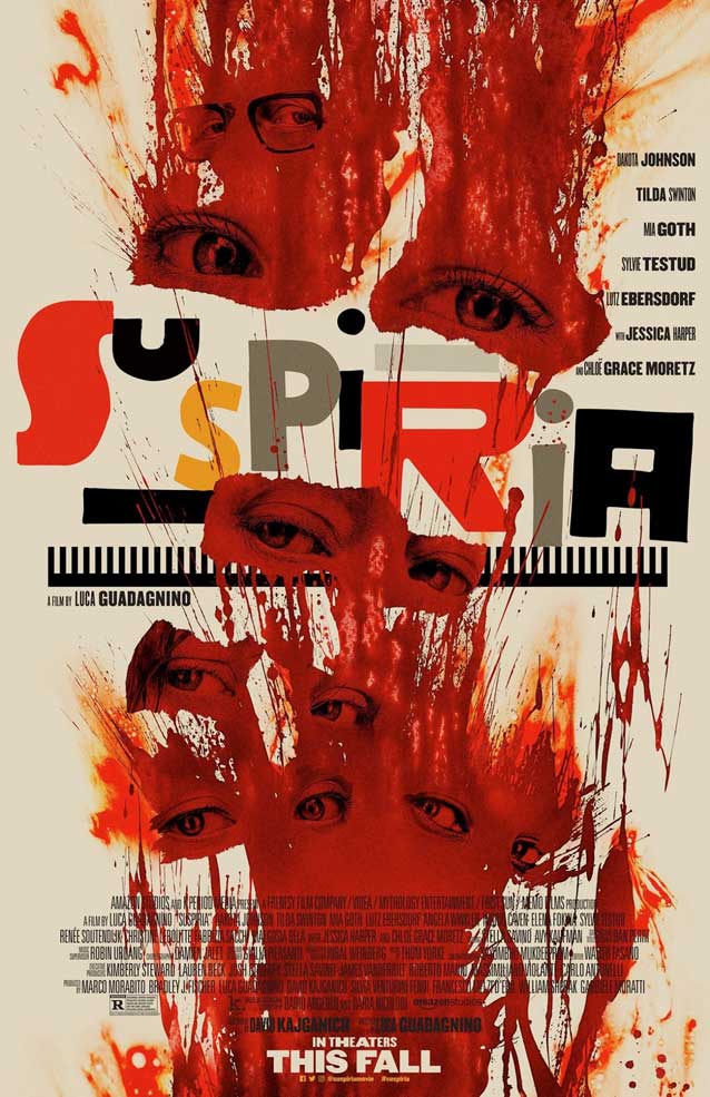
LA’s theatrical one-sheet for Suspiria
© 2018 Amazon Studios. Key art by LA. Logo by Dan Perri.
We open with the horror epic Suspiria, which reimagines Dario Argento’s cult supernatural horror thriller of the same name. While director Luca Guadagnino uses identical story elements—an ambitious young dancer joins a world-renowned troupe that is much different than what it seems to be on the surface—the new namesake is an entirely transformed film. This makes comparing the marketing collateral with the posters for the original movie an interesting exercise. LA’s campaign for Guadagnino’s version relies heavily on an amazing multicolor typographic lockup consisting of eclectic letterforms and abstract elements. The blood aggressively splattered on the main theatrical one-sheet reveals pairs of eyes looking askance. The unsettling image offers a taste of the harrowing cinematic assault on the senses that awaits the viewer.
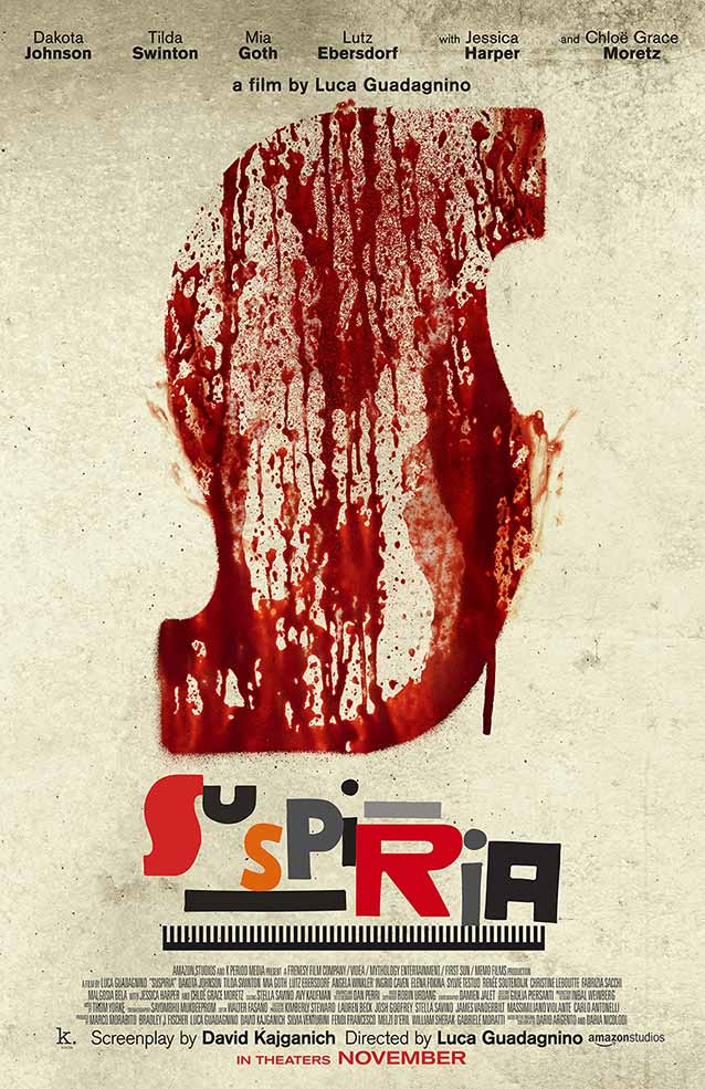
LA’s theatrical one-sheet for Suspiria
© 2018 Amazon Studios. Key art by LA. Logo by Dan Perri.
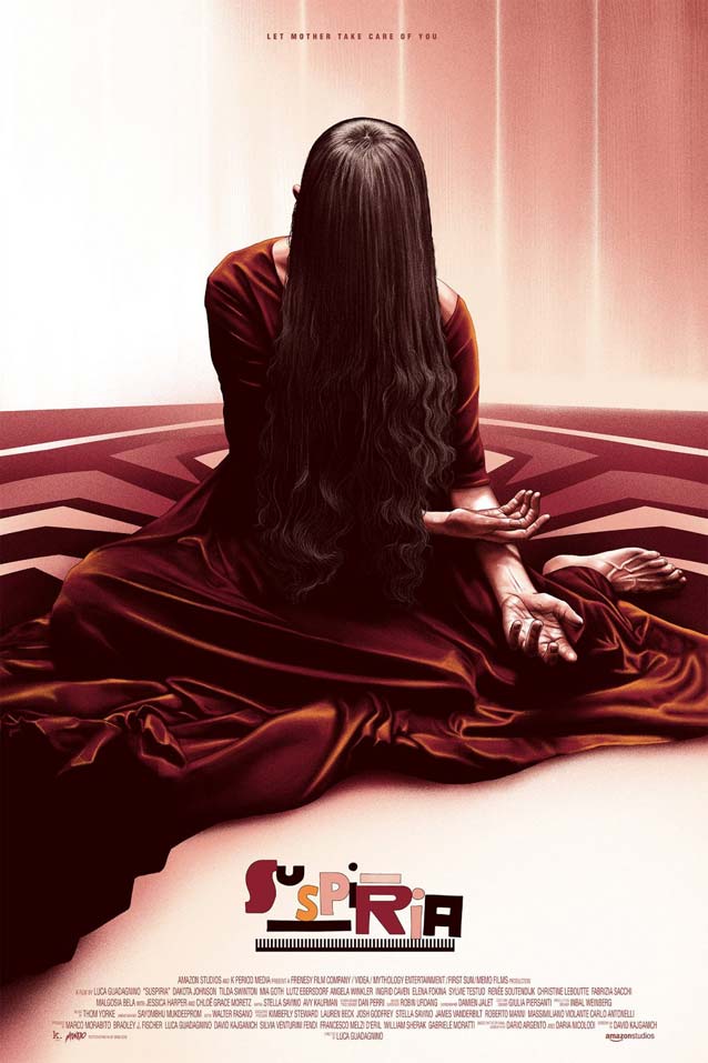
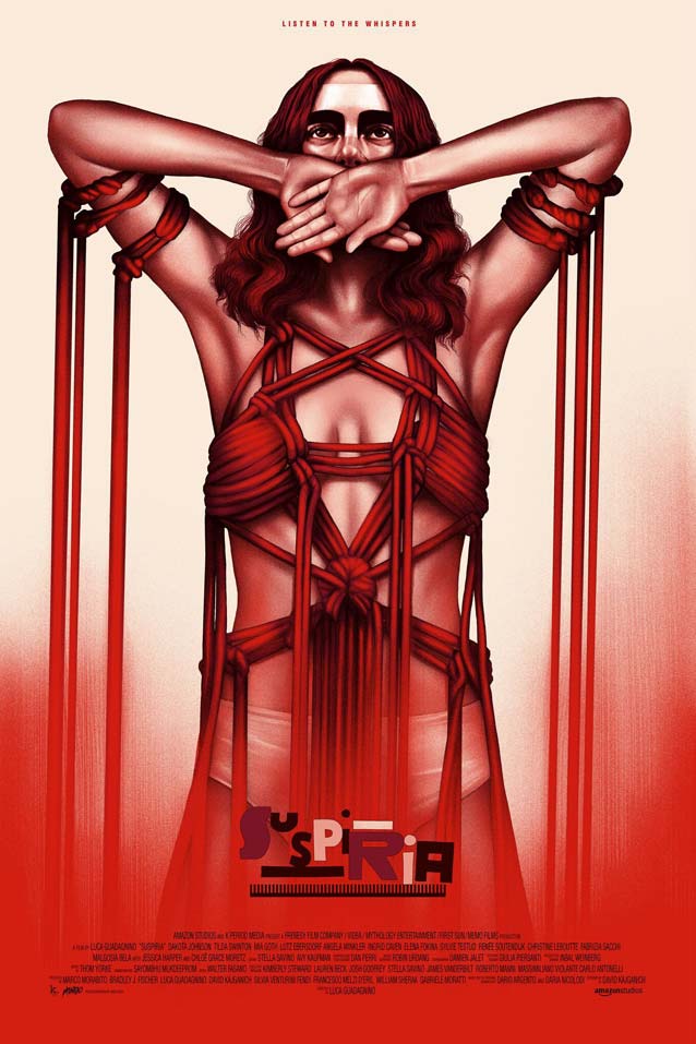
Designer Dan Perri created the Suspiria logo. In a telephone interview, the legendary designer of film and television titles told me he took cues from some post-WWII German designs that he and Guadagnino found. “The bold, clunky, blocky letters weren’t perfect or precisely edged; the bumps and imperfections lent themselves perfectly to conjuring up the horrific and unpredictable world the film inhabits,” Perri said. “I explored literally fifty to sixty different approaches in the same vein—some of them more illustrative—that also felt tense and intimidating. They all exhibited a roughness that reflected the storytelling. There is a suggestion of blood in the initial S, and the R, the other red letter, is more like dried blood, toned down, like the result of bleeding. The letters and the bars are all different percentages of gray to create a sense of curiosity, intensity, and unpredictability.” “The comblike element underlining the logo came out of the same series of German post-WWII images,” Perri continued. “Experimenting with size and thickness and proportions and rhythm, I built my own interpretation from scratch. It stabilizes the lockup: the letters are all slightly skewed, some distorted, and nothing is really horizontal or vertical. I wanted to give the design a sense of stability, to allow the letters to interact with one another while staying grounded in a world of chaos. “During my studies, I was taught that a good logo should work at any size, even in tiny sizes, without blotching up and becoming unreadable,” Perri added. “The Academy of Motion Picture Arts and Sciences recently sent me a screener on DVD. The Suspiria logo was printed on the spine of the DVD box, which is maybe a quarter of an inch thick, and it still read perfectly.”
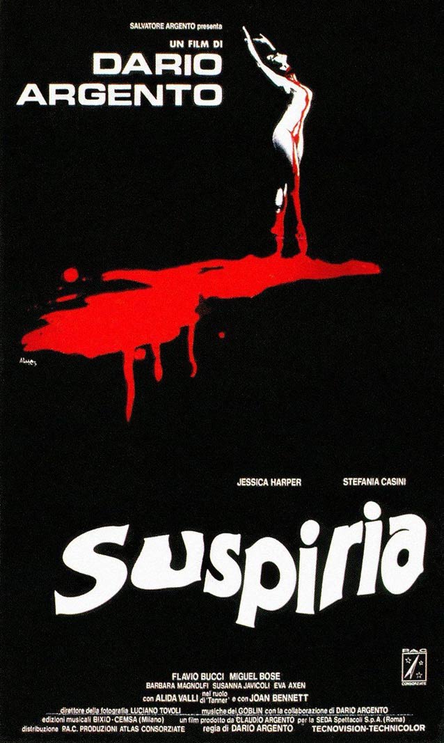
Italian domestic one-sheet for Suspiria (1977)
© 1977 Produzioni Atlas Consorziate (P.A.C.).
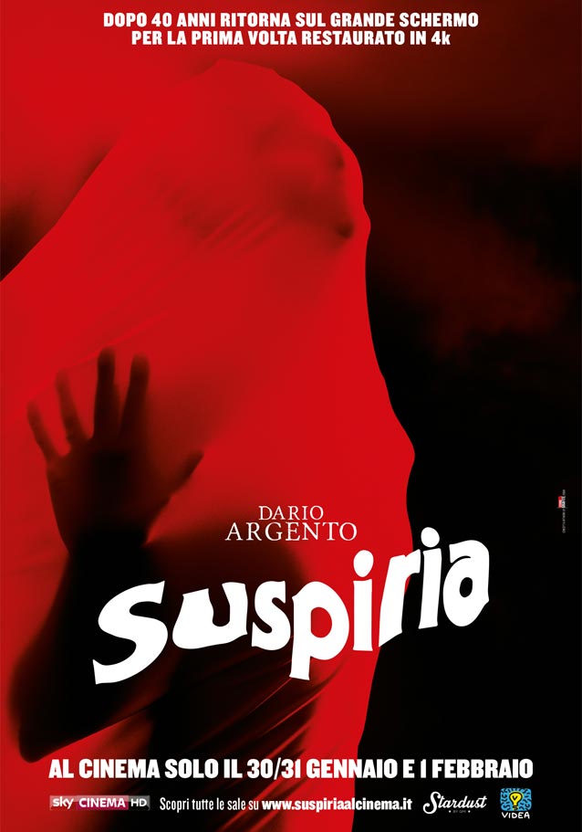
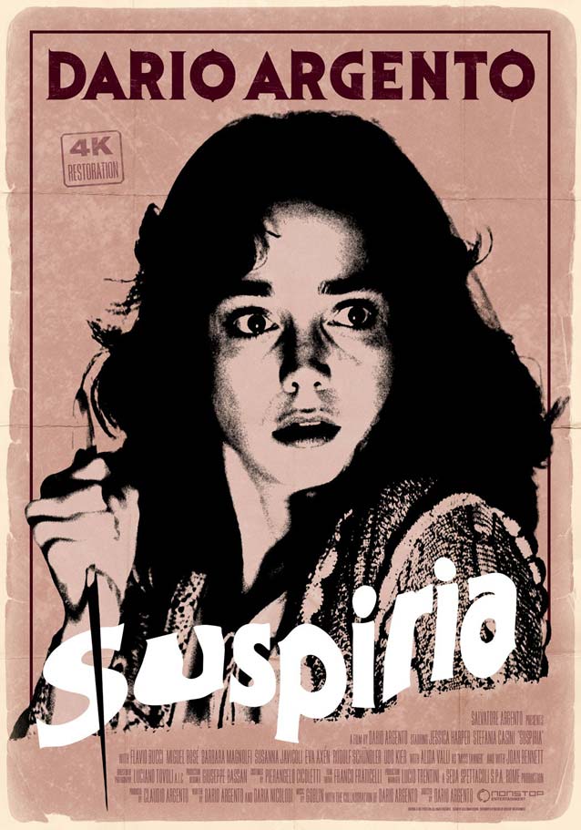
Theatrical one-sheet for the 4K restoration of Suspiria (1977)
© 1977 Produzioni Atlas Consorziate (P.A.C.).
Kellerman Design’s poster for the 4K restoration of Suspiria (1977)
© 2017 Nonstop Entertainment. Key art by Kellerman Design. Part of a Dario Argento poster series including L'uccello dalle piume di cristallo, Profondo rosso, Tenebre, Phenomena, and Opera.
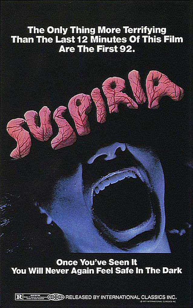
2018’s Suspiria relies on mismatched, jumbled up letters as a metaphor for the disorienting viewing experience. For the 1977 giallo original, the then wildly popular ITC Serif Gothic was distorted into a liquid typographic treatment reminiscent of psychedelic oil projections—in those days, a popular cinematographic styling used to evoke dreamscapes and nightmares. The Italian poster for the fortieth anniversary 4K restoration tastefully updates the minimalist original key art. The dancer trying to burst through a red veil is conceptually equal to, yet less exploitative than, the nude ballerina hemorrhaging from her slit throat. The new artwork incorporates the original title treatment, the angle ever so slightly adjusted to match the movement of the fabric stretched around the dancer’s anatomy. It also appears in Kellerman Design’s retro interpretation for Nonstop Entertainment, which is loosely based on a Japanese poster.
International theatrical one-sheet for Suspiria (1977)
© 1977 Produzioni Atlas Consorziate (P.A.C.).
Oddly, the international one-sheet for the original release abandons the canonical title treatment. Instead, squishy, amorphous shapes marbled with veins make the pink letters look like sickly organs, turning the logo into a ghoulish body-horror extravaganza.
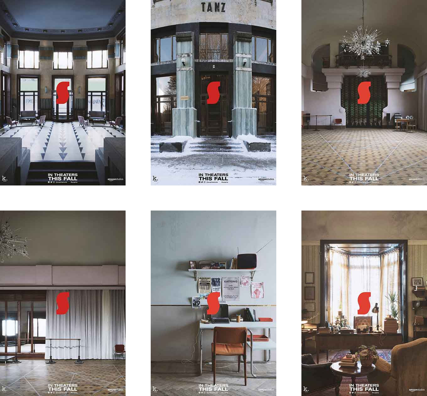
LA’s architectural character posters for Susperia
© 2018 Amazon Studios. Key art by LA. Logo by Dan Perri.
But let’s get back to the new film. The peculiar S from Dan Perri’s logo becomes a reference point throughout Suspiria’s marketing campaign. It brands this series of brooding teaser images, which treat the film’s settings as actual characters. This unusual approach foreshadows how the architecture of the locale plays an essential role in the story, to the point that it almost becomes a sentient creature.
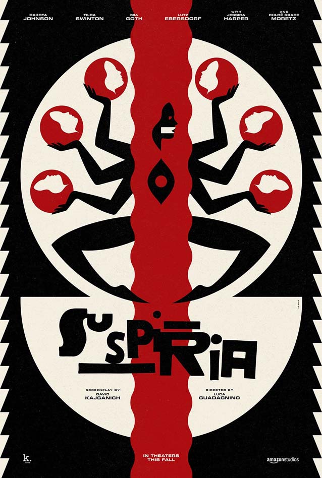
La Boca’s alternate poster for Suspiria
© 2018 Amazon Studios. Key art by La Bocca. Logo by Dan Perri.
La Boca’s alternate poster for Suspiria
© 2018 Amazon Studios. Key art by La Bocca. Logo by Dan Perri.
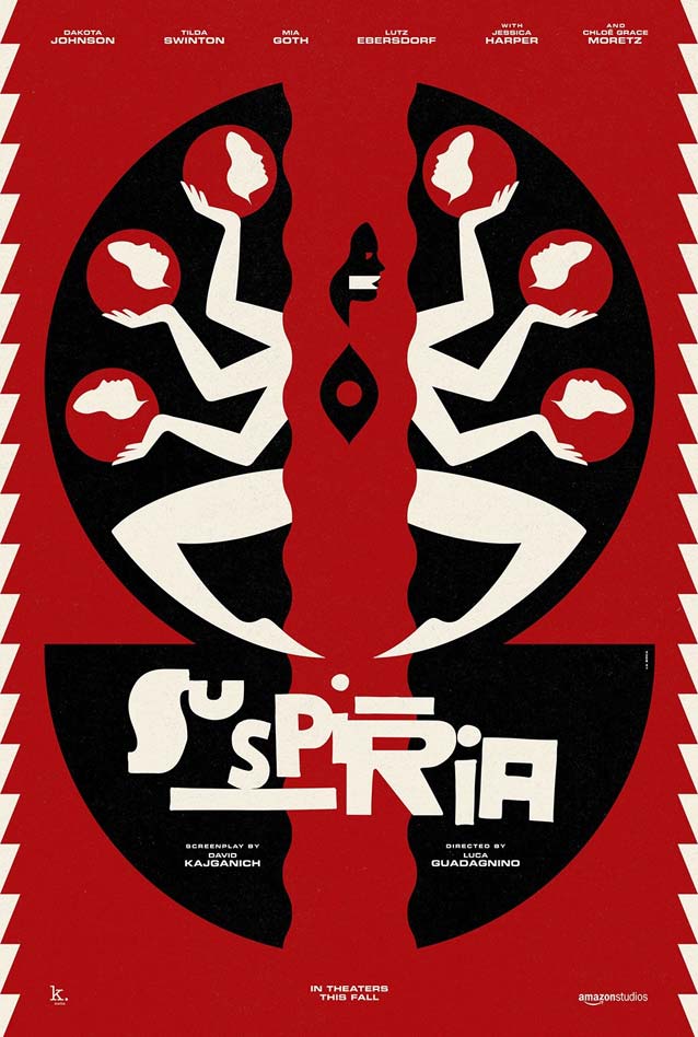
Known for their multiple-award-winning teaser series for Black Swan, which made the internet rounds in 2011, La Boca used a similar art-deco-inspired visual language to create two wonderful, limited-edition silkscreens for Suspiria. Here, the dancer has six arms (each one holding a head) and a yoni-shaped opening in her chest, which makes her look like a Hindu goddess. In a private conversation, Mota Italic’s Kimya Gandhi Keller suggested that the iconography points to Kālī, the ferocious form of the Divine Mother.
Sara Deck’s Madame Blanc Mondo poster for Suspiria
© 2018 Amazon Studios. Key art by Sara Deck. Logo by Dan Perri.
Sara Deck’s Susie Bannion Mondo poster for Suspiria
© 2018 Amazon Studios. Key art by Sara Deck. Logo by Dan Perri.
Sara Deck created two wonderful pieces of art for Mondo, spotlighting the film’s two leads. Her meticulously detailed depictions of Tilda Swinton’s Madame Blanc and Dakota Johnson’s Susie Bannion marry a deceptive vulnerability with sinister sensuality to create two unnerving images.

The Bray Road Beast

Theatrical one-sheet for The Bray Road Beast
© 2018 Small Town Monsters. Key art by Adrienne Breedlove with lettering by Zac Palmisano.
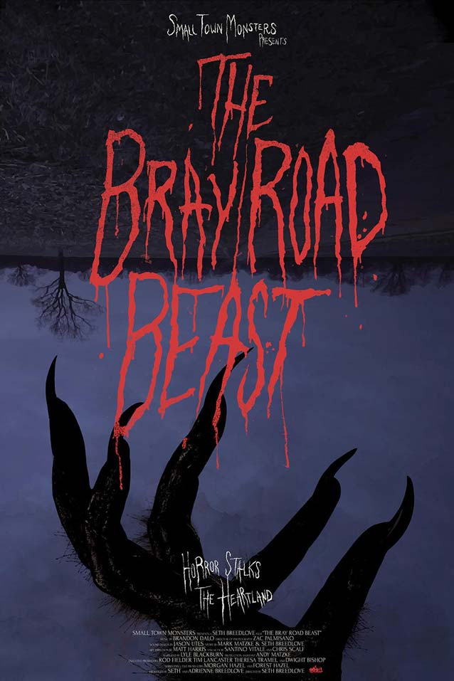
Coming across a minor gem like this one is all I need to remind me why I comb through dozens of posters each month. The Bray Road Beast investigates a string of real-life werewolf sightings in early 1990s rural Wisconsin. The key art proves that you don’t always need a big-shot art director or design studio to get a great poster: it was designed entirely in-house by producer Adrienne Breedlove, with lettering by director of photography Zac Palmisano. The upside-down nocturnal scene provides a neat backdrop for the hirsute hand clawing at the spindly, drippy film title, as if it had scratched the letters into the canvas. The art conjures up both the haunted forest scene in Disney’s classic Snow White and The Seven Dwarfs and pulp-horror book covers, with a soupçon of Tim Burton. Earnest and unpretentious, this poster is just lovely. Richard Lipton’s typefaces inspired by Margo Chase’s signature lettering style—Shogun, Ecru, and Talon—would also be a perfect fit for this poster.

Beoning (Burning)

Palaceworks theatrical one-sheet for Beoning (Burning)
© 2018 Well Go USA Entertainment. Key art by Palaceworks.
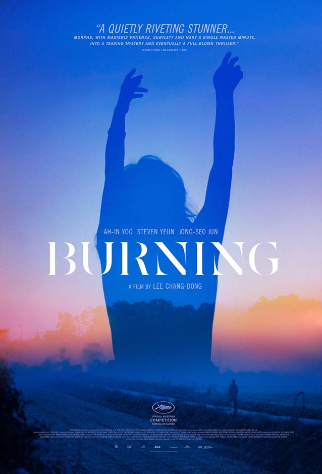
Palaceworks, Inc. trades night for dawn in this stunning one-sheet for Beoning (Burning). The dreamlike image superimposes a silhouette of Hae-mi, the female lead, onto a hazy landscape, creating a gorgeous palette of intense blues fading into delicate shades of orange and pink. It beautifully captures the fog that Paju (the main character Lee Jong-su’s hometown near the Korean demilitarized zone) is famous for. In an email, Caelin White told me she always tries to use images that are either very cinematic, or the most emblematic of the film. “For me,” she wrote, “that scene with Hae-mi was mystical and represented the effect she had on Lee Jong-su.” The film title is like a frail typographic phantasm, set in a classic-looking serif face similar to Big Moore or Big Caslon with the thins wisped away, as though they’ve been filtered out by the mist or are materializing in the light of the rising sun. It brings an air of mystery to this delightful piece.
Alternate poster for Beoning (Burning)
© 2018 Well Go USA Entertainment.
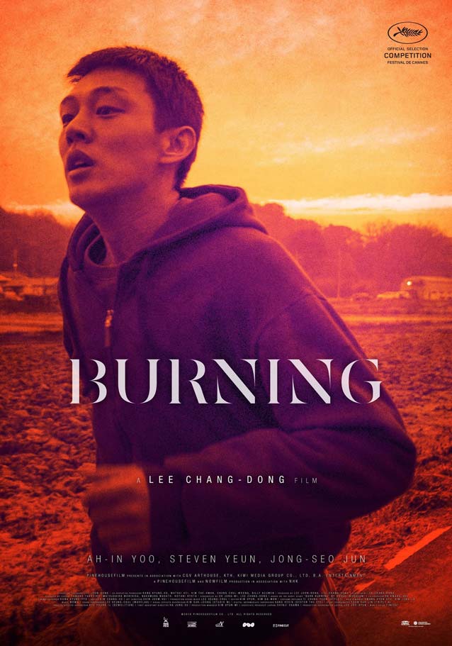
This alternate poster is the main theatrical one-sheet’s color opposite. Intense warm reds, oranges, yellows, and a dash of purple replace the cool blues. It shows Jong-su running at dawn in his search for greenhouses; you may have missed him in the previous poster.

Can You Ever Forgive Me?

Midnight Oil’s teaser poster for Can You Ever Forgive Me?
© 2018 Fox Searchlight Pictures. Key art by Midnight Oil.
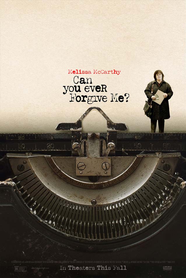
When once-best-selling celebrity biographer Lee Israel struggles to stay relevant in the early nineties, she turns to literary forgery and theft to make ends meet in the biographical comedy Can You Ever Forgive Me?, an adaptation of her memoir. Midnight Oil cut the teaser sheet clean halfway down the canvas, thus creating a striking juxtaposition between the mostly blank sheet of paper and the dark, grimy typewriter. The protagonist’s tiny size and body language perfectly convey the embarrassment and guilt permeating the film title next to her. The title and the star’s name are spelled out in a worn typewriter face in red and black, the two colors available on classic typewriter ribbons. IvyStyle TW’s lack of contrast, sturdy slab serifs, and pronounced ball terminals suggest that Jan Maack was inspired by similar typewriter faces. And if you like a distressed look, try Nitti Typewriter.

What They Had

Gravillis Inc.’s theatrical one-sheet for What They Had
© 2018 Bleecker Street Media. Key art by Gravillis Inc.
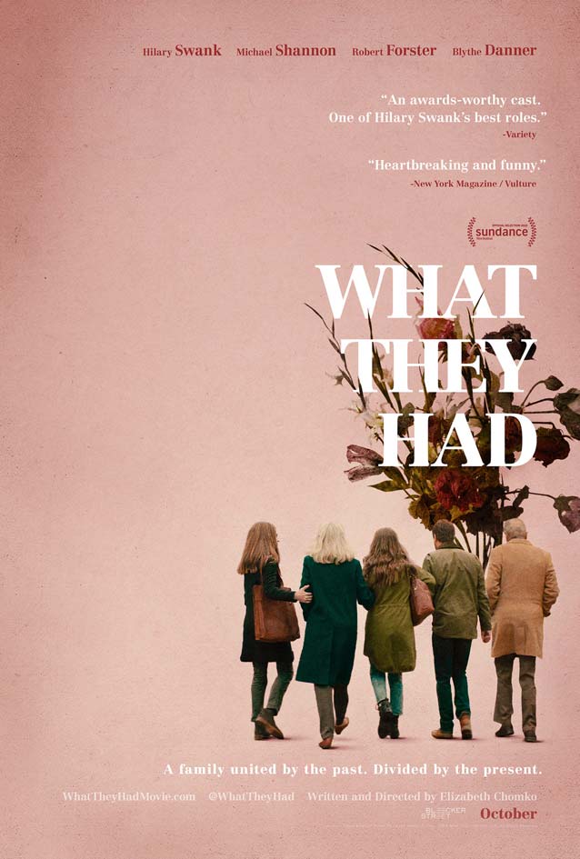
Gravillis, Inc. tugs at the heartstrings with their tender theatrical one-sheet for What They Had. It visualizes the act of saying goodbye and letting go—this family drama’s main theme—as three daughters and a son walk into the distance with their father. Showing their backs turned is a pretty bold move; lesser studios would have banked on the actors’ star power (Hilary Swank won two Oscars and Michael Shannon is the current hot ticket) by having their heads float all over the poster. The dried flowers symbolize days gone by, a life lived, fading into memory. They subtly weave in and out of the letters of the movie title, set in Adrian Frutiger’s Centennial. The extensive Benton Modern suite is based on the same models from around the turn of the twentieth century—notably Morris Fuller Benton’s Century, which he drew for ATF.

Beautiful Boy

InSync Plus’ theatrical one-sheet for Beautiful Boy
© 2018 Amazon Studios. Key art by InSync Plus.
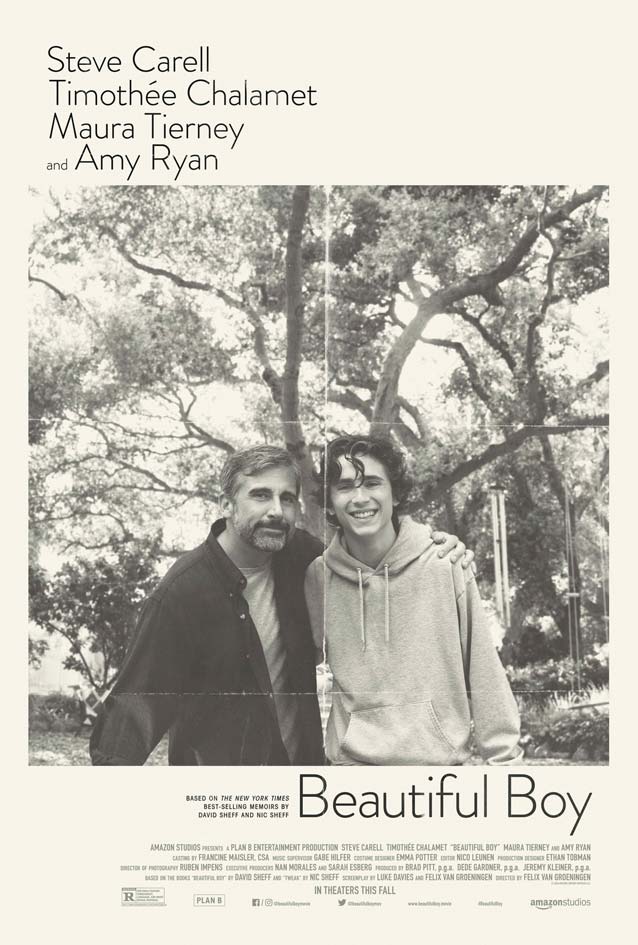
Another tender moment is captured by InSync Plus in their key art for Beautiful Boy, based on the best-selling pair of memoirs from father and son David and Nic Sheff. The seemingly carefree snapshot gets loaded with meaning and emotion when you realize that the biographical drama chronicles the family’s struggle with their son’s addiction over the years. The creases not only add to the bittersweet quality of the candid image, but also create a division between father and son, a symbol of how drug addiction carves a rift between loved ones. Brandon Grotesque matches the personal theme of the artwork. A similar marriage of warm, humanist forms and rounded stroke endings can be found in Newlyn’s elegant New Atten Round or his soothing New Zen. His equally soft New Rubrik and Type-Ø-TonesDINosaur are more technical in nature. And Gasket’s curves are imbued with Cyrus Highsmith’s singular wit.

Private Life

Chris Ware’s theatrical one-sheet for Private Life
© 2018 Netflix. Key art by Chris Ware.
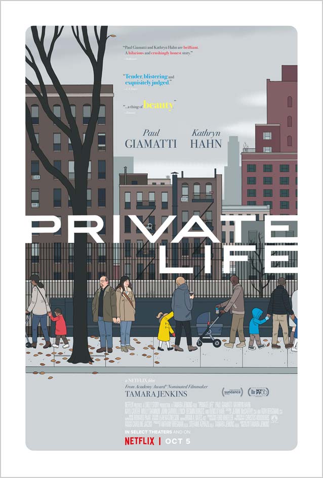
In Private Life, an author’s continuing fertility treatments put stress on her relationship with her husband. Chris Ware has mastered the art of finding comfort and even humor in immense sadness and existential pain. He depicts the two main protagonists with great empathy. They look away from each other but keep their pinkies hooked in a moment of awkward tenderness, as they watch, bemused, parents and children passing them by. It’s astonishing how much emotion Ware can express with the sparest of means and the simplest of lines. His ability to capture the essence of our humanity so poignantly is uncanny. Little details in the letter drawings make me suspect Ware lettered the film title himself. Stainless Extended’s tense forms would have looked great in this context; other very wide sans serifs include Dinamit, Titling Gothic Extended, Rhode Extra Extended, and Benton Sans Wide.

Bikini Moon

Dave McKean’s theatrical one-sheet for Bikini Moon
© 2018 Czar Film. Key art by Dave McKean.
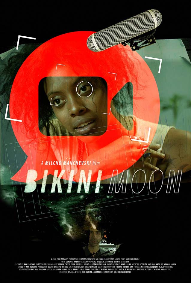
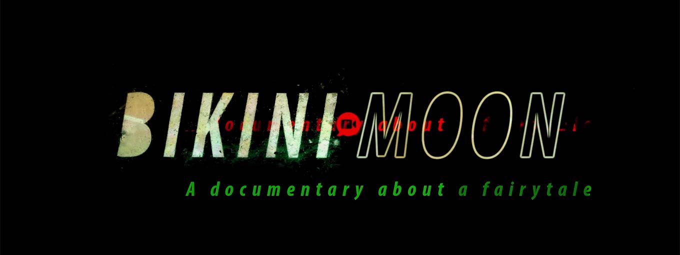
Just as I was winding up this episode, I stumbled upon the theatrical one-sheet for Bikini Moon, “a very modern, urban fairy tale set amidst a fractured ideal of family,” according to the official blurb. In an email, director Milcho Manchevski told me that Dave McKean, one of my favorite comic-book artists, created the key art. Maturing as a designer in the late eighties and early nineties gave me an affinity for deconstructivist graphics. And as an avid reader of comics, I was blown away by McKean’s collaborations with Neil Gaiman, Violent Cases and Black Orchid, and Arkham Asylum: A Serious House on Serious Earth, McKean’s magnum opus with Grant Morrison. Both predilections merge in this design. McKean’s lyrical, layered style results in a visually rich poster that updates nineties grunge style for a contemporary audience. His textured treatment of a humanist sans akin to Agenda Extra Condensed Italic displays a controlled nonchalance, a measured randomness that I find refreshing.
Dave McKean’s title treatment for Bikini Moon
© 2018 Czar Film. Title by Dave McKean.
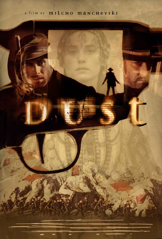
Dave McKean’s theatrical one-sheet for Dust
Dust © 2001 Lions Gate Films. Key art by Dave McKean.
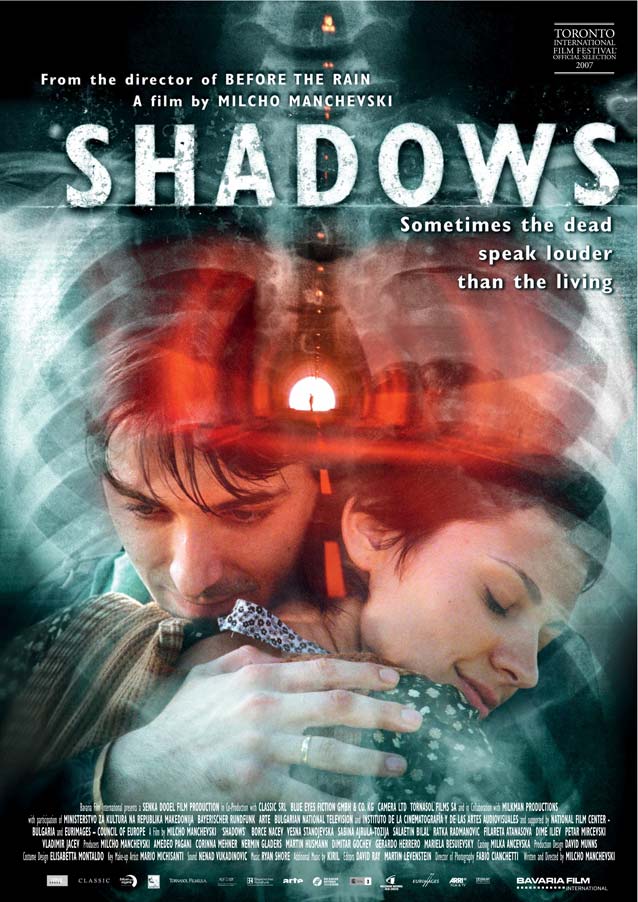
Dave McKean’s theatrical one-sheet for Shadows
Senki (Shadows) © 2007 Mitropoulos Films. Key art by Dave McKean.
In our email conversation, Manchevski mentioned that McKean designed the posters, opening credits, and titles for all of his films after the first one, Before The Rain. Dust is a great example of McKean’s early style: a muted brown-and-gold color palette, subtle layering of people and symbolic objects, and glowing, scintillating type set in an adventurous typeface—Jeremy Tankard’s Disturbance. Shadows suffers a bit from the pitfalls of late-2000s post-grunge, with overdone layering and texturing, resulting in a less cohesive look.
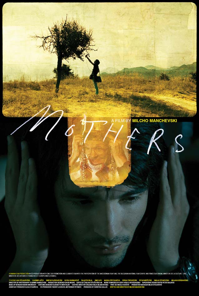
Dave McKean’s theatrical one-sheet for Mothers
Majki (Mothers) © 2010 Banana Film. Key art by Dave McKean.
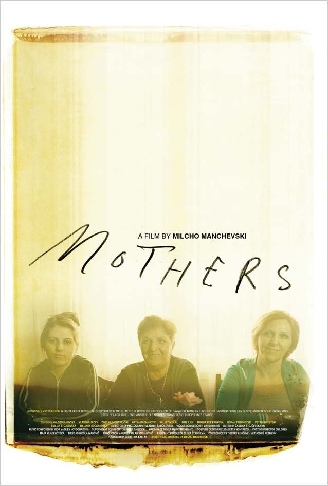
Dave McKean’s theatrical one-sheet for Mothers
Majki (Mothers) © 2010 Banana Film. Key art by Dave McKean.
McKean’s marvelously luminous key art for Majki (Mothers) shows him evolving into an increasingly lyrical style. The naive, casually scrawled film title is the perfect foil for the almost sacred imagery, reminiscent of gilded religious iconography.
It’s ironic that, after writing about all of these movies where people experience difficulties, I find myself struggling to come up with a witty endnote. Or maybe I just did! Anyway, come back for The Leftovers in a couple of days. Bald Condensed, né Yves Peters, is a Belgian-based rock drummer known for his astute observations on the impact of letterforms in the contemporary culture-sphere. A prolific writer on typography, he has a singular knack for identifying the most obscure typefaces known to humankind.