Type Network Logo
Fonts
Foundries
Designers
Stories
Services
Search Icon
Search
User
Account
Cart Icon
Cart
Menu Icon
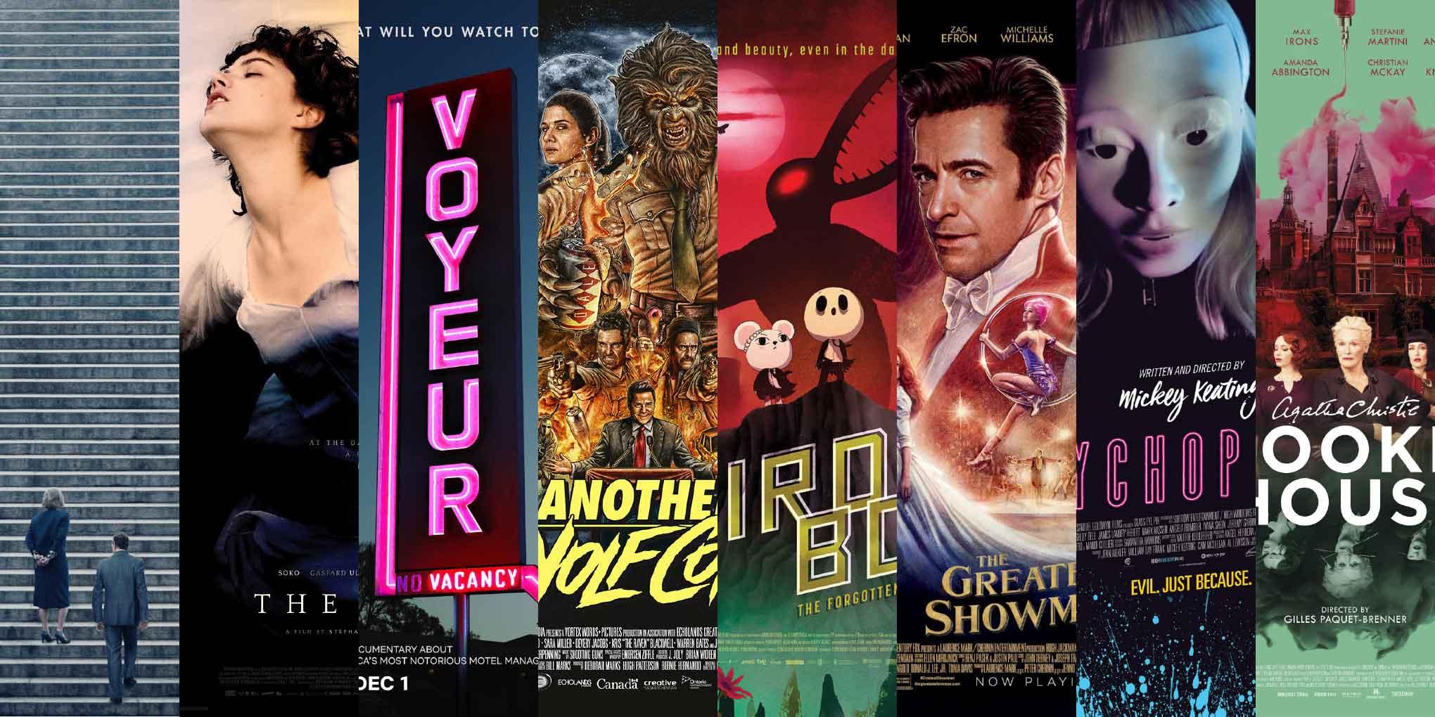
ScreenFonts: January 2018 | The Leftovers
These posters didn’t make the
cut
, but are still noteworthy for their design and/or typography.
By Bald Condensed
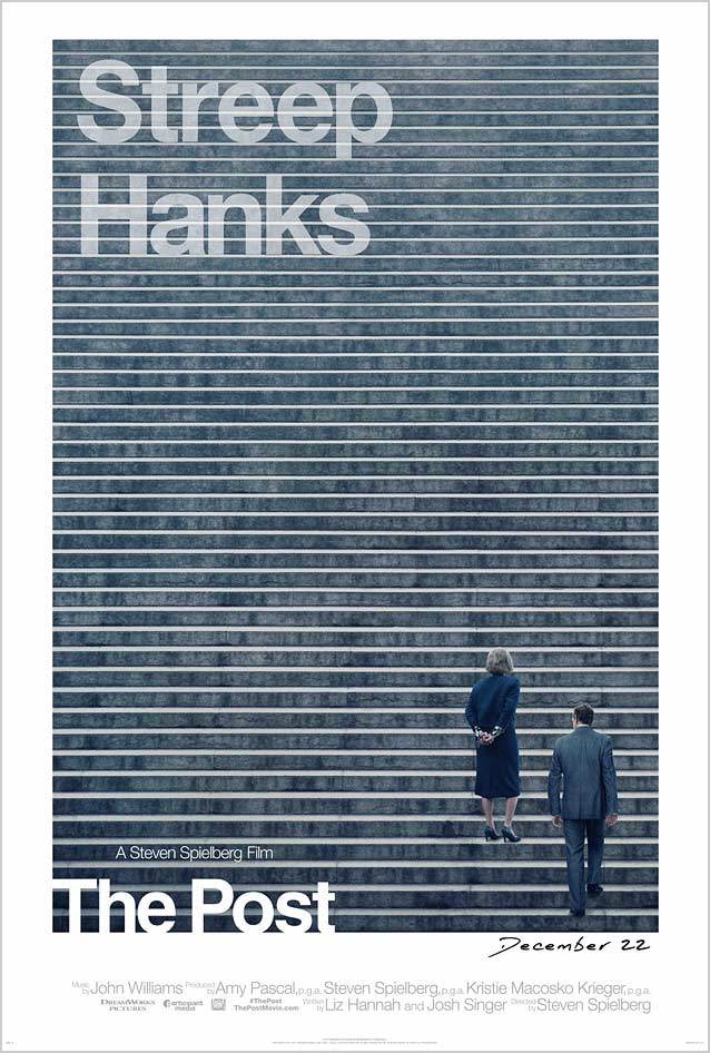
The Post
© 2017 Twentieth Century Fox Film Corporation. The steps of the Supreme Court in
BLT Communications
’ stylish
theatrical one-sheet
evoke lines of newspaper type.
Neue Haas Grotesk
looks terrific in this context, but it doesn’t really match conceptually, since Bodoni served as
The Washington Post
’s headline face in the mid-1970s. Matthew Carter’s
Stilson
is a great interpretation of Bodoni’s types, and would have worked well here.
Phantom City Creative
’s excellent
alternate poster
rotates the concept slightly by having a stack of folded newspapers stand in for the steps of the Supreme Court. The legendary
Nixon Resigns
headline on August 9, 1974, was set in Century (cf.
Benton Modern
).
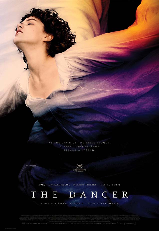
La Danseuse
(The Dancer)
© 2016 Myriad Pictures. It’s interesting to see how image treatment can influence one’s perception of a poster. The original photograph of Loïe Fuller dancing, cropped straight, accompanied by the no-nonsense Alternate Gothic (cf.
Benton Sans Compressed
), gives the
domestic one-sheet
a sense of
cinéma vérité.
By tilting the image toward the upper left corner and colorizing the swirling gown,
This Time Tomorrow
’s poetic
international poster
transforms the dancer into a celestial being taking flight. While more refined than Alternate Gothic, Quattrocento is a little too static; the gestural feel of a calligraphic serif like
Dolly
,
Kopius
, or
Lavigne
would better mirror the movement in the image.
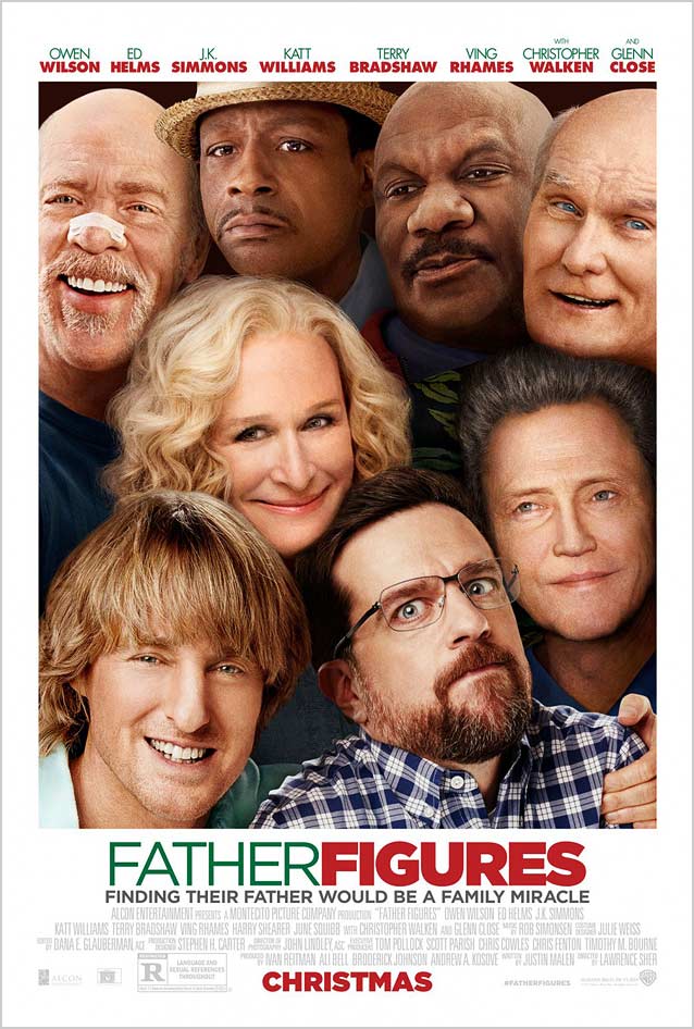
Father Figures
© 2017 Warner Bros.
Canyon Design Group
’s
Photoshop trainwreck
doesn’t seem to grasp the concept of physical space. In the immortal words of
Gavin Berliner
: “The more heads, the better.”
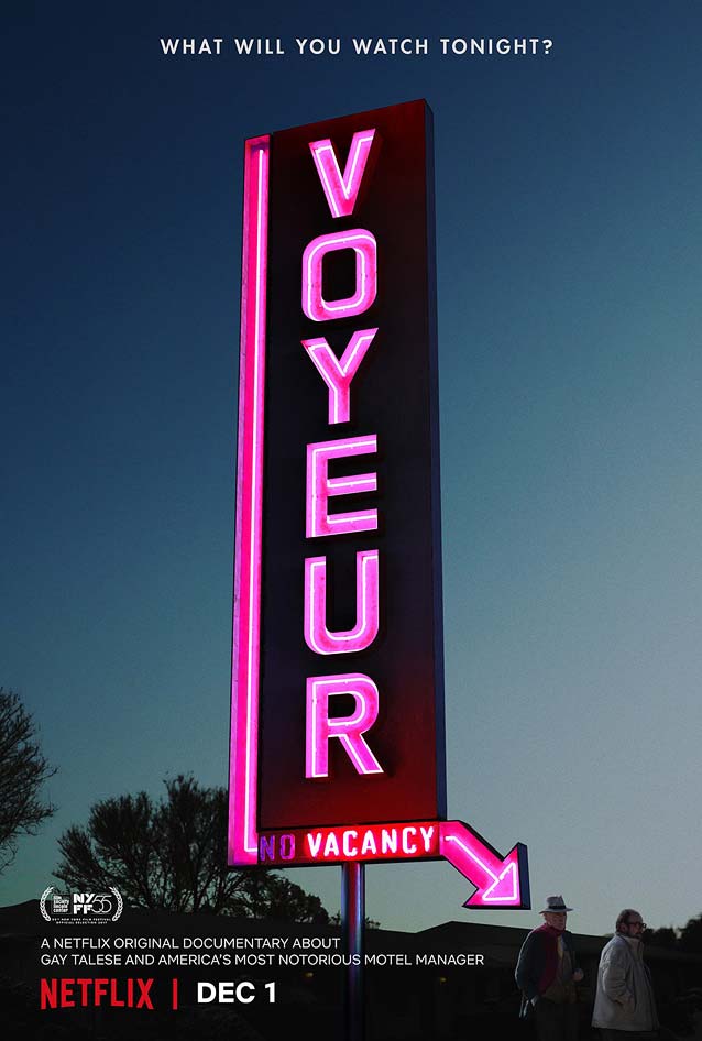
Voyeur
© 2017 Netflix.
LA
created one of the smartest and funniest posters I’ve seen in a while. The documentary’s title does double duty in as a giant, brightly lit motel sign with an arrow pointing at the voyeur (who naturally would prefer to remain unseen).
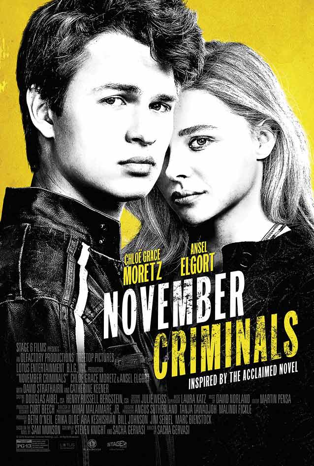
November Criminals
© 2017 Batrax Entertainment. An IMPAwards commenter pointed out that
Kustom Creative
’s
theatrical one-sheet
(with type similar to
ITC Franklin Compressed
) resembles an earlier poster.
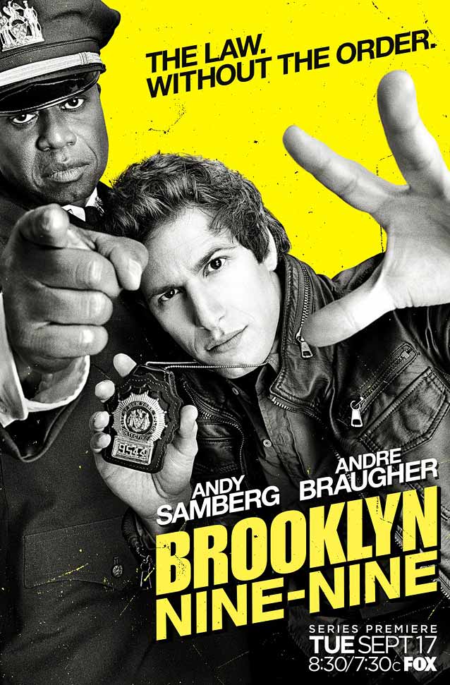
Brooklyn Nine Nine
© 2013 Fox. Is
Arsonal
’s promotional
poster
for Fox’s comedy series
Brooklyn Nine-Nine
a precursor to Kustom Creative’s effort?
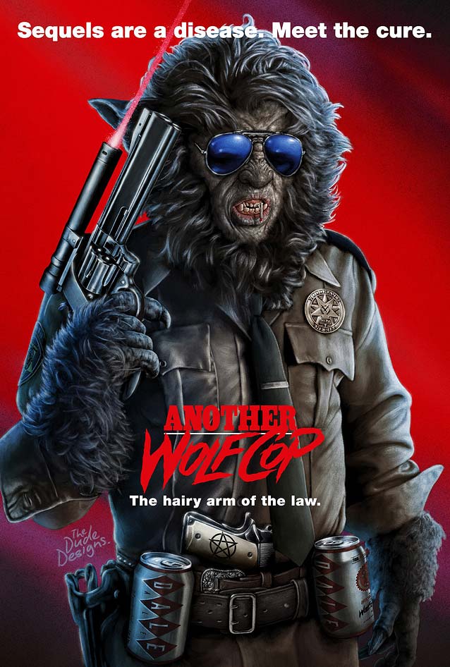
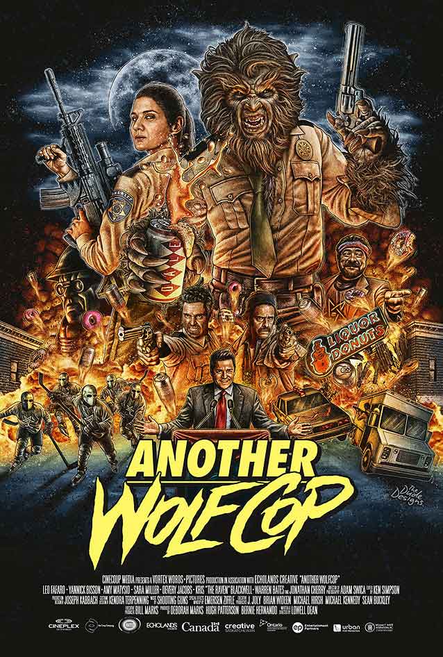
Another WolfCop
© 2017 Cinecoup Media. Tom Hodge, a.k.a.
The Dude Designs
, has built a solid reputation with his unabashed pulp aesthetic.
Hodge’s intricately detailed
painted artwork
seems ripped from the boxes of the straight-to-VHS eighties videos one might find in the bargain bin.
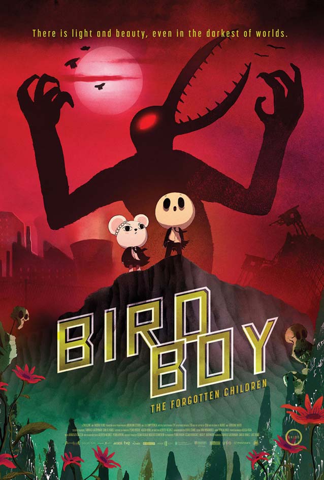
Psiconautas, los niños olvidados
(Birdboy: The Forgotten Children)
© 2015 Gkids. Instead of a tired orange-and-teal combination, contrasting crimson red and jungle green inject drama into this
international poster
. The square sans made me think of
Agency FB
.
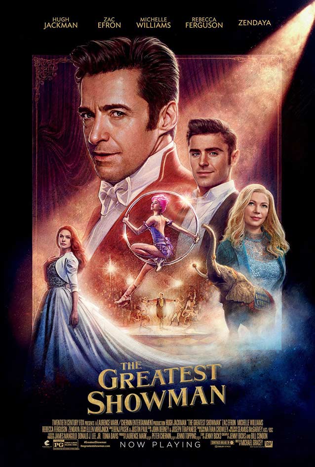
The Greatest Showman
© 2017 Twentieth Century Fox Film Corporation.
BLT Communications
’
painted poster
channels a classic illustration style that originated in the mid-1970s, with
Drew Struzan
as its most famous proponent.
Meyer Two
,
Grand Central
, and
Parkinson
have a similar vintage look.
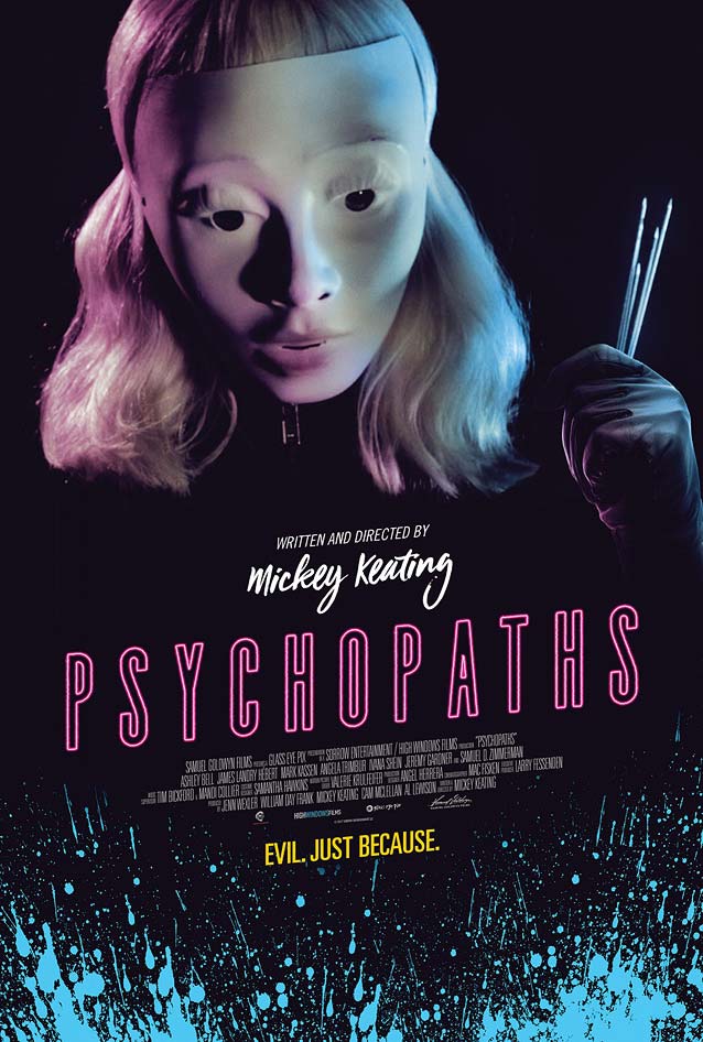
Psychopaths
© 2017 Samuel Goldwyn Films. The limited color palette of cyan, magenta, yellow, black, and white lends
Champ & Pepper
’s
theatrical one-sheet
a sickly air. The elongated sans reminds me of
Garage Gothic
.
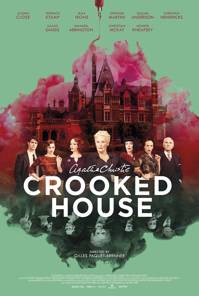
Crooked House
© 2017 Sony Pictures Worldwide Acquisitions (SPWA). The gorgeous red-and-green complementary color scheme reflects the inverted images in this moody
poster
.
Proxima Nova
is an excellent alternative to Gotham.

