The premier of ScreenFonts at Type Network features (full-size!) posters for The Girl on the Train, The Birth of a Nation, The Accountant, The Lennon Report, Christine, Ah-ga-ssi (The Handmaiden), King Cobra, Boo! A Madea Halloween, and The Unspoken—and comes full circle with Inferno.
By Bald Condensed
Editor’s note: Yves Peters (aka Bald Condensed) has been writing ScreenFontssince 2006. After debuting the successful series on his personal blog, Peters was tasked with writing “interesting stuff” about type and typography at FontShop. Instead of preaching to the converted, he wanted to attract readers who were not yet familiar with typography and introduce them to this fascinating field. Peters’ solution was to use pop culture to spark people’s interest by writing about topics like music, film, and advertising—artifacts that form part of the fabric of daily life.ScreenFonts demonstrates Peters’ affinity for opening our eyes to the diversity of typography that surrounds us, and his wry commentary on cinematic themes is a bonus for film buffs. And now, without further ado, it’s time to raise the curtain on the first edition of ScreenFonts at Type Network.
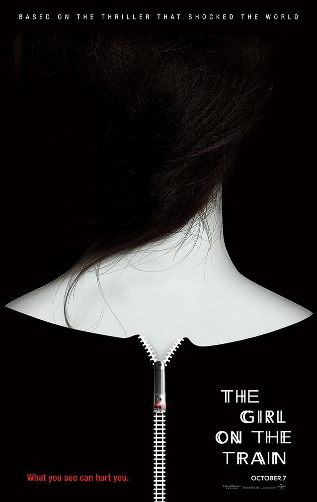
In their teaser poster for the thriller The Girl on the Train, BOND wanted to “capture the dark, dangerous mystery at the heart of a story in which nothing is what it seems.” BOND used a simple, high-concept approach. Two elements from the film—the woman witnessing the events from the train and the love affair—are combined into one striking image. The zipper on the back of a woman’s dress turns out to be train tracks, with a speeding locomotive serving as the zipper pull. The stylized image is clever and engaging, inviting the viewer to become an active participant.
The train motif is also present in the typography. Parts of Avenir’s capitals are doubled, replicating the effect of watching the passing landscape from a speeding train. An additional conceptual link to trains could have been made typographically. While the over-used Gill Sans or ITC Johnston may seem like obvious choices, it’s about time we start defying expectations as designers and typographers. Greg Thompson’s elegant Agenda is a fine alternative. Agenda’s design was also inspired by the work of Edward Johnston—in this case, his iconic London Transport face drawn for the Underground a century ago—yet the humanist sans is decidedly modern, and would have been a great fit for this stylish contemporary poster.
The iconic flag of the United States has often been used as a graphic device to tell a story. No less than three posters this month play with the stars and stripes, two of them for the historical drama The Birth of a Nation. Set in the antebellum South, this biographical account of the uprising orchestrated by Nat Turner, a literate slave and preacher, intentionally reappropriates the title of D.W. Griffith’s virulently racist 1915 epic. The teaser poster shows alternating rows of the rebelling slaves and their white masters charging at each other in monochrome red, thus creating the red stripes, with blood-like color streaming down. In the roughly painted blue canton, the stars have been replaced by the film title. The aged-paper look of the canvas nicely ties the image together.
The typography, alas, is not as successful. The designer(s) obviously had period handwriting in mind, but ITC Blackadder resembles a cartoonish pirate script. Honestly, the name kind of gives it away. While the font itself is poorly drawn, the handwriting in the alternate poster on the right looks more appropriate. There are many digital interpretations of the scripts used in the Declaration of Independence that would have done an even better job, or simply a calligraphic script with a classical look, like Sloop Script or Savanna Script.
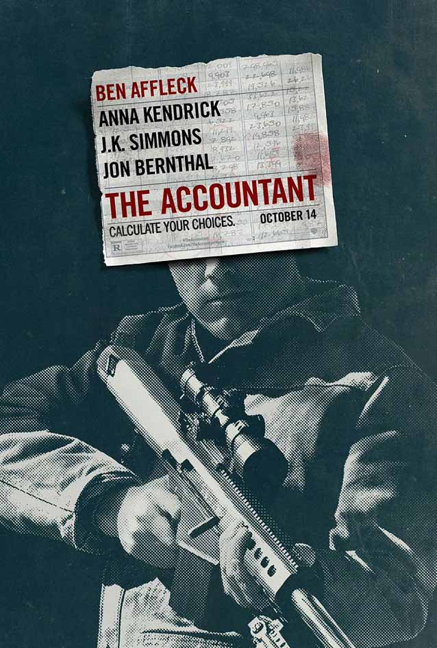
In The Accountant, Ben Affleck plays a math savant who becomes a target of the Treasury Department as he uncooks the books for a new client, and bodies start to drop. Poster designers P+A used a strategy similar to Jon Manheim’s for Money Monster. Just as the television test pattern hiding most of his face could not disguise George Clooney, Ben Affleck is easily recognized despite the paper covering the top half of his head in the teaser poster. In both cases, the anonymization of the actor serves a specific purpose. For Money Monster, it emphasizes the expression of Clooney’s mouth, providing a metaphor for the words that set in motion a chain of events leading to a hostage situation. In the poster for The Accountant, this technique directs the viewer’s attention toward the gun. Together with the coarse rasterization which makes the image look like a newspaper clipping, it lends the act of killing a disconcerting emotional detachment.
Morris Fuller Benton’s classic Alternate Gothic is laid over scribbled numbers on a page ripped from an accounting ledger—a nice detail. Try Benton Sans as an alternative. This redesign of Benton’s work—initiated by Tobias Frere-Jones and developed by Cyrus Highsmith—is a far-reaching series with matched weights and widths, offering performance well beyond the limits of the original.
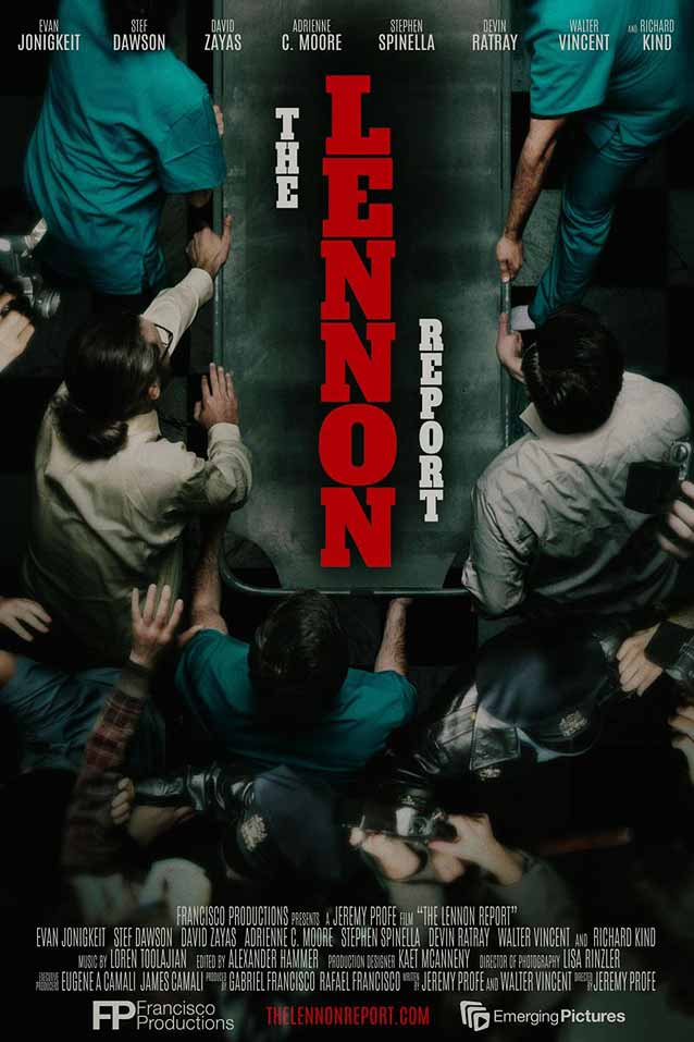
The Lennon Report is the unheard true story of the moments after Lennon was shot, as seen through the eyes of those who lived it. On the theatrical one-sheet, an image of a gurney seen from above, surrounded by medical personnel and press as it is being hurried toward the emergency room, beautifully conveys the urgency of the moment. Having the movie title impersonate John Lennon’s body on the gurney is a brilliant idea and makes the poster even stronger. It’s hectic, it’s chaotic, it’s messy—exactly what it needs to be.
The condensed neo-grotesque slab serif works surprisingly well set vertically, thanks in part to the fact that there are no exceptionally wide or narrow letters in the title. Add a W or an I to the mix and the whole thing falls apart. Matthew Carter did a masterful interpretation of this style with his expansive Roster family.
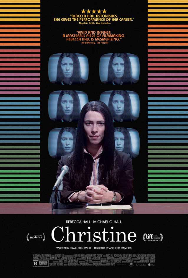
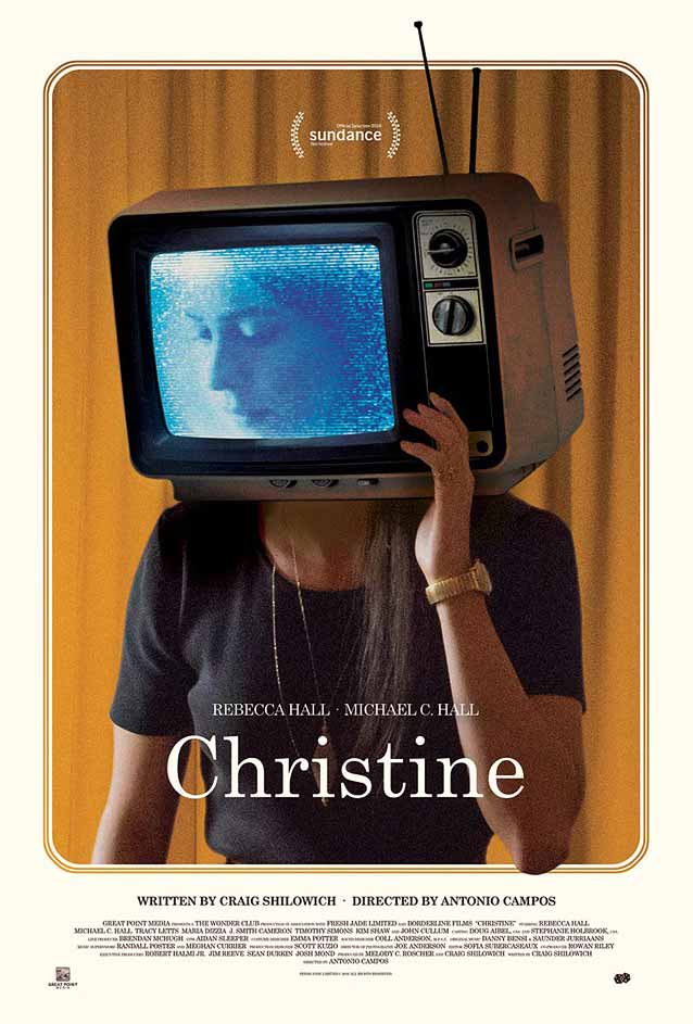
Guns are also an underlying theme in this third poster in a row, this time not to kill another, but to take one’s own life. The biographical drama Christine shows 1970s TV reporter Christine Chubbuck struggling with depression and professional frustrations severe enough to drive her to commit suicide live on the air. It is interesting to compare the main theatrical poster on the left with what I think is a festival poster on the right; they are both strong designs, but quite different. The main poster offers a more conventional image, with the titular character seated at a news desk. The static, symmetrical setup and Rebecca Hall’s intense gaze, multiplied by the monitors behind her, give the poster a foreboding quality. The festival poster is experimental: placing the television on Hall’s shoulders and her head on the screen disconnects her thoughts from her being, a perfect metaphor for her psychic unraveling, Her sideways glance hints at her angst and vulnerability. Two noteworthy design details: in the main poster, the testimonials are set in ITC Bauhaus to reinforce the 1970s look; in the festival version, elbow and antenna break through the border, adding subtle depth.
Morris Fuller Benton’s Century Schoolbook gives the movie logo a period-faithful newsy look. “The typeface that taught America how to read” was one of the templates for the Benton Modern series. Originally developed by Font Bureau as a text face for the Boston Globe and the Detroit Free Press, its design and proportions were taken from Benton’s turn-of-the-twentieth-century Century Expanded, while the italic was based on Century Schoolbook. The series was expanded with Display cuts designed by Dyana Weissman and Richard Lipton.
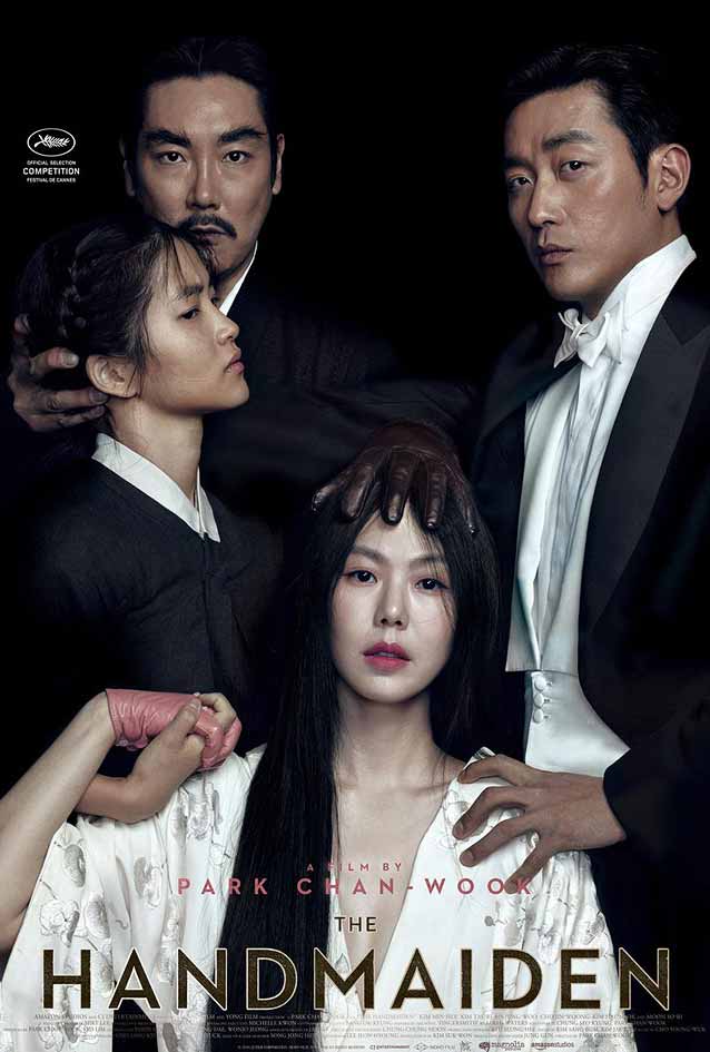
Films by Korean writer and director Chan-wook Park occupy a realm of their own in contemporary cinema. In his romantic drama Ah-ga-ssi (The Handmaiden), a woman hired as a servant to a Japanese heiress is secretly involved in a plot to defraud her. Don’t be fooled–the international poster on the left is more than a mere ensemble cast poster—it has the four protagonists cleverly placed on the canvas to illustrate their relationships. The orientation of their faces and bodies, and particularly the position of their hands, is anything but random, giving clues to the intrigue about to unfold.
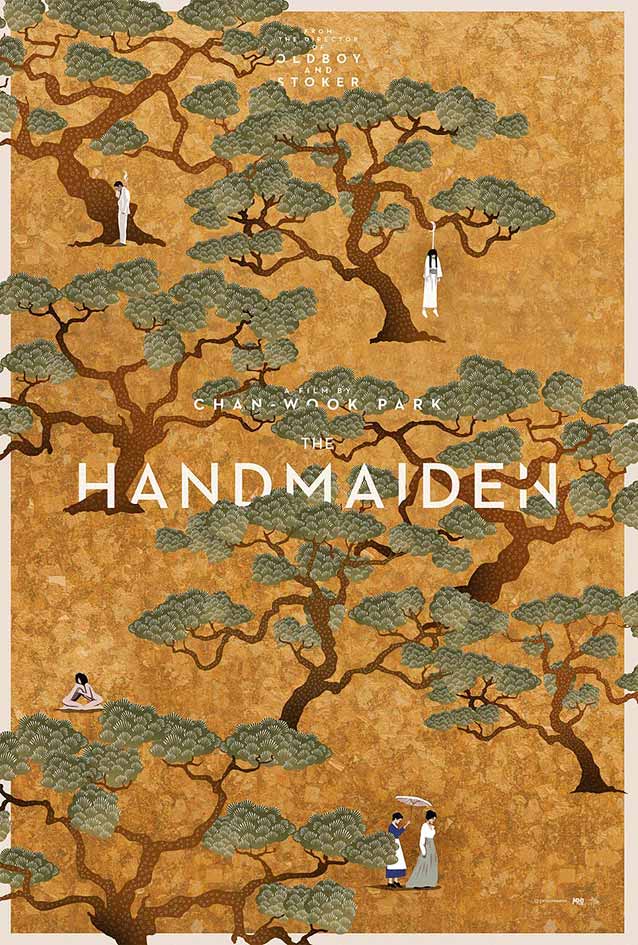
Empire Design’s illustrated poster is simply gorgeous. Upon closer inspection, what looks like an art deco painting reveals (and in my opinion actually spoils) certain story elements. Since the film takes place in the 1930s, the art deco display sans Neutraface fits. I love how the letters are woven into the detailed art, giving a surprising dimensionality to the illustration. Because it was originally released in Book and Bold weights only, I almost forgot that David Berlow’s lovely Light weight of Bureau Eagle is an excellent alternative.
Gravillis, Inc.’s poster for true crime movie King Cobra immediately made me think of the classic sleeve for the Rolling Stones album Sticky Fingers. The film title refers to Cobra Video, the gay porn production company that made adult performer Sean Paul Lockhart (aka Brent Corrigan) famous. This ripped-from-the-headlines drama covers Lockhart’s ascension to stardom in the early 2000s, his falling out with Cobra Video owner Bryan Kocis, and the latter’s subsequent murder. The knife outline in the tight jeans alludes to both the main character’s career in porn and Kocis’ murder, quite literally, as his throat was slit. The sky-blue-to-pink neon treatment of Agency FB fits the setting in the California gay porn community to a tee.
Let’s radically shift gears—from sexy, sunny California to the darkest depths of horror. Although Trajan has become the typographic signature for this genre, the poster for The Unspoken uses a different typeface in the same class. Originally developed by Damien Gautier with help from Quentin Margat as a custom font for the eponymous city in Burgundy, France, Le Beaune also conjures up stately capitals engraved in stone. In tune with its source of inspiration, the design offers many ligatures, alternate glyphs, and final letters. For more capital ligatures and nested capitals on engraved letterforms, take a look at Matthew Carter’s epic Mantinia and Sophia.
I often criticize the spoof posters for Tyler Perry comedies because they never have a conceptual link with the originals they satirize. LA’s designs for Perry’s horror comedy Boo! A Madea Halloween, however, break with this trend. Hellurween does a humorous take on the iconic poster for Halloween illustrated by Bob Gleason, and The Exorsister plays with Bill Gold’s classic image for The Exorcist. The typography is also well done. ITC Serif Gothic is faithful to the original for Halloween; Albertus is a departure from the glyphic sans for The Exorcist but still appropriate.
The Refinery developed the promotional campaign for Inferno, an adventure thriller based on a book by Dan Brown. The teaser poster on the left features a logo set in Requiem, with the end of the leg on the R encroaching on the serif of the second N—a refined customization. If you are a fan of this kind of delicate, elegant serif face, take a look at Throhand Pen or Eldorado Display.
Like the majority of the film’s marketing materials, the theatrical one-sheet on the right uses Trajan. Not enough people know that Richard Lipton considerably expanded the usefulness and expressive potential of this typographic model with Canto. Starting from Edward M. Catich’s seminal thesis on the origins of the Roman inscriptional style—such as that found on Trajan’s column—Lipton explored three variations: the expressive, preparatory Brush, the informal Pen, and the formal Roman. The classical capitals have been augmented by Lipton’s own calligraphic lowercase (absent in Trajan), small caps, and swashes.
I am not a big fan of symbolism, but I have to admit that I appreciate the symmetry. Back in 2006, the first poster discussed in the first episode of ScreenFonts was for The Da Vinci Code, the first film chronicling the adventures of Robert Langdon. And now, ten years later, we end the first episode of ScreenFonts on Type Network with the final installment in the Langdon trilogy. Nice move, universe.
Bald Condensed, né Yves Peters, is a Belgian-based rock drummer known for his astute observations on the impact of letterforms in the contemporary culture-sphere. A prolific writer on typography, he has a singular knack for identifying the most obscure typefaces known to man.