ScreenFonts: December 2017
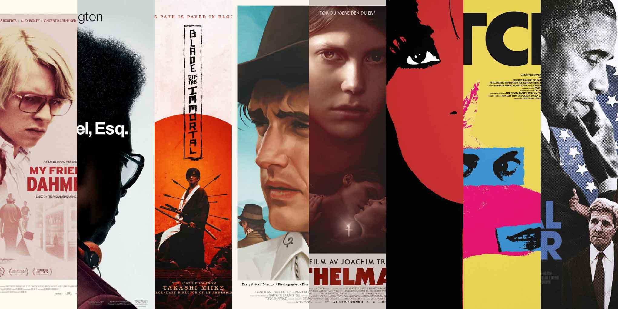
This episode of ScreenFonts unexpectedly turned out to resemble a blind taste test. I look at posters for My Friend Dahmer, Roman J. Israel, Esq., Mugen no jûnin (Blade of the Immortal), Along for the Ride, Thelma, Most Beautiful Island, Bitch, and The Final Year.
Sometimes I wonder if I’m biased, if I select certain movie posters for ScreenFonts simply because I recognize the artist’s name. Other times, I find myself frustrated by missing credits on Internet Movie Poster awards—an inconvenient but probably unavoidable consequence of the website’s user-generated content. For example, take James Jean’s teasers for mother!, which I wrote about last month: only the Javier Bardem key art is properly credited, while the piece featuring Jennifer Lawrence is not. These two phenomena—suspecting an unconscious preference for artists I know combined with missing credits—converged this month when I chose posters for two different films that jumped out at me, only to find out later that both were designed by Jay Shaw, one of my favorite artists. So, yes, this episode has three Akiko Stehrenberger one-sheets. But that’s only because they’re so damn good.
And with that, ’tis the season to take a break and be with family and loved ones. Save room for a quick serving of The Leftovers and then we’ll reconvene in the new year. Happy holidays!
Bald Condensed, né Yves Peters, is a Belgian-based rock drummer known for his astute observations on the impact of letterforms in the contemporary culture-sphere. A prolific writer on typography, he has a singular knack for identifying the most obscure typefaces known to humankind.
My Friend Dahmer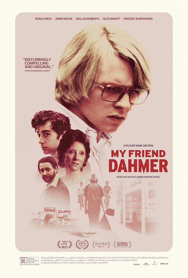
|
Roman J. Israel, Esq.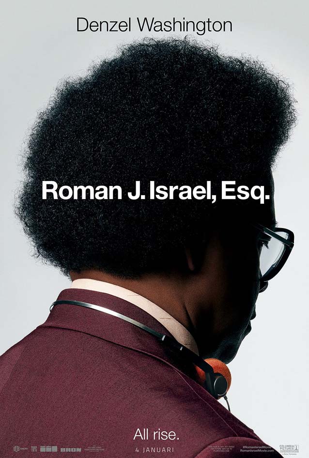
|
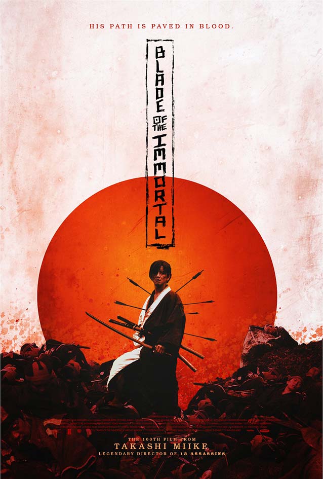
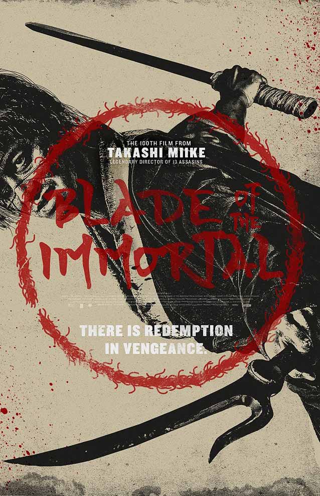
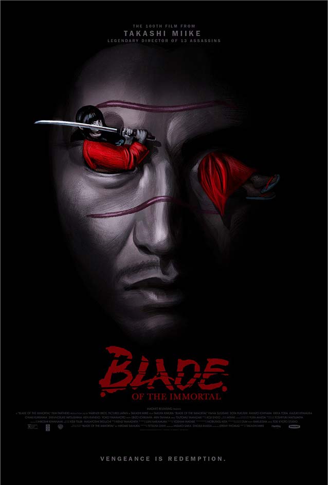
Mugen no jûnin (Blade of the Immortal)Despite increased awareness, cultural appropriation still haunts graphic design. Exoticism, which became popular in the late nineteenth century under the influence of European colonialism, also expresses itself in typography with designs that are now widely recognized as culturally insensitive. The question remains: How much of an “exotic” culture can be injected into Latin letterforms before a line is crossed? In order to explore this conundrum, I singled out some of Gravillis Inc.’s posters for Mugen no jûnin (Blade of the Immortal), Takashi Miike’s film based on Hiroaki Samura’s popular Japanese manga series. Because I don’t feel qualified to comment, I solicited feedback from Toshi Omagari, a type designer specializing in multilingual scripts; localization and globalization expert Hitomi Kudo and her husband, Dr. Ken Lunde, CJK specialist at Adobe Typekit; and calligrapher Keiko Shimoda, who excels at both Latin and Japanese calligraphy and worked on props for 47 Ronin. |
|
|
|
Along for the Ride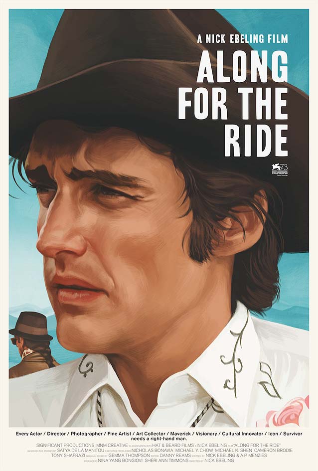
|
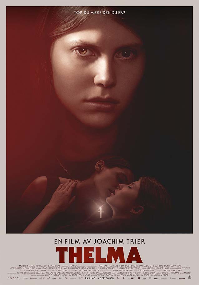
Thelma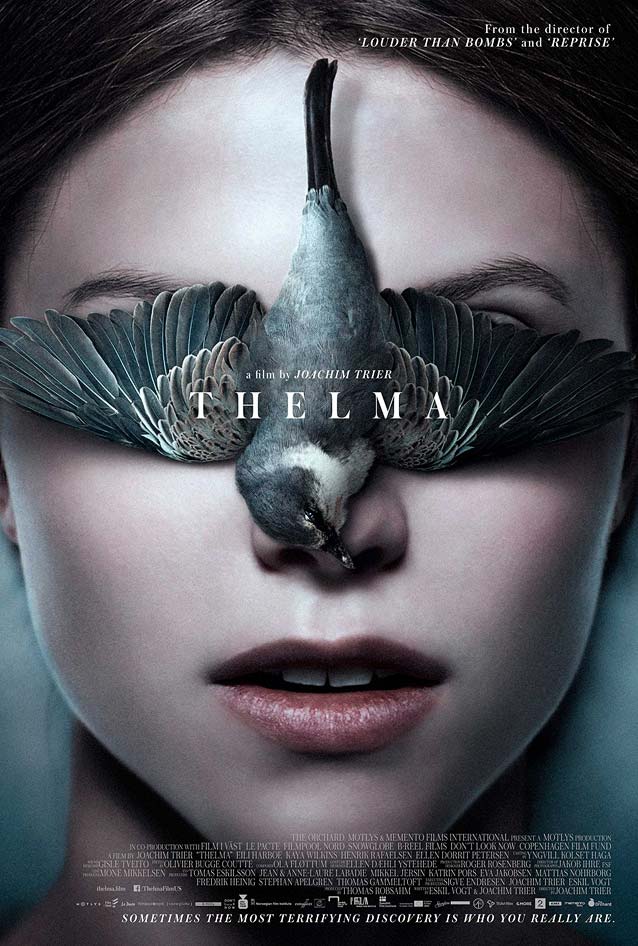
|
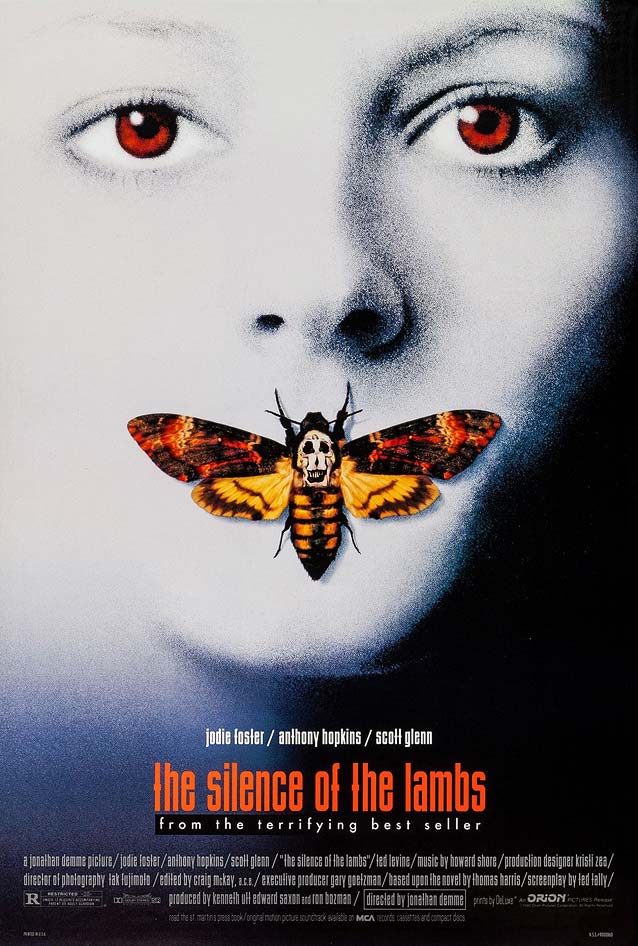
| Even though I originally fell for Stehrenberger’s third entry this month (see below), I quickly became enamored of P+A’s magical American one-sheet for Thelma, a supernatural thriller about a confused, religious young woman. While attempting to deny her feelings for a female friend who’s in love with her, the titular character’s suppressed psychokinetic powers emerge. The slightly unsettling presence of the dead bird lying on Thelma’s face flung me back to my childhood—I associated the image with the zoological engravings in my grandfather’s 1903 encyclopedia. The delicate turn-of-the-century serif type (could it be Paul Barnes’ Austin?) beautifully complements the hyperrealistic painting. You can find similar refinement in the larger optical sizes of families like Benton Modern, Escrow, or Miller. An observation: it’s better not to letterspace lowercase characters, but if you decide that you really must, be sure to deactivate the Ligatures feature; see “a film by” right above the title for an example of what happens when such details are overlooked. This poster also reminded me—in a good way—of BLT Communications’ equally splendid and iconic key art for The Silence of the Lambs. |
|
Most Beautiful Island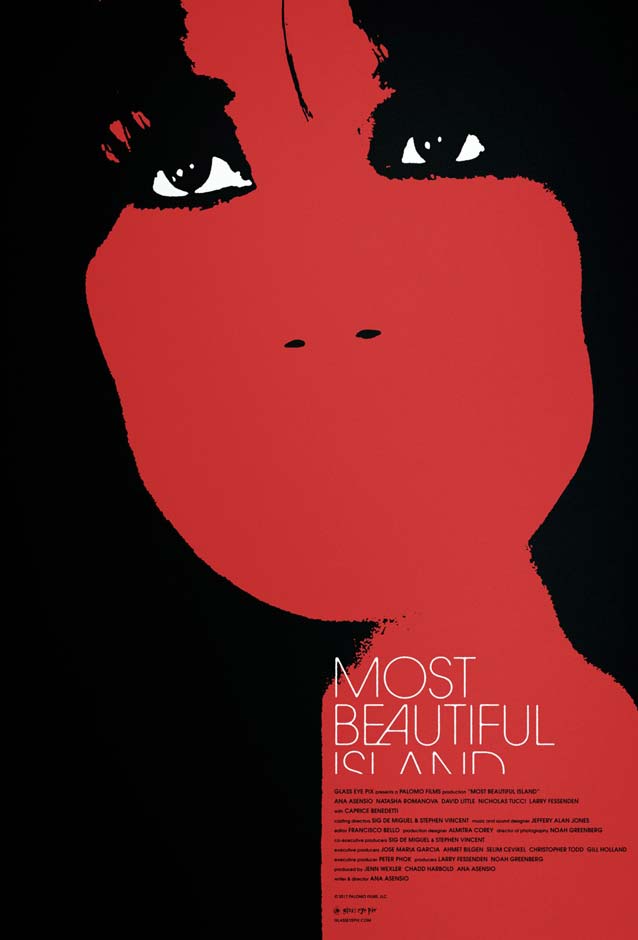
|
Bitch
|
The Final Year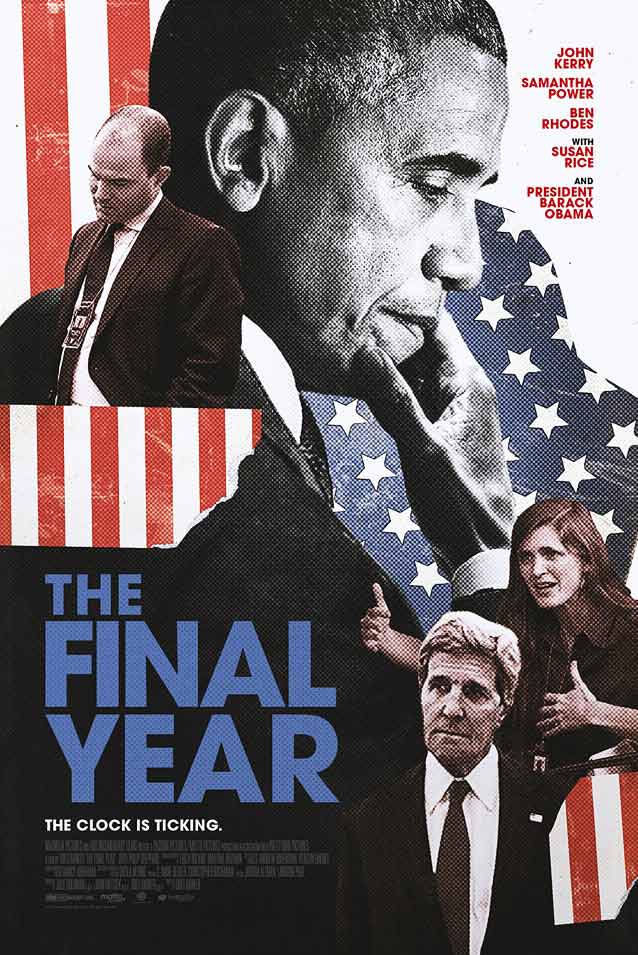
|