ScreenFonts_201804_2-1_lede.jpg

ScreenFonts: April 2018

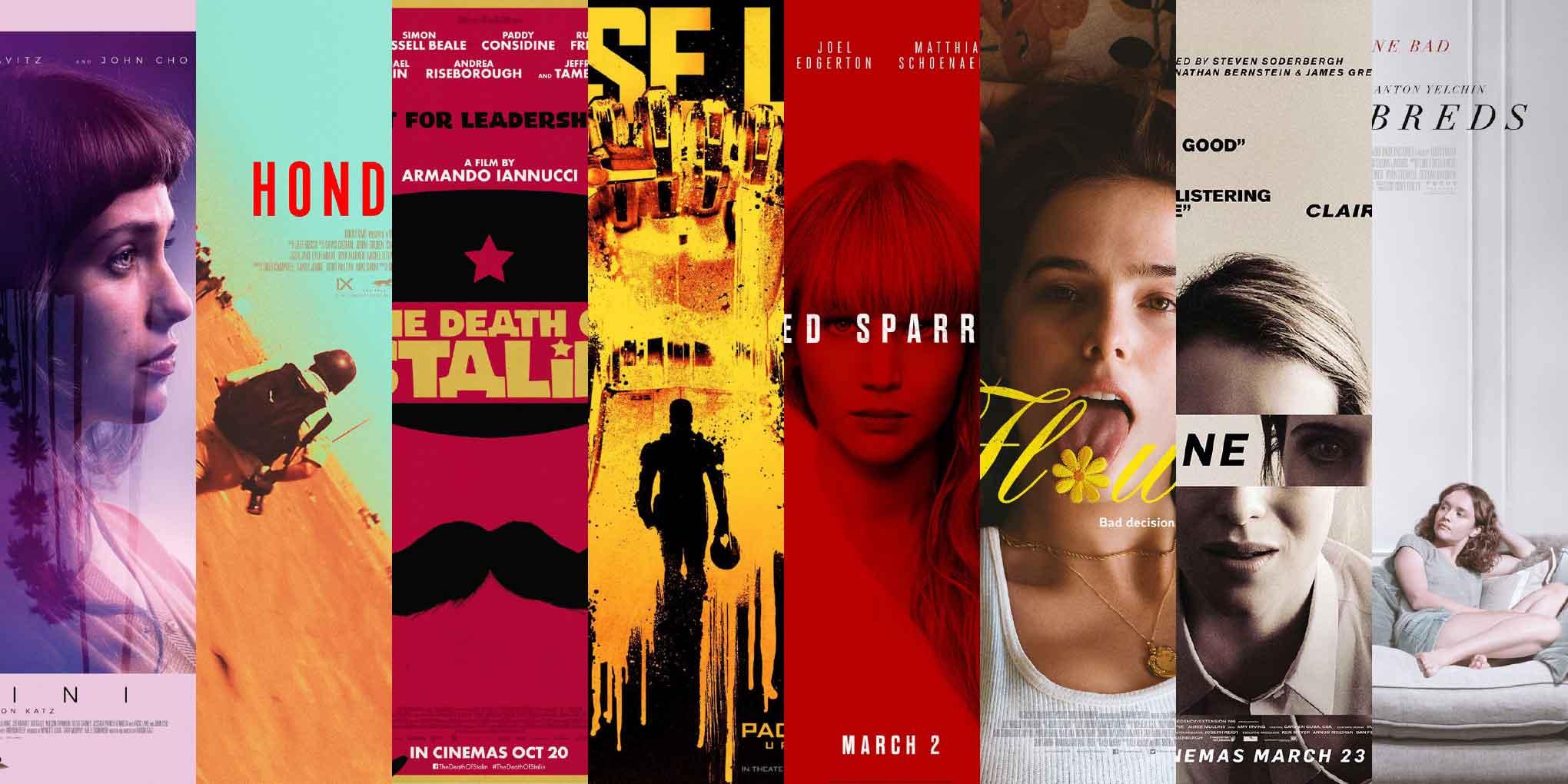
This episode features posters for Gemini, Hondros, Pacific Rim: Uprising, The Death of Stalin, Red Sparrow, Flower, Thoroughbreds, and Unsane, with some interesting interactions between the characters (the type) and the characters (the people.)
This month, the latter half of the posters in my selection feature type that interacts with the scene portrayed, either as a physical object or a virtual presence. This strategy, when it doesn’t feel forced and is well executed, injects wit into a design, elevating the artwork to a higher level.

Gemini

AllCity’s US one-sheet for Gemini
© 2017 Neon. Key art by AllCity.
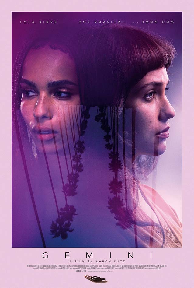
Another common tactic is turning (part of) the world upside down in a poster, which skews the audience’s interpretation, sending a subliminal signal that something is off. In Gemini, the complex relationship between a tenacious personal assistant and her Hollywood starlet boss is tested by a heinous crime. By flipping the classic image of leggy palm trees lining the Hollywood avenues on its head and saturating the artwork in dark purple and pink, AllCity fabricated a sinister, slightly disorienting atmosphere. The handgun at the bottom may seem like an afterthought, but it plays a vital narrative role in this dreamy US one-sheet. The pared-down capital G in the geometric sans used on the poster is less common. Zeitung looks just as pure and evenly balanced, but with a smidgen more tension in the curves. Stainless’ letterforms are even tenser, to the point of being superelliptic.

Hondros

Poster for Hondros
© 2017 Entertainment Studios Motion Pictures.
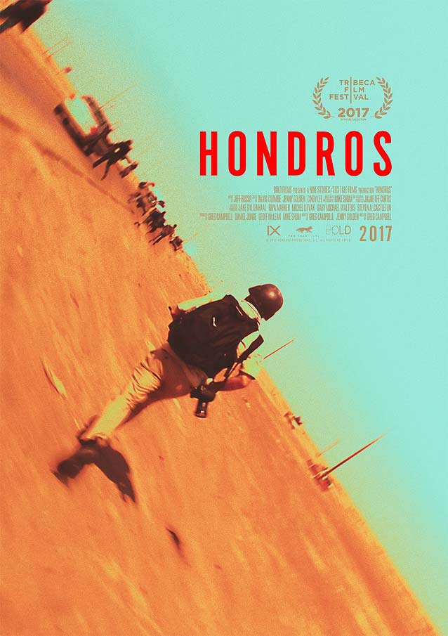
Instead of inverting an image, tilting it sideways can be just as effective. Directed by Greg Campbell, Hondros paints the life and career of Chris Hondros, the American war photographer killed while covering the 2011 Libyan civil war. The theatrical one-sheet focuses on the man behind the pictures, quite literally—it adopts the vantage point of someone following Hondros in full protective gear running through a conflict zone. The tilted image and subtle concentric blur not only conjure up a sense of urgency and danger; they also create a gorgeous diagonal composition in intense orange and aquamarine. The red compact sans serif used here beautifully complements the image. Titling Gothic FB Skyline comes maddeningly close; Benton Sans Extra Compressed and Interstate Compressed have a little more roundness in their character shapes.

Pacific Rim: Uprising

LA’s teaser for Pacific Rim: Uprising
© 2018 Universal Pictures. Key art by LA.
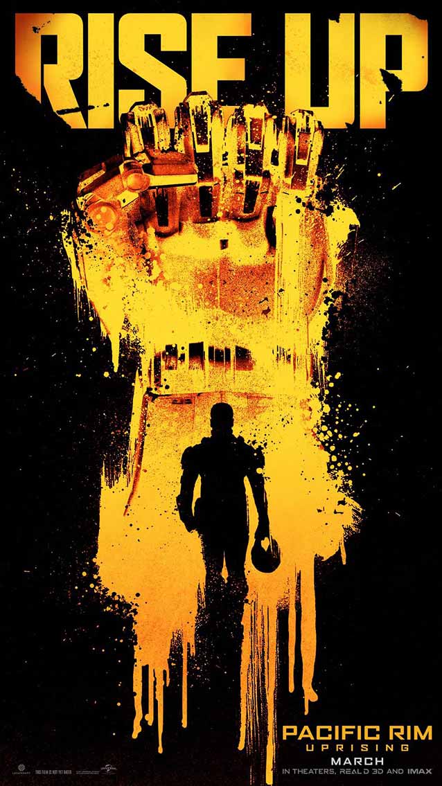
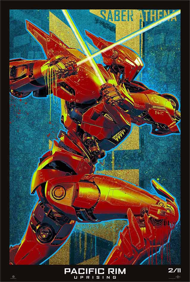
War on an entirely different—dare I say gargantuan—scale emerges in the clash between giant Jaeger robots and a new Kaiju threat in the sophomore sci-fi feature Pacific Rim: Uprising. LA cleverly plays off the youthfulness of the new generation of Jaeger pilots by appropriating the visual language of graffiti, stencil art, and revolutionary graphics for this teaser. Bright yellow splashes of paint contrast with the sharply delineated anatomy of the raised robot fist. This universal symbol for uprising references the movie title, and nicely frames the knocked-out silhouette of one of the young protagonists, helmet held casually in one hand. Agency FB’s forceful features make the perfect typographic foil for the bold art. Its forty-nine styles—seven weights, each in seven widths— make it possible to fill in virtually any area with tightly fitted text.
LA’s Gipsy Avenger character poster for Pacific Rim: Uprising
© 2018 Universal Pictures. Key art by LA.
LA’s Saber Athena character poster for Pacific Rim: Uprising
© 2018 Universal Pictures. Key art by LA.
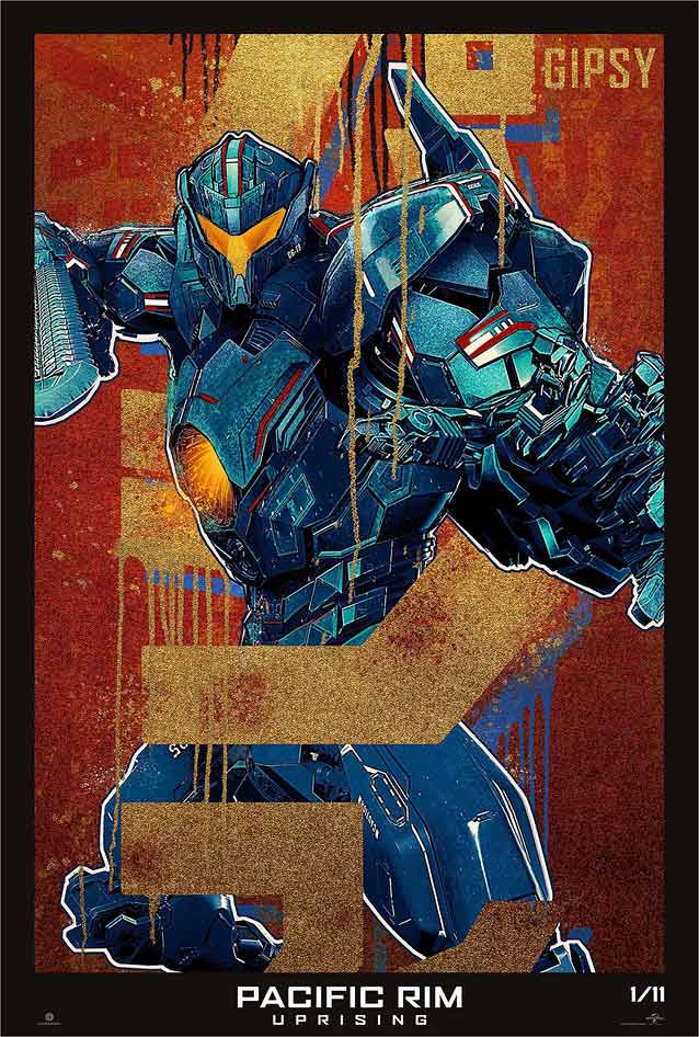
Pacific Rim: Uprising’s expansive collection of marketing collateral (just shy of eighty visuals on GoldPoster) includes a series of stylish character posters merging metallic precision with grainy textures and organic paint streaks.

The Death of Stalin

AllCity’s teaser one-sheet for The Death of Stalin
© 2017 IFC Films. Key art by AllCity.
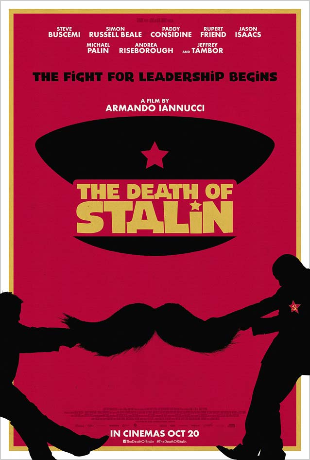
More revolutionary graphics appear in AllCity’s teaser one-sheet for The Death of Stalin, a comedy set during the Soviet dictator’s last days. In the minimal illustration, Stalin’s iconic mustache serves as the rope in a game of tug-of-war, a humorous metaphor for power struggle and the regime’s chaos after his death. I have reservations, though, about the Cyrillic De subbing for the capital A; in my opinion, it verges on cultural appropriation. How culturally insensitive is this fake Cyrillic to native speakers? Is it acceptable to allude to other cultures by incorporating their scripts’ letterforms into a Latin context? When in doubt, consult native speakers. Listen to their perspective and be sensitive to their experiences. The fat sans serif is a staple for comedies. Asphalt has a similar joyous, casual quality. Personally, I would have preferred to see a stronger typographic statement. The culturally appropriate and period-perfect Pilar would have looked absolutely smashing in this design.

Red Sparrow

InSync Plus’ teaser for Red Sparrow
© 2018 Twentieth Century Fox Film Corporation. Key art by InSync Plus.
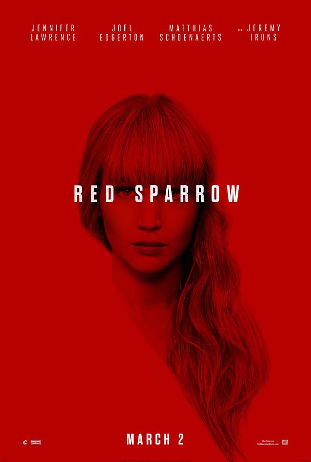
The first example of sophisticated interaction between type and image in this month’s selection can be found in InSync Plus’ teaser for Red Sparrow. In this spy thriller, a ballerina is recruited to “Sparrow School,” a Russian intelligence service that teaches her to use her body as a weapon. The poster is superb in its simplicity. Jennifer Lawrence’s monochrome red portrait is interrupted by the movie title crossing her face. The knocked-out line of white type is a brilliant typographic metaphor for the spy theme: the space between the two words leaves just enough room for her eye to peek through the text, as she scrutinizes the viewer while remaining anonymous. The straight-sided, squarish narrow sans works just as well to suggest Russia, as it references the constructivist art movement that had a very strong following in that part of the world. Try Tasse for a Weimaresque touch.

Flower

Gravillis-Inc.’s theatrical one-sheet for Flower
© 2018 The Orchard. Key art by Gravillis-Inc.
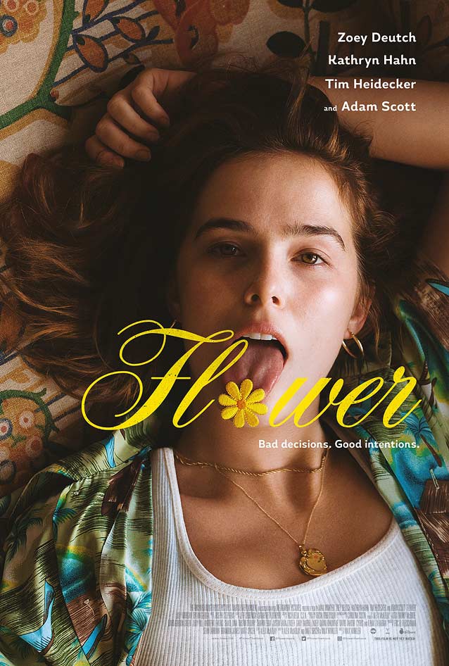
Gravilis, Inc. takes the interaction between type and character one step further in their splendid theatrical one-sheet for Flower. The o in the movie title takes the form of an actual embroidered flower resting on the girl’s tongue, stuck out in a way that is both defiant and sensual. This deftly ties in with the character she plays: a sexually curious teen who forms an unorthodox kinship with her mentally unstable stepbrother. The flower adds a whimsical touch to this candid image. As viable alternatives to the typeface used for Flower’s title, Type Network offers two exquisite families based on copperplate scripts: Occupant Fonts’ Novia and Retype’s Medusa. Biscotti and Krul are further removed, but equally delicate and refined. The supporting typeface, the humanist sans Magallanes, exhibits the same calligraphic traits as BigCity Grotesque, Newson, and Laski Sans.

Thoroughbreds

Arsonal’s poster for Thoroughbreds
© 2018 Focus Features. Key art by Arsonal.
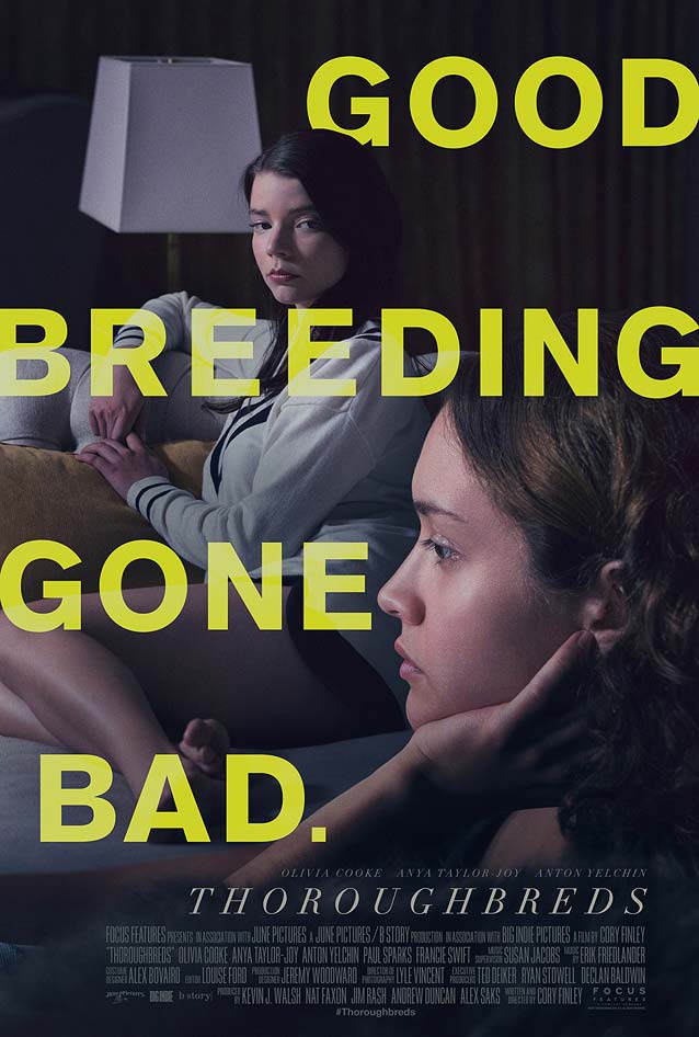
We find more teens gone wrong in Thoroughbreds, a tale of two upper-class girls in suburban Connecticut who, upon rekindling their unlikely friendship after years of growing apart, hatch a sordid plan. Arsonal plays games with our perception. Having the head of the girl in the back block part of the G suddenly adds dimensionality to the type. The tagline almost looks like it’s in the physical space instead of floating on top of the photograph. The typeface is Akzidenz-Grotesk, recognizable by—among other things—the straight leg on the R. Neue Haas Grotesk, the most faithful digitization of the original Helvetica, offers the same kind of straight leg as a stylistic alternate. If you prefer a more contemporary alternative, take a look at CSTM Fonts’ daring Navigo.
Arsonal’s poster for Thoroughbreds
© 2018 Focus Features. Key art by Arsonal.
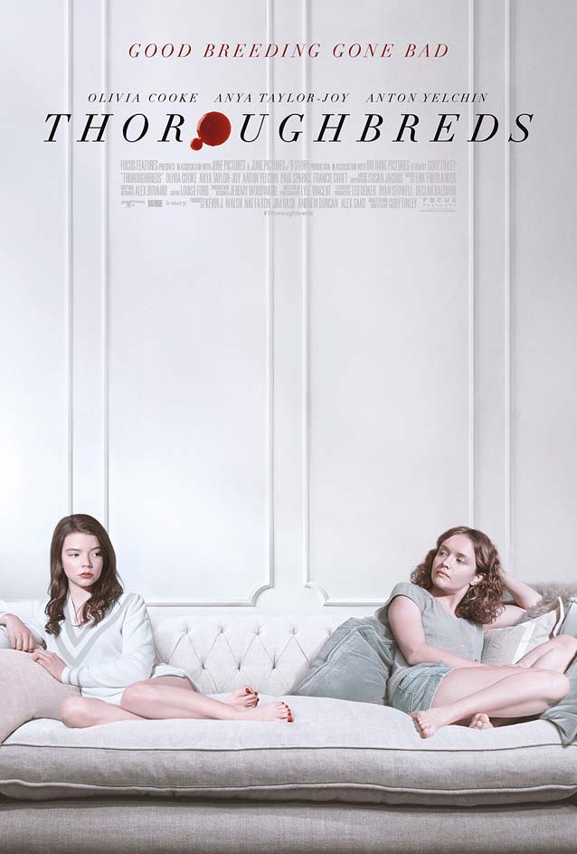
Similar to what Gravillis, Inc. did with the flower for Flower, Arsonal turns the second o in Thoroughbreds’ title into a drop of blood. This simple and efficient intervention helps communicate the movie’s themes and storyline. The poster makes excellent use of whitespace to build an elegant triangular composition with a refined didone face at the top. Matthew Carter interpreted Bodoni as Stilson, also available in a display version for those extra-fine hairlines. Other typefaces with delicate hairlines include Freight Big, Escrow Banner, Miller Banner, and Benton Modern Display.
Arsonal’s poster for Thoroughbreds
© 2018 Focus Features. Key art by Arsonal.
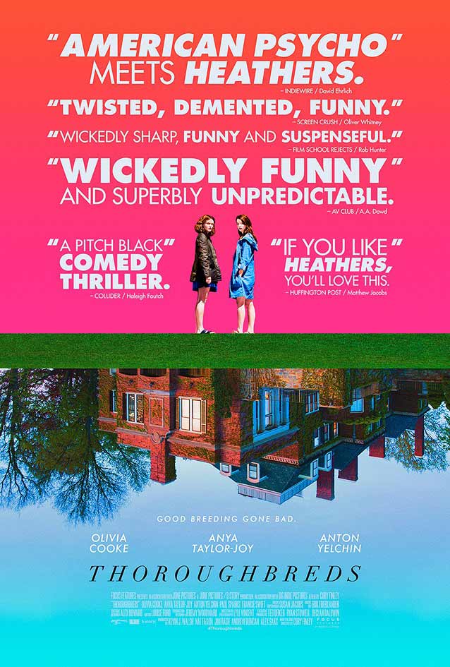
We come full circle with Arsonal’s glorious third variant poster. Here, the upside-down house insinuates that sinister events unfold inside. This strategy also allows the girls to be on the same canvas without the two elements interfering with each other. The saturated colors add up to a striking poster that is both bold and refreshing. If you agree that Futura is grossly overused, have a gander at New Hero, a contemporary take on the geometric sans genre that has an even wider weight range, from Hairline to Super.

Unsane

LA’s poster for Unsane
© 2018 20th Century Fox. Key art by LA.
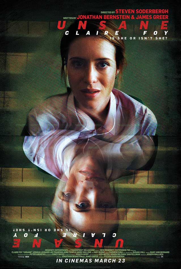
From teens to young women in trouble: Unsane tells the story of a woman confronted by her greatest fear when she is involuntarily committed to a mental institution. LA’s theatrical one-sheet duplicated and rotated Claire Foy’s portrait to symbolize the central theme: is her fear real (the top part) or a product of her delusion (the distorted upside-down part)? I can’t help but find this solution a little bit too on the nose; furthermore, the hectic colors and visual noise make the poster look very busy, even a little messy.
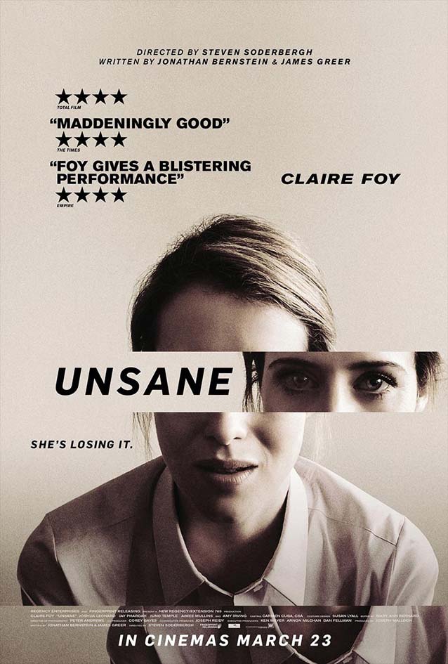
Poster for Unsane
© 2018 20th Century Fox.
LA’s alternate poster shows a much stronger solution. The movie title pushes part of the portrait out of whack to indicate the young woman’s mental distress. The monochrome image and simple black type don’t get in the way, allowing this simple graphic intervention to shine. It reminded me of the exceptional poster for Brothers from almost a decade ago. Cutting up a photograph and judiciously moving parts around can be such an elegant metaphor for a variety of concepts, and this poster nails it. The typeface is a bit of a mystery. I at first suspected an American gothic like Benton Sans, but now I’m pretty sure it’s Mário Feliciano’s Flama.
Me, I am anything but unsane. Of course, that is precisely what any crazy person would say, so there are no guarantees. Next, follow me at your own risk on my trip through The Leftovers, then come back in a few weeks for the next ScreenFonts installment—if you dare. Bald Condensed, né Yves Peters, is a Belgian-based rock drummer known for his astute observations on the impact of letterforms in the contemporary culture-sphere. A prolific writer on typography, he has a singular knack for identifying the most obscure typefaces known to humankind.