
OpenType at Work | Standard Ligatures
What are ligatures?
Ligatures are two or more letters that are connected. These connections can serve different purposes: they can either solve a problem, have an aesthetic function, or be purely ornamental. Five types of ligatures are defined in the OpenType feature list (each OpenType feature is identified by a four-letter abbreviation): Standard Ligatures (liga), Discretionary Ligatures (dlig), Historical Ligatures (hlig), Contextual Ligatures (clig), and Required Ligatures (rlig). The first three are typically activated by the user; clig and rlig work under the hood. This article will cover Standard Ligatures. They were the only ligatures supported in legacy PostScript Type 1 typefaces before the arrival of OpenType—but on a software level, not as a typographic feature.
The ligatures in Font Bureau’s Farnham Headline solve collisions between the hook on the lowercase f and the tittle over the i or the top serif on the l (among others).
Collision hazard
The concept of ligatures is commonly explained by showing the letter sequence fi, with the end of the hook[1] on a lowercase f encroaching on, or even colliding with, the tittle[2] over the i. To keep these two elements from clashing, many designers draw a tidy fi combination as a single glyph[3]. They alter the hook on the f so that its end merges with the tittle over the i, and often also connect the cross stroke[4] of the former with the top serif of the latter. The other classic ligature is the fl combination in a serif face, where the hook on the f joins the top serif on the l.
Some designers like to add a little spice to their ligatures. Victoria Rushton extended the stem of the second f with a downward hook in the ff ligatures for Marcia. Activating Stylistic Set 3 (SS03) lends them a more conservative form.

Ligatures don’t only appear in serif faces. Typetr’s Productus (Proforma’s sans serif sibling) has an f with a considerable overhang, a common feature in humanist sans designs, hence the need for ligatures. Even though the l has no top left serif, Petr van Blokland cleaned up the connection with the f by drawing fl ligatures.
Two (or three, or four, or… ) become one
Now that, thanks to the OpenType format, the capacity of fonts has vastly increased, there is virtually no limit to the number of ligatures type designers can include in their fonts. When the Standard Ligatures feature encounters particular letter sequences, it replaces them with the corresponding ligatures. No need to worry about the searchability of your copy. Early implementations of ligature substitution in apps like Illustrator and QuarkXPress replaced a letter sequence with its corresponding ligature, physically altering the word. By contrast, the Standard Ligatures OpenType feature only changes the sequence’s visual representation. Spell-checking will still work correctly, and your text remains searchable.
Instead of connecting hook and tittle, Cyrus Highsmith went in the opposite direction with Gasket, shortening the hook and the cross stroke on the f in the fi and fj ligatures to avoid fussiness. He did connect the cross strokes and correct the spacing in the ft and ff ligatures, though, and alternated long and short versions of the f in the latter. The fj ligature uses a short f to avoid confusion with the j.
Fear of commitment
Not every typeface design calls for ligatures. Only when letters like the f have a significant overhang[5] are they necessary. However, even if your typeface design has no real need for ligatures, that doesn’t mean you can’t have fun with them. Cyrus Highsmith, for example, plays with the atypical f that plunges below the baseline[6] in Gasket, alternating a long and a short version in the ff ligatures, and connecting cross strokes but not hooks and tittles.
Because David Jonathan Ross designed Gimlet to have no need for ligatures at all, the Standard Ligatures OpenType feature is missing entirely from the fonts in this impressive extended family.

German typographic rules recommend avoiding ligatures when they connect different neighboring morphemes. In the examples above set in Richard Lipton’s Meno, the top word, Schneeflocken (snowflakes), consists of the two morphemes Schnee (snow) and flocken (flakes). The fl ligature is allowed because it is situated within the morpheme flocken. The bottom word, hinauflocken (to lure upstairs), consists of the two morphemes: hinauf (up, upwards) and locken (to lure). In this case, an fl ligature would connect the final letter of the first morpheme with the initial letter of the second morpheme to create the existing (but incorrect) morpheme flocken and create confusion.

Richard Lipton’s Meno offers users both options: either an extended ligature set, or a non-kerning f that makes ligatures redundant.

Aside from the usual f-combinations, Richard Lipton also uses ligatures to solve potential connection problems in his elegant stylized brush script Tangier. Even though it looks quite ornamental, the Th belongs to the Standard Ligatures.
Dangerous liaisons
Connected scripts are a typeface category where Standard Ligatures can help optimize connections between letters. Just like in handwriting and calligraphy, letters can adopt different shapes to make the best possible transitions to adjacent letters. A typical example is the lowercase o. While most letters connect at the baseline, the outgoing stroke on the o is often situated higher up, at the middle or the top of the letter, so the shape of the succeeding letter needs to change accordingly. There are a number of ways to solve this problem; some designers choose to draw ligatures for common letter combinations to ensure smooth connections. Whether you prefer your ligatures to be self-effacing or exuberant (or even non-existent), typeface designers create them to make your text look cleaner and more balanced, with a steady rhythm and smoother flow. Ultimately it comes down to personal taste. However, we recommend you activate the Standard Ligatures in your text processor or design app before you make a decision. They are a first, easy step to achieving professional-looking typography.Support
Standard Ligatures are universally supported in all major apps and browsers.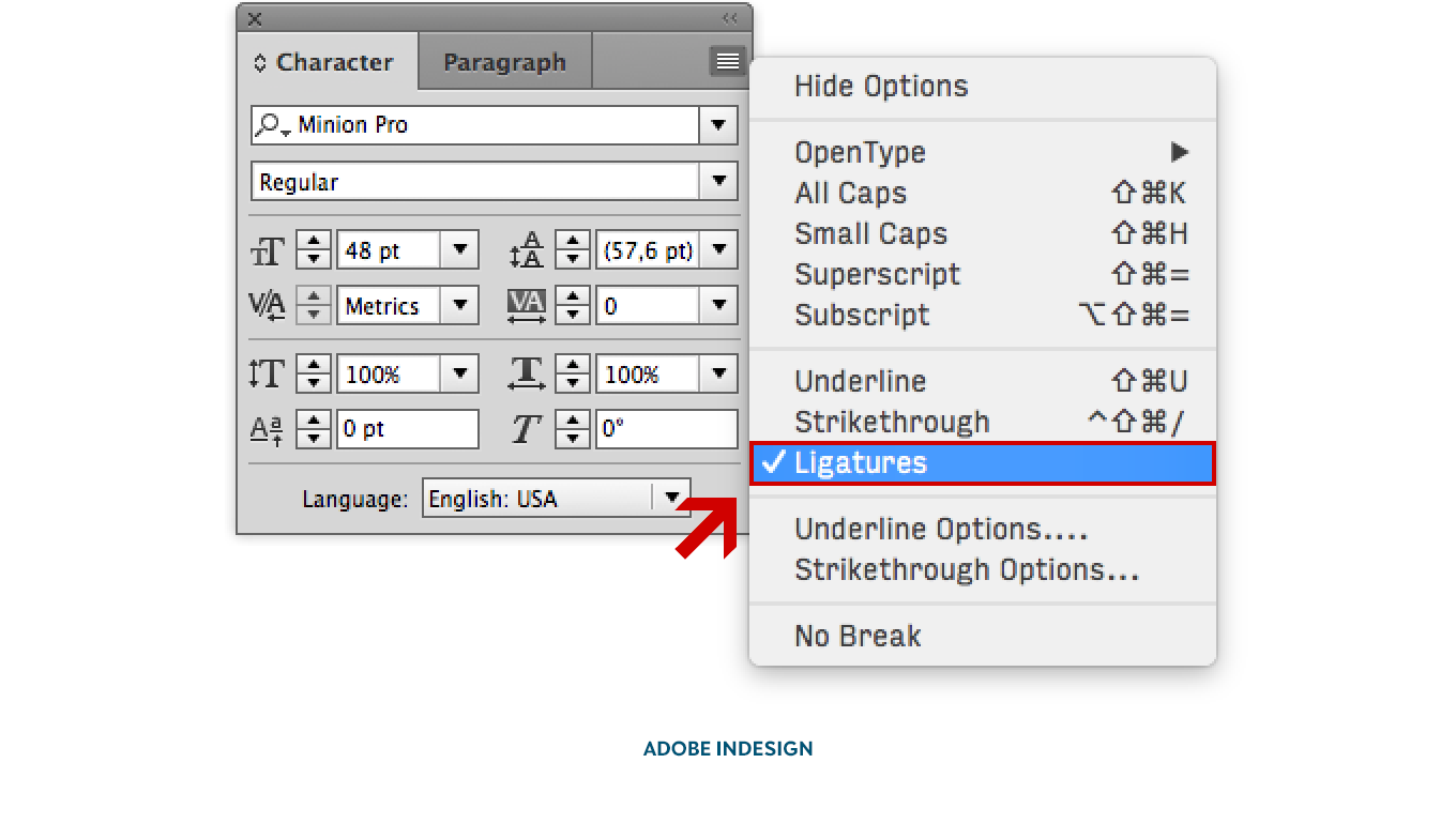
Activating the OpenType feature Standard Ligatures in Adobe InDesign CC.
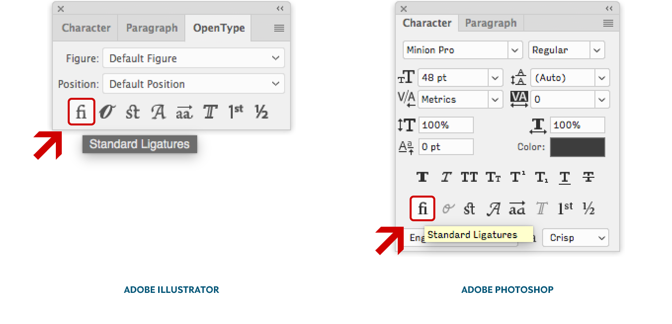
Activating the OpenType feature Standard Ligatures in Adobe Illustrator CC (left) and Photoshop CC (right).
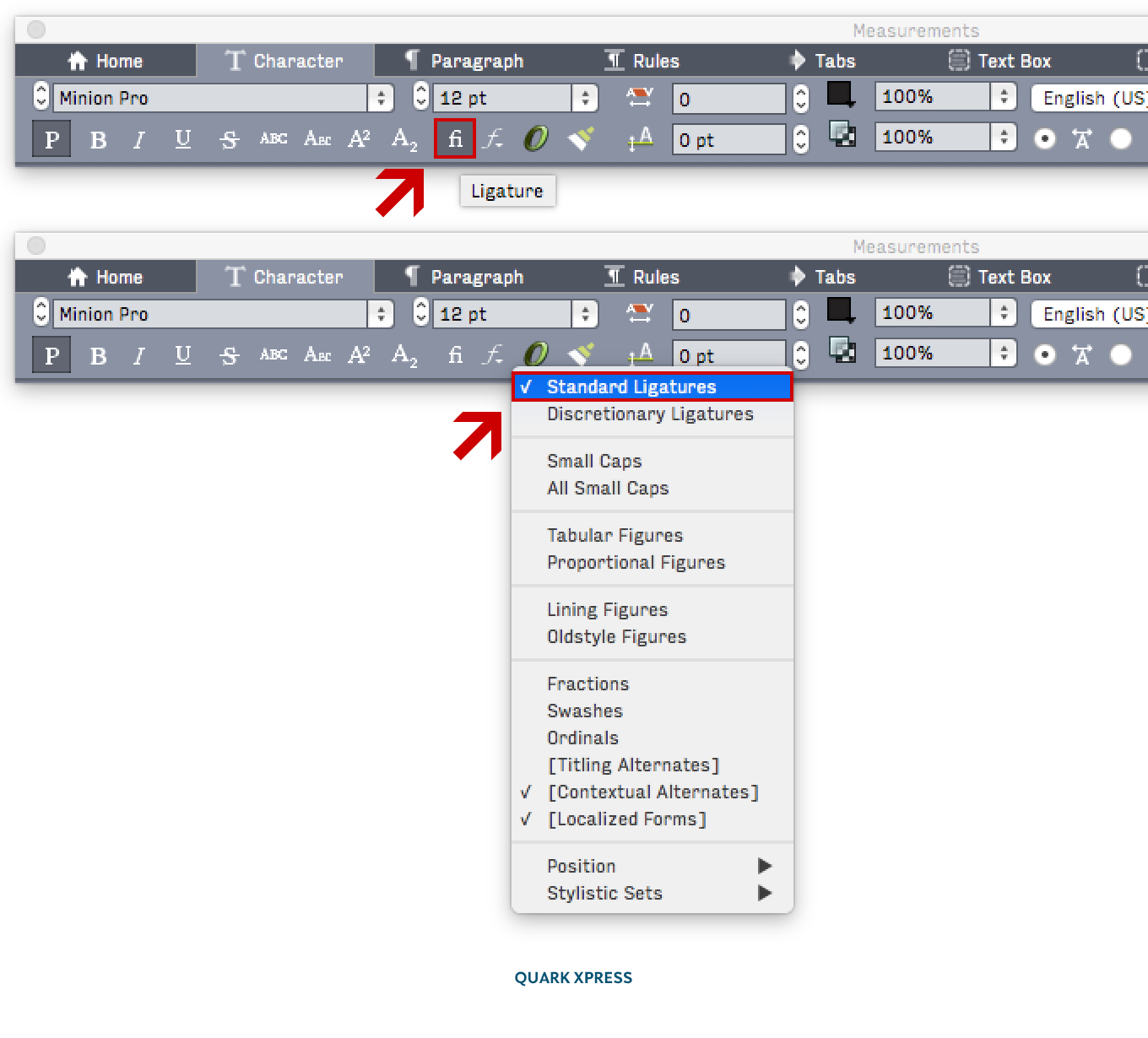
The OpenType feature Standard Ligatures in Quark XPress can be activated in either the Character control bar or in the OpenType drop-down menu.
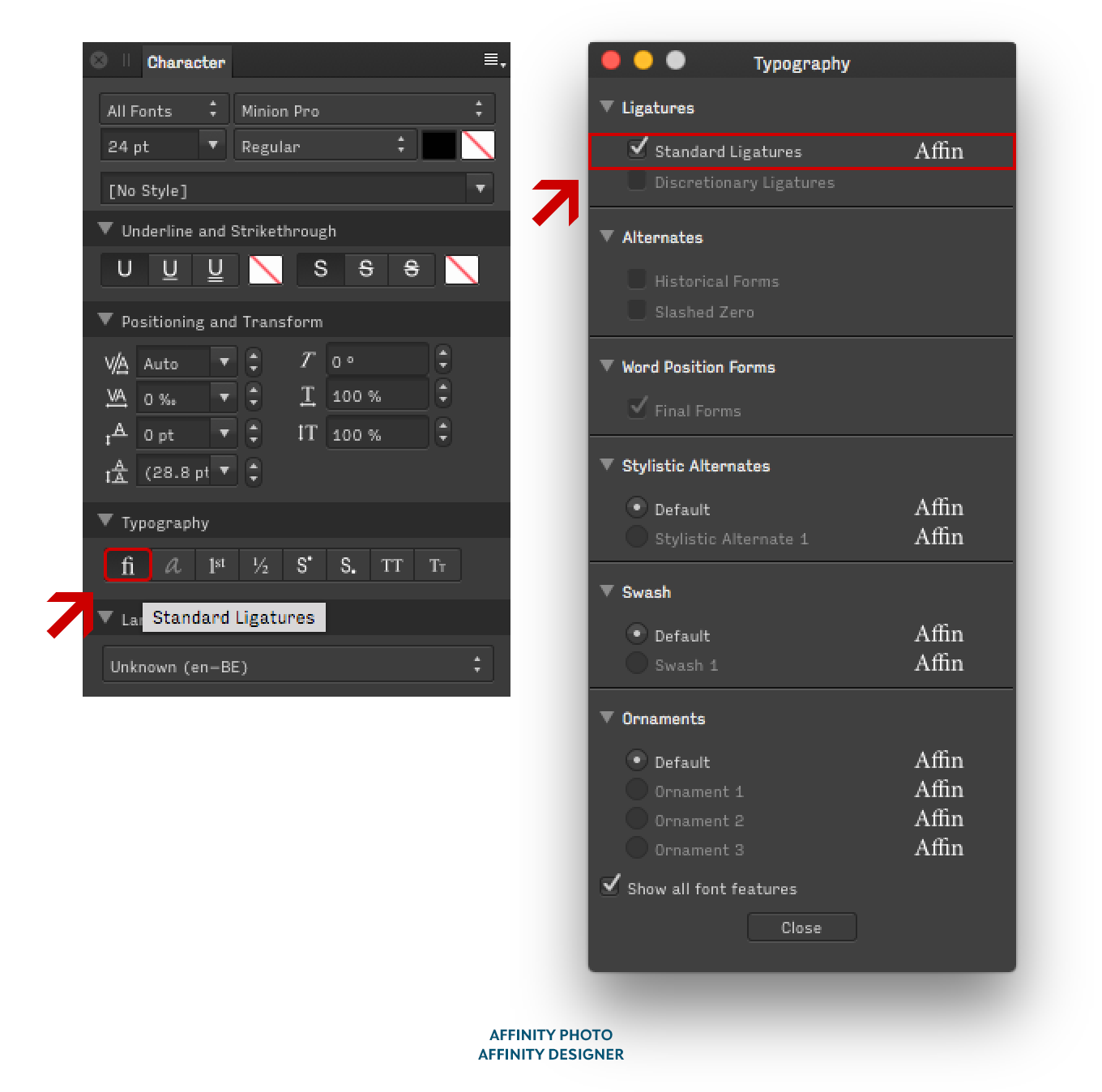
The OpenType feature Standard Ligatures in Affinity Designer and Photo can be activated in either the Character or the Typography window.
Notes
1 | A hook is the curved extension of the stem in letters like f, j, and J. |
2 | A tittle is the dot on the lowercase i and j. |
3 | A glyph is the visual representation of a character, be it a letter, a figure, a punctuation mark, a ligature, or any other alphanumeric character. The capital A and lowercase a are two different glyphs representing two different characters; but if, for example, a capital letter A exists in a standard form and as a swash variant, these are two different glyphs for the same character. |
4 | A cross stroke is the (usually horizontal) stroke that intersects the stem of letters like f and t. |
5 | Overhang is the amount any letter extends beyond its expected boundaries. For example, if the hook on the f has a lot of overhang, it will intrude into the space of the subsequent letter. |
6 | The baseline is the imaginary line on which letters rest. |
Bald Condensed, né Yves Peters, is a Belgian-based rock drummer known for his astute observations on the impact of letterforms in the contemporary culture-sphere. A prolific writer on typography, he has a singular knack for identifying the most obscure typefaces known to man.