Explaining Grades, the trick to a great reader experience
First, what the heck is grade? Fair question. It’s like weight, except it doesn’t add any length. Yves Peters explained the difference between grade and weight best in his article on Richard Lipton’s Bennet:
Weights are meant to create differences between type styles, to allow readers to easily distinguish one type style from another. (Think of a bold word in a paragraph of text set in a lighter weight.) Grades, however, are designed to do the exact opposite: they make type in different environments appear similar. Their weight increases in a different way to preserve the overall proportions and contrast of the characters.
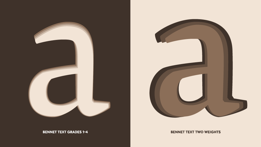
From Yves Peters’s article on Bennet: The weight of letterforms increases in a fundamentally different way in grades than in weights. On the left, the grades one through four of Bennet Text; on the right the Regular, SemiBold, and Bold weights of Bennet Text Two, superimposed.
As mentioned, grades were originally developed for print to accommodate various qualities of paper stock. Absorbent newsprint, for instance, is known for its ink spread. Anyone who has letterpress printed, too, knows that the inked impression on the page always looks thicker and heavier than the face of the type itself. On the flip side, high-quality, glossy paper is more accurate to the type design, with very little ink spread.
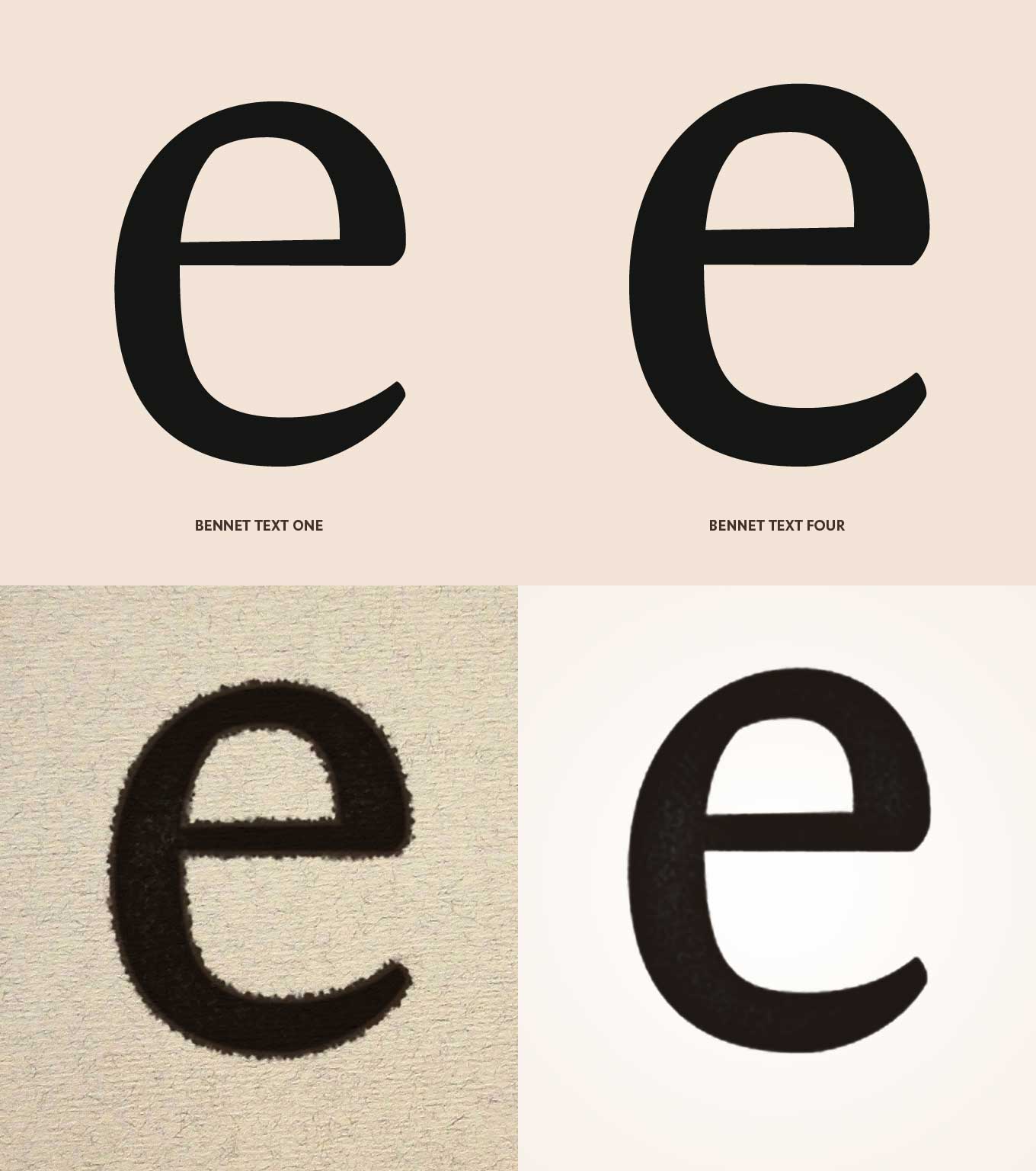
From Yves Peters’s article on Bennet: In the top row of this simulation, you can see that Bennet Text Grade 1 is noticeably lighter than Bennet Text Grade 4. The bottom row shows how, due to ink spread, Grade 1 printed on absorbent paper becomes as dark as Grade 4 printed on high-quality glossy paper.
To make up for this—and to make text appear the same across media—type designers developed grades. One well-known example is the Poynter series of fonts designed by Tobias Frere-Jones, published by Font Bureau and available from Type Network.
In 2002, following a study involving The Washington Post, St. Petersburg Times, the Kinston, N.C. Free Press, and papers from Germany, Canada, and Switzerland, the Poynter Institute commissioned a new typeface with four grades, meant to solve the troubles of contemporary newspaper publishers.
Based on Hendrik van den Keere’s Dutch types of the 17th-century, the Poynter type family combined “comfortable familiarity, economy, and readability," according to international news organization consultant Ron Reason.
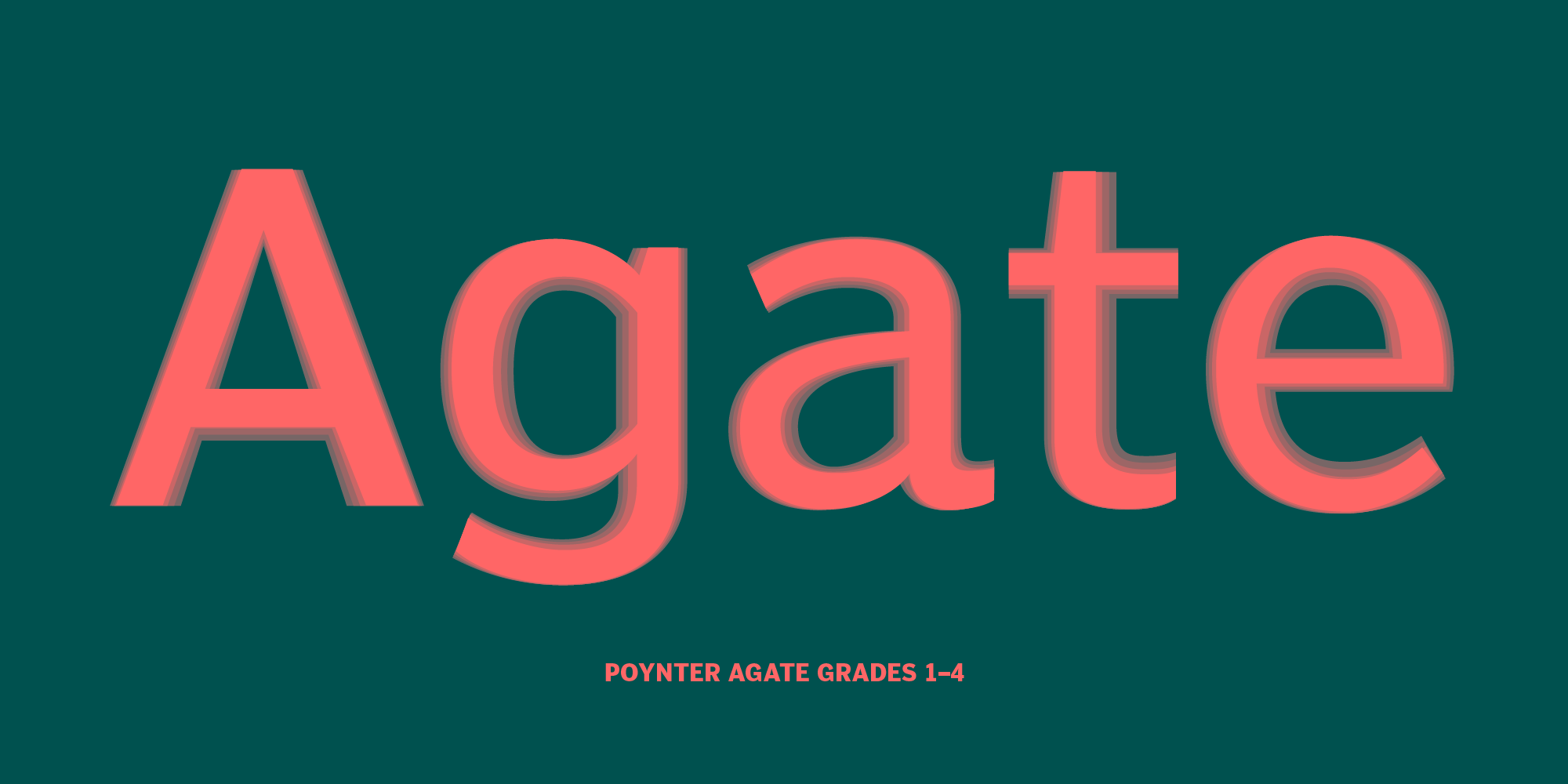
The grades one through four of Poynter Agate regular.
Grades in Digital Design
The appeals for print designers might be obvious, but digital designers—especially those working in user interface and user experience design—have as much to gain from grades. True, there is no ink-spread on a screen; however, in place of that mechanical phenomenon are a few optical illusions resulting from screen technology and varied resolutions.
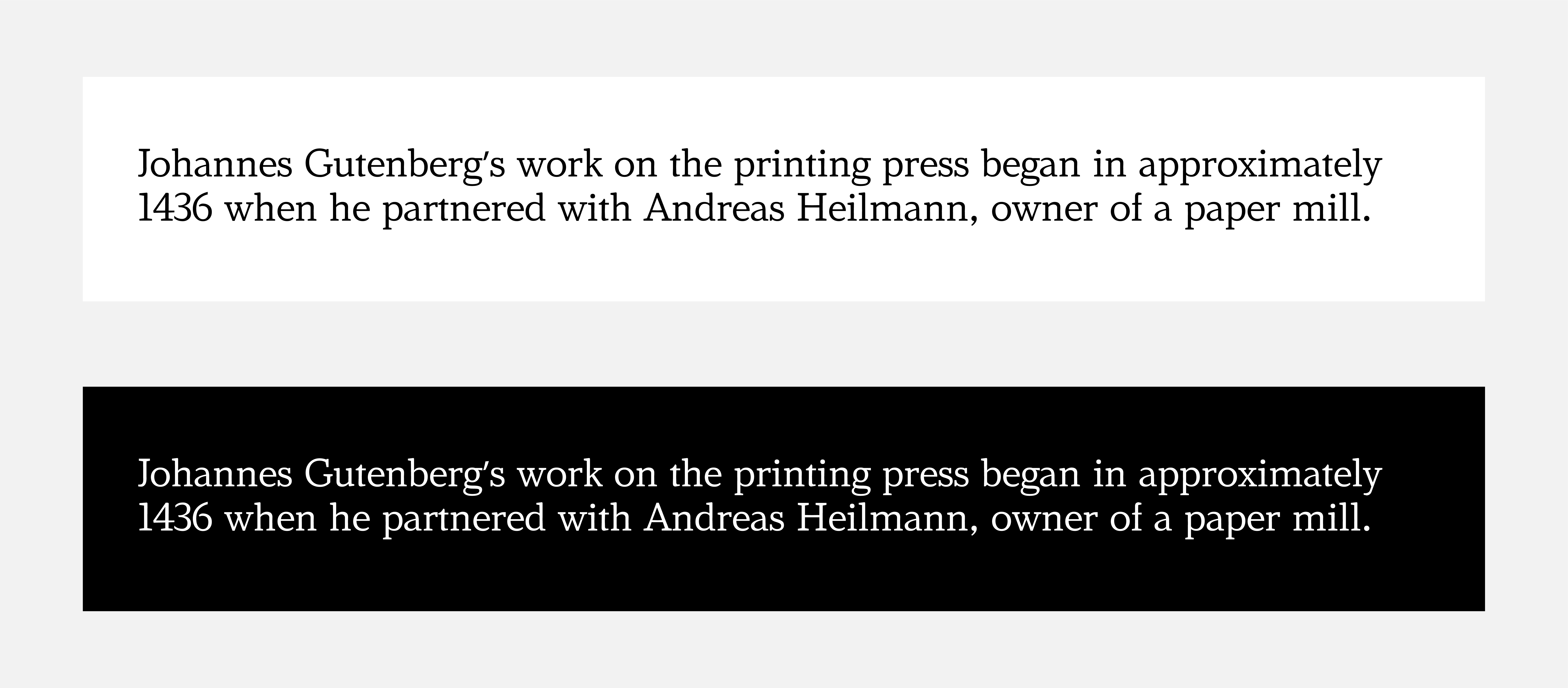
Text at small sizes can be harder to read when the black and white are reversed. The white tends to weaken slightly as the contrast switches on the details of letters. Experiment with this example
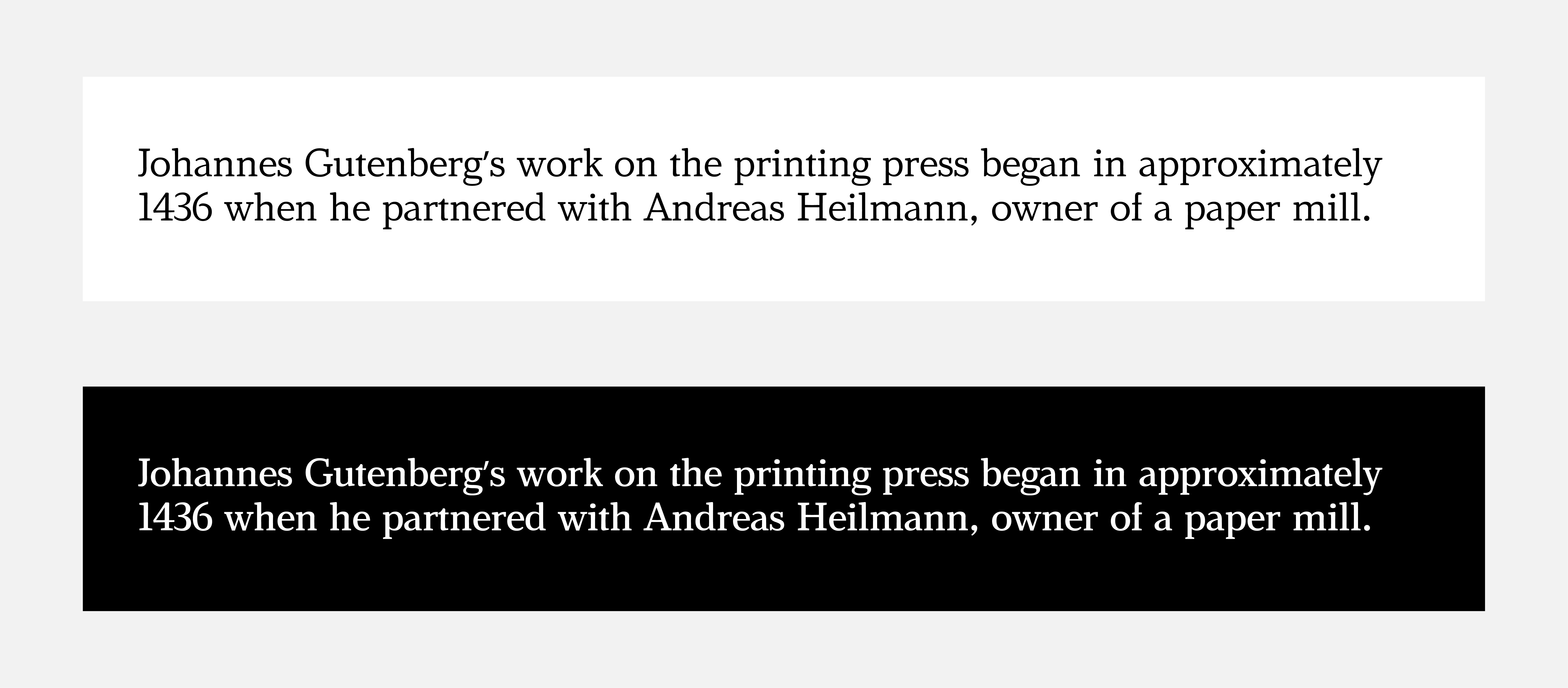
Grades, used even in small amounts, can add the strength of the text back in with no change to format. Experiment with this example
Thanks to additive color (screens produce light, as opposed to printed pages which reflect it), black isn’t usually anywhere close to black, which has odd effects on letters. As written by David Berlow, “Text at small sizes [on screens] can be harder to read when the black and white are reversed. The white [strokes] tend to weaken slightly as the contrast switches on the details of letters.” With the rising popularity of dark modes—just in the past few years has YouTube, Facebook, Windows, and Instagram added them—designers need to perfect the art of setting type in reverse.
To satisfy users whose screens have a lower resolution, some designers might turn to typefaces with optical sizes, substituting low-res for small. While this approach solves most of the issues associated with pixelated screens, it creates new issues in its place. Fonts designed with optical sizes often sacrifice nuance and character at the smaller end of the spectrum—those details would be lost in smaller printed sizes, so they’re enlarged and made more obvious. Using a typeface with multiple grades, on the other hand, allows the design to remain highly legible on low resolution screens while maintaining character and detail. Some typefaces have both optical sizes and grades, proving a robust toolkit for designers confronted with this issue.

From Yves Peters’s article on Bennet: This simulation shows how text grades could adapt to changing ambient light to preserve legibility.
Finally, the prevalence of mobile experiences and the sensors afforded app developers has made possible typographic adjustments based on the environment of the reader. Ambient light and screen brightness, as examples, impact readability in the same way as paper quality. A dark screen or an overabundance of environmental light can reduce perceived contrast, as both dark text on a darkened background and glare have similar results on screens. Dynamically increasing the grade of your displayed typeface can alleviate these problems.
Grades might be rare in type design today, but their benefits become clearer and clearer in an ever-more digital world. Type Network offers a selection of typefaces with grades: Bennet Text by Lipton Letter Design is available in our catalog, graded versions of Poynter, Benton Modern, Miller and others are available by request, and we offer custom typeface design and modification work to satisfy any other need.