Yves Peters demystifies the secret language of movie posters at Adobe MAX 2016 · Type Network
Yves Peters demystifies the secret language of movie posters at Adobe MAX 2016
Yves Peters brings his popular ScreenFonts series of movie poster reviews live to the stage at Adobe MAX on Thursday afternoon, November 3.
By Type Network Staff
Shortly after Yves Peters joined Typophile’s [now defunct] Type Identification Board in 2002, he noticed that there was a real demand from people who wanted to know which typefaces were used on film posters. This inspired him to start writing ScreenFonts, regular reviews of film posters with a focus on the typefaces used in the designs. Originally published on the FontShop BeNeLux blog Unzipped, ScreenFonts was ported to The FontFeed in 2008 when Peters became its editor-in-chief. ScreenFonts quickly became one of the most popular series on the international design and typography blog; now, its latest incarnation will find a permanent home on Type Network.
As Peters became more and more acquainted with the world of film posters through his review series, he started noticing things about the genre, picking up trends and distinguishing specific (typo)graphic tricks. As he further explored the medium, Peters discovered how film posters use their own visual shortcuts as a way to communicate more efficiently with the intended audience. This codified language is not only limited to images and color schemes, but also applied to type styles that identify film genres.
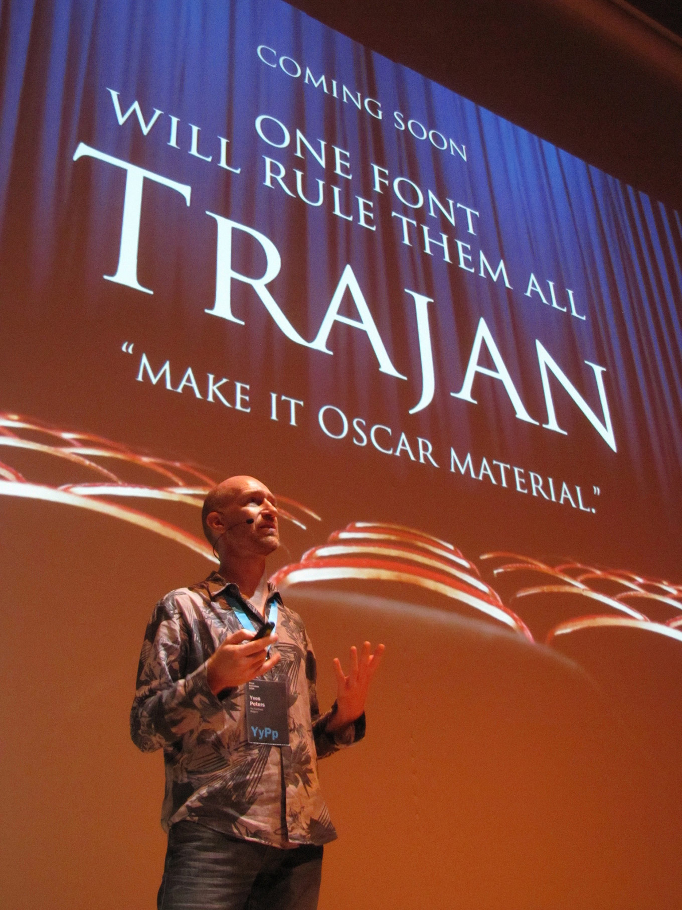
However, one typeface defies all categories—Trajan. Soon after its appearance on the font market more than twenty years ago, the Adobe Original was embraced by Hollywood. Now it seems to grace more movie posters than any other typeface. Its stately and classic character shapes have made it the go-to choice for Oscar-worthy material. After hearing one too many times that Trajan was the “movie poster font” without any evidence to back up this claim, Peters went on an epic journey (pardon the pun) to investigate whether or not Trajan truly was the most-used typeface in the history of cinema posters, and if it really did help films “win Oscars.”
On this fascinating journey into pop culture and popcorn, you’ll learn how letters tell us much more than simply the words they spell out; how we subconsciously translate images, colors, and letterforms into moods and concepts; which typeface styles identify specific film genres; and much more. The story of this investigation will not only make you discover hidden facets of typography, but most of all, as Peters says at the beginning of his presentation: “I will tell you very little that you don’t already know; you simply just don’t realize it yet.”
Join Peters tomorrow, Thursday, November 3, at 4:15 pm Pacific at Adobe Max in Room 5AB for The Secret Language of Movie Posters.