TYPO Labs: variable fonts and beyond · Type Network
TYPO Labs: variable fonts and beyond
Yes, TYPO Labs 2017 tackled more than just variable fonts—but the new technology maintained a constant presence in the background.
By Bald Condensed
The first part of this report focused on the technical aspects of the new OpenType 1.8 specification. Although variable fonts make another appearance in this second and final installment, this part focuses on so-called non-Latin typeface design and development—starting with why the “non-Latin” moniker is so problematic.
A grounded look at variable fonts
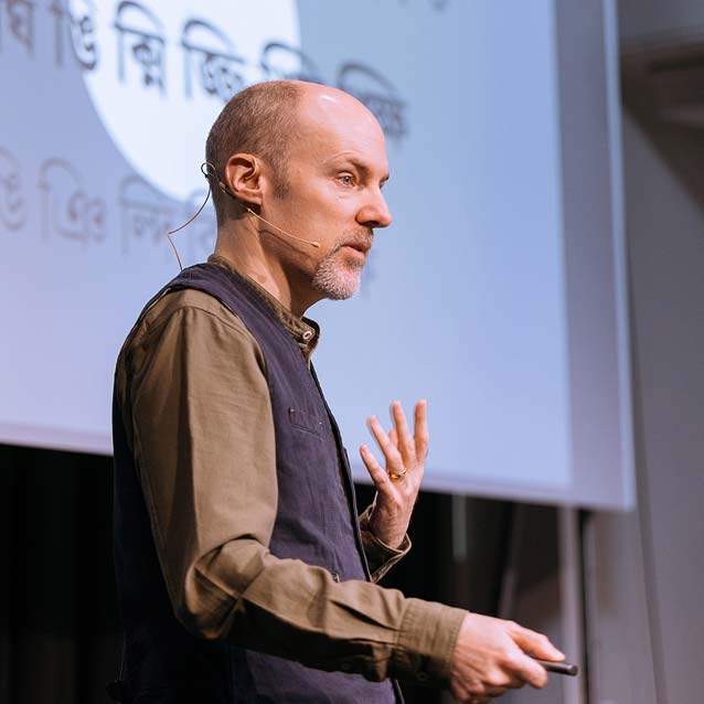
Jean-Baptiste Levée discusses the commercial viability of variable fonts from the perspective of a type designer and type founder. Image courtesy of Norman Posselt/Monotype.
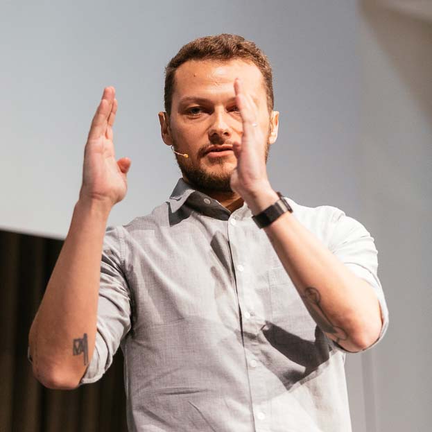
I’ve come to appreciate Jean-Baptiste Levée’s philosophical and slightly irreverent but committed approach to typeface design and typefounding. Because of my work with the Adobe Typography Customer Advisory Board, I found myself nodding along with his opening statement for “A designer perspective on OpenType Font Variations—chances and risks”: many users still struggle with OpenType features, said Levée, and variable fonts will add another level of complexity.
The potential of the new format may blow minds—64,000 axes for interpolation!—but Levée is still waiting for basic updates to the OpenType spec, such as the ability to include more than twenty stylistic sets or use longer font names. The main challenge remains the development of a user interface that makes applying font variations intelligible and intuitive. Beyond that, the new standard has other issues. Marketing, for example, continues to be a thorny subject. How do you price a single font that contains an entire type family within it? How can you make customers understand the superior capabilities and added value of variable fonts without overwhelming them? Even if you don’t share his opinions, Levée’s insights offer food for thought.
TrueType GX and variable fonts pioneer David Berlow explains Font Bureau’s approach to the new format. Image courtesy of Norman Posselt/Monotype.
The commercial aspects of variable fonts also formed the cornerstone of “Business opportunities and challenges in bringing variable OpenType fonts to the market.” Matthew Rechs, director and general manager at Adobe Type and Typekit, Font Bureau’s David Berlow, Ivo Gabrowitsch, director of ecommerce marketing at Monotype, and Alexandra Korolkova, art director at ParaType, took the stage for a panel discussion moderated by FontLab’s Adam Twardoch.
The group debated the perceived value of variable fonts and their advantages over static font formats. But before market-based business discussions can begin in earnest, the difficulty in explaining the new format to users is a problem that must be solved. Although the OpenType format has been around for almost two decades, many customers don’t realize that extras like small caps are often included in the fonts as an OpenType feature. This has led certain foundries to give up and start offering these extras as separate font files again. ParaType is one foundry that takes this pragmatic approach. Their strategy for converting legacy families and assessing their subsequent marketing potential, Korolkova said, is based on the reality of the current market for Cyrillic fonts. Berlow, an early champion of TrueType GX (variable fonts’ precursor), is now spearheading variable font development. His sharp analysis of the current status and promise of variable fonts proved that he continues to be a visionary thinker. He echoed Dan Rhatigan’s opening keynote argument that it is too soon to discuss how best to market variable fonts when more pressing issues must first be resolved.
Learning from the past, working on the future
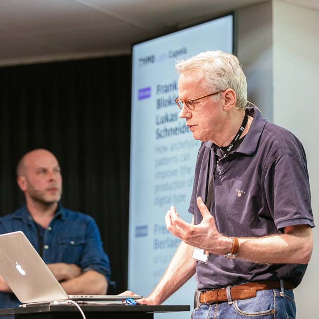
Frank E. Blokland shares the findings of his PhD research. (With Lukas Schneider, pictured in the background.) Image courtesy of Norman Posselt/Monotype.
In “How archetypal patterns can improve (the production of) digital type,” Frank E. Blockland presented findings from his PhD research at Leiden University. Blokland challenges the conventional wisdom that punchcutters relied on their eyes instead of measuring tools. He unearthed the same proportions with different details in different typefaces, and even identical offsets in matrices of different widths.
With this discovery, Blokland concluded that transferring letter drawings to metal was done using standardized widths, with units derived from the stem interval. This method sped up production and simplified justification because spaces could be defined as multiples of units. Exploring the possibility of using this unit-arrangement system in contemporary type production, Lukas Schneider developed a tool he calls Cadenceculator, which applies cadence units to space typefaces efficiently.
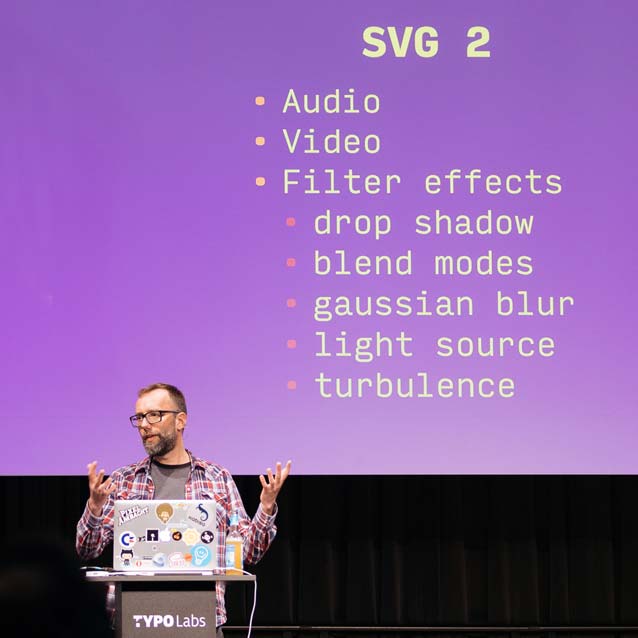
Roel Nieskens followed Twitter’s advice to use DJR’s Input Sans for his slides. Image courtesy of Norman Posselt/Monotype.Roel Nieskens’ light-hearted manner was well suited to his talk, “Exploding emoji and other experiments in web typography.” Retracing his early exposure to typography through arcade games and the Commodore 64, Nieskens made a connection with the new color fonts in SVG format. SVG is a versatile, mature vector format that can mimic and even reuse parts of others—and browsers already “know” SVG. Nieskens delved deep into the technical minutiae of color fonts and mentioned Chromacheck, a tool for determining which color font to serve to specific browsers in order to avoid support issues. LapisLegit checks which features are supported in an OpenType SVG font. His demonstration with an emoji proved that variable color fonts are technically possible.
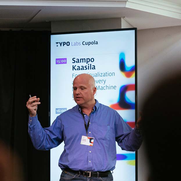
Sampo Kaasila reveals that artificial intelligence has led to new breakthroughs for locating and classifying typefaces. Image courtesy of Norman Posselt/Monotype.Sampo Kaasila, director of research and development at Monotype, immersed the audience in experiments in machine learning with “Font Visualization and Discovery based on Machine Learning.” After a brief introduction to artificial intelligence, Kaasila explained how recent breakthroughs in computational power have made alternative means of locating fonts in the vastness of the typographic landscape possible. Because machines now outperform humans in many ways, the principles of deep learning—a subfield of artificial neural networks—can be applied to font recognition. This is not limited to the traditional categories of type classification; it can also encompass more abstract concepts like emotions. Kaasila showed how typefaces can be mapped in two dimensions according to various criteria, with color-identifying type classification.
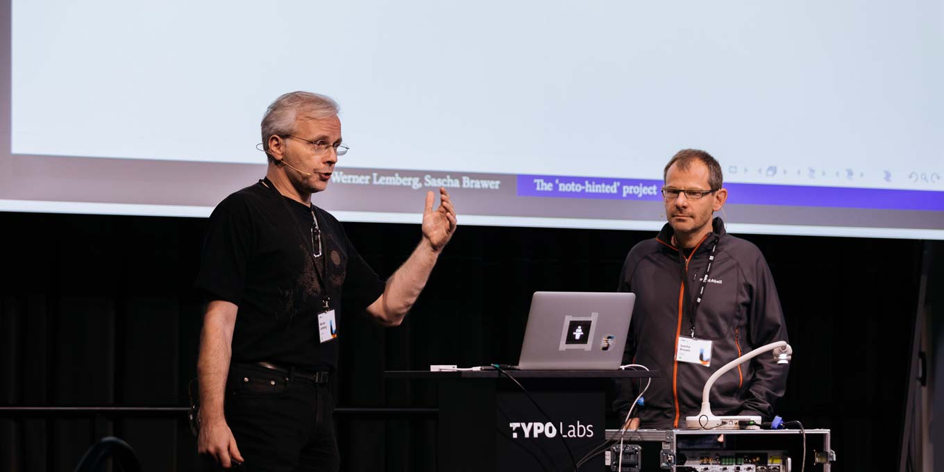
Werner Lemberg discusses his processes and code in great detail. (With Sascha Brawer, pictured right.) Image courtesy of Norman Posselt/Monotype.
I confess I felt a little out of my depth during “The ‘noto-hinted’ project.” The presentation by FreeType’s Werner Lemberg and Sascha Brawer, a software engineer at Google, dealt with hinting support for Google Noto. The Noto project is a font for all languages ever, anywhere. It currently covers all 109,449 glyphs in Unicode 6, and will eventually cover Unicode 9. This unprecedented breadth makes testing the rendering of the hinted font an arduous task. Google collaborated with Lemberg to automate this process, which uses snapshots to compare the font’s hinting in different browsers. This pragmatic approach accepts slight compromises on quality: just ship it; only fix it if and when people complain. Lemberg walked through the process and code in incredible detail. He concluded by announcing that a new version of TTF Autohint would soon be available, and that FreeType now supports variable fonts.
Latin-centricity in (digital) type
The issues that designers of Latin-based scripts (which include Cyrillic and Greek) need to tackle when developing feature-rich OpenType fonts and variable fonts pale in comparison to the often mind-boggling complexity of non-Latin scripts. The root of the problem lies in the very phrase “non-Latin.” The world of type is centered around the Latin-based alphabets to such an extent that the scripts used by millions—nay, literally billions—are all lumped together under a name defined by exclusion. Many conventions from Latin-based scripts are imposed on non-Latin type design and engineering—a counterproductive approach that creates more problems than it solves. The last batch of presentations made this painfully clear.
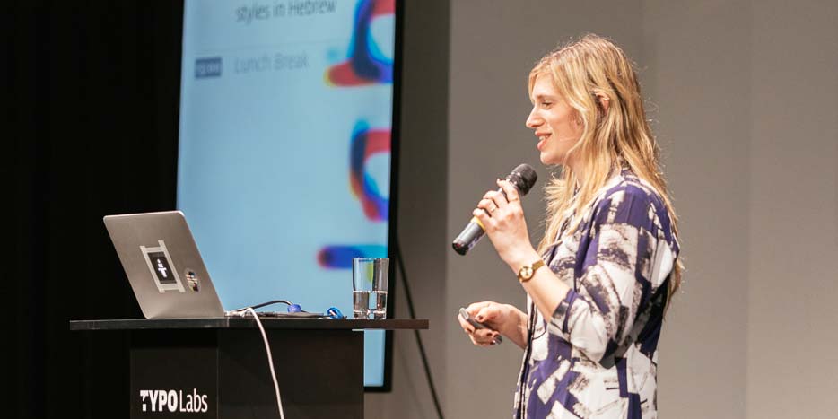
Liron Lavi Turkenich asks why conventions from Latin-based scripts are imposed on Hebrew typography. Image courtesy of Norman Posselt/Monotype.
Type designer and researcher Liron Lavi Turkenich investigated conventions around and opportunities for emphasizing text in “Go bolder, just slant it—secondary styles in Hebrew.” She examined how secondary styles work in other scripts to determine whether bold and italic are viable solutions for indicating emphasis in Hebrew. Italic proves problematic because, in Hebrew, reading direction runs counter to the conventions for italicization in Latin typesetting. On top of the cultural differences of how heavy a type style must be in order to be considered “bold,” the design of very bold Hebrew faces is challenging due to the presence of glyphs with three horizontals.
Turkenich ended by looking at other solutions, like creating emphasis by increasing the letterspacing, using a different typeface or display styles from the same family, switching from a sans serif to a serif (or the inverse), or using a different color. While she left the topic open for discussion, Turkenich suggested that common interface elements like b and i buttons may be part of the problem, since they shape users’ expectations.
John Hudson shows how target anchors can control the length of distinct glyph parts in composite characters. Image courtesy of Norman Posselt/Monotype.
Type designer and Tiro Typeworks cofounder John Hudson offered radical new ways of looking at interpolation in “Interpolating the Future.” He regards interpolation not strictly as movement along an axis from one state to another, but approaches the states as objects with several deltas. Hudson showed three case studies. In the first, an example of intelligent composition of composite characters and (stacked) diacritics, all components and marks existed in their own design spaces. Because they were responsive, the proportions of diacritics were adjusted according to the axis determining the vertical position.
Hudson’s second case study showed solutions to substitution issues in feature-rich OpenType fonts, with a target anchor determining the length of distinct glyph parts in composite characters. The third case study examined how OpenType refinements could still be applied after a line break, specifically for justifying Arabic script, since those line breaks interrupt the necessary OpenType substitutions.
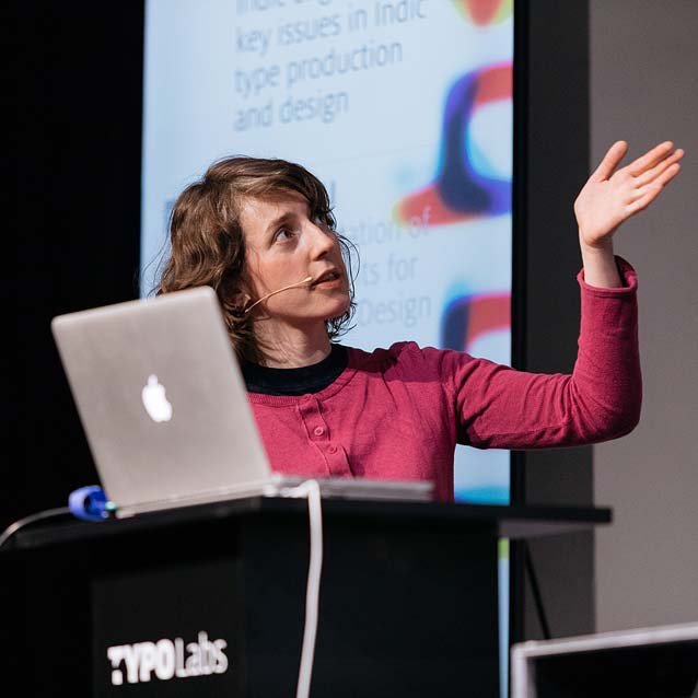
Amélie Bonnet points out how not activating the World-Ready Composer in your text editor or design app creates disconnected, faulty Devanagari. Image courtesy of Norman Posselt/Monotype.Amélie Bonet nicely segued from Hudson’s second case study into “Indic Engineering: key issues in Indic type production and design.” The Monotype designer and font engineer who specializes in the Devanagari script reminded the audience of the discrepancy between the number of users (approximately half a billion Devanagari readers greatly outnumber, for example, the approximately 13 million readers of the Greek alphabet) and the number of available typefaces (the users of the Greek alphabet have many more typographic options).
Bonet gave a historical overview of Devanagari typesetting and explained how technical restrictions gave rise to alterations in Devanagari letterforms, and even affected the lettering tradition. Although modern feature-rich OpenType fonts can create the correct glyph shapes and composing conjuncts, legacy problems with typesetting give rise to mistakes in contemporary designs based on historic typefaces. Devanagari fonts still suffer from problems with adoption and rendering, and have issues with shaping engines. This forces font developers to devise workarounds for faultily composed glyphs.
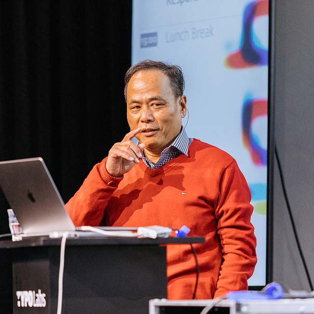
Jef Wu explains how assembling Chinese characters with basic stroke elements makes the creation of thousands of logograms a little less difficult. Image courtesy of Norman Posselt/Monotype.
If the challenges of designing Devanagari scripts are related to shaping, Chinese has a numbers problem—the different Chinese scripts count literally thousands of logograms. Jeff Wu, general manager of Arphic Technology in Taiwan, outlined his company’s efforts to produce variable fonts for digital media in “Implementation of Chinese Fonts for Responsive Design.”
Arphic’s decision to develop responsive typefaces takes its cue from responsive web design. Responsive typefaces not only provide solutions to rendering issues with Chinese on screens, thus tackling legibility issues; they also dramatically reduce file size. Before the advent of variable fonts, Arphic’s proprietary rendering engine Infinity Font had already achieved font-size reductions of up to a staggering 92.8%. With regards to the development of Arphic’s three Chinese variable font families, Wu revealed that a design with three axes requires “drawing” more than a million glyphs. Their solution involves combining repeating strokes to create the characters.
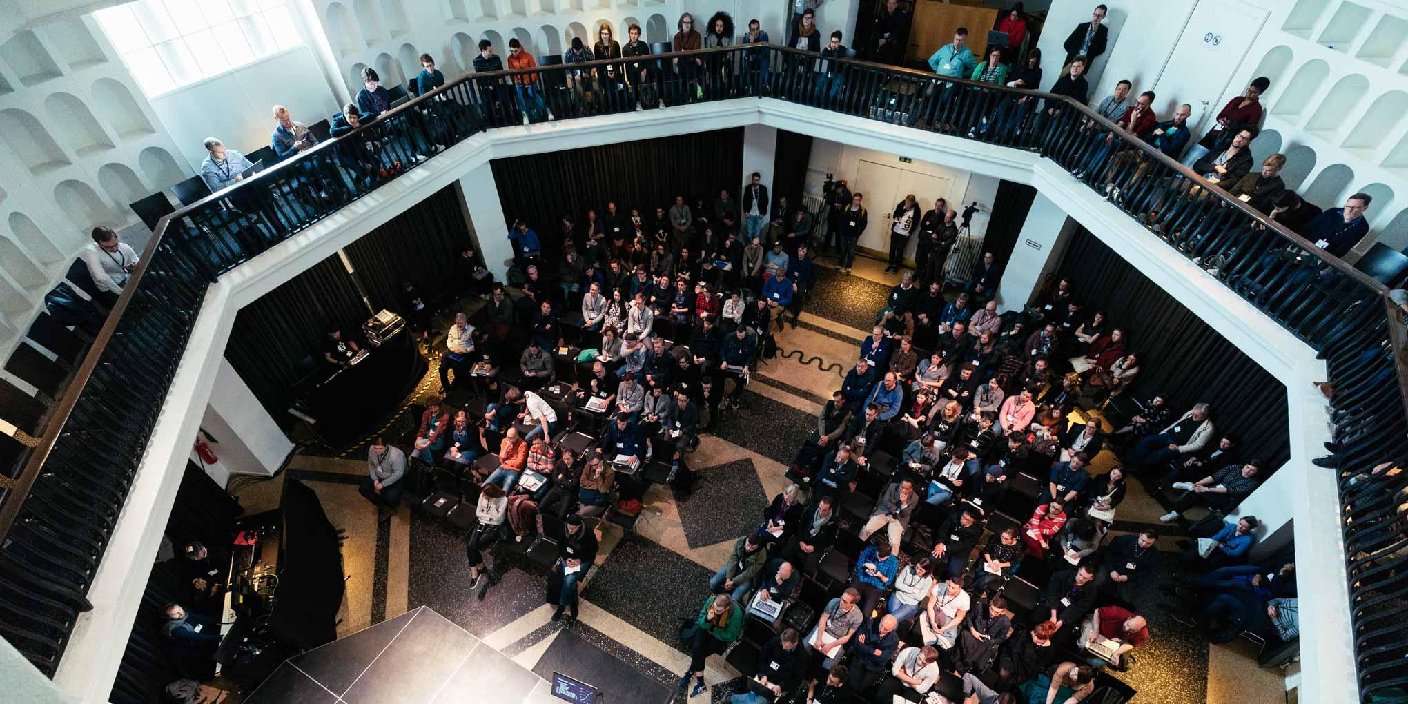
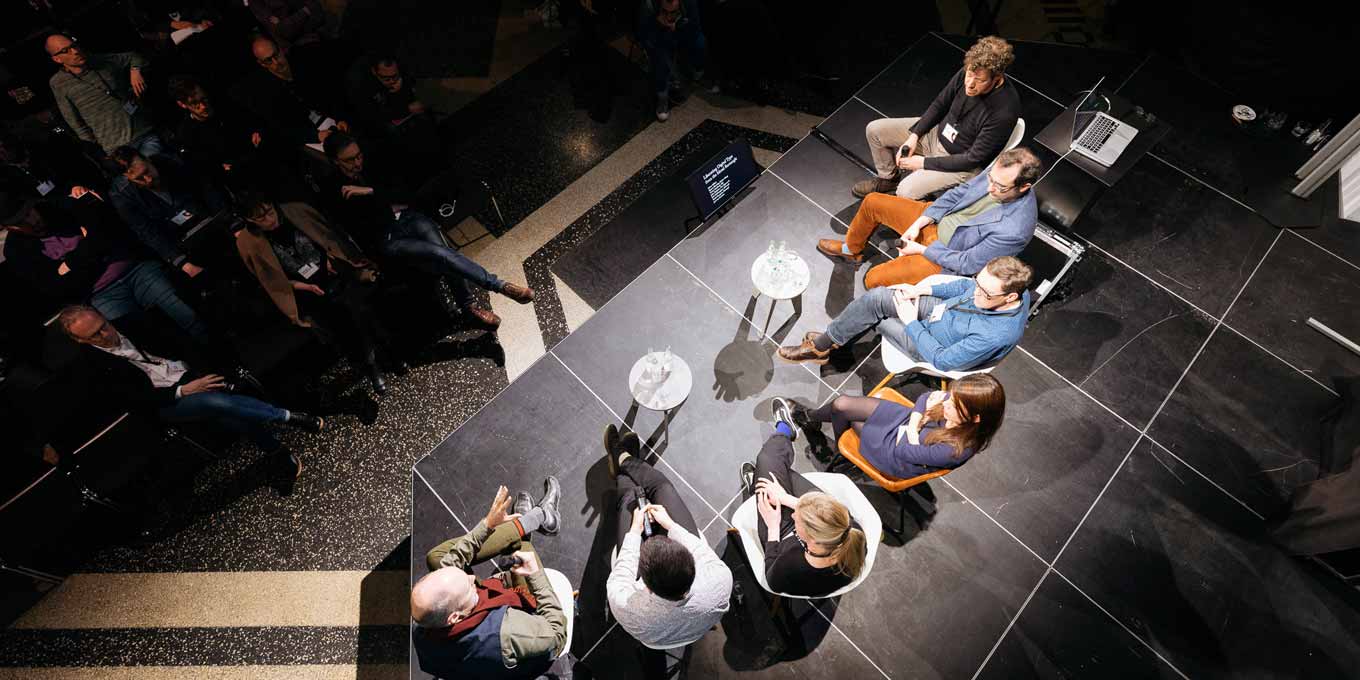
Aerial view of the discussion panel “Liberating Digital Type from the Metal Rectangle.” Image courtesy of Norman Posselt/Monotype.
Many of the issues with non-Latin font development stem from the tyranny of the rectangle, a relic from the days of metal typecasting. This shape suits characters in Latin-based and certain far-Eastern scripts well, but poses a problem for other scripts. Just van Rossum moderated a panel with Bianca Berning, font engineer at Dalton Maag, Toshi Omagari, advanced typeface designer at Monotype, Victor Gaultney, senior type designer for SIL International, Microsoft’s Rob McKaughan, type designer and researcher Sahar Afshar, and Hudson. The panel discussion “Liberating Digital Type from the Metal Rectangle” explained how we arrived at the current situation, and explored a number of possible alternatives to it. Switching from the rigid rectangle to more flexible glyph containers that better address the needs of non-Latin fonts may be one of the next big challenges to solve in typeface design.
This last panel discussion also marked the end of three days of conference programming. My overall impression is that TYPO Labs is both a welcome and necessary technology-oriented event that complements existing type conferences. The 2018 edition is already in the planning stages. It will, however, have to compete with what may be the geekiest and most intense type-related meeting worldwide: the sixth edition of Robothon, the triennial conference on font software and technology that will take place next spring in The Hague.
Bald Condensed, né Yves Peters, is a Belgian-based rock drummer known for his astute observations on the impact of letterforms in the contemporary culture-sphere. A prolific writer on typography, he has a singular knack for identifying the most obscure typefaces known to man.