The sophomore edition of TYPO Labs was even bigger and better than the first—and jam-packed with enough stimulating content to make your head spin.
By Bald Condensed
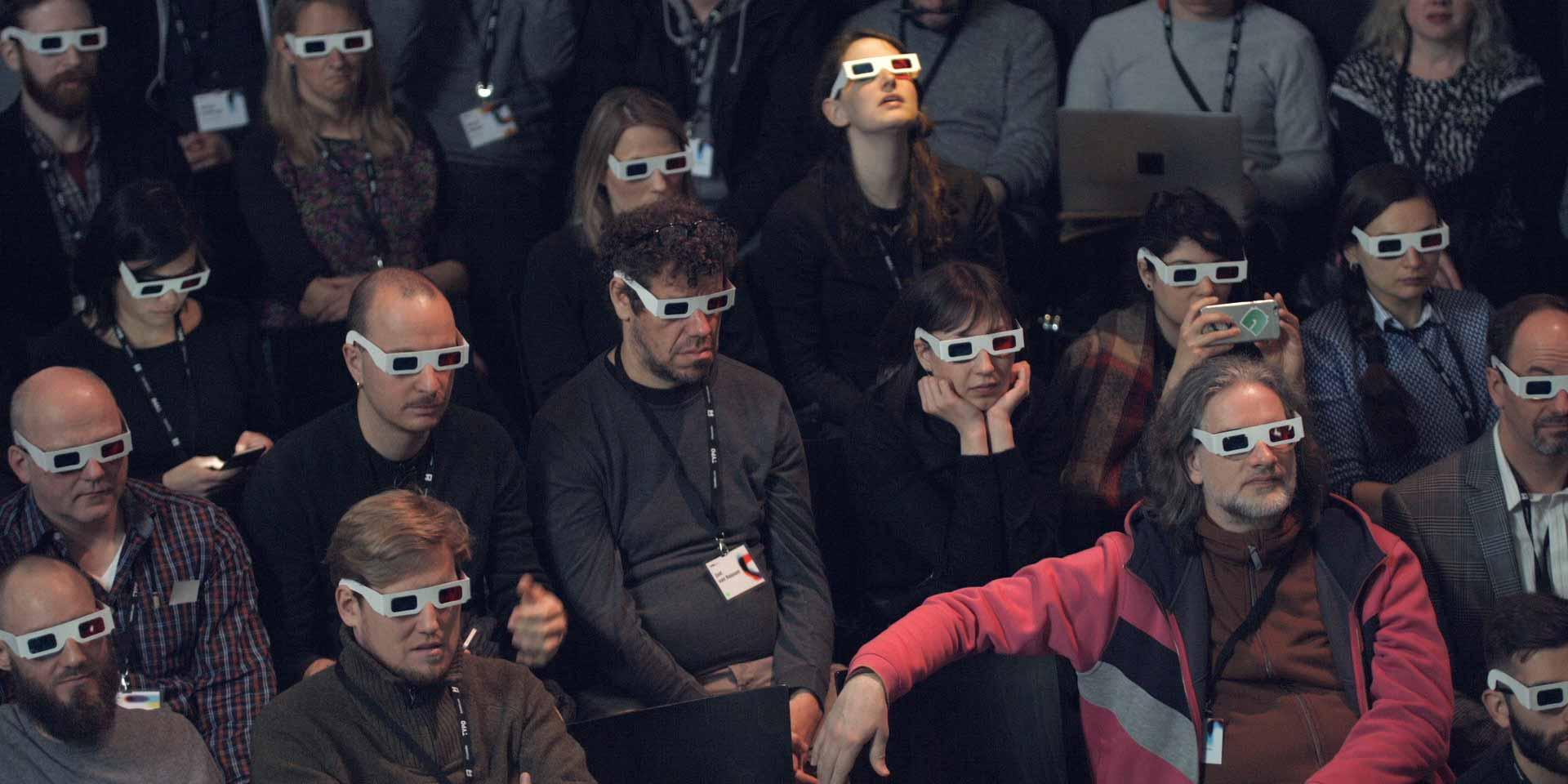
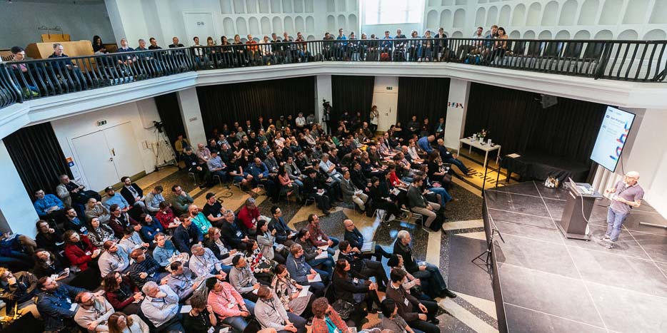
They grow up so fast. The first edition of TYPO Labs in 2016—scheduled on the two days leading up to TYPO Berlin—was more like a geek preconference, an hors d’œuvre leading up to the main event. This time, TYPO Labs arrived six weeks ahead of TYPO Berlin “Wanderlust,” and the program expanded with a third day of talks. 280 visitors (almost twice as many as last year) completely filled the venue. The event’s success probably derives from the type community’s burgeoning interest in the technical aspects of typeface design and emerging technologies. More indirectly, it also hints at how collaboration between type designers and font technicians is fast becoming the norm.
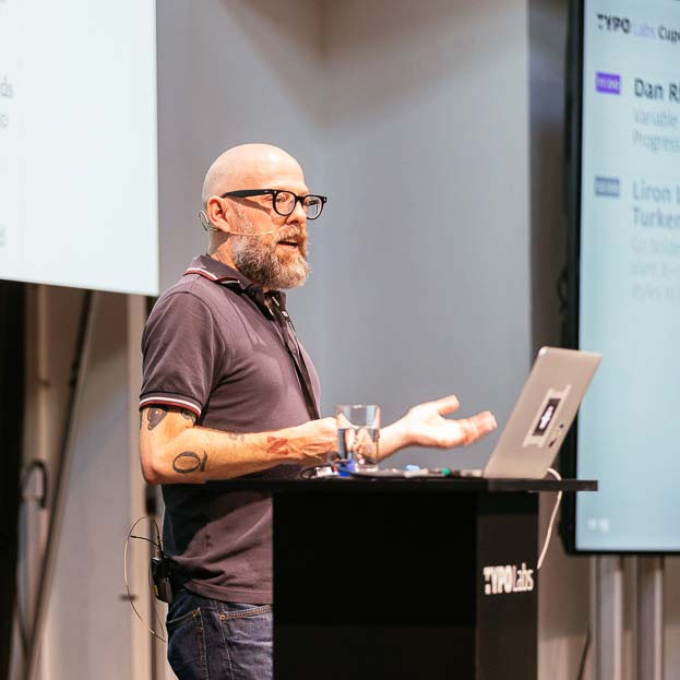
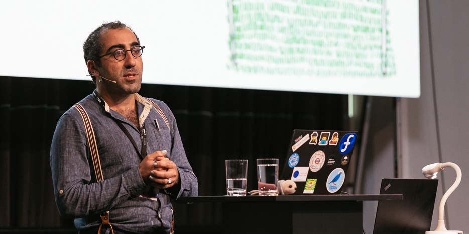
Typekit’s Dan Rhatigan addresses the crowd at TYPO Labs during his opening keynote. Image courtesy of Norman Posselt/Monotype.
The organizing team’s efficiency was impressive. A group of editors wrote up reports on the individual presentations for the TYPO Talks News section, and videos of the entire programme were posted on both the TYPO Talks website and on YouTube by the end of the conference. Organizer Jürgen Siebert explained that the decision to make the videos freely available stemmed in part from the fact that demand for tickets was still high by the time the event sold out. Announcement of a third edition of TYPO Labs comes as no surprise.
Industry updates from Adobe, Microsoft, and Google
Dan Rhatigan delivering his opening keynote at TYPO Labs. Image courtesy of Norman Posselt/Monotype.
The opening keynote at a conference works best if it sets the stage for the days to come, and Adobe Type’s new Senior Manager Dan Rhatigan did exactly that. His “Variable Fonts: Progress Report” provided an overview of the current state of the OpenType 1.8 specification, and touched upon the latest advancements in making variable fonts accessible to a larger audience. Rhatigan’s slides cleverly referenced upcoming talks whenever he mentioned a specific topic another speaker would tackle. Examples included how David Berlow’s Amstelvar and Decovar push the boundaries of the OpenType spec; Underware’s experiments with UI controls; AxisPraxis offering the most direct way to make novices understand variable fonts; and Adobe’s own efforts to build new tools and develop an Adobe Variable Font Prototype as close to spec as possible to expose any bugs in the rasterizer.
Rhatigan pointed out how much the current situation differs from the Font Wars of the nineties, now that Apple, Microsoft, Google, and Adobe are collaborating and exchanging information. His main message was that it makes no sense to start making commercial announcements this year, or to promise anything to clients and customers. The whole ecosystem is in its infancy; everything is still in flux. But one thing is clear: the variable font format will play a pioneering role on the web. The technology will be incorporated into operating systems, browsers, and apps; creating intuitive user interfaces will be key to their eventual adoption.
Besides Adobe, two other major players—Apple and Microsoft—were present at TYPO Labs.
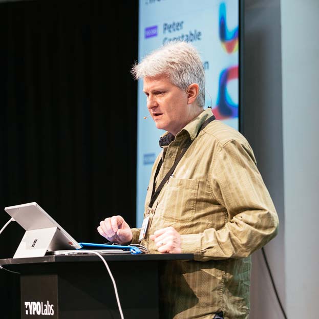
Peter Constable of Microsoft detailing the refinements in the OpenType 1.8.1 specification. Image courtesy of Norman Posselt/Monotype.
In the dual presentation from Microsoft, “Variable Fonts Update / Brainstorming Variable Fonts,”Peter Constable, vice president of the Unicode Consortium and senior program manager lead at Microsoft, explained how the first update to version 1.8.1 implemented refinements to the OpenType specification, and looked ahead at the next steps. Rob McKaughan, typographer in Microsoft’s Advanced Reading Technologies group, ventured beyond those next steps and the simple repackaging of existing possibilities. He presented a series of fascinating experiments, like text optimizations similar to optical sizing to compensate for our peripheral vision, and adding motion and depth to typography to help people with dyslexia.
Google’s Behdad Esfahbod lifts the curtain on improvements in font variations in FontTools and Chrome. Image courtesy of Norman Posselt/Monotype.Dominik Röttsches, senior software engineer for Google Chrome, opened “Update on Font Variations in FontTools & Chrome” by announcing that variation support has been introduced on all Chrome platforms since ATypI. Public prerelease versions are available for testing variable fonts. Röttsches summed up the upcoming stages in implementation, shipping, and integration. Internationalization Software Engineer Behdad Esfahbod of Google, one of the true champions for OpenType font variations, continued the talk by admitting that, despite tireless efforts, he has made slower progress than he had hoped for. He showed a promising sneak peek at improvements and concluded by intimating that although many features are ready, they still need to be folded into a viable workflow.
The presentations by Adobe, Microsoft, and Google made clear that we need to exercise a bit of patience. Initial excitement has turned into a healthy realism focusing on concrete, gradual improvements. Considerable efforts are underway to get this technology into the hands of as many users as possible, as soon as possible.
(Variable) font development
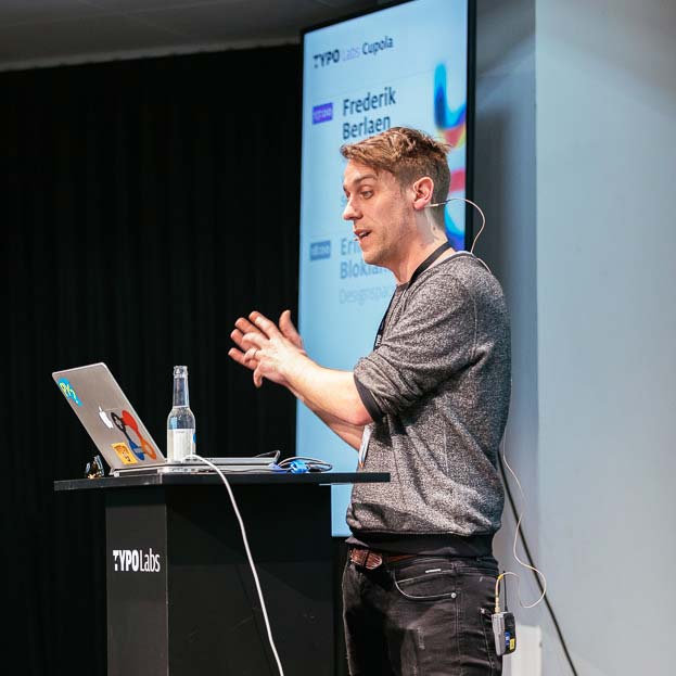
Developer Frederik Berlaen announces version 2.0 of RoboFont. Image courtesy of Norman Posselt/Monotype.
The major type design and font development tools had a strong presence at TYPO Labs. RoboFont developer Frederik Berlaen announced the tool’s new 2.0 release (14th build) in his enigmatically titled “What can you do with those extra 30 sec!” (referring to the increased speed that frees up time for actual design work). The new version is built within the OpenType 1.8.1 spec to guarantee interoperability, and incorporates FontParts from RoboFab, which is fading out. New features—both open-source and custom-built—will be offered in the upcoming extension store. In “More Glyphs, more fun,”Rainer Erich Scheichelbauer and Georg Seifert started by explaining that they use their entry-level font editor Glyphs Mini 2 to try out elements that might make their way back into the main Glyphs app, which is currently at version 2.4.2 (with over a thousand builds). Scheichelbauer and Seifert introduced four new apps: MergeGlyphs lets the user sync and merge two .glyphs files; CommitGlyphs is a Git client that does the same on Github; FontTableViewer allows users to review the OpenType tables of compiled fonts in a handy spreadsheet format; and TextPreview lets you preview your fonts in CoreText without having to install them. FontLab’s Thomas Phinney demonstrated new interface elements in the current build of FontLab in “Spacing and kerning in FontLab VI.” Glyphs, FontLab, and DTL/URW++ also led workshops that dealt with the production of font variants in detail. The remaining two workshops focused on workflow optimization: shell scripting and hinting variable fonts.
FontLab Product Manager Adam Twardoch shows how to create variable fonts with the tools currently available. Image courtesy of Norman Posselt/Monotype.
On that score, Adam Twardoch’s “Make your fonts variable. Upgrading existing font projects to OpenType Variations” was very revealing, particularly on the subject of wrangling the complexity of multiple axes. After giving the audience a quick tour of the various methods, concepts, and publicly available tools involved in creating (not designing) font variants, Twardoch sketched out the steps of building a working variable font. It was interesting to see how the FontLab product manager had to switch between different apps—even competing ones—to achieve what he set out to do. Mistakes and unexpected results along the way highlighted that some issues still need addressing.
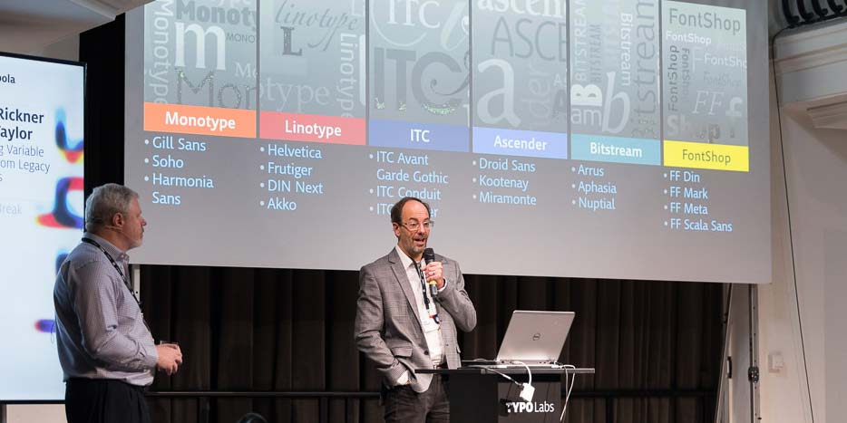
Monotype’s Tom Rickner and Bob Taylor on the automated conversion of legacy typefaces to variable fonts. Image courtesy of Norman Posselt/Monotype.
On the topic of the conversion of existing typefaces, “Creating Variable Fonts from Legacy Families” revealed a different set of issues. In his introduction, Director of Studio at MonotypeTom Rickner explained that the company’s type designers needn’t be burdened with harmonizing node points and correcting curves for all of the fonts in their extensive library; instead, engineers should take on the conversion of static to variable fonts. Quality cannot be compromised, Rickner emphasized—so production scope, cost, and schedule will determine the availability and cost of variable fonts. Bob Taylor, director of font technologies at Monotype, then ran through all of the phases from preflighting fonts to adapting existing designs to point-to-point compatible forms, and explored possibilities for a fully automated set of processes. Differences in the topology of distinct weights in certain legacy typefaces prove to be the toughest hurdle to scale.
Poking and prodding the format and the UI
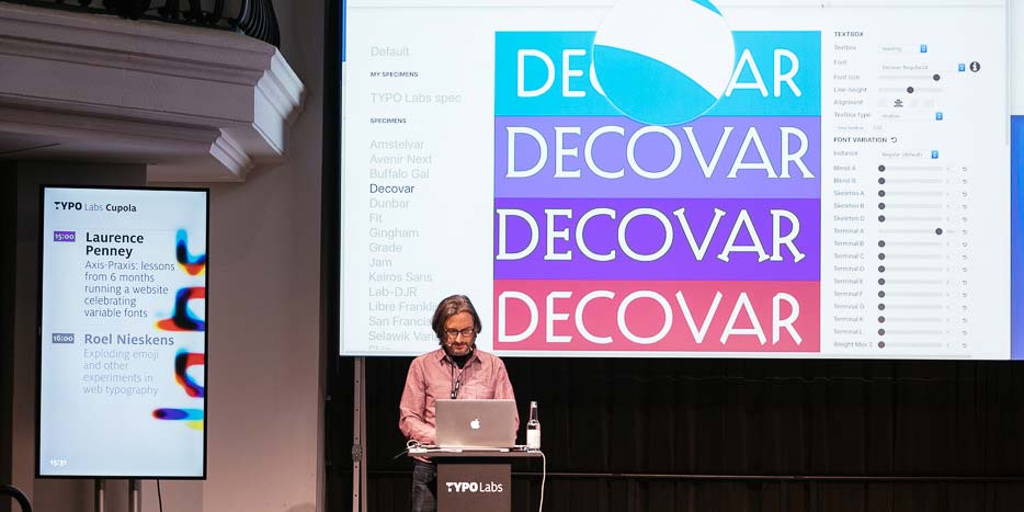
Laurence Penney demonstrates Decovar on Axis-Praxis. Image courtesy of Norman Posselt/Monotype.
After giving a very welcome history of the path to variable fonts from 1970 to today, Laurence Penney shared his frustration that there was nowhere to play with variable fonts after the announcement of the spec at ATypI Warsaw last September. “Axis-Praxis: lessons from 6 months running a website celebrating variable fonts” recounted how he turned this frustration into an opportunity. Axis-Praxis allows you to explore all axes and instances of both pre-loaded variable fonts and your own font variations that you can add via simple drag-and-drop. Penney premiered the demo of Axis Praxis 2, and discussed strategies for removing sliders to come up with a better, more intuitive user interface for variable fonts.
Like a master alchemit, Erik van Blokland explains the difference between DesignSpace and VariationModel using an ingenious color model. Image courtesy of Norman Posselt/Monotype.
Besides teaching at Type and Media and designing type, Erik van Blokland makes font development tools and is one of the creators of the UFO (Unified Font Object) format. His presentation “Designspaces” delved into the minutiae of the .designspace document, which contains the axes, sources, instances, and rules for font variants. Van Blokland used an ingenious color model to explain the very subtle but essential difference between the DesignSpace in MutatorMath and the VariationModel of variable fonts.
Monotype’s Marianna Paszkowska showcases an FF Clifford font variant that applies a breakpoint on its optical size axis. Image courtesy of Norman Posselt/Monotype.Marianna Paszkowska, font engineer at Monotype Berlin, started with an overview of art and typography projects that react to things like human presence, topography, weather, and so on in “Typographic Wonderland.” Paszkowska joined the UI debate by claiming that shifting the responsibility from type designers to users might not be good practice. Presenting users with too many options for complex variable fonts creates the risk of choice overload. She demonstrated an experiment with an FF Clifford variable font whose optical size automatically adapted to the distance of the reader to the screen, and whose extenders got longer or shorter in response to users’ facial expressions.
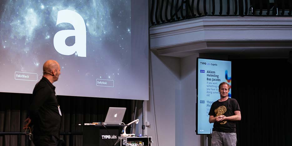
Underware joking that their superfont contains every typeface ever designed and every future typeface; all you need to do is locate it in its design space. Image courtesy of Norman Posselt/Monotype.
“If you want something new, you have to stop doing something old” proved yet again that Underware is one of the most exciting type design outfits in the world. Their inquisitive minds and flair for original, high-performance type families turn each of their releases into an event. Akiem Helmling and Bas Jacobs—two-thirds of Underware—took the stage with a philosophical question: “What does it mean when something new is created?” Making a connection with Neville Brody’s FF Blur (1992) and FUSE (1991), they argued that creating something new means adding new value to an existing artifact—see color fonts and variable fonts, for example. Starting from the thesis that the truly new thing about variable fonts is the possibility of having 64,000 axes, they demonstrated mind-blowing explorations of font variations that ended with a superfont with 241 axes containing their entire type library in a single variable font file.
Helmling and Jacobs seamlessly switched from these experiments to practical applications in their current families, like the impressive Zeitung Flex, a precursor to OpenType font variants, and the intelligent Liza Lettering app that helps users create gorgeous brush lettering. They concluded their presentation with a preview of their upcoming project. Duos, which is almost finished, is based on the idea of a monolinear script. By playing with the skeleton, font variations turn it into an animated script. Duos also introduces the concept of polyglyphs: ambiguous glyphs that can be read differently according to context. Hooking up the font to a “polydictionary” allows users to control how the words can be misread.
To be continued
The variable font format may not yet be ready for commercial applications, but the presentations confirmed that the type community is diving headfirst into the OpenType 1.8 specification, fearlessly experimenting with variable fonts for the ultimate benefit of end users. We just have to sit tight and pull up our socks, because they are about to be blown off pretty soon. In the second (and final) part of my report: a French philosopher, two panel discussions, and not everything at TYPO Labs was about variable fonts.
Bald Condensed, né Yves Peters, is a Belgian-based rock drummer known for his astute observations on the impact of letterforms in the contemporary culture-sphere. A prolific writer on typography, he has a singular knack for identifying the most obscure typefaces known to man.