
Type-Ø-Tones releases four new wide-ranging type families
By Kate Beckwith
With Ella, Karol, Karol Sans, and Eixample, Type-Ø-Tones present a slate of new, historically informed, completely unique type families. These four designs contain 9 typefaces and a total of 46 different styles, all available to license from Type Network.
Type-Ø-Tones’ new additions to the Type Network library absolutely embody Jan Middendorp’s characterization of their type as “simultaneously adventurous and serious, witty and well-conceived.” Laura Mesegeur’s Ella, a stencil series, takes its typographic approach from the principles of calligraphy. Karol and Karol Sans, by Daniel Sabino, are a pair of humanist faces inspired by the work of Eastern European type designers. Sabina Chipară’s and José Manuel Urós’s Eixample families, Dip, Glaces, and Villa, turn modernist signs from Barcelona into versatile digital type.
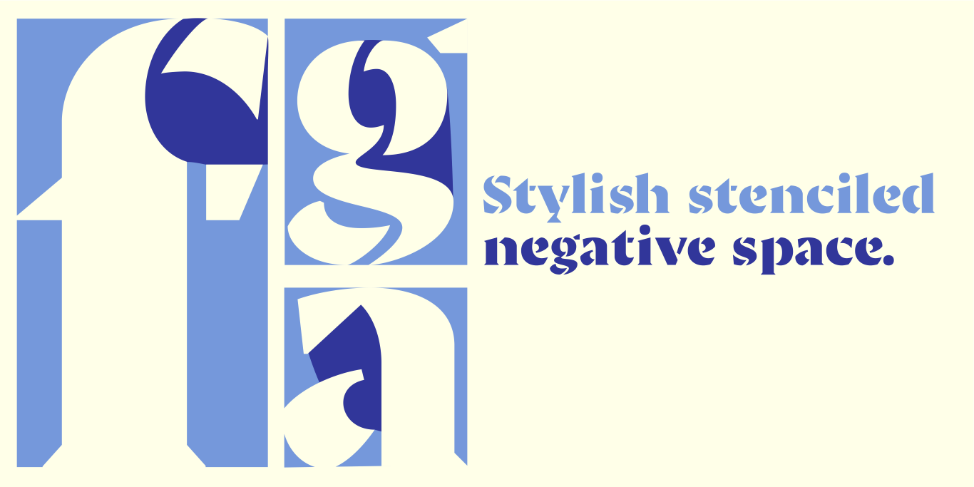
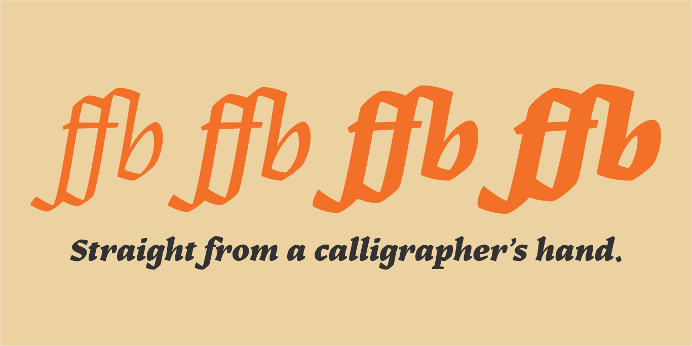
Mesegeur chose to marry the connected negative spaces of stencil type with the pen-derived terminals and serifs of calligraphy.
Tracking the history of the Latin alphabet, Ella offers designers options for each era, allowing them to match their type to their content without searching for another new font.
Ella
Ella began as a morphological design study: Laura Mesegeur wanted to discover how classic calligraphy models could be adapted to and perform as contemporary, digital, stencil typefaces. Starting at the Hoffmitz Milken Center for Typography’s “Typographers-in-Residence 2021: Mujeres Hispanas y Tipografía”, Mesegeur took the calligraphy models of Oriol Miró (themselves based on historical models) as her origin, pushing them to their typographic limits.
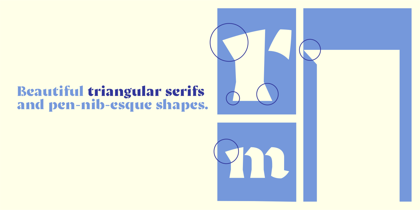
Stencil type is defined by the channel of negative space between each part of each letter, allowing it to be cut into material without the counters falling out. Laura synthesized this approach with calligraphy by first determining the minimum number of letterform parts required without losing the strokes’ calligraphic qualities. These calligraphic origins can be seen in Ella’s triangular serifs and pen-nib-esque shapes. The resulting letterforms exude the warmth of handwriting.
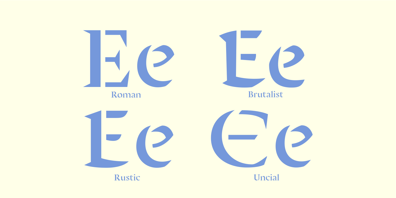
Ella consists of four families: Roman, Uncial, Rustic, and Brutalist, each in two styles: Regular and Bold. These families have different capital styles, which mirror the historical evolution of the Roman script, yet they share a single lowercase set that unifies their distinct characteristics.
The Ella series was designed for posters, book covers, and even brand identities. Wherever personality, expressionism, and sophisticated brutalism are needed, use Ella.
Sabino’s Karol started as a school project, became a TDC award-winner, and is now refined and released on Type Network.
Karol
Like Ella, Karol proves its value in the quality of its strokes. Despite appearing on digital screens, one could imagine its structures flowing from an expert calligrapher’s hand. Daniel Sabino first designed Karol in 2011 as a school project while obtaining his MA in Advanced Typography from EINA/UAB, in Barcelona, Spain.
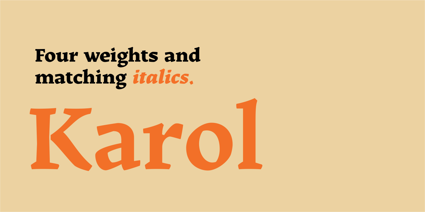
Drawing inspiration from Eastern European type designers such as Oldřich Menhart, Karol’s eight styles (four weights and matching italics) feature high readability, strength, and personality; so much so that Karol was awarded the Certificate of Typographic Excellence (Judges’ Choice) from the Type Directors Club in 2012.
When designing Karol Sans, Sabino avoided the typical method of simply knocking-off the serifs. Instead, he designed it from scratch as a pairing, not simply a derivative.
Karol Sans
Inspired by wood engraving and the work of calligraphy masters like Menhart and Rudolph Koch, Karol Sans is a non-literal sans-translation of Karol. Taking the hand-drawn feel of Karol and further refining it, Karol Sans possesses its own humanist personality. It also offers a wider range of weights, including two display weights—Light and Black—and all the most desirable OpenType features. Karol Sans functions well from text to display sizes and makes a natural companion to Karol.
One could easily use Ella, Karol, and Karol Sans together in a single project. Are you designing, say, an informational website that would benefit from a richly historical font palette? Look no further than these faces from Type-Ø-Tones.
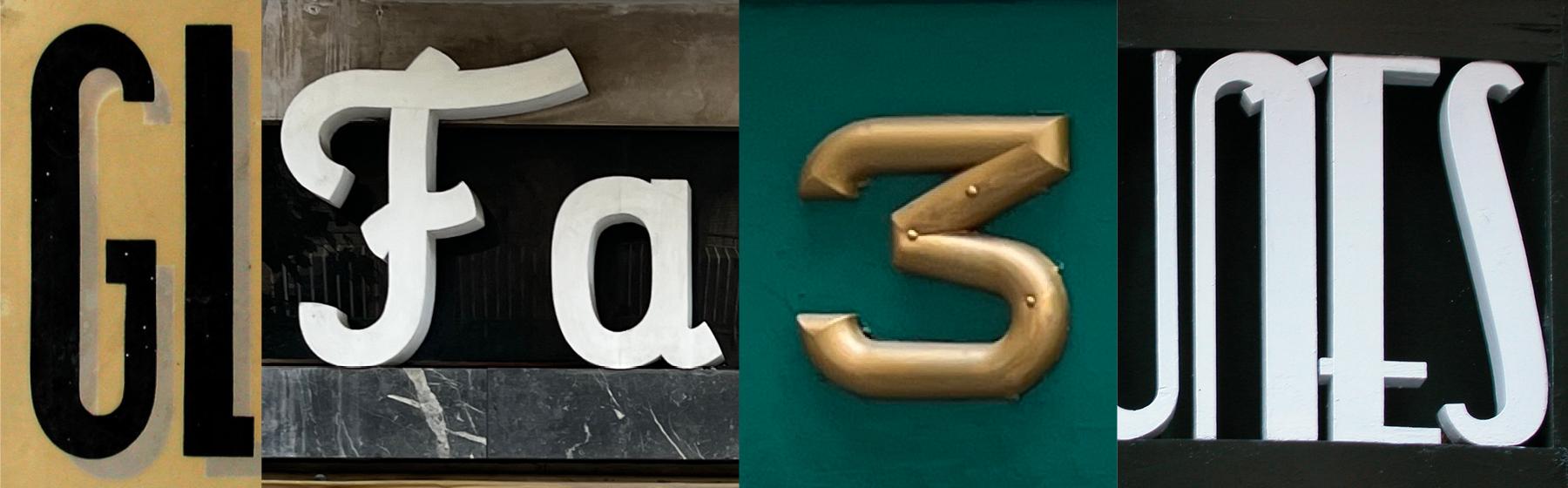
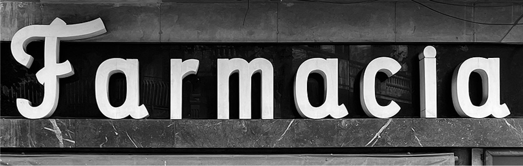
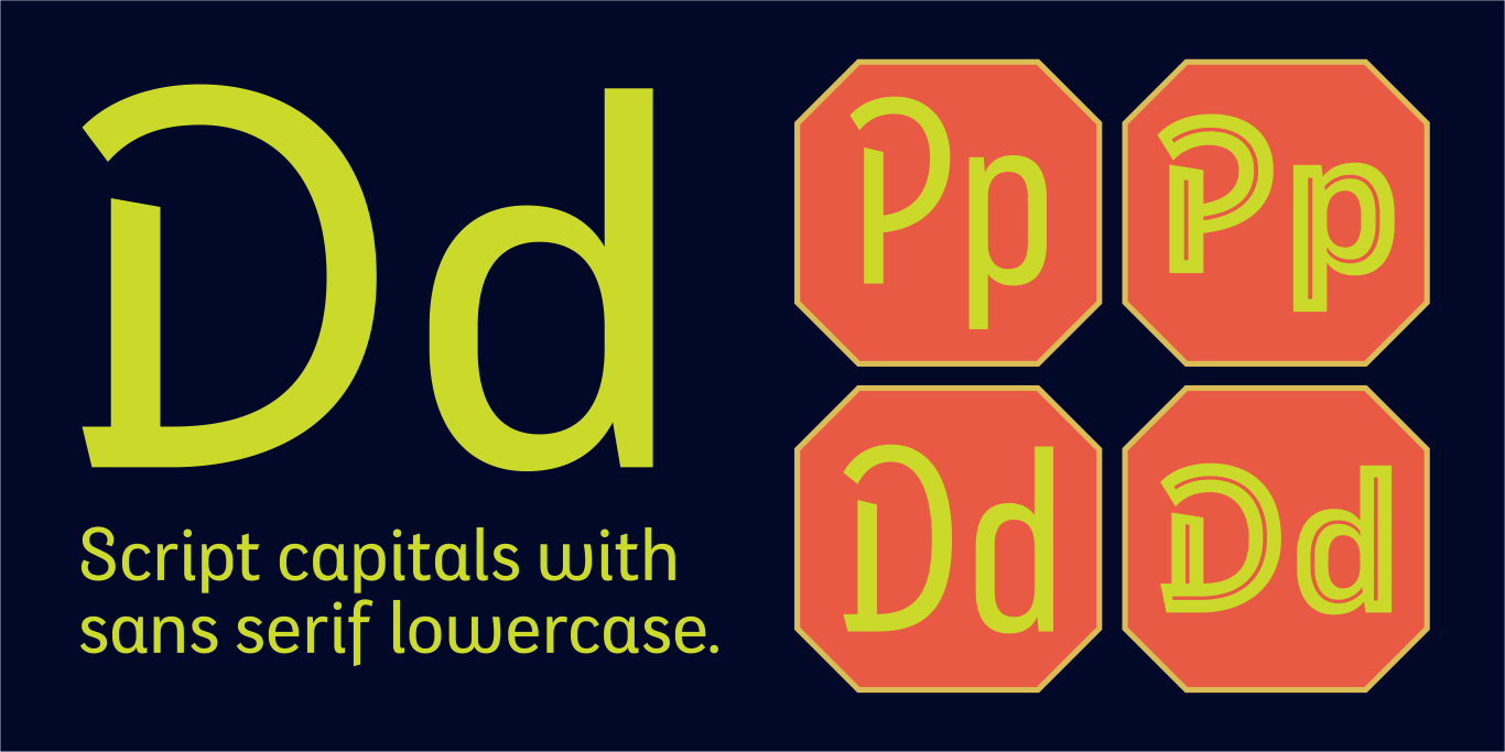
Eixample Dip gets its name from Carrer Diputació (Diputació Street), where the original sign reads Farmacia Específicos Diputación. This pharmacy sign contains sans-serif lowercase letters coexisting with a script uppercase, a curious model that Chipară and Urós used to develop Eixample Dip.
Dip’s capitals are built with contained decoration to achieve maximum compatibility between letters. The script capitals are the default uppercase, but an alternate slab style is included as OpenType glyphs. Narrow and Inline styles round out this versatile subfamily.
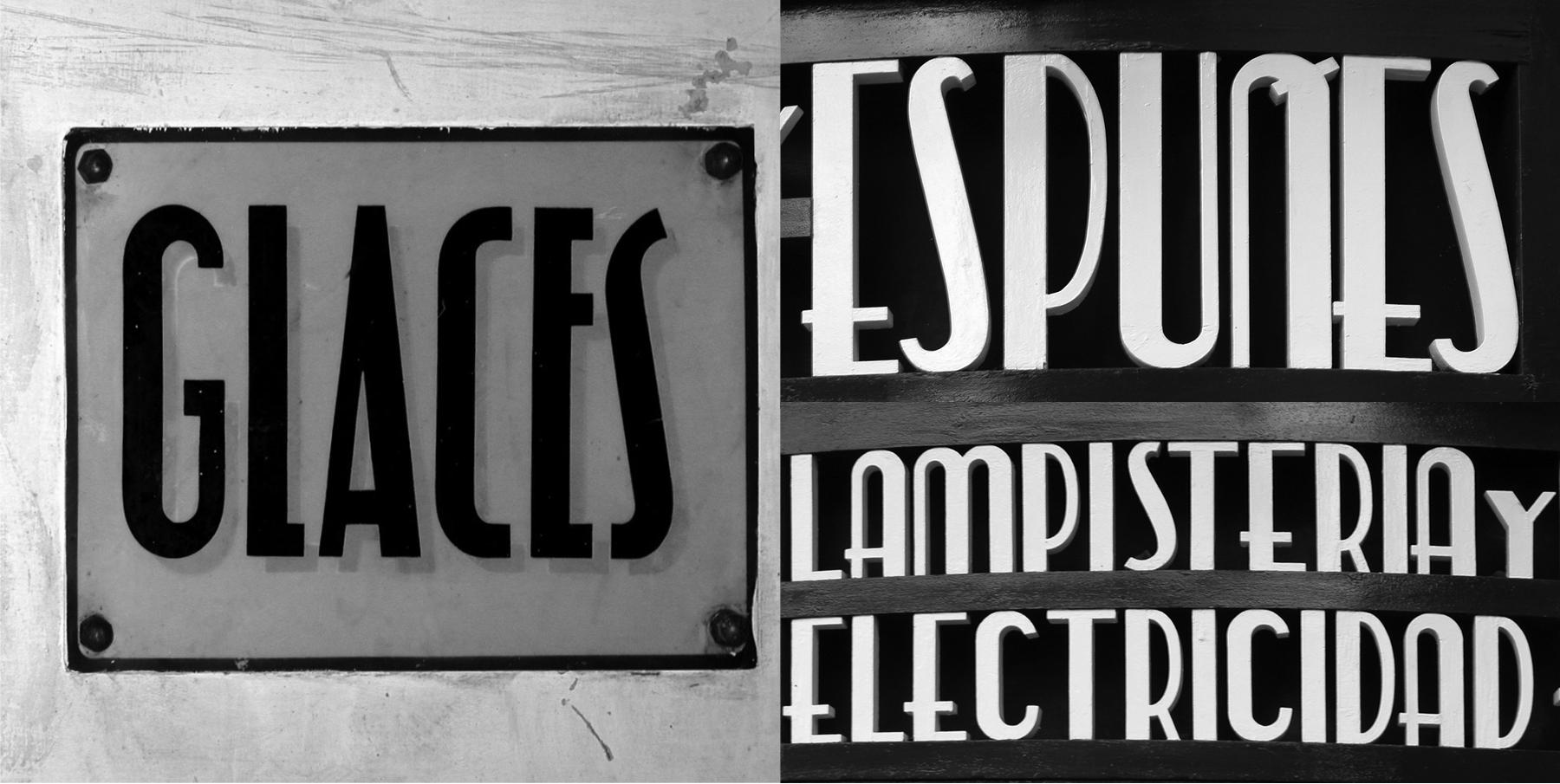
In 2003, Chipară and Urós photographed a sign with the word GLACES painted on a refrigerator. Just a few meters away is the eye-catching sign for Lampistería y Electricidad Espuñes, a lighting store that uses similar lettering. These signs prompted a years-long speculation between them on how to manage the concept of double vertical modulation.
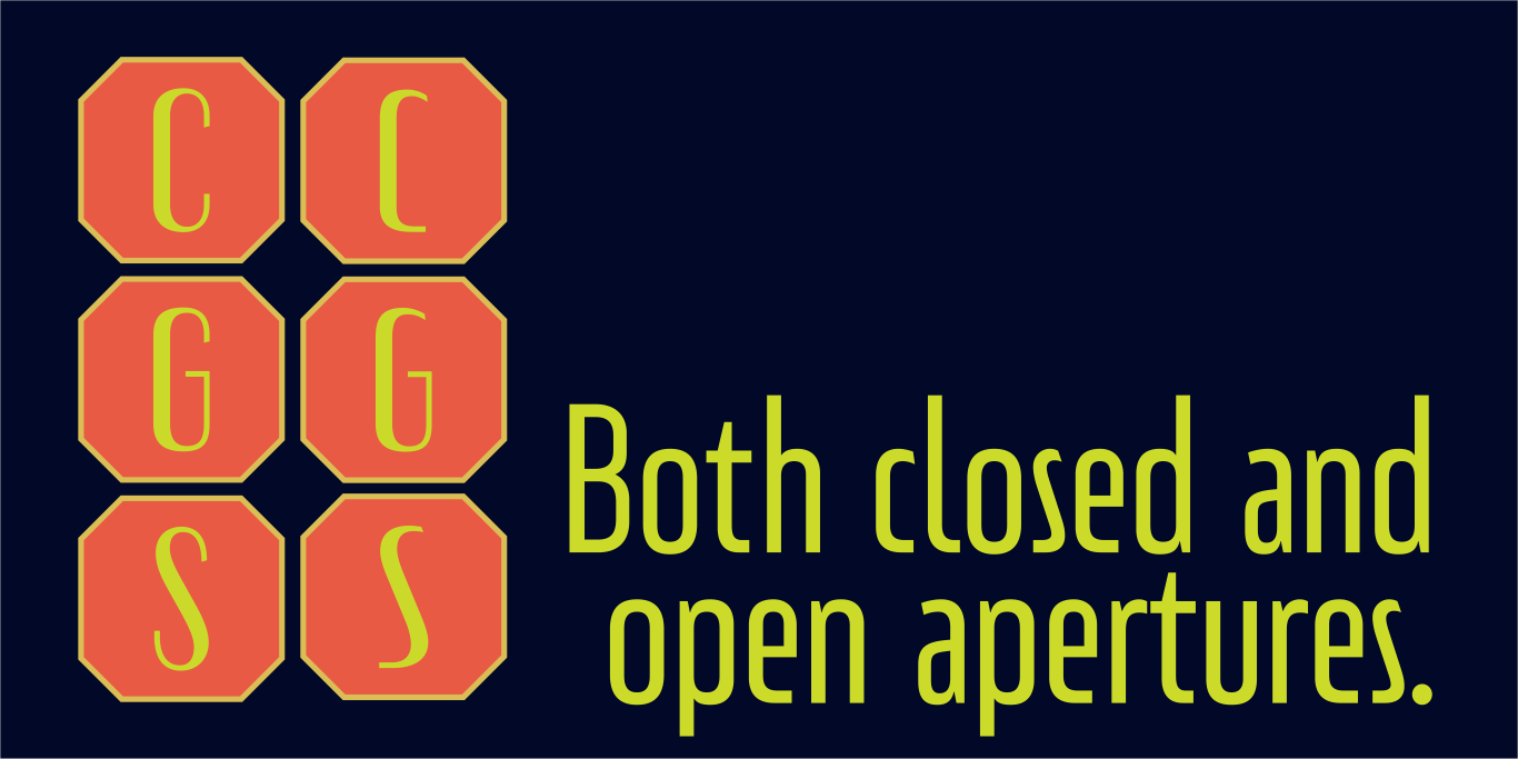
Their answer to this conundrum resulted in three styles that slide between monolinear and high contrast. For added versatility, Eixample Glaces offers a choice between conventional closed apertures for characters like C, G, and S, and more playful open apertures. These features, as well as small caps, can be accessed using OpenType.
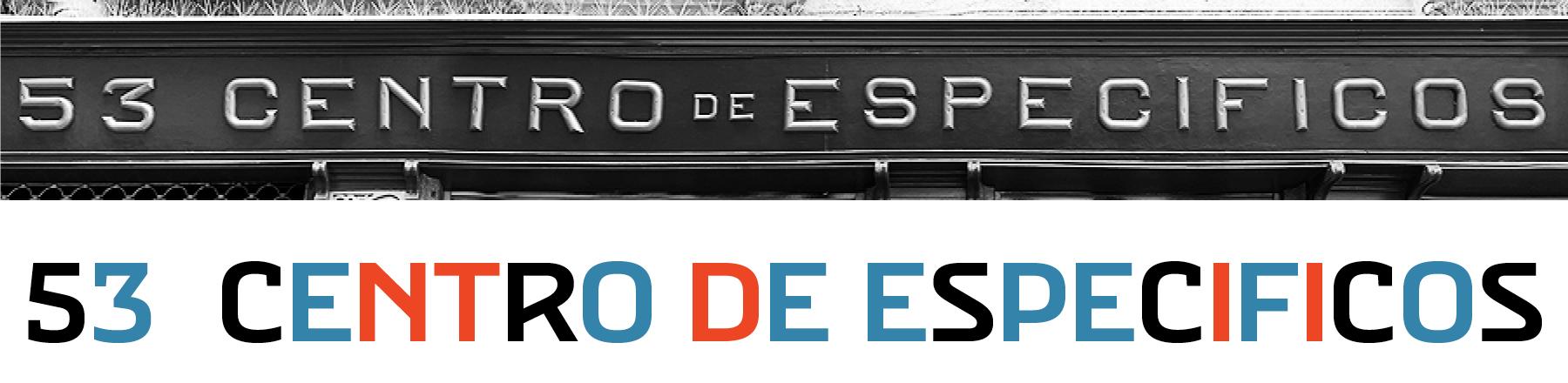
Villa is an abbreviation for Carrer Villarroel (Villarroel Street), where the Villarroel Pharmacy has been displaying its lovely sign since the first quarter of the twentieth century. The Eixample Villa family this sign inspired contains sturdy, industrial letters, free from ornament. Only the treatment of the curves borrows modernist features.
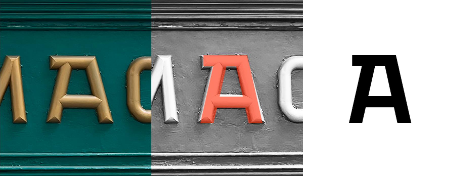
The uppercase “A” was the main influence for the design. From that single character, Chipară and Urós extrapolated an entire personality for their new typeface, deciding along the way which letterforms would hew closely to the logic of the sign and which would be updated for its typographic interpretation. Some letters, like the “A,” are faithful representations of the original sign (red). Others have been slightly tweaked to work better within the system as a whole (blue), and still others were designed completely from scratch (black).
Eixample
Rounding out the new offerings from Type-Ø-Tones, Sabina Chipară’s and José Manuel Urós’s Eixample contains three families—Dip, Glaces, and Villa—inspired by modernist signage found in Barcelona’s Eixample neighborhood. The name of each family is related to the sign’s location or to some specific elements of its design.
The Eixample families clearly show their origins as display fonts inspired by modernist signage, but they have been engineered for great results at smaller sizes as well. Each of them would be an excellent choice for any number of branding projects, from a hip new bar to a playful children’s clothing brand. You can license one or all of them now in the Type Network store.
Like all Type-Ø-Tones fonts, Ella, Karol, Karol Sans, and Eixample can be licensed for print, web, mobile apps, and ePubs. Webfonts may be tested for thirty days, and desktop trials are available upon request. Have a licensing question? Check out our support page or get in touch.