The Wall Street Journal’s design chief talks type and trustworthiness after launching updated app
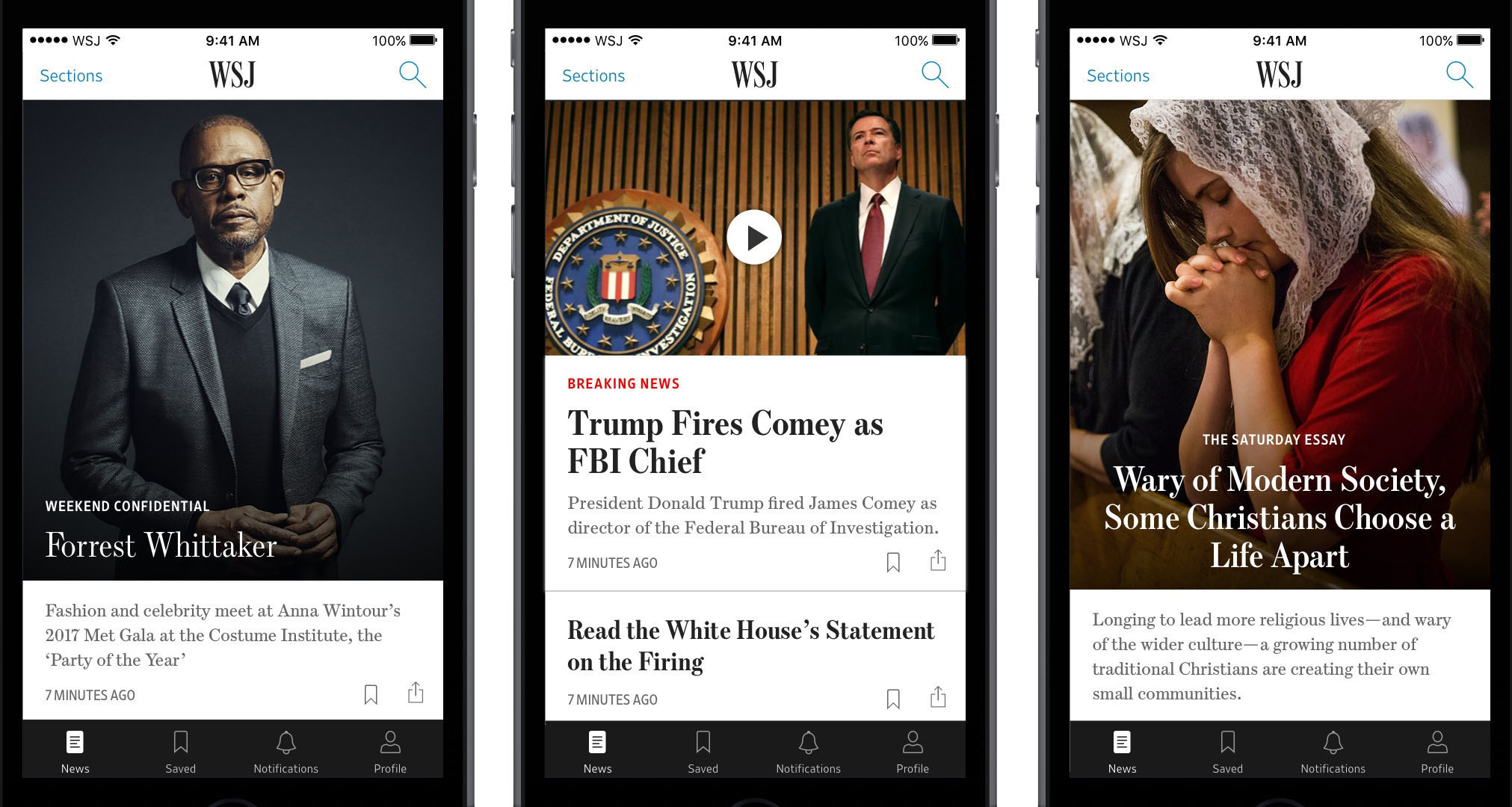
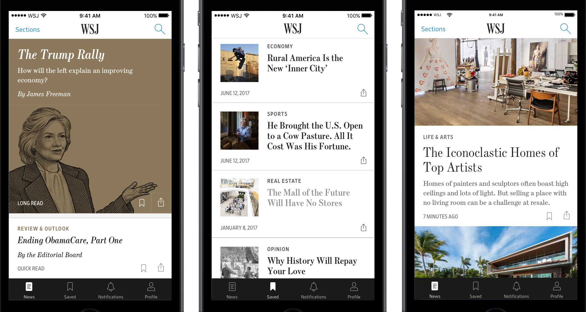
Che Douglas, the Journal’s Global Head of Design, oversaw a major overhaul of its digital product, which, like the print edition, prominently features Font Bureau’s Escrow.
Editor’s note: On July 13, Che Douglas, Global Head of Design for the Wall Street Journal, announced that his team (including Fernando Turch, the lead designer, in collaboration with Bonnie Jarvie, the lead UX designer, and creative director Thomas Williams) had launched a major update to the paper’s digital app. Because the Journal has so deftly employed Font Bureau’s Escrow for over fifteen evolutionary years, we wanted to hear more about the challenges of publication design for a device-dependent audience. Douglas graciously agreed to an interview with Type Network’s Yves Peters.
“Headlines in a newspaper are what people recognize,” said Che Douglas, Global Head of Design for the Wall Street Journal and Dow Jones. When a newspaper is seen ambiently—for example on the subway, in office waiting rooms, or in movies—headline typography has such a strong character that it creates an imprint in the reader’s mind. Escrow, the Journal’s anchor typeface, displays an elegant authority that perfectly fuses with the weighty content of the venerable publication—a powerful combination for creating lasting impressions.

© 2017 Wall Street Journal.
Commissioned by the Wall Street Journal in 2002 as part of a major revamp overseen by publication design consultant Mario García and former WSJ design director Joe Dizney, Escrow was crafted in Text and Display versions by Cyrus Highsmith and expanded in 2016 by Richard Lipton (with Banner styles for the largest headlines) and Dyana Weissman (with four Reading Edge variants engineered to be clear and readable at text sizes on screen).

© 2017 Wall Street Journal.
A decade and a half after that unprecedented redesign, changing technology and an increasingly mobile audience necessitated a reworking of the Journal’s digital platforms. Enter Douglas, a digital-products guru with the soul of a typographer. After running his own branding and digital studio in Australia for almost ten years, Douglas transitioned to news and media, joining the Wall Street Journal in 2014. He soon learned that, purely from a design perspective, the Journal’s brand identity did not get the attention it deserved. During meetings, Douglas opened a dialogue about the brand and what it stood for. Together with the design and marketing teams, he made an effort to translate and elevate the brand identity to a higher level by building on the visual cues born of the paper’s 130-year history.
While some designers have a penchant for redesigning all the things, Douglas thinks that continually changing typographically resonant elements like headlines is a bad idea: “I have gone on a mission to stop the redesigning and figure out what the core ingredients are for the future of our digital products.”
With the rise of fake news in an ever-evolving editorial landscape, publication designers need to work toward a point where the typographic identity of a newspaper stabilizes and becomes a recognized, trusted voice. ”You need distinct, well-crafted typefaces to begin with–that's a given,“ Douglas said. ”You can't take things that are off the shelf necessarily. An ownable aspect comes into it.“
For the Journal, Douglas wanted to introduce the established, distinctive quality of the paper’s typography into its digital products, treating the types with a respect befitting their origins and tradition. He always strives to earn the trust of the people who created the brands he works on by doing them justice. Faithfully and carefully translating Escrow and Tobias Frere-Jones’ Retina, the paper’s two foundational typefaces, to a digital environment embodies this effort.

© 2017 Wall Street Journal.
The branding of the Wall Street Journal can be broken down into three principal parts. The first is the full masthead—drawn from a customized version of Escrow—which is now responsive. In the newspaper and on the site, the masthead is written out in black type. In the digital app, the second critical branding component surfaces: the masthead becomes a logo when shortened to its initials (WSJ) to accommodate the smaller screen footprint. Those two key elements—the masthead and the logo—are the most recognizable; they are ownable and trademarked. The third element is the typography, which does a lot of heavy lifting.

© 2017 Wall Street Journal.
Escrow sets the tone of the pages, its stately, high-contrast forms perfectly cut for aesthetics and optimal readability. With its suite of weights, widths, and optical sizes, the family offers expansive versatility across content types, fluently carrying everything from body copy to attention-getting banner headlines. Escrow works well with Retina; the clean agate cuts of the latter make up the DNA of the market data that is a defining feature of the newspaper. Although Retina was drawn specifically for printing tiny text, its shapes translate nicely to the digital medium. “When I presented the new design of the mobile app to our CEO,” Douglas recalled, “everyone loved the story of bringing heritage fonts and our original characteristics into the digital app, and implementing them in a way that makes sense for those faces.”
With an eye to further typographical enhancements, Douglas has been considering what additional features could be built into WSJ typefaces, like arrows, symbols, and icons for the market-data fonts. He’s also looking forward to being able to implement variable fonts, which will be extremely important for the web. His first short-term objective is enhanced storytelling, with Escrow and Retina playing a significant role; the following milestone will be improved performance. Most of wsj.com’s traffic comes from readers sharing articles via social media and email. Because page-load speed is so crucial in these situations, having a single variable font instead of several static styles could dramatically reduce the amount of data that has to travel over a network connection.
Douglas has found that the ongoing process of fine-tuning and hinting the Journal’s existing fonts for on-screen use, and getting readability and accessibility right, is way more interesting than redesigning and changing typefaces. The ability to collaborate closely with the teams at Font Bureau, Type Network, and Frere-Jones Type is essential to the ongoing process of gradually improving and refining the typography of the Wall Street Journal. The redesigned app is but one example, with more to come in the future.
“Typography is a core element of a newspaper’s brand identity, and we were honored to consult on fine-tuning the Wall Street Journal’s typefaces for their digital products,” said Type Network General Manager Paley Dreier. “Escrow is a readable, high-contrast Scotch serif that represents the heritage of the paper. It also provides a steadfast foundation for the new app, delivering everything from breaking news to thought-provoking op-eds without missing a beat.”
Like all Font Bureau fonts, Escrow is available for print, web, applications, and ePub licensing. Webfonts may be tested free for thirty days. To stay current on all things Font Bureau, subscribe to Type Network News, our occasional email newsletter featuring font releases, foundry happenings, type and design events, and more.
Bald Condensed, né Yves Peters, is a Belgian-based rock drummer known for his astute observations on the impact of letterforms in the contemporary culture-sphere. A prolific writer on typography, he has a singular knack for identifying the most obscure typefaces known to humankind.
