
The supertype approach
Jürgen Huber and Martin Wenzel (supertype) found their paths to type design through communication design: Huber at the University of Essen and Wenzel at the KABK Royal Academy, the Hague. This shared background underpins the supertype approach, with an emphasis on message-delivery, text-readability, and user-customizability. Their latest additions to the TN library demonstrate these tenets with class and panache.
Supertype’s latest additions—Cy, Duper, and Adapt—don’t look like a set. They differ widely in aesthetic, features, style range, and purpose, yet they make a certain kind of sense when you consider Huber and Wenzel’s process. Used to designing custom type for corporate clients of all sizes and audiences, Huber and Wenzel always start with the context.
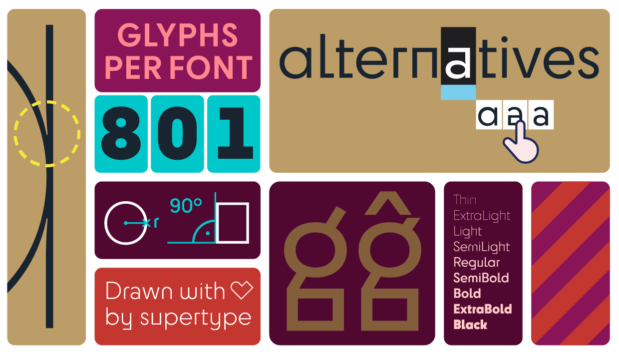
For Cy, Huber’s oddly eye-catching round and squared geometric sans serif, the context was contemporary brand and display systems. Each of the 801 glyphs across Cy’s nine weights has a variety of alternates, allowing the designer to fine-tune their text. From constructionist squares to friendly circles (and every combination in-between), Cy manages to convey any tone.
Set “DANGER” in its squared forms and readers will keep out; set “Bauhaus” in its mixed forms and you have a word that’s right at home in Dessau; set “Playground” in its rounded forms and you a word that is inviting and energetic.
Cy offers designers the ability to create unpredictable, engaging, lively word shapes. With support for 135 languages, Cy is ideal for branding, headlines, labels, and games.

Duper, Wenzel’s “best font since sliced bread,” is at once both unserious and refined. Derived from his earlier typeface Profile, Duper contains all the quality and features one would expect from a supertype family . . . with a few extra tricks up its sleeve.
Most typefaces don’t match Duper’s various sets of numbers, fractions, ornaments, alternate glyphs, arrows, and pointers, but Wenzel took the idea of casual variation one step further: There’s an intelligent OpenType feature “that loops through the available triplicates of all characters.” In other words, no two glyphs in a row appear the same.
The result is a casual and inviting typeface that looks fresh and organic in any context. Supporting 135 languages across its four styles (regular and bold, plus italics), Duper is perfect for educational materials, recipes, and book covers.
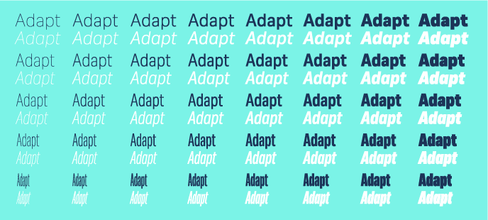
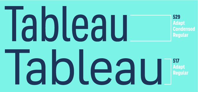
Their collaborative typeface, Adapt, was designed for designers, “because you love convenience.” It’s a massive family: Its 80 static styles span widths from compressed to normal and eight weights from thin to black, while its two variable fonts offer those ranges (and everything in between) with width and weight axes. This flexibility allows designers to “fit text into any space, giving it a neat and confident appearance.”
This level of adaptability pushed Wenzel and Huber beyond their typical assignments. In their own words:
It takes a lot of planning to create an extensive font family. Nothing is quite what it seems when it comes to widths and weights in typeface design, and what is mathematically identical is often visually different. For this reason, the x-height of a Bold must be significantly higher than in the Regular in order to appear the same height as the latter. Also, when designing a Condensed version, its Bold stems should be slimmer than the normal Bold to maintain the overall gray value of text. The overshoot in the Compressed styles need tweaking as well, in order to harmonize the cap and x-heights across widths. Finally, ink traps keep the letters' inner forms open in condensed styles, even when working in pixels and are indispensable for good screen rendering. All of these principles are essential when creating a well-functioning, harmonious typeface family.
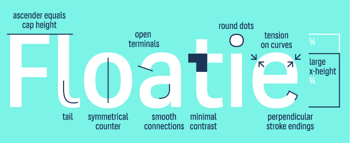
All that functionality and attention to detail would be in vain without the looks to match . . . but Adapt is up to the test. With a large x-height, low contrast, vertical axis, true italics, and open terminals, Adapt is ‘no frills’ done right.
Like the other supertype families mentioned, Adapt supports 135 languages across its massive style range, with all the OpenType features you would expect from Wenzel and Huber. Adapt is adaptable to most scenarios: Set everything in it for a cohesive look or use it as the display face (or body text, marginalia, caption, or anything else). It would be nearly impossible to list all the ways you could use Adapt, because it’s as versatile as its name suggests.
Jürgen Huber and Martin Wenzel build tools for communication. Their supertype fonts, counting this new batch of three—Cy, Duper, and Adapt—reach a degree of refinement, include a variety of features, and solve a myriad of challenges.
Like all supertype fonts, Cy, Duper, and Adapt can be licensed for print, web, mobile apps, and ePubs. are available for desktop, web, app. Webfonts may be tested for thirty days and desktop trials are available upon request.Have a licensing question? Get in touch.