The influence of Adobe Originals
In 2016, when Type Network stepped out into the world, one of its first partners was Adobe. As an inaugural partner of Adobe’s now-retired Typekit Marketplace, Type Network formalized a relationship that eventually led not only to hundreds of Type Network fonts being available in today’s Adobe Fonts service, but also, beginning in 2020, to Adobe’s own typefaces being available for licensing from Type Network.
There is more to this partnership than meets the eye. Both Type Network and Adobe—with their commitment to quality and their deep roots in the history of digital type—have a broad, shared understanding of type’s place in design and media today, but with complementary focus on different customers and workflows. While Adobe Fonts gives millions of Creative Cloud subscribers instant access to Type Network’s fonts for desktop and web publishing, Type Network can give personal attention to customers and clients who have special licensing requirements, from application embedding to font customization.
But first, it helps to understand what makes Adobe Originals so special. Let’s begin with a look at where these typefaces came from, and how the collection grew and evolved over the decades.
Adobe might be best known for its popular software applications like Photoshop and Illustrator, but the history and influence of its Adobe Originals type design program is more significant than many realize. Adobe’s own library of typefaces set early standards for typographic quality, and has some of the most successful and durable designs of the digital era. Today, Adobe Originals are still pushing boundaries with layout features, innovative technologies, and expansive character sets that comprise multiple languages and scripts. While some of these typefaces are celebrated, familiar, and ubiquitous, others are underutilized. What they have in common is a compelling attention to quality and craft rooted in Adobe’s own unique history.
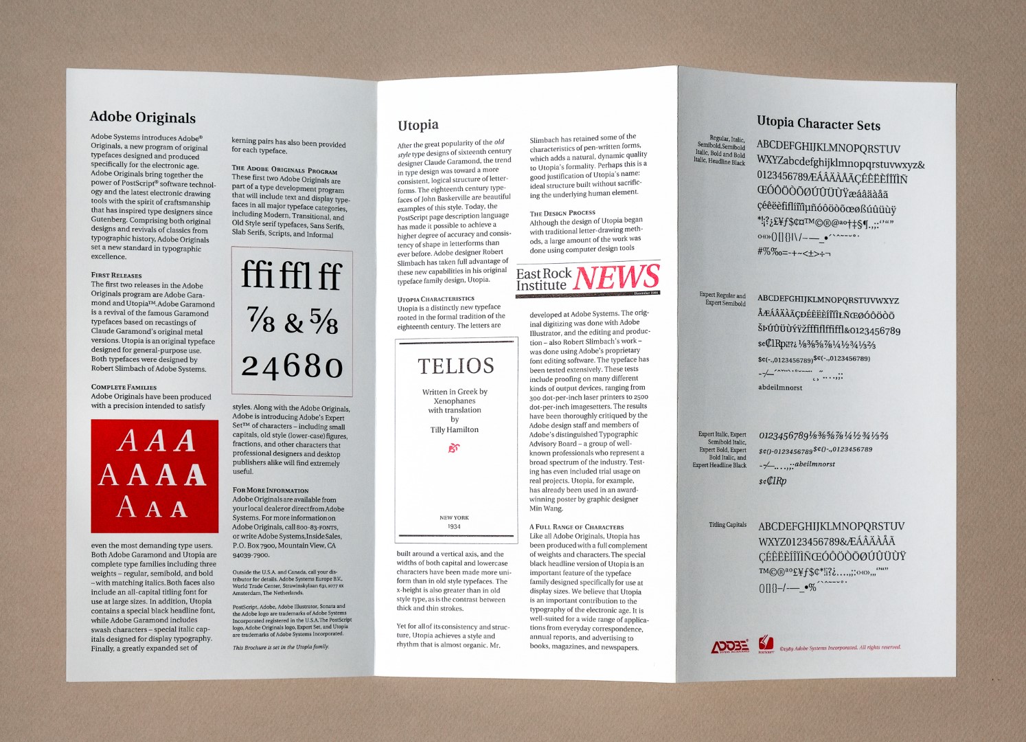
Type was a critical component of Adobe’s first product, the PostScript page description language. In the earliest days of desktop publishing, Adobe first digitized older, existing typefaces from third party foundries like Berthold, ITC, Monotype and Linotype to be used with PostScript. Adobe’s goal was to prove that digital type was a worthy desktop replacement for older technology. In a few short years, the Adobe Type team–and its production of new fonts–became critical to the success of Adobe’s business and quickly validated a substantial investment of time and resources. (Type would become Adobe’s first retail product, and, for a time, its biggest source of retail revenue.)
But just as previous technologies like metal type and phototypesetting influenced the typefaces used with them, Adobe imagined that desktop publishing needed a new, more thoughtful approach to type. Soon, Adobe’s type staff began producing its own typefaces: They revived typographically important features like extended character sets, small capitals, and old style figures—and the fonts were produced under strict quality standards that quickly became an industry benchmark. These typefaces came to be called “Adobe Originals.”
In producing type for a digital medium of their own creation, Adobe understood that skillfully-drawn letterforms could easily be undone by technical shortcomings, so the Originals team worked to perfect their technology and technique. Careful spacing and kerning were important, but so were the construction of each letter’s curves and points. Maintaining meticulously consistent stem widths and vertical alignments, for example, ensured that text still looked its best when rendered on low-resolution printers and screens.
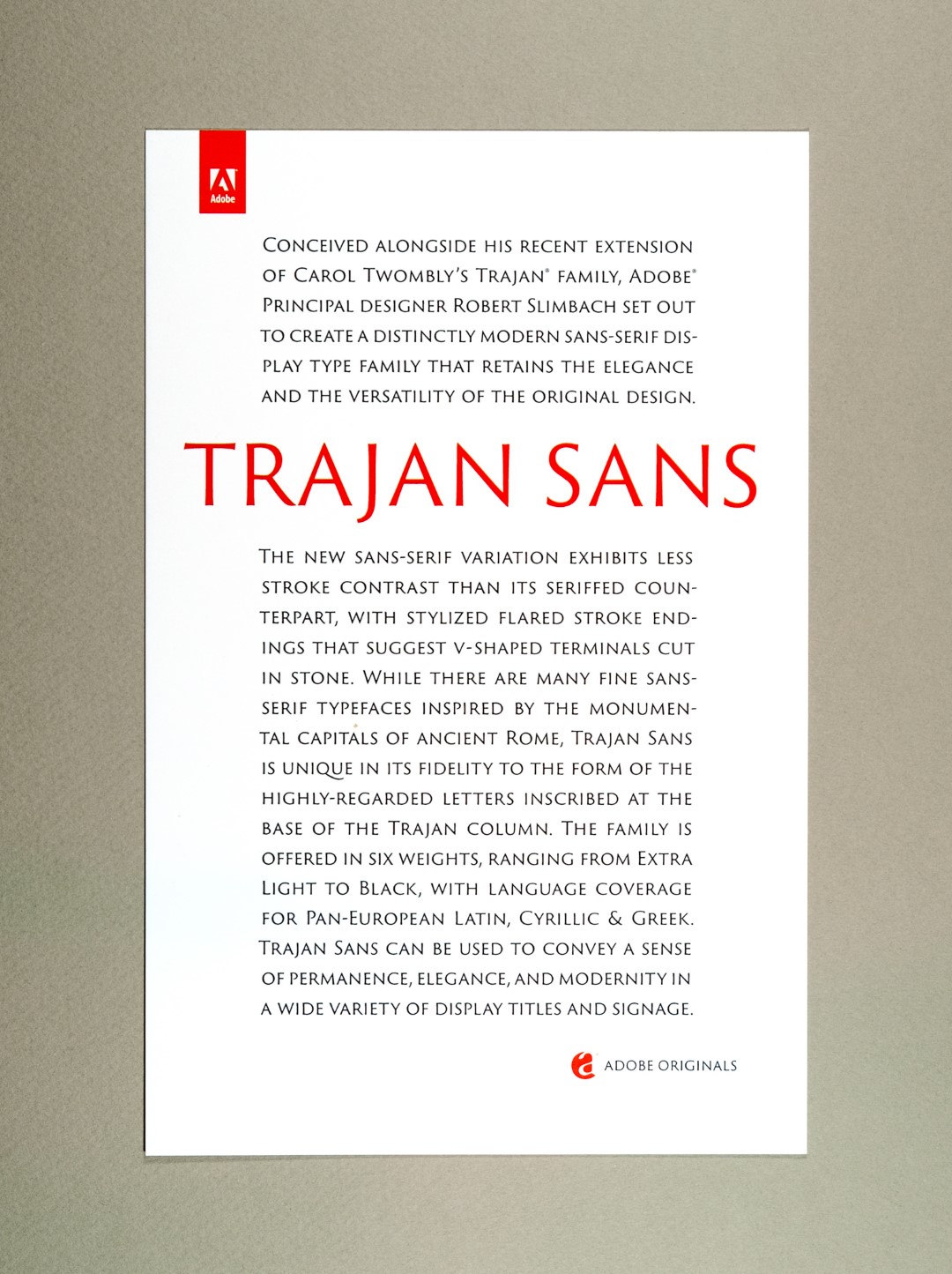
The new typefaces were ambitious but were, above all, designed for lasting utility. Two of the first Adobe Originals were Robert Slimbach’s Adobe Garamond and Carol Twombly’s Trajan, each released in 1989. Both were thoughtfully crafted revivals of classic letterforms—the product of extensive research and development, studying centuries-old metal fonts and printed pages (in the case of Adobe Garamond) and classical stone inscriptions (in the case of Trajan). They remain popular today, certainly so for Trajan, which remains a staple of packaging, branding, and film posters.
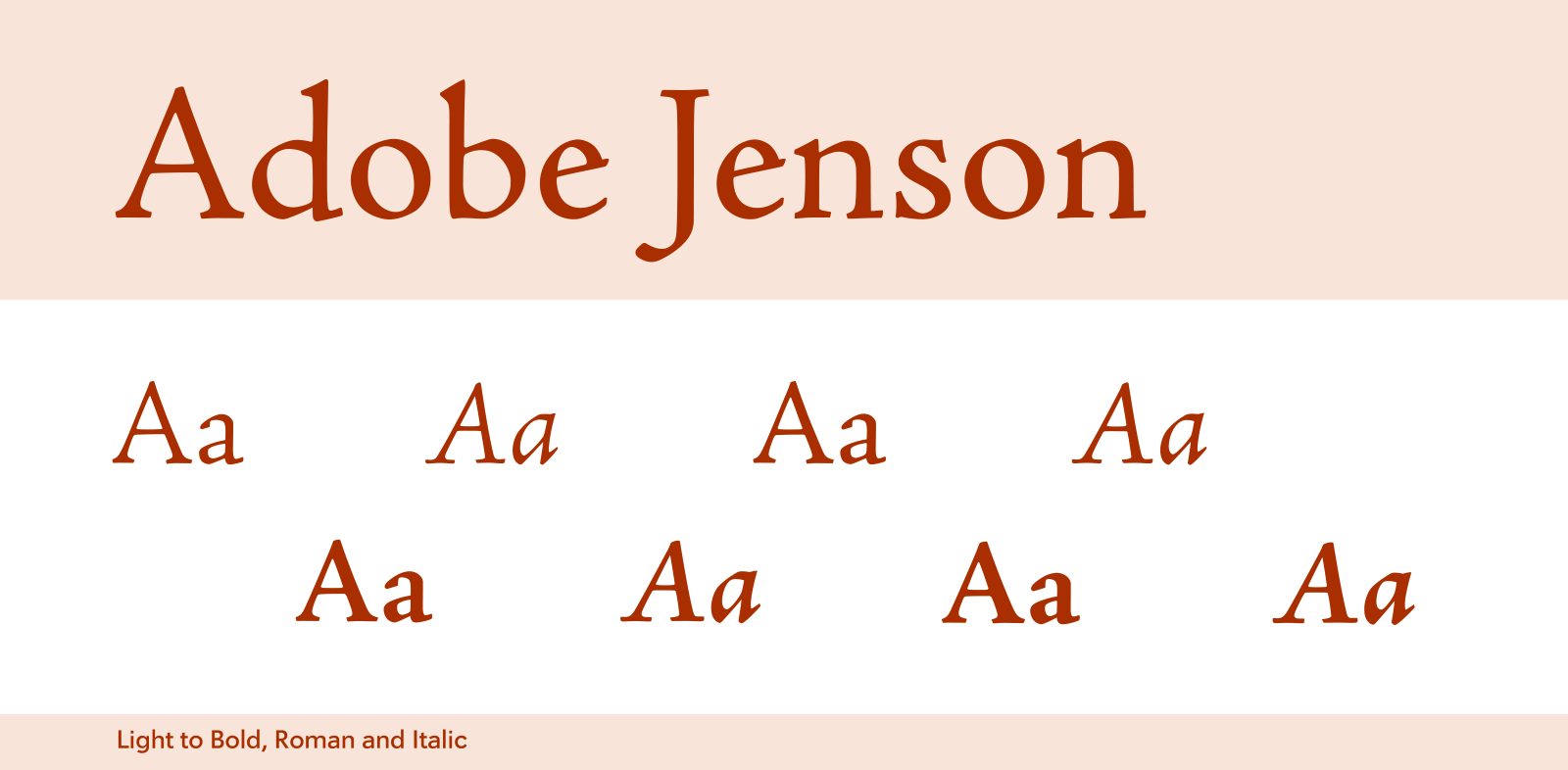
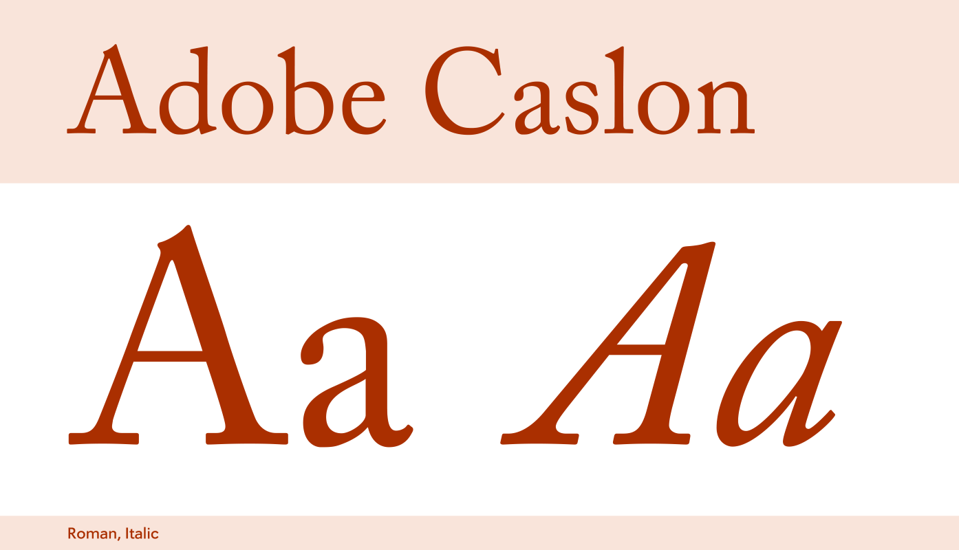
Other acclaimed revivals followed, like Twombly’s Adobe Caslon, Slimbach’s Adobe Jenson, and a three-part series of wood type revivals—but arguably the most innovative typefaces were new designs. Slimbach found inspiration in historical models (Renaissance type and lettering in particular) to produce Utopia, Minion, Poetica, Kepler, Brioso, Arno, and others. Twombly explored more contemporary forms, designing Viva, Nueva, and Chaparral.
One of Adobe’s most successful Originals during this time was a collaboration between Slimbach and Twombly: A humanist sans serif named Myriad. Myriad not only served as the corporate typeface for Adobe and later Apple, but was also conceived as the poster child for Adobe’s “multiple masters” (MM) font format—a precursor to today’s variable fonts. For many years, the MM format was influential in the expanding Adobe Originals catalog.
Twombly retired in 1999, but not before the Originals program had expanded to include many talented outside designers. Among their work, one of the earliest and most popular typefaces was Tekton, by entrepreneur David Siegel. Lettering artist Michael Harvey produced Mezz and others. Lance Hidy, a well-known book designer, created Penumbra, an all-caps design in MM format with a contemporary look and classical proportions. Type designer Richard Lipton’s Bickham Script is a tour de force, and a standard for copperplate lettering in digital form. Its latest OpenType version features dozens of automatic substitutions for all its ligatures and alternates. A variety of display faces came from Julian Waters, Akira Kobayashi, Carl Crossgrove, Joachim Müller-Lancé, Jovica Veljović, and Jim Parkinson, among others.
Beginning in the late 1990s, Adobe Originals were converted to the new OpenType font format, which provoked refinements to the existing library and inspired new designs. The format supported substitution features for greater control over a font’s stylistic alternates and ushered in support for much larger character sets—and consequently more languages and scripts. Previously released Originals were updated and expanded—including Greek and Cyrillic scripts for Myriad and Minion, as well as extra features for many other faces. New, ambitious designs emerged. Slimbach produced the contemporary family Warnock and revisited a classic with Garamond Premier, giving both a range of weights and optical sizes and expansive character sets. Meanwhile, international scripts were produced to support Japanese, Hebrew, Arabic, Thai, Devanagari, Gujarati and Tamil—many of which were designed to harmonize with Minion and Myriad.
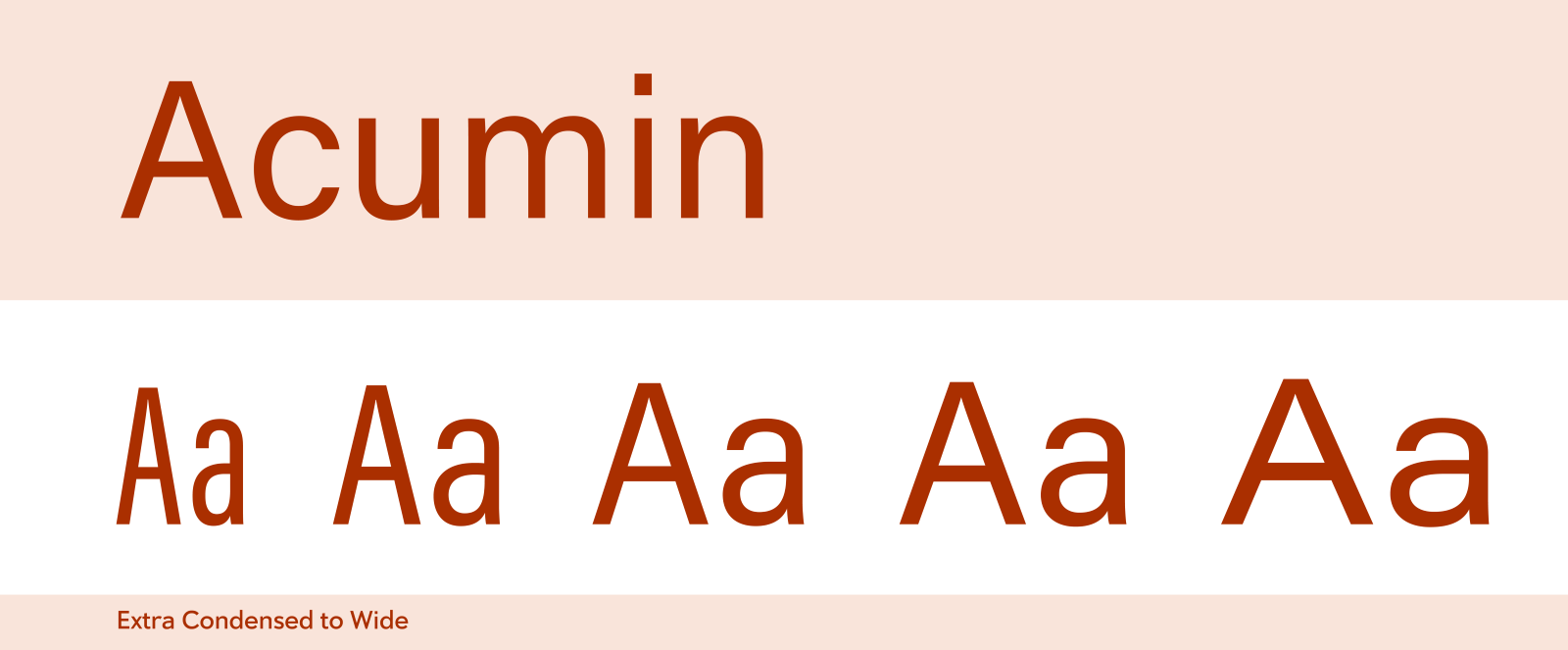
The most recent Originals from Robert Slimbach include contemporary classics like Adobe Text, Trajan Sans, and Pelago, but also 2015’s Acumin, a departure from Slimbach’s usual humanist leanings. Acumin is a neo-grotesque sans serif typeface that was designed to make text sizes readable.
Learn about Adobe Originals
To learn more about Adobe Originals, subscribe to the Type Network Newsletter, where we’ll be sharing interviews, case studies and tutorials explaining everything designers should know about Adobe Originals and Adobe Fonts licensing.
Adobe Originals are more than just typeface designs. Over the years, the program has served to establish new standards for digital type and technologies—from the original PostScript Type 1 format, to multiple masters, OpenType, and variable fonts. From the beginning, Originals made extended character sets, extensive ligatures, and alternate forms a consistent design consideration, often inspiring new typographic features in early desktop publishing applications like PageMaker and QuarkXPress—not to mention Adobe’s own applications like Photoshop, Illustrator, and InDesign. They succeeded in establishing digital fonts as professional-quality tools, and inspired countless type designers to create their own.
Type Network will be diving deep into the Adobe Originals collection and Adobe Fonts. We'll explore the best of what Adobe has to offer, how to make the most of licensing options, best font pairings, and hidden gems in the library.
Type Network provides enterprise, app-embedding, and self-hosting licenses for Adobe Originals (and for all our partner foundries which have typefaces included in Adobe Fonts. Let us show you how to go beyond the single-user licenses that come with Adobe Creative Cloud.Correction (8/4/2022): Adjusted to clarify that type became Adobe’s biggest source of retail revenue, not total revenue.