Roger Black explains his method for setting readable, intelligible text with a ragged right edge with no orphans and no widows.
After receiving an email describing the “proper” way to set text flush left/ragged right, Roger shares his thoughts on the matter, including how to save unfortunate orphans and widows, the importance of typeface selection, and the relevance of . . . the actual words on the page.
Ragged orphans
A quick discussion of the best way to rag type.
[An edited transcript]
The other day I got an e-mail, a kind of typographical “manual,” from one of the big companies in the business. It was useful explanation of widows, rags, and orphans. No, this was not a fundraising appeal. This was about typographical widows and orphans and rags. A rag, of course, is when one side of a column is uneven, not aligned on the margin. Typically, we see flush-left columns, where lines of type line up on the left and then end unevenly on the right. That’s called ragged right, of course.
That’s the way it comes out in word processors, and in most of the text you see on the web. My friends in Europe always said ragged right is better for readability than justified type, because the word spacing is even, unlike in justified type where space is added between words in some lines to make them all line up. And if the typesetting rules are set that way, you get space between the letters as well in order to justify. This makes my European friends scream.
Some people like ragged left for captions, or even for some text blocks. I never use it. Why? Because it's a little harder to read since you don’t start reading from the same vertical position. It’s more random. Coming back to the same place seems more comfortable.
Long text is one thing, and since the typewriter we’ve been used to ragged right. Problems come when you use it for shorter pieces of copy—for display type. It’s almost always better than justified type, but there are other issues.
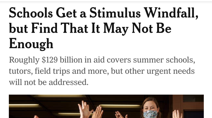
Here’s an example from The New York Times. There are three headlines on a page from their Android app. The first one is sort of typical: As many words as possible are fit on the first line, and then text spills over to the second line which comes out shorter. And we see that the third line just has one word. That’s an orphan! You’re sort of used to them on the web. They may look a little random, but nobody gets too excited. Maybe it’s unintentionally poetic, that second line: “But Find That It May Not Be . . .”
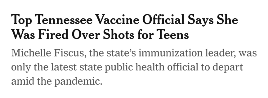
The next headline, same thing: The first line is the longest. Notice that it ends with the pronoun, “she,” which is a mistake, at least if you had any experience with a newspaper copy desk in the old days. The New York Times in print will still never end a headline with a pronoun or a preposition, nor start a line in a head with a lower-case letter. That’s against the style.
But with type spewing out on the web, those rules fall by the wayside. The random rag in the digital editions is made more awkward because the newspaper sticks to “upstyle,” where each noun is capitalized, although pronouns and conjunctions are lower case. So the capitalization starts looking random, too.
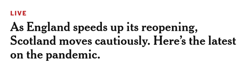
The third headline here is downstyle, I guess because it is a promo and not a headline. But it works. “As England speeds up its reopening,/ Scotland moves cautiously. Here's the latest on the pandemic.” Inadvertently, perhaps, each line is a phrase. This reads much better. It’s what we call “phrase ragging.” This is my point today: Phrase ragging is a better way to set type.
If a headline is not going to fit in one line, and you have spill it into multiple lines, perhaps you can set the type so that it reads one phrase at a time? Many typographers (and the manual I got in the mail is among them) are looking only for the best color for the texture. A random pattern. This reminds me of the old days, when designers would indicate type on a layout that they were drawing with gray boxes, or gray areas, roughed in with a felt-tip marker. It was as though the text was just an abstract pattern, with a tint color.
That puts type in the same category as other elements of graphic design: Shapes, images, drawings, photos, whatever you have, are all composed, essentially, equally. But some elements have. . . content. You know, of course, that a picture has meaning. And you think about that meaning when you're laying it out.
When you lay out text, you need to ask yourself, “What is the content? What’s the copy?”
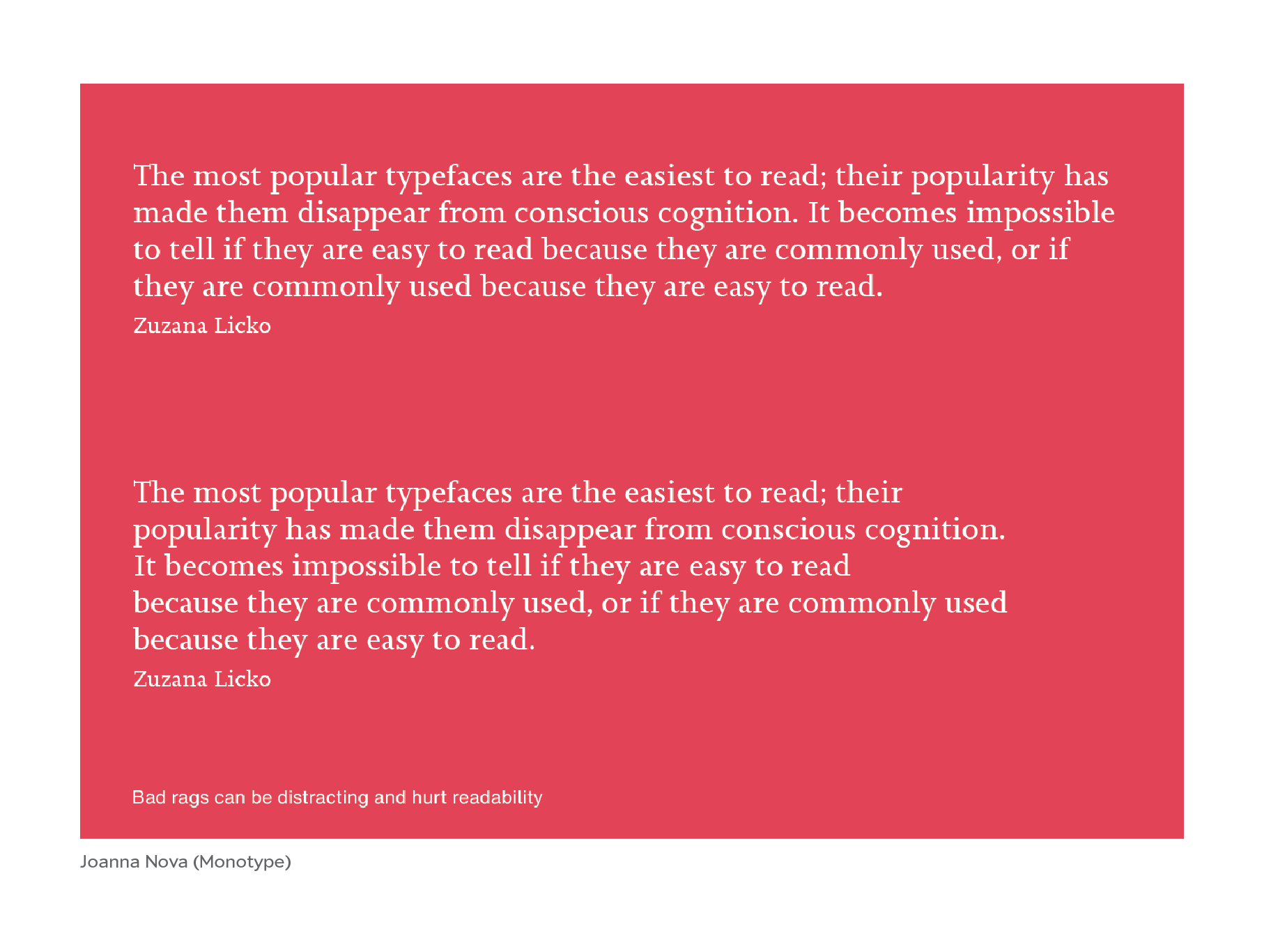
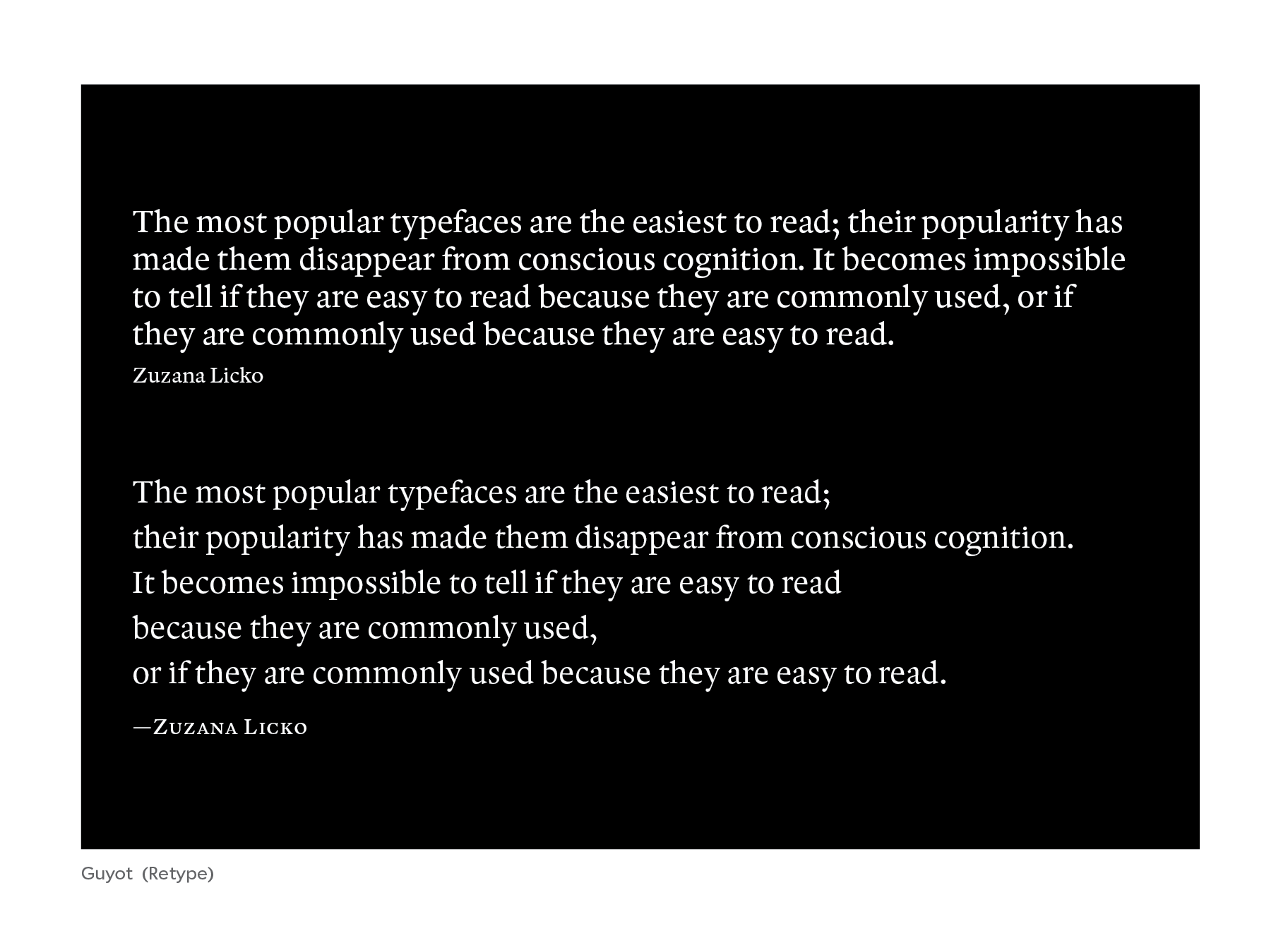
The meaning of the text is often ignored in a typical typographic exercise. Take the example in the e-mail manual. The copy is a delightful quotation from Zuzana Licko the co-founder of Emigre, one of the first desktop type foundries, founded in 1989 (the same year as the Font Bureau started). She's a great designer and has a lot of good observations about type.
Here she says, “The most popular typefaces are the easiest to read; their popularity has made them disappear from conscious cognition. It becomes impossible to tell if they are easy to read because they are commonly used, or if they are commonly used because they are easy to read.” Very nicely put.
Our friends at the big company used this quote to show how to improve ragged type. Their before-and-after examples are the two text blocks on the red background. At the top is the quote at the top, as it would come “out of the can”—the way a web browser would set it. You can see that it is a little random, and after the second line, each line is shorter.
Below is the text the way that they suggest setting it, alternating the line lengths: Short, long, short, long, short, long. This is what some typographers call, “feathered.”
Our friends at an even bigger company, Adobe, try to do this automatically. They made the Adobe Paragraph Composer for InDesign, which uses some rules, some algorithms, to make nicely feathered ragged copy. It avoids the widows. And you don’t have to do it by hand. But the line endings often interrupt the phrases.
For the typeface in the manual, the choice was Joanna Pro, which was designed by W. A. Dwiggins. It has a nice kind of bite for text. It’s very good for books. Thinking about the Type Network catalogue, I thought, well, Cyrus Highsmith (of Occupant) has a wonderful type called Quiosco, done for a publication in Mexico designed by Eduardo Danilo. It has a little Dwiggins flair in some of the swells of the letters, and in the terminals. This flair seems to improve readability. Dwiggins, as may know, made marionettes as a hobby. He said he learned from painting expressions on their small wooden faces how to create expressions that could be seen from a distance.
Also, Quiosco is stylish. And so here, on the black background,* is another try at the same text, but using the Highsmith font instead of the Dwiggins. In the first text block, you see the same line endings as the original example. One thing I noticed is that attribution on the quote seems a little weak, it's just the same optical size, reduced, flush left. It seems itself kind of orphaned down there. It does not stand out as a signature.
In my resetting, I made the rag follow the natural phrases, which you can easily guess by the punctuation. Each line is a phrase in this case, and the final line becomes a punch line.
For the signature, I put Zuzana’s name in caps-and-small-caps, in a slightly heavier weight, so that it would stand out better and hold its own even at the smaller size. There’s an old typographical rule that proper nouns, when set outside of text, are dignified with caps-and-small-caps. And of course, we letterspace the caps-and-small-caps, to help make the color match the text.
To sharpen the point. Phrase ragging improves readability, even at the cost of making the text a bit more ragged.
In desktop typesetting, you can intervene and make the phrases work for display copy. But with type on the web and digital apps, because of different targeted screen sizes you can’t predict the line endings. I think adding hard “returns” in HTML is an okay solution for phrase ragging in display type—that is, for headlines and quotes and such. You may end up with more extreme rags when the lines break again on smaller screens, but in the digital world there is unlimited space. (And there is a lot of forgiveness for bad typography anyway.)
Text is meaning.
With text, there is actual language. There is somebody saying something to you in the text. Typography only comes alive when you read it. Type is not a random set of shapes with aesthetic compositions. It is ideas, stories, news—everything that can be said. And if you’re going to increase the understanding of the meaning in the text, use phrase ragging.
____________
*The black background, I think, makes the text easier to read. Never mind the associations with either color, white-on-black has more contrast than white-on red.
.png)
.png)