Type Network Logo
Fonts
Foundries
Designers
Stories
Services
Search Icon
Search
User
Account
Cart Icon
Cart
Menu Icon
ScreenFonts: May 2018 | The Leftovers · Type Network
ScreenFonts: May 2018 | The Leftovers
These posters didn’t make the
cut
, but are still noteworthy for their design and/or typography.
By Bald Condensed
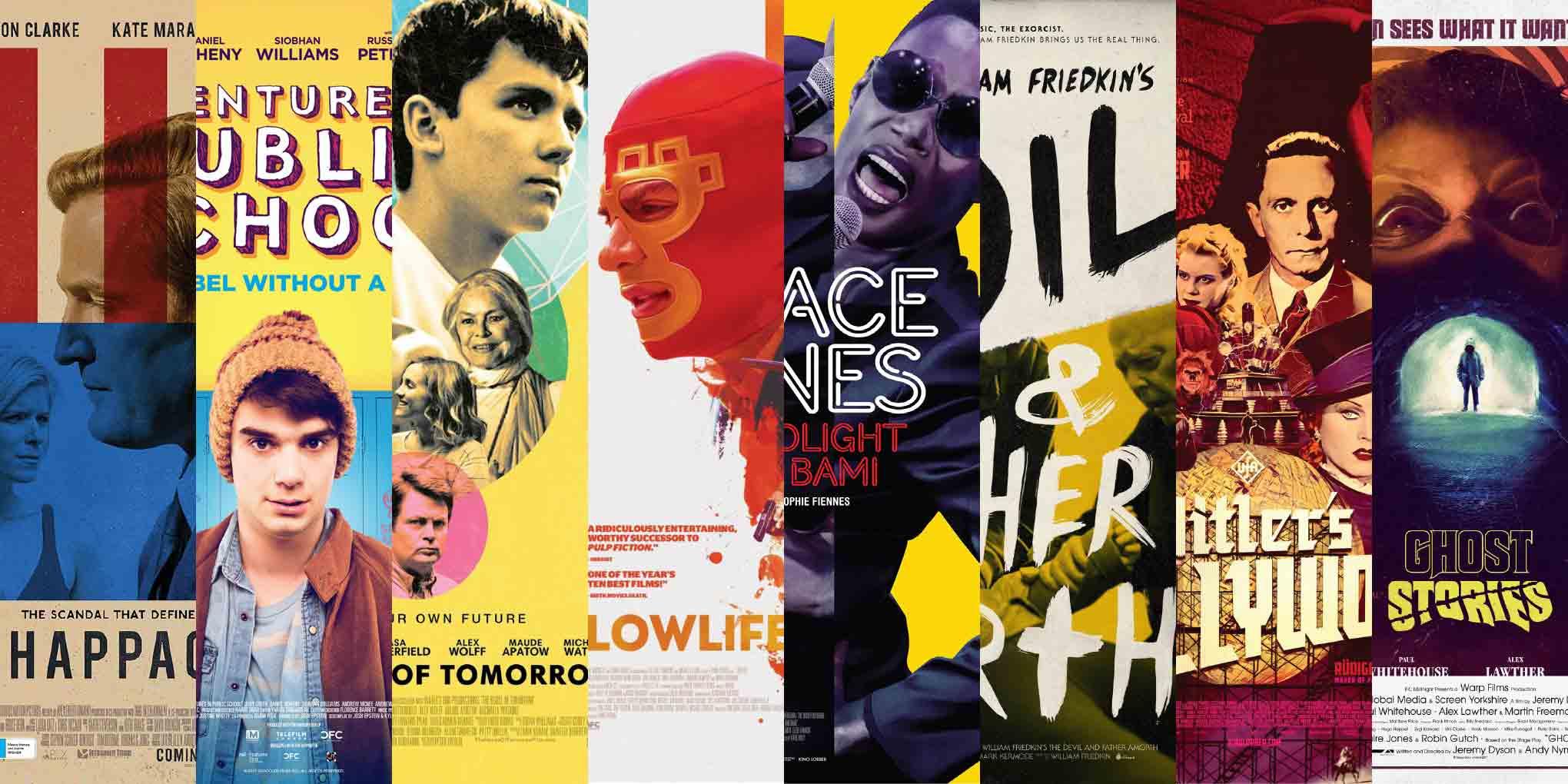
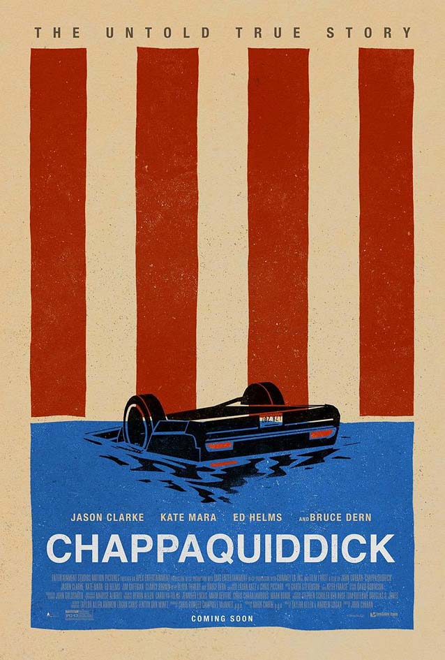
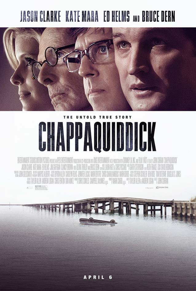
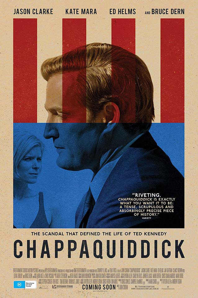
Chappaquiddick
© 2017 Entertainment Studios Motion Pictures.
Bond
’s strong key art repurposes the core elements of the American flag to suggest the bridge and the river in which Ted Kennedy’s car is sinking. The modernist icon
Neue Haas Grotesk
is a perfect match for the minimalist graphics.
This lackluster photographic one-sheet, also by Bond, is a radical departure (and not in a good way) from the stylish minimal version. Other very narrow typefaces that would work well here include
Antenna Compressed
,
Titling Gothic Skyline
,
Amplitude Extra Condensed
, and
Agenda Ultra Condensed
.
Bond’s third version combines the best of both worlds, with Kate Mara’s character submerged in the blue area to hint at her fate. For an alternative to Alternate Gothic, look at the Extra Compressed widths of the expansive American gothic series
Benton Sans
, which is based on the same source material.
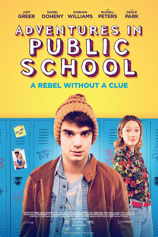
Adventures in Public School
© 2017 Gravitas Ventures. Somebody got the memo that posters for indie coming-of-age films need to be
predominantly yellow
with
hand-drawn block letters
.
Caslon’s Egyptian
has a similar vibe.
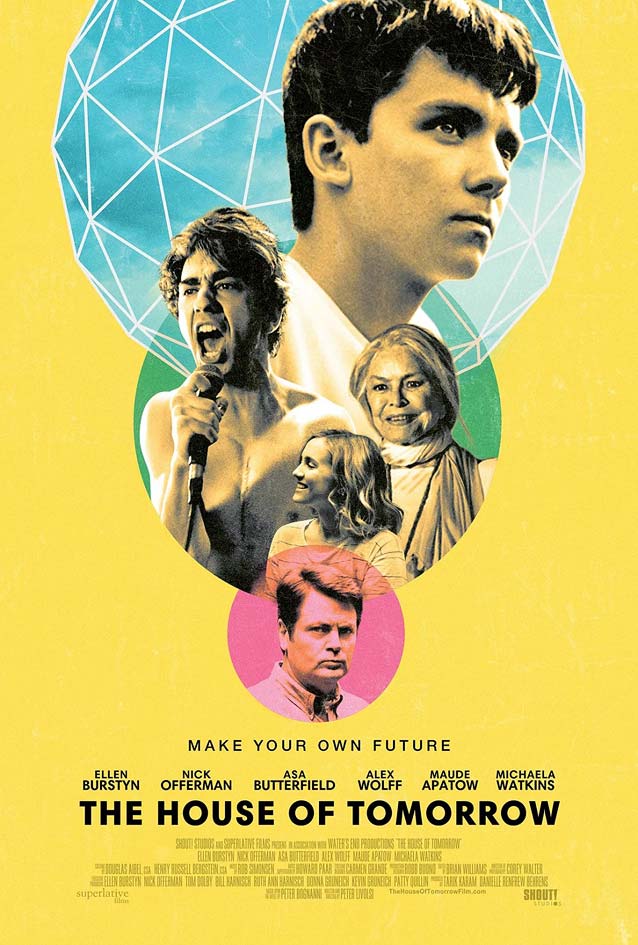
The House of Tomorrow
© 2017 Shout! Factory.
mOcean
applies the yellow scheme to an inventive, stacked composition.
Newlyn
’s
New Hero
offers a refreshing take on the geometric sans genre.
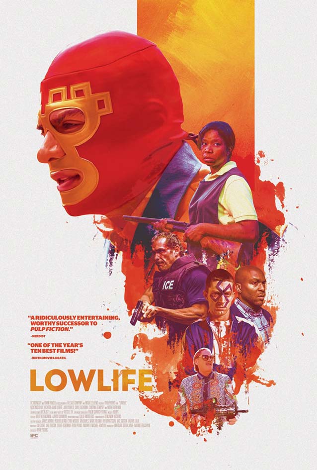
Lowlife
© 2017 IFC Midnight. In a Twitter direct message,
Brandon Schaefer
told me: “
Floating heads
are weirdly fun, if only because
I just keep trying to see if I can get them right
.” And he does. Look at
New Atten
and
Telefon
for sans serif capitals with a similar architecture.
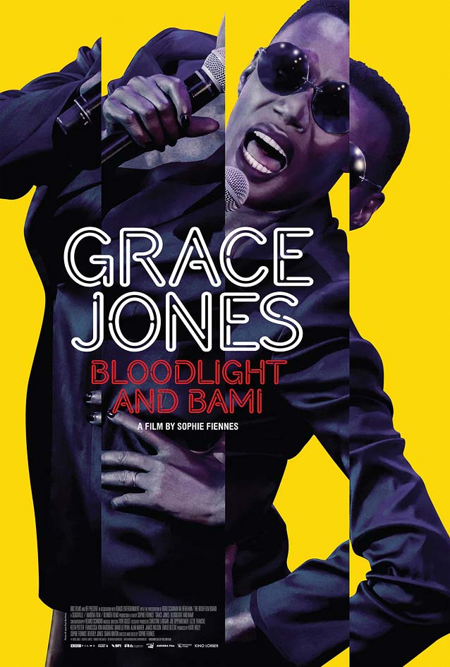
Grace Jones: Bloodlight and Bami
© 2017 Kino Lorber. The bright colors and sliced image make for a poster as exuberant and in-your-face as the artist, with her name in bright neon letters.
Zavier Cabarga
’s
Neon Stream
would fit right in here.
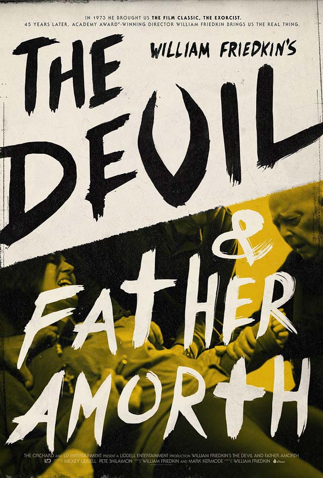
The Devil and Father Amorth
© 2017 The Orchard. Raw and uncompromising brush lettering mirrors the intensity of the exorcism depicted in
Gravillis, Inc.
’s excellent theatrical one-sheet.
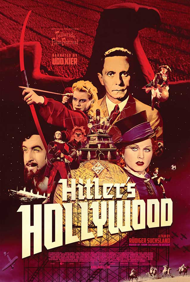
Hitler’s Hollywood
© 2017 Kino Lorber. Superb use of colorized black-and-white photography in
Matt Frost
’s stunning poster. The “Germanified” Hollywood sign is a fun detail.
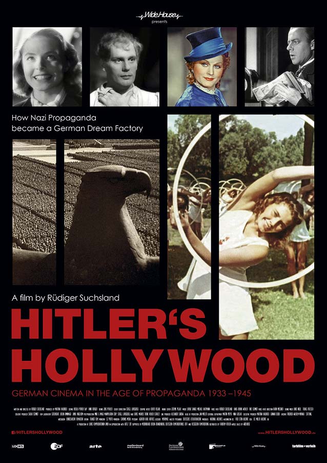
The international version of the original German domestic one-sheet shows why colorization was the best option. The mosaic lay-out on black can’t disguise the inconsistent quality of the inset images. Because the German possessive needs no apostrophe, one had to be added for this English-language version. Note the incorrect use of
Neue Haas Grotesk
’s upside-down apostrophe. Rookie mistake.
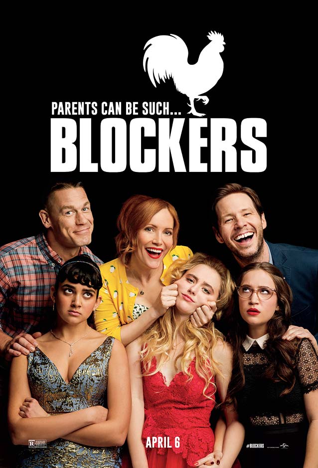
Blockers
© 2018 Columbia Pictures. Oh, I see what you did there, Columbia Pictures and
LA
. This movie is not
really
called just
Blockers,
is it?
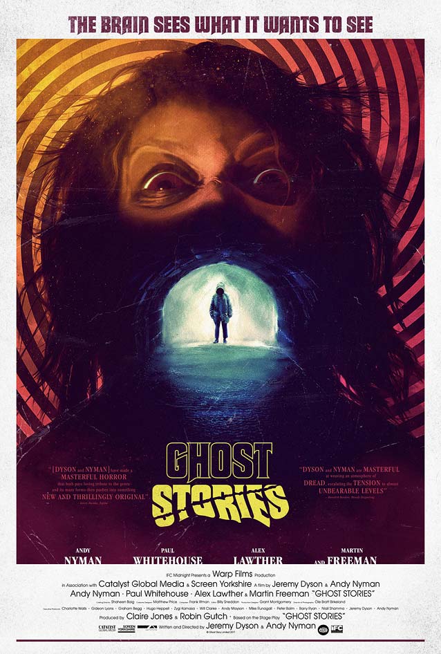
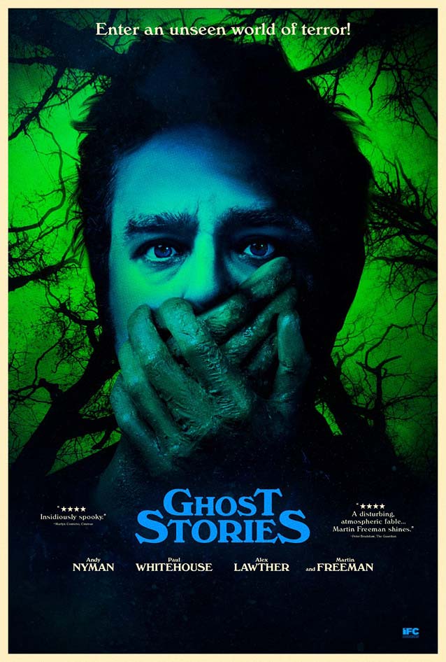
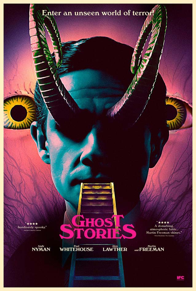
Ghost Stories
© 2017 IFC Midnight. Glorious over-the-top retro poster with vintage Macbeth (yay!) and eighties go-tos ITC Garamond and ITC Avant Garde Gothic (yawn).
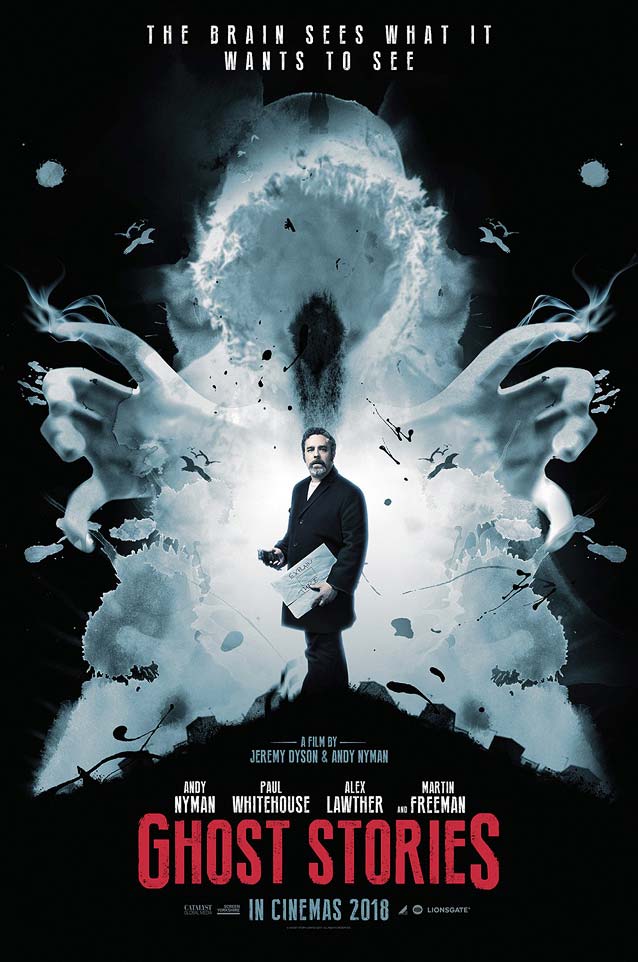
© 2017 IFC Midnight.
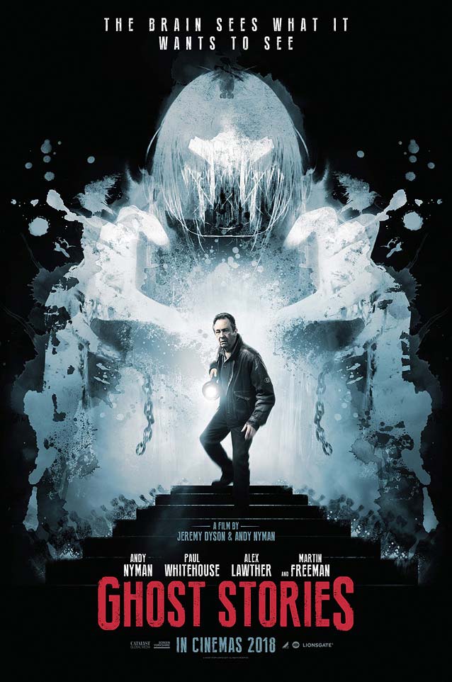
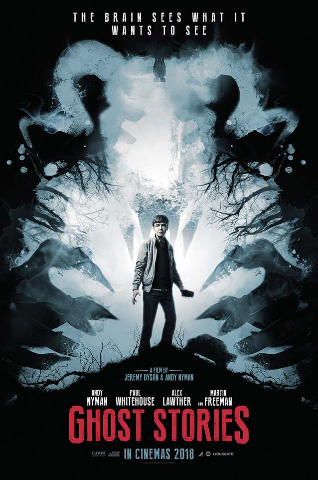
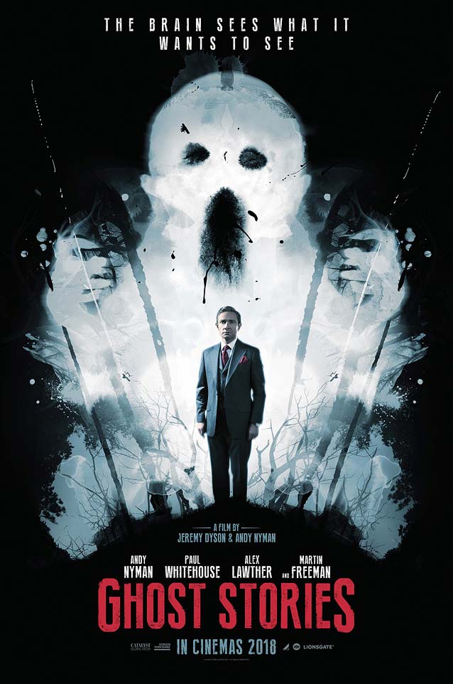
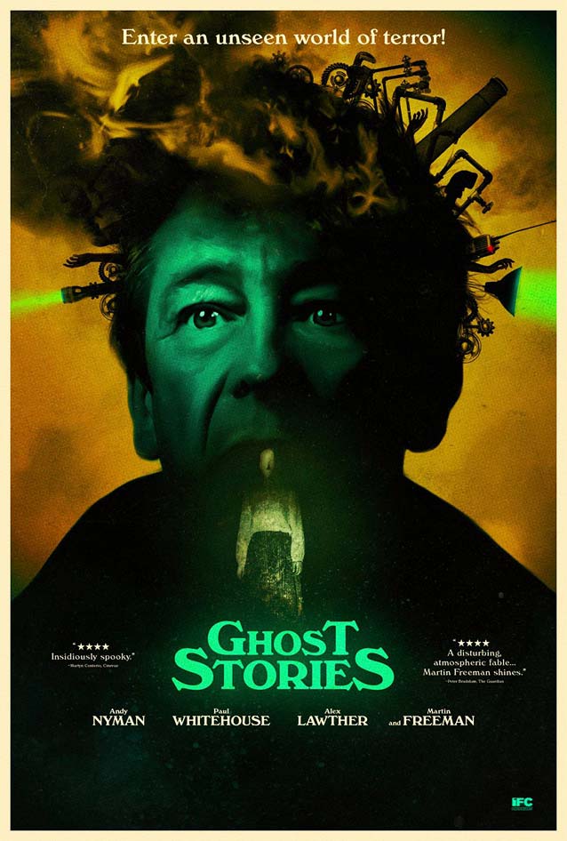
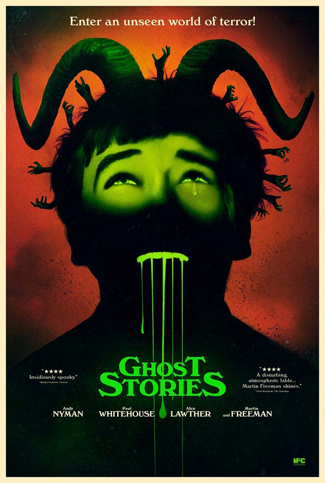
The Posterhouse
designed a fun series of character sheets playing with the concept of images hidded in Rorschach blot tests.
© 2017 IFC Midnight.
© 2017 IFC Midnight.
© 2017 IFC Midnight.
© 2017 IFC Midnight.
P+A
went all out with their psychedelic collage-like compositions in garish colors. Windsor seals the artwork with a seventies look.
© 2017 IFC Midnight.
Kopius
,
Custer RE
,
Turnip
, and
Bookmania
all evoke a similar atmosphere.
© 2017 IFC Midnight.
© 2017 IFC Midnight.