
ScreenFonts: January 2017 | The Leftovers
These posters didn’t make the cut, but are still noteworthy for their design and/or typography.
Every month, when I trawl through the posters of recently released movies, I never know what I’ll find or how many will end up in a story. To review a poster, I need a hook, something interesting to write about, be it the design or the typography. I try to limit myself to about ten posters so as not to make ScreenFonts entries overly long. Because of this—very arbitrary—selection process, some beautiful designs end up on the cutting-room floor. From now on, I’ll publish these tasty “leftovers” in brief follow-up posts.
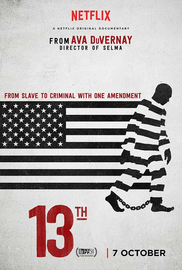
13th © 2016 Netflix. Poster by BOND. The flag’s stripes become the stripes in the classic garb of a prisoner, his feet shackled in chains. 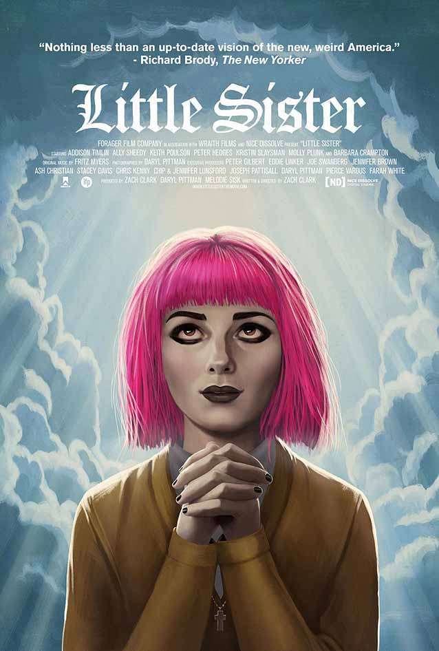
Little Sister © 2016 Forager Films. Illustrated poster by Akiko Stehrenberger. The choice of typeface is clever: blackletter is as prevalent in religious literature as it is in goth culture. |
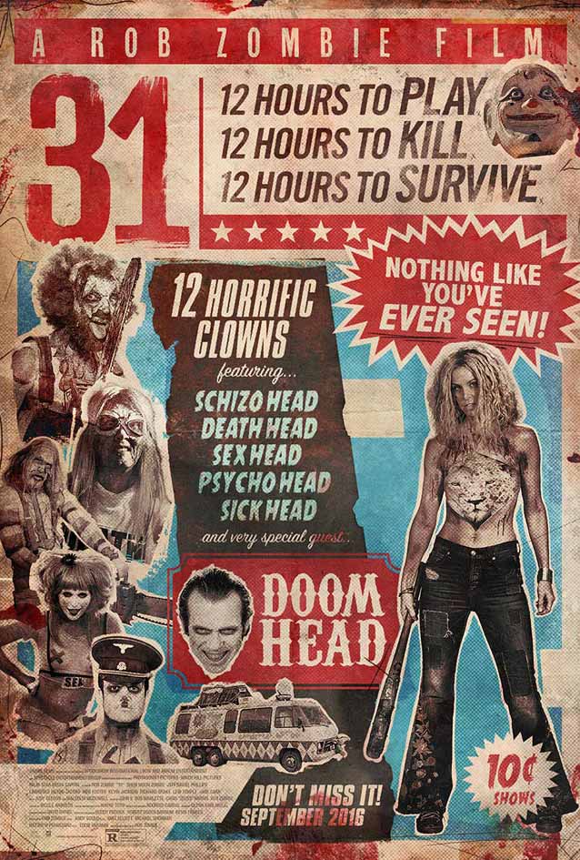
31 © 2016 Saban Films. Grindhouse-style poster designed by Gravillis, Inc. 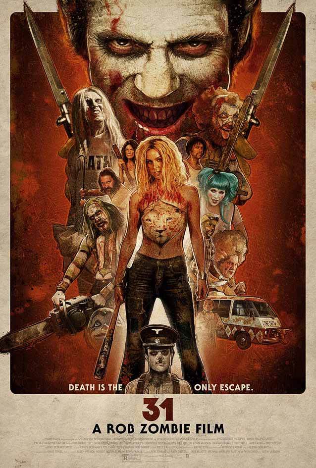
31 © 2016 Saban Films. Illustrated poster designed by Gravillis, Inc., with masterful artwork by Paul Shipper, one of the rightful heirs to the legendary Drew Struzan. |
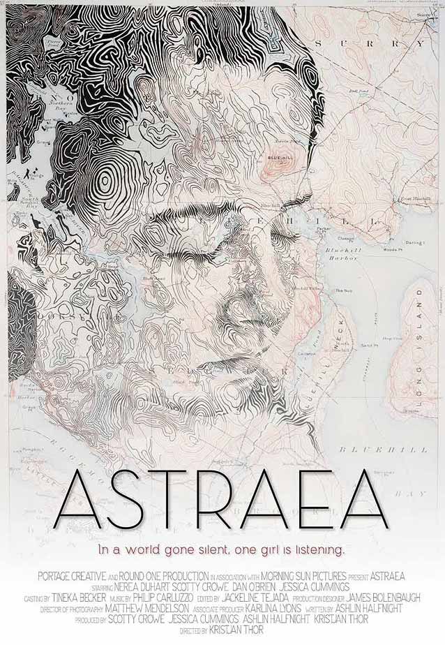
Astraea © 2015 Random Media. Inventive use of contour lines on a topographic map create the portrait of the female lead while the film title is set in Neutraface Titling. 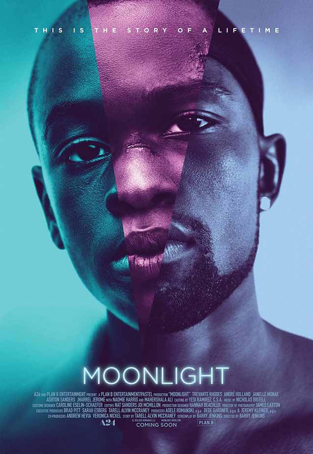
Moonlight © 2016 A24. Gorgeous, poetic theatrical one-sheet designed by InSync Plus for one of the highest-rated movies of 2016. The three tastefully hued sections symbolize the story being told across three defining chapters in the life of the main character. Tobias Frere-Jones’ contemporary classic Gotham subtly shines. Like, literally. |
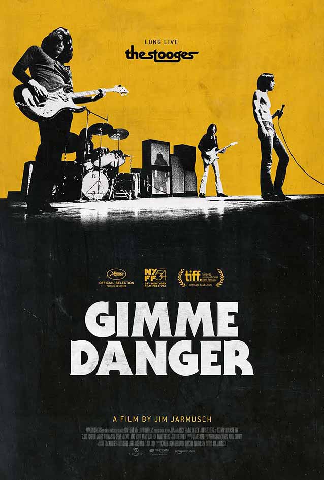
Gimme Danger © 2016 Magnolia Pictures. Fitting early 1970s typography on this poster designed by Gravillis Inc. 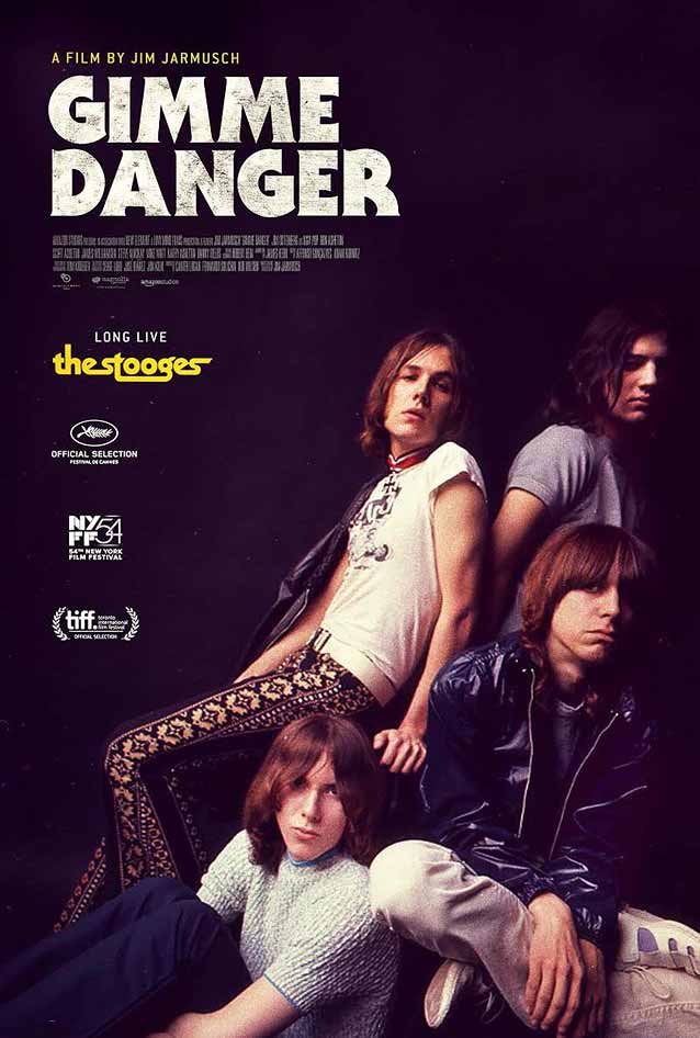
Gimme Danger © 2016 Magnolia Pictures. Poster designed by Gravillis Inc. |
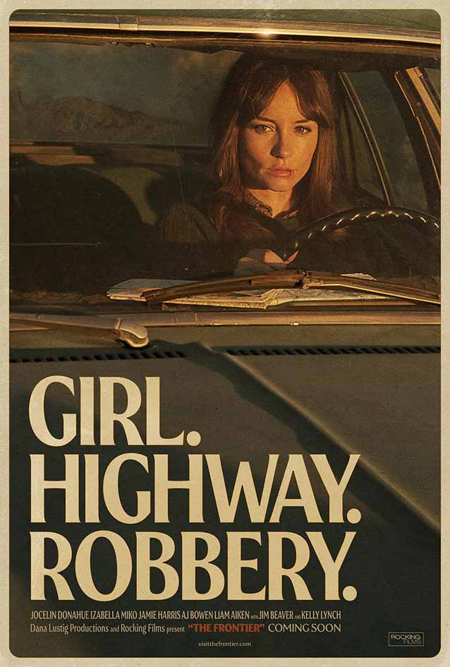
The Frontier © 2016 Kino Lorber. Teaser poster designed by Robbergirl Productions. This lovely 1970s-style series makes beautiful use of Göran Söderström’s nostalgic Heroine. 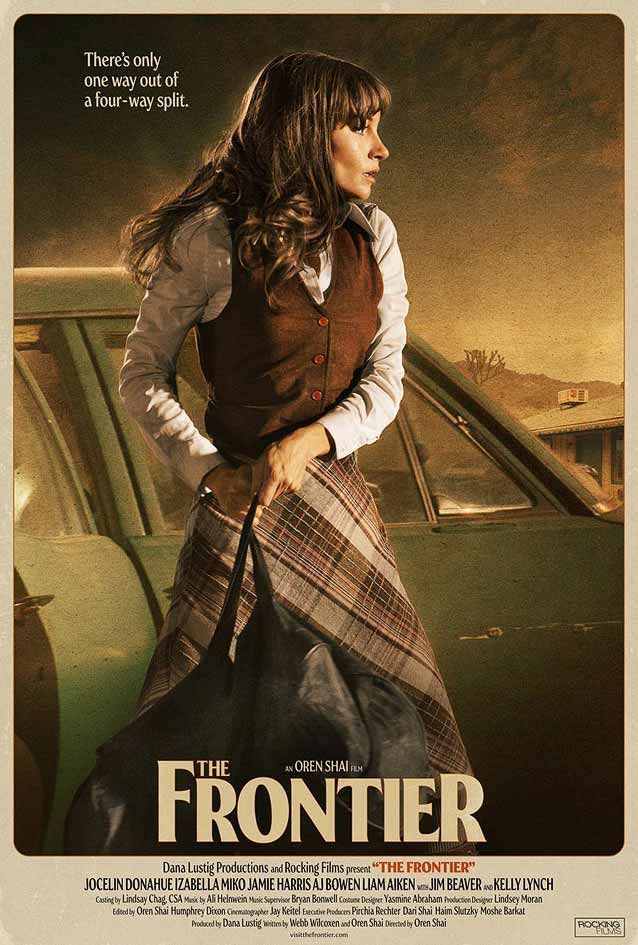
The Frontier © 2016 Kino Lorber. Theatrical one-sheet designed by Robbergirl Productions. |
Bald Condensed, né Yves Peters, is a Belgian-based rock drummer known for his astute observations on the impact of letterforms in the contemporary culture-sphere. A prolific writer on typography, he has a singular knack for identifying the most obscure typefaces known to man.