ScreenFonts: August 2018
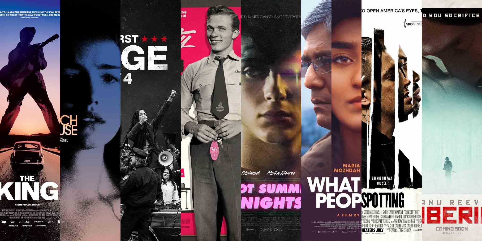
The temperature rises with posters for The King, Beach House, The First Purge, and Scotty and the Secret History of Hollywood. Then it reaches scorching highs with Hot Summer Nights; gradually drops with Hva vil folk si (What Will People Say) and Blindspotting; and finally hits glacial lows with Siberia.
Before we dive into the summer edition of ScreenFonts, I’d like to ask you a favor. Buoyed by my successful appearance at SXSW Interactive last spring, I’ve submitted a couple of proposals for next year: one for a talk at the interactive festival, and another for a panel at the film festival. In Variable Fonts: The New Frontier, I’ll give an introduction to the revolutionary format that is changing how we view and use type. For A conversation about movie posters, three acclaimed poster designers will join me onstage: Akiko Stehrenberger, Midnight Marauder, and Kenny Gravillis. If you’d like to see any or both of these panels happen or simply want to support me, please click the link(s), register on the Panelpicker platform—it’s free and there are no strings attached—and vote. You will have my eternal gratitude (give or take a few years).
We have experienced an atypically hot summer where I live in Belgium, with a prolonged heat wave. I just hope it isn’t followed by finger-numbing cold this winter, so I can type up more ScreenFonts episodes. In the meantime, come back for The Leftovers in a few days.
Bald Condensed, né Yves Peters, is a Belgian-based rock drummer known for his astute observations on the impact of letterforms in the contemporary culture-sphere. A prolific writer on typography, he has a singular knack for identifying the most obscure typefaces known to humankind.
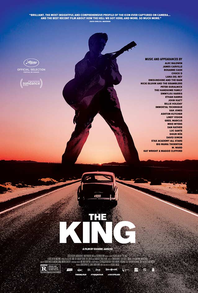
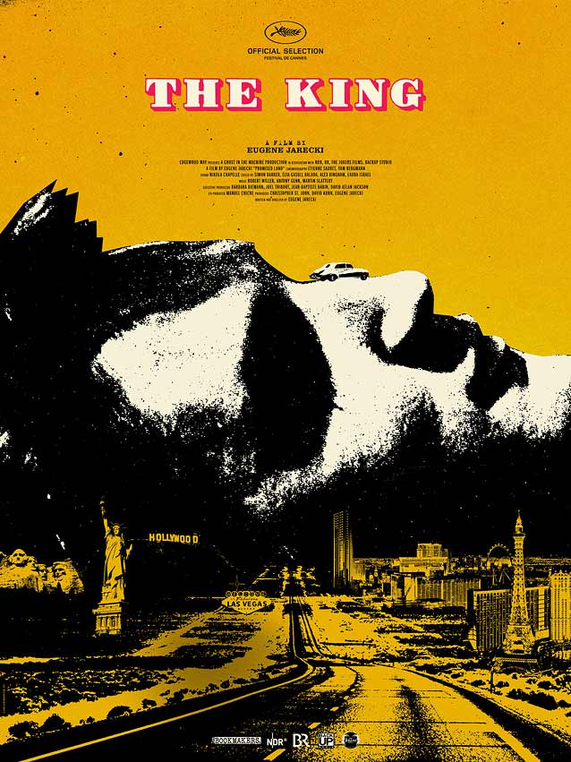
The KingWe open—coincidence?—with one of two posters by my potential SXSW copanelist Midnight Marauder (MM for short). He developed the key art for The King (originally called Promised Land) for the Cannes Film Festival. This musical road trip across America in Elvis Presley’s 1963 Rolls Royce, forty years after his death, explores how a country boy lost his authenticity and became a “king,” while his country lost its democracy and became an empire. MM told me he spent several weeks creating dozens of renditions without having seen the film, and with few visual references to work from. He came up with an imaginative (and historically appropriate) pop-art collage. A highway cuts through a collection of American landmarks, with Presley’s profile towering over the landscape like a mountain range, his Rolls perched atop his nose. The hard contrast and brutalist color scheme, accented by an outlined fat face with a bright red shadow, reinforce the artwork’s impact. CSTM Fonts’ Kazimir Black is equally suited for outlining and shading; another great choice would be Revolver’s Mondial, whose geometry and abrupt changes in contrast conceptually match the art. |
Brandon Schaefer chose a similar yet softer photographic treatment for the theatrical one-sheet. The Rolls Royce drives down the highway into the sun setting between Presley’s feet, the King’s giant silhouette rising above the highway. His iconic pose transforms the man into a historic landmark. Schaefer’s surreal image tenuously balances between melancholy and hope. Centered sans-serif capitals beautifully complement the single-perspective art. But Akzidenz-Grotesk Super is German; a quintessentially American Gothic like Benton Sans Black or ITC Franklin Black would have been a culturally relevant alternative. The more pronounced contrast in Cyrus Highsmith’s Salvo Sans Black would have given the film title a little bite. |
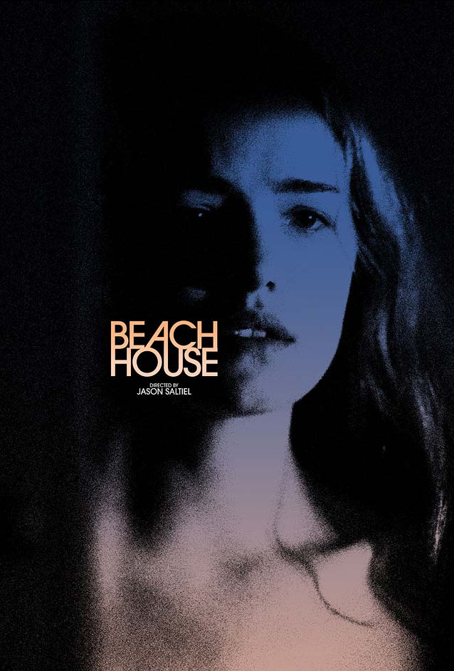
Beach HouseThings get a little warmer with Jason Saltiel’s thriller Beach House. In Midnight Marauder’s second poster this month, the blue-to-pink gradient is similar to Schaefer’s for The King. The stylish end result, however, gives off a completely different vibe—one of dread and disquiet. MM’s design makes me reassess my belief that connecting letters vertically never looks good. His expert ITC Avant Garde Gothic lockup is impressive: a perfect, tightly tracked rectangle with an inventive trajectory starting from the O, moving upward to the alternate A, then plunging to the U, and finally swinging back up to the C. Observe how the circular shapes of the O and the U, the initial BE and the final SE, and the two Hs are in perfect balance. This kind of typographic symmetry makes my synapses purr like a content kitty. |
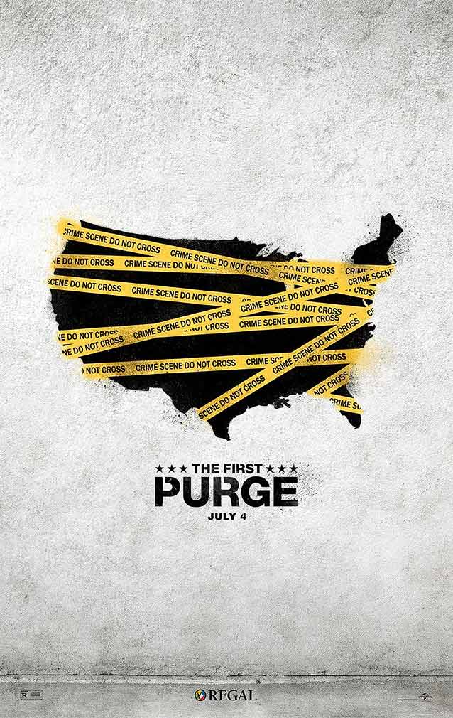
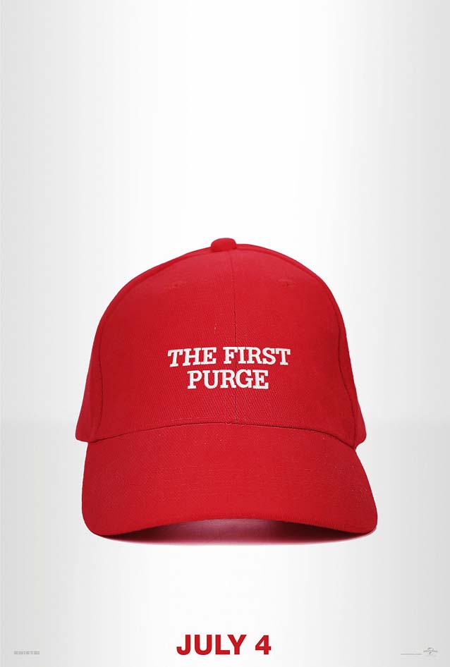
The First PurgeThe temperature is figuratively cranked up with the fourth installment in the Purge series. The First Purge shows how a fictional third major political party, New Founding Fathers of America, comes to power in a dystopian future and conducts a social experiment by making crime legal for twelve hours on Staten Island. In this teaser, LA spray-painted an outline map of the United States, covering it with police tape to drive home the message that the entire nation has turned into a crime scene. Neue Haas Grotesk is the de facto official face of public notifications and warning signs. Minimal bridges connecting the counters of the P and R to their contours make it look as if the film title has been applied with a stencil. |
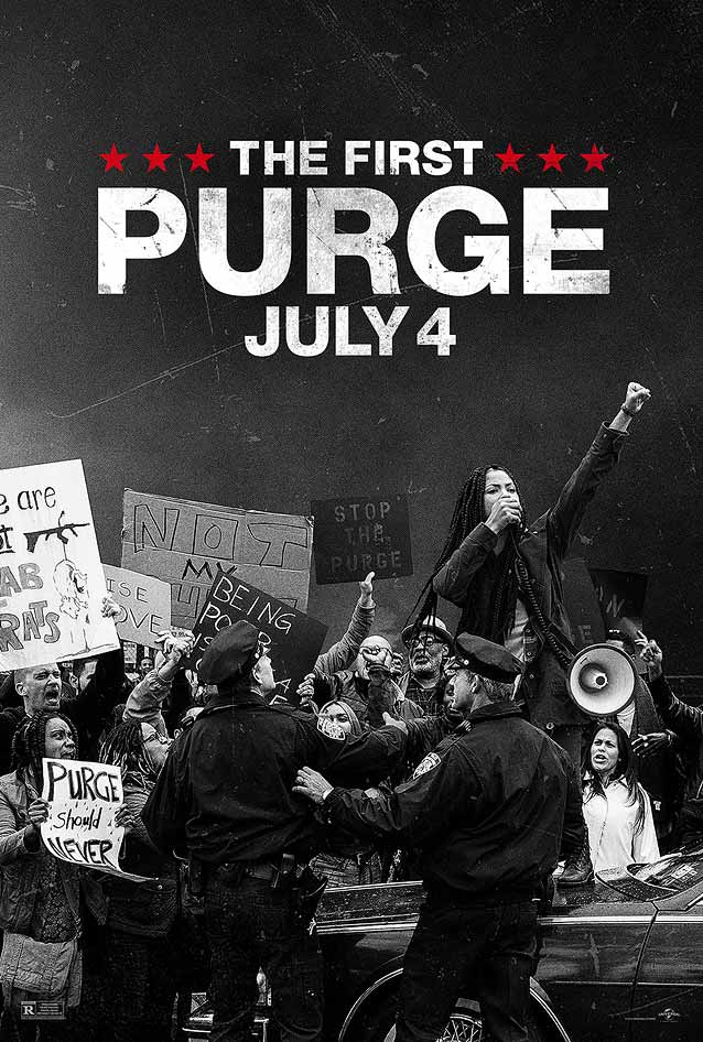
The series of Purge films, while neither cinematic masterpieces nor critical darlings, have always had political undertones. Yet for the first time, two of the teasers openly draw parallels between the horrific events depicted in the movie and the current political climate in the United States. One poster depicts protesters demonstrating against the fictional purge. All but one are people of color; the most prominent woman raises her clenched fist—long a symbol of resistance against unjust policies and biases directed by a white-supremacist culture toward African Americans—in what could be taken as a nod to Black Lives Matter. The other teaser comments even more obviously on the current presidency, swapping out the Make America Great Again slogan on the trademark red baseball cap for the movie title. They got the typeface wrong, though: Adrian Frutiger’s classic Glypha instead of the transitional face in the actual hat. Intriguingly, the closing shot of the hat in the announcement on Vimeo was replaced with a shot of the American flag in the same clip on YouTube. |
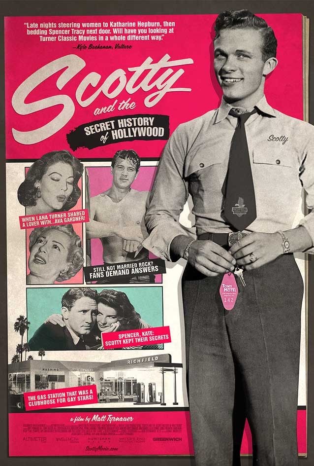
Scotty and the Secret History of HollywoodIt gets even hotter with Scotty and the Secret History of Hollywood, a steamy portrait of unsung Hollywood legend Scotty Bowers, whose bestselling memoir chronicled his decades spent as a sexual procurer to the stars. Matt Frost’s made his theatrical one-sheet to look like a fifties gossip magazine. Its sensationalist headlines remind us how far we’ve come in terms of sexual moeurs (though we clearly still have a long way to go). At first blush, the titular Scotty seems to be part of the magazine cover—but his silhouette extends beyond the magazine trim, lending the poster a fun dimensionality. The type does a good job of conveying a period look. A digital brush script mimics the hand-lettered titles that were so common in mid-century magazine layouts. Mark Simonson’s Lakeside and Kinescope tap into this vintage vibe; Underware takes digital brush lettering to previously uncharted extremes with typefaces like Bello and Duos. Helvetica Compressed, drawn for cold type by Matthew Carter and Hans-Jürg Hunziker, is a typographic anachronism. It was issued in 1966, about a decade after the time frame covered in the documentary. |
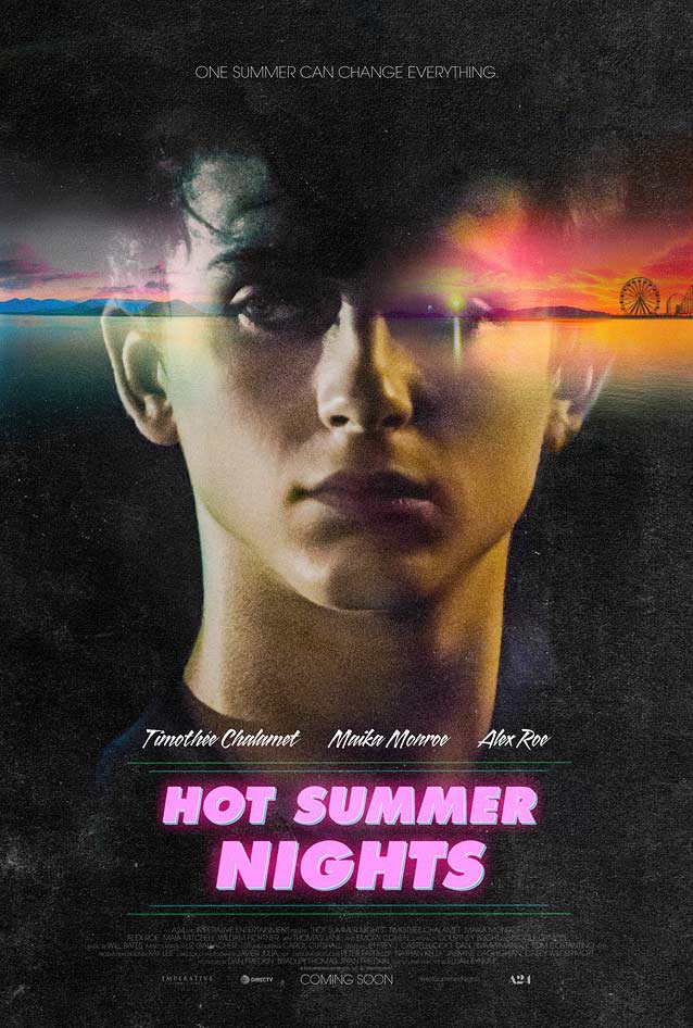
Hot Summer NightsWe reach peak temperature with Hot Summer Nights. Set in Cape Cod over one scorching summer, this fun, stylized thriller follows a teenager who gets in over his head dealing drugs with the neighborhood rebel while pursuing his new sidekick’s enigmatic sister. Inspired by the 1990s setting, Bond created a gorgeous double exposure of the main protagonist, a neon sunset slicing through his smoldering eyes. The nineties inspiration extends to the typography: the inescapable Futura Extra Bold Oblique set in all caps in hot pink with a cyan shadow and VHS video artefacts. Dunbar Tall Utra has a similar recent-retro look; Zeitung Black Italic and Newlyn’s New Hero Super Italic would be refreshing replacements for the grossly overused Futura. XYZ’s energetic—and technologically advanced—Cortado would be a perfect alternative to the angular brush script. |
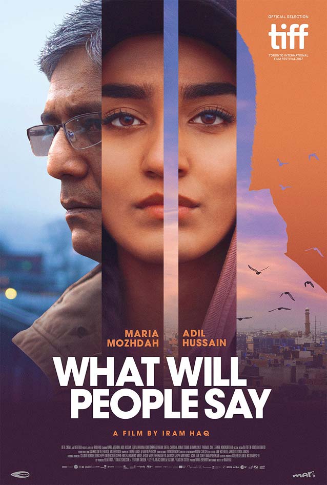
Hva vil folk si (What Will People Say)The theatrical one-sheet for Hva vil folk si (What Will People Say) is equally colorful. Market Reactive visualized sixteen-year-old Nisha’s double life—a normal Norwegian teenager when out with her friends and the perfect Pakistani daughter at home with her family—by dividing her portrait in two parallel bars. Her two worlds brutally collide when her father catches her alone with her boyfriend in her room and sends her against her will to a small town in Pakistan to live with extended family. All of these story elements are deftly integrated in the artwork: her father’s profile is shot in a Norwegian setting, but the right side of his silhouette frames a Pakistani cityscape. This makes for a clever, well-executed poster. ITC Avant Garde Gothic is another overused typeface. For this poster, I would have preferred to see Navigo, CSTM Fonts’ forward-thinking geometric sans with surpising design details—check out its cut corners. |
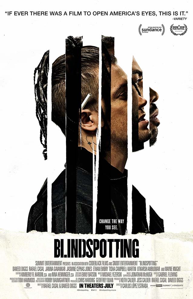
BlindspottingLA also combines two images for Blindspotting, about a black man who, while on probation, begins to reevaluate his relationship with his volatile best friend. Alternating vertical strips of both men’s profiles provide a clever visual metaphor for how their lives are intertwined. The strips also deftly illustrate the tagline “Change the way you see”—one man appears to be inside the other’s head, viewing the world through his eyes. The verticality of the compact sans-serif shapes echoes the graphic motif. Bureau Grot Compressed, Titling Gothic Skyline, Rhode Condensed, Garage Gothic, Antenna Compressed, or Tasse would have been excellent alternatives. |
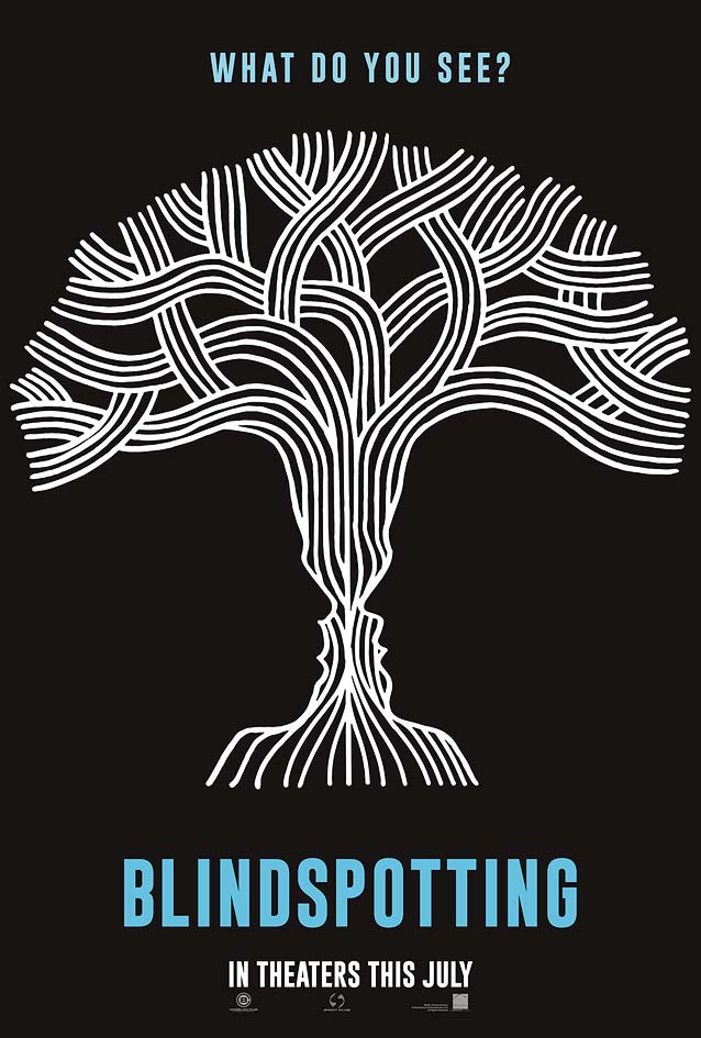
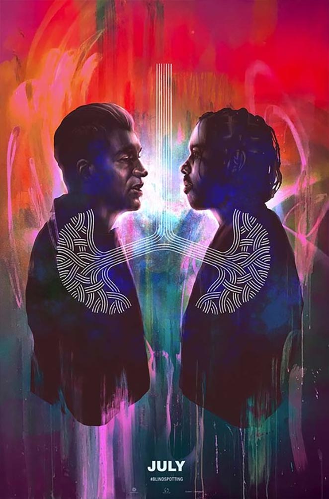
The graphic element introduced by LA in their black-and-white teaser finds its way into Hueman’s painted art. While it looks like a stylized tree in the former, with both men’s profiles distorting its trunk, in the latter it seems to symbolize a pair of lungs shared by the two friends, so close they’re breathing as one. |
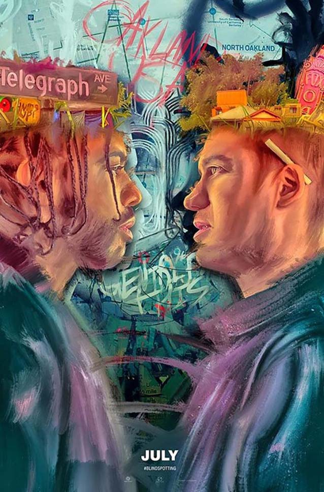
Digital visual artist Brandon Gastinell was also commissioned to produce art for the film. His two gorgeous pieces drip with raw emotion. |
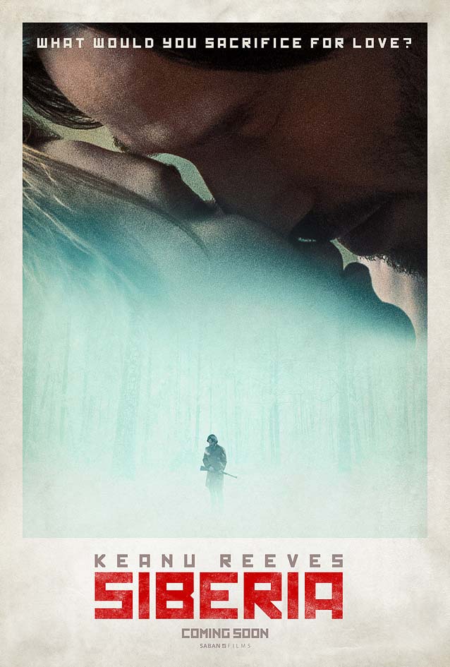
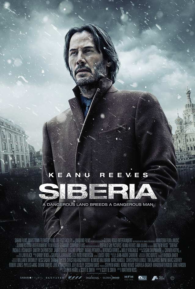
SiberiaGoing from Hot Summer Nights to Siberia is the cinematic equivalent of joining the 300 Club. In Matthew Ross’ crime thriller, an American diamond trader journeys to Siberia in search of his missing Russian partner, only to begin a love affair. Kustom Creative’s one-sheet is nothing to write home about, depicting star Keanu Reeves in the snow with the film title set in a wide grotesque. When Revolver Type Foundry joined Type Network last year, they brought the lavishly wide Dinamit with them; it would have been a refreshing choice here. |
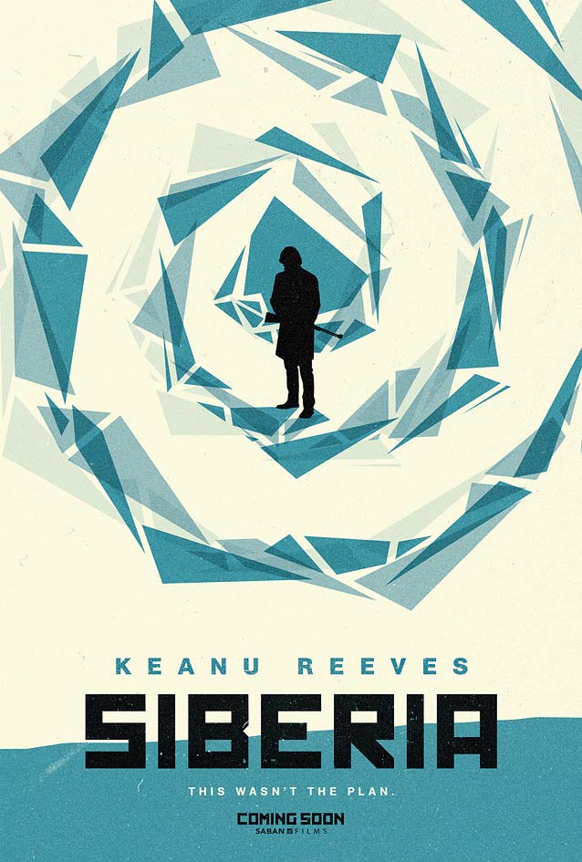
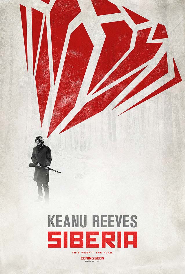
We started with one of my potential SXSW copanelists, so it’s only fitting that we also end with one: Kenny Gravillis. Gravillis, Inc. designed a poetic and sensitive alternate poster for Siberia, a dreamlike beauty with daring typography. Most studios would turn to faux Cyrillic, a facile practice that almost always leaves a bad aftertaste. Not Gravillis. Drawing inspiration from Russian constructivism, they set all the main text in rigid rectangular letters. Their conceptually more refined approach steers away from typographic pastiche and gives the key art a crisp sharpness that calls to mind both the Siberian cold and the faceted hardness of cut diamonds. The indestructible Agency FB is equally square and faceted. It would have looked perfect here. |
The two striking teasers integrate the diamonds’ geometry as a visual motif. They display Gravillis’ firm grasp of the history and visual language of film posters. Lesser designers end up plagiarizing Saul Bass when attempting to pay homage to the late giant of design. Gravillis understands the thinking behind Bass’ unique style, so the end result rings true without looking anything like a Saul Bass poster. |