Loading...
Please wait while we load the content.
Please wait while we load the content.

David Jonathan Ross, known to the type world simply as DJR, stands out in both work and personality. His faces cross styles and uses, from experimental display faces like Fit to workhorses like Gimlet, from modern expressions like Forma to coding faces like Input. He’s now releasing four more faces on Type Network. From his home in icy New England, donning a thick blue beanie with matching, blue-framed glasses, DJR spoke with Lucas Czarnecki about these new releases.
Lucas Czarnecki: This group of four releases contains two revivals and two originals. Do you think of revivals and originals differently? How does your approach change when creating one versus the other?
David Jonathan Ross: I used to think about my font catalog in that way of revivals versus originals, but honestly so many of my quote-unquote “originals” are also working directly from source material. So, for revivals, yes, I use the historical name and try my best to be faithful to the designs, but even Map Roman and Job Clarendon have very clear historical sources that they are citing.
Map Roman is citing the work of a single person. So, is it a revival? I don’t think so, because I was definitely doing more interpretive stuff there. But it’s still very indebted to historical material. It’s more of a spectrum to me.
LC: You said you try to be as faithful to the original designs as possible when creating a revival. Do you make changes? When do you decide to?
DJR: I try to be honest about what I took from the original, what I wanted to change, and what I knew had to be the same. With Crayonette, for example, I used the original name but added DJR after it to make sure people knew it was not the definitive Crayonette, just my interpretation.
There were a couple characters in the original that were just no-goes, so I changed them. For example, the descender of the lowercase j curled backwards, to the right. If you think about metal type, maybe that makes sense! A curve to the left would need to be kerned, since it went outside the bounds of the sort. So it was more practical to make it backwards, but it also looked really weird. We all make weird things and I like weird things… but this was a disruptive kind of weird. So, I did a more typical j. Of course, the original design’s backwards j is included as an alternate. If something will seriously hurt contemporary usage, I’ll adjust it.
LC: Revivals are obviously inspired by other typefaces, but where do you find inspiration for your historically informed “originals”?
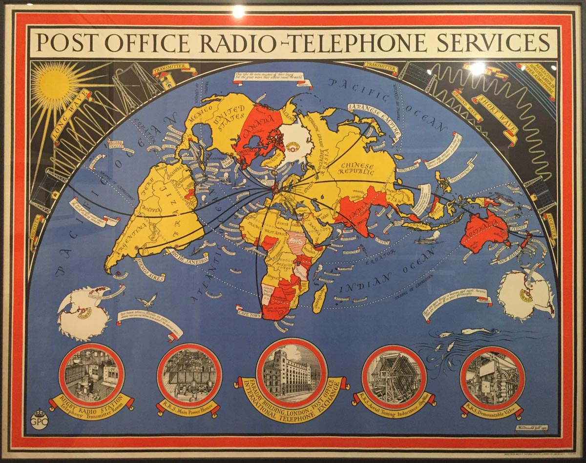
DJR: Well, the source material for Map Roman came from a map museum in La Jolla, California, right outside San Diego. There’s a small private museum in a mini mall. It was this weird, cool discovery to be outside on a bright, hot, sunny South Californian day and then walk into this dimly lit room with maps from the 1500s on the walls.
They had this special exhibit on the promotional maps of MacDonald Gill. One was for the London Underground, advertising all the different places one could go and the sights you could see using the trains. He had these fun illustrations with very particular lettering. Of course, it’s related to the British capitals like that of Edward Johnston, but I was drawn to this particular execution of that style in his maps. I started riffing on that for Map Roman.
I’m not always so lucky to stumble into a museum and find intriguing type. Generally, I’ll see something out there and there’s either something I like about it or something I don’t like about it. Usually it’s a combination of both, where something works really well one way, but it has something about it that—for lack of a better way to put it—is why it’s not used more today.
They’re these ideas that you can dust off and polish up or take it and transform it in some way. Type design is circular in that way: Great old ideas that for whatever superficial reasons are not in the current conversation can be interpreted and put into the culture. Until they become the old, unfashionable ideas that need to be updated.
LC: These releases vary widely in style—granted, your entire body of work varies widely—how did you decide to release these specific four faces?
DJR: I thought about it library-wise. I looked at the Type Network library and asked myself where the biggest gaps were and what I could offer to fill those gaps. These just so happen to be the faces without many similar faces. I thought, why not?
They are intentionally varied in that way.
But that’s the weird thing about my Font of the Month Club. I’ve been releasing a face each month for almost five years. They’ve piled up. Now I want to think about their future. And with respect to Bradley and Crayonette—because these are revivals—I consider myself sort of in their corner, trying to push them out. Not because they’re my own thing, but because I think they’re cool designs and I want to see them out and about in the world.
Releasing faces each month is cool because I get to publish these ideas quickly and get them out there, but now releasing these on Type Network is about giving some of my favorite designs a bigger future too.
LC: What makes a DJR font a DJR font, aside from the fact that they’re designed by you?
DJR: I’m not sure I have a strong personal style. I mentored under Cyrus Highsmith at Occupant Fonts while we were at Font Bureau together. I always admired how much of his own hand you could see in his work, and how he was able to expertly pull it back or adapt it when it made sense for the project.
I’m not sure I ever succeeded in emulating that, so I guess my style is a kind of eclecticism. Looking at my faces visually, I don’t think there’s a specific style that permeates through all of them. But in the background, maybe it’s a historical curiosity that ties them together.
My library contains a lot of very different styles. And each face is a kind of pure little expression of one aesthetic or another, as opposed to being a part of an overarching idea about shape and form. I like the idea that each font can be taken on its own.
LC: What’s it like to have several popular faces of completely different styles?
DJR: I like that I’ve put out a lot of fonts that are so totally different from each other that people are genuinely surprised when they realize they were done by the same person.
I like that I’m known for different things to different people. Then again, I like that a majority of people—even a majority of people who use my typefaces—don’t know me at all! It’s not a prerequisite to be aware of a type designer to use a typeface, and I enjoy that anonymity.
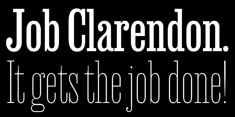
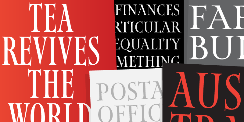
Job Clarendon is an homage to ‘job printing’ and the Condensed Clarendons used in posters and flyers in the heyday of letterpress printing. A collaboration between David Jonathan Ross and Bethany Heck, this interpretation focuses on the style’s adaptability, taking it both thinner and heavier than most of its nineteenth-century exemplars dared to go. Throughout this expansive range, Job Clarendon maintains its dense charm, with chunky slab serifs, ample ball terminals, and square-terminal alternates.
Map Roman is an elegant set of titling capitals based on the lettering of MacDonald “Max” Gill, whose work included a variety of beautifully handlettered maps of London, the United Kingdom, and the world. After stumbling upon his work in a cartography museum, DJR tried his hand at a typographical interpretation of his style that attempts to capture the liveliness and authority of his letterforms. Map Roman distinguishes itself in its flexibility: at its widest, it is broad and luxuriant, while its narrower widths retain their charm even as they cram into the tightest of spaces.
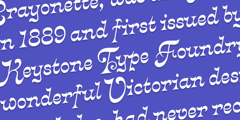
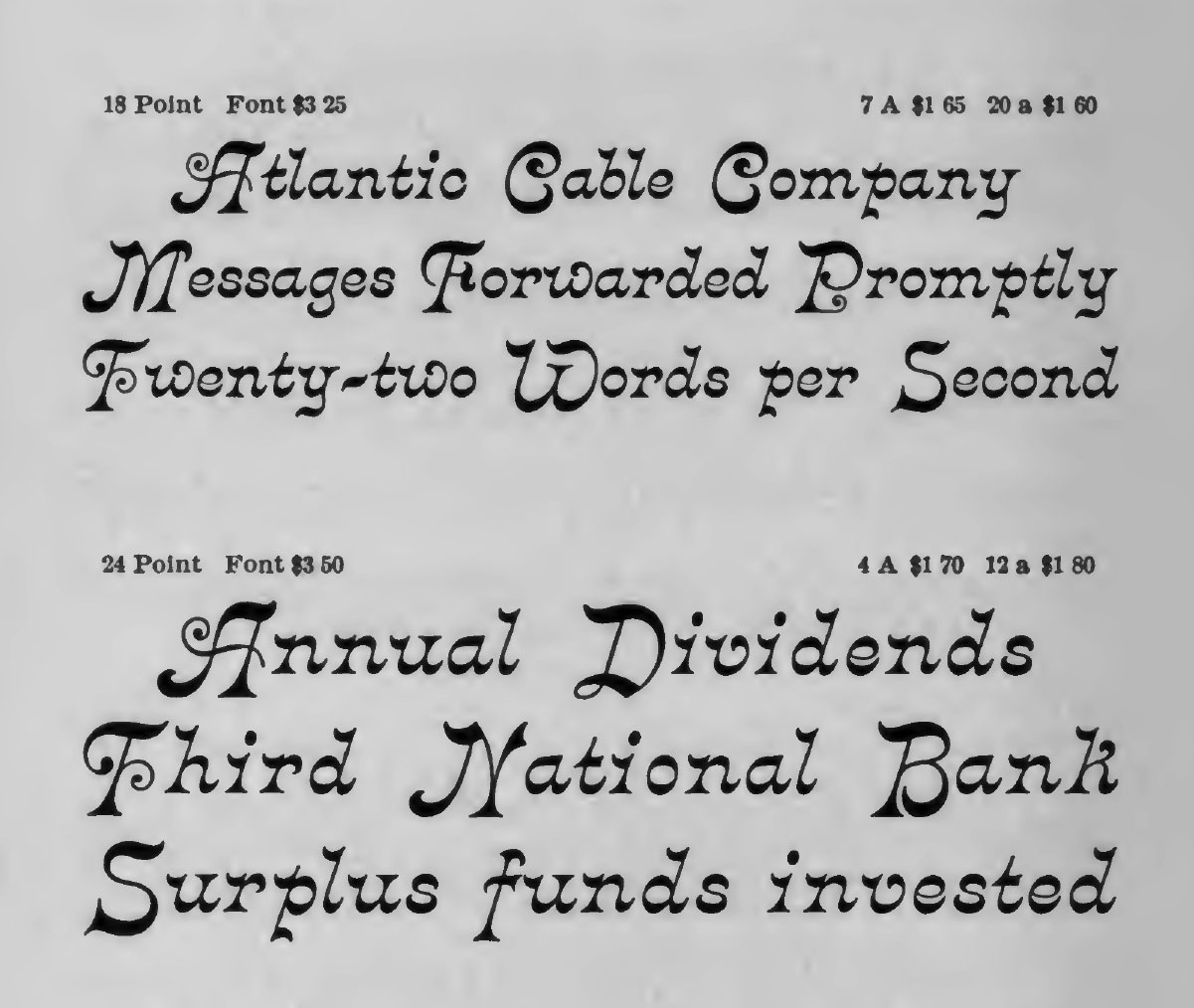
Crayonette DJR is a revival of Crayonette, a typeface designed by Henry Brehmer and first issued by Philadelphia’s Keystone Type Foundry. Until now, this typeface has survived without a digital interpretation that does it justice. This delightfully quirky italic features horizontal stress, luxurious curves, and oversize swash capitals. Crayonette DJR retains the key features and proportions of the original but improves its spacing and tames a few of the wilder letterforms.
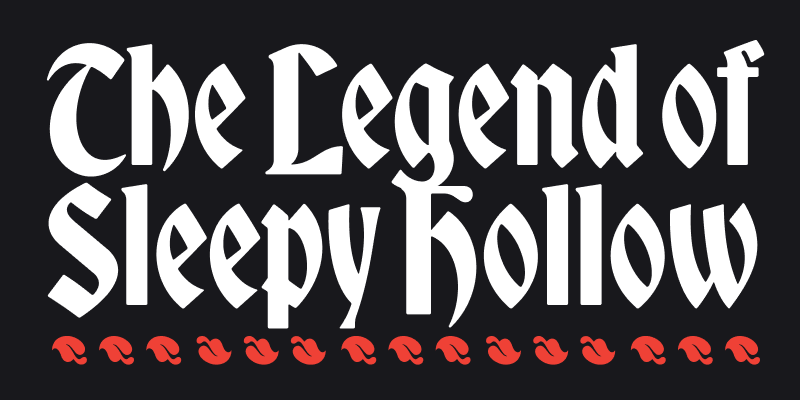
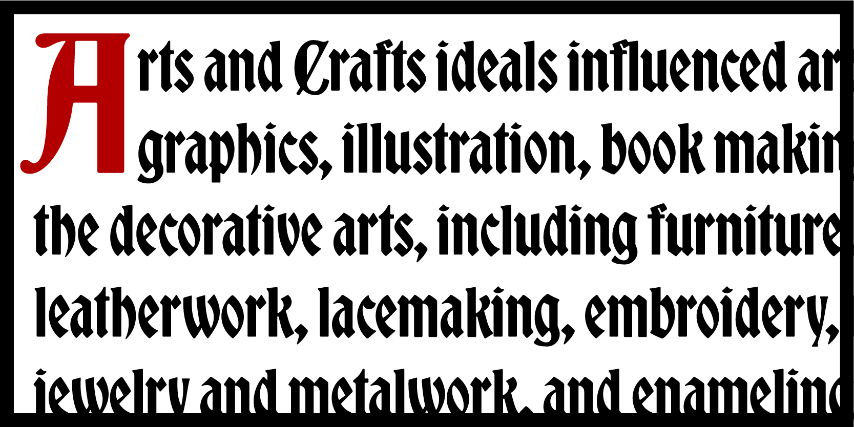
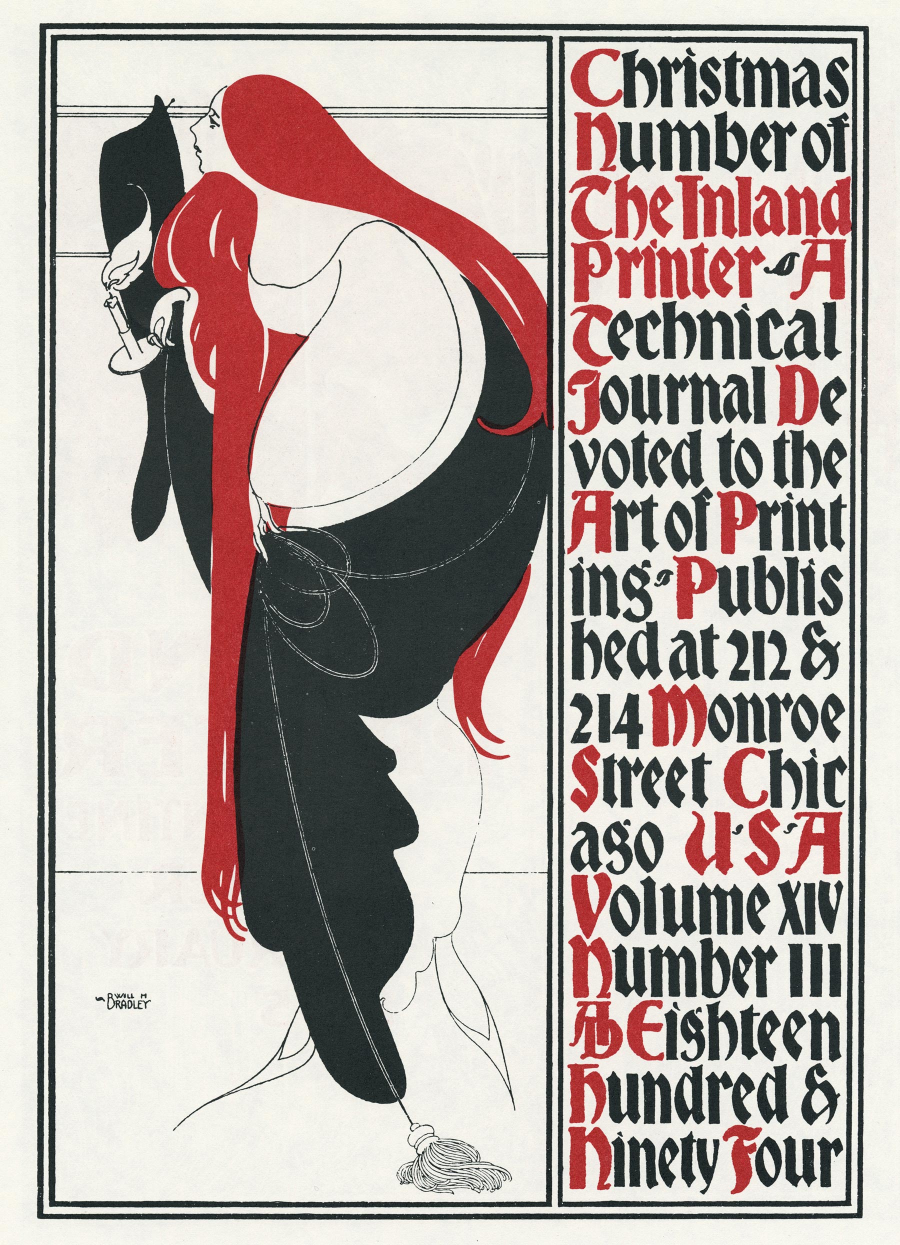
Bradley DJR is a revival of Bradley, a typeface released by American Type Founders in 1895. It is based on Will H. Bradley’s cover for the Christmas edition of The Inland Printer magazine, and most records show that it was Hermann Ihlenburg who completed the typeface design. Its simplified forms make it more accessible to readers who aren’t accustomed to blackletter, and this revival seeks to preserve its softness, descending capital letters, and distinctive storybook character.
All DJR fonts are available for print, web, applications, and ePub licensing. Webfonts may be tested free for thirty days; desktop trials are available upon request. To stay current on all things DJR, subscribe to Type Network News, our email newsletter featuring font analysis, designer profiles, type and design events, and more.