Neville Brody on Popaganda and why design needs friction
When Neville Brody releases a typeface, it doesn’t arrive quietly. It arrives with context: editorial, cultural, ideological. The retail release of
Popaganda
brings into circulation a typeface that began not as a product, but as an argument.
In this conversation with Lucas Czarnecki, Brody reflects on disillusionment with magazines, enthusiasm for reggae record labels, agitprop, and why typography today needs a little less optimization—and a little more resistance.

Lucas Czarnecki: Tell us the story behind Popaganda.
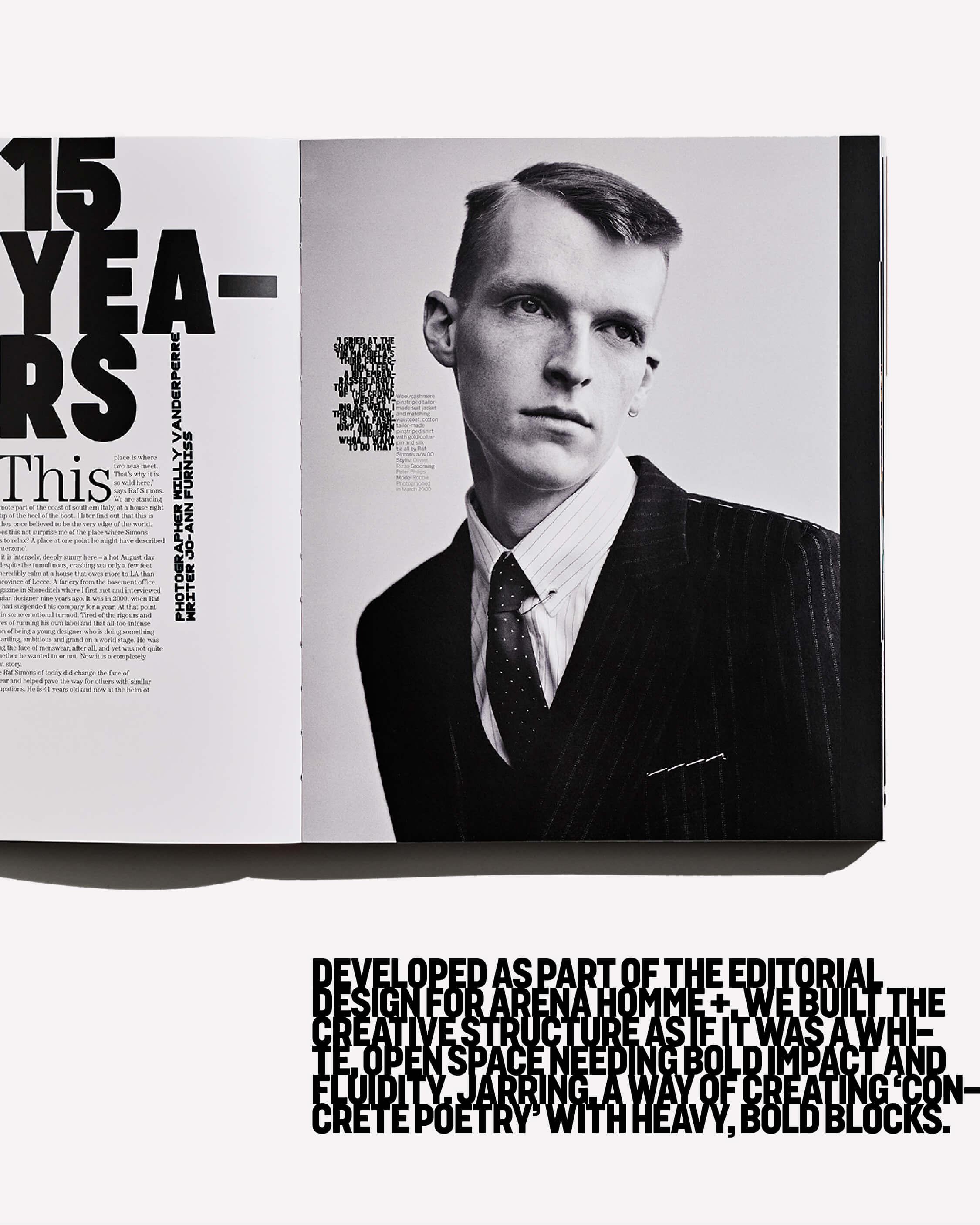
Neville Brody: We developed it originally for an English magazine called Arena Homme+. I had not designed a magazine in many years, because I’d become very disillusioned with the industry. I remember hearing a marketing manager say that the role of a designer and art director on a magazine is to “deliver readers to advertisers.”
I heard that about thirty-odd-years ago and thought, I’m out. No more magazine design for me.
Editorial, for me, was never about servicing advertising. It was about risk-taking. Building drama. Building stories. Taking the reader somewhere. Using layout to create new understandings of the world.
I heard that and thought: I’m out.
Magazines were becoming predictable. No real risks being taken. Everything shifting toward digital smoothness.
But eventually I was persuaded back in by editor and writer Jo-Ann Furniss, who wrote one of the three essays at the back of my book, which I see on the shelf behind you.
Brody Fonts publishes new typefaces from Neville Brody and his studio associates, while also revisiting key moments in Brody’s typographic legacy.
LC: I need to get it signed!
NB: Next time you’re in London.
Jo-Ann kept hounding me to work on this magazine, but I kept saying no. She’s incredibly smart, though, and has a very interesting viewpoint. The first issue centered on Buffalo—the fashion collective from East and West London spearheaded by Ray Petri. He was the first person to mash together luxury and sportswear, reggae and high fashion—things that weren’t supposed to belong together. It felt urgent and looks even more modern today.
I think every magazine is an opportunity to design a new typeface, because the typeface becomes the voice that underpins everything else.
So I designed two. One became Buffalo. The other became Popaganda.


LC: What were some of your influences when designing it?
NB: Popaganda was deliberately intended to undermine the content, in a way. It was saying that everything you read is propaganda in a way. Everything you read is persuasion and redefining what success might look like.
One of my influences was reggae seven-inch records. At that time in London there were hundreds of new releases every week, plus everything coming from Jamaica—these were cheaply pressed, one- or two-color labels, made in bedrooms and garages. Those labels had to stand out in a shop.
Very few elements. Maximum impact.
That was important to me. And agitprop: agitation and propaganda. It’s a word that isn’t used much anymore, but I love it. Using propaganda to agitate.
There was also Victorian boxing posters, market announcements, newspaper covers, and a bit of Constructivism in there. But then to use it in a very, very pure way. It was about scale and white space.
We created a language, and then used real disruption: We used narrow column headlines that forced words to flow around them—technologically imposed concrete poetry. Using something quite unforgiving in a poetic way.
People don’t really do that anymore.
There are hundreds of thousands of fonts now. People tend to select rather than curate—or create.
But I still believe every new project is an opportunity for a new typeface.

Neville Brody is one of the most influential figures in contemporary design. A designer, typographer, and brand strategist, he has spent over four decades redefining what visual language can be, constantly pushing creative boundaries through experimentation and innovation.
LC: The typeface feels forceful—almost confrontational.
NB: It’s not optimized for aesthetic balance. It was never meant to be.
For typography to stay alive, it needs mutations. It needs things that aren’t quite correct. That’s what brings humanity.
If everything is optimized, smoothed out, engineered for seamless delivery—we lose friction. And friction is where engagement happens.
At small sizes, fine—it has to function. It’s like plumbing or electrics. Is it condensed? Is it bold? Is it legible?
But at large scale? It should be about impact. We don’t need everything to behave like a UI font.
If you’re living in a box, all you can do is change the curtains or do a little dance.
LC: What changed from the original version to this release?
NB: Originally it was all caps. No lowercase.
The lowercase came later for a client project. Then just before the pandemic we expanded the family—more weights, widths, extended styles, and what became the poster version.
The poster version is chunkier. Less polite.
I tend to move on once something has done its job. It’s the team—Ollie, Borys, Flo—who say, “Hang on. There’s more life in this.”
There are many typefaces we’ve designed over the years that never saw the light of day beyond single use. It’s a shame, really. So, it’s good to give them another life.
LC: Do you think variable fonts have changed typography?
NB: They’re interesting. But I remember earlier experiments that felt more radical.
Beowolf, for example—where every time the font was used it produced something unique. That was disruptive. That was exciting.
I’m less interested in technical flexibility for its own sake and more interested in conceptual mutation. How does typography behave? How does it resist expectation?
If everything becomes smoother and more optimized and gridded—we end up living in a box. And if you’re living in a box, all you can do is change the curtains or do a little dance.
For typography to stay alive, it needs mutations.
LC: You’ve said a brand isn’t about what it looks like; it’s about how it talks.
NB: Yes. Not necessarily what it says, but how it says it. This is part of the message.
The graphic voice becomes central. The logo appears for a second—if that. It’s not the primary carrier of identity anymore.
Content is.
You don’t put a logo on every Instagram post… that would be absurd. But you do choose a typeface, and that typeface, if it has personality, becomes the thread that connects everything.
Typography shapes how a brand speaks. There are fewer places to express identity now. Fewer surfaces. So type becomes even more important.
Commissioning custom type makes enormous sense. But it shouldn’t be an afterthought. It should be foundational.
LC: Why have you chosen to release Popaganda now?
NB: We’ve lost some of the editorial voice in design.
Everything is templated. Modular. Systematized. There used to be more authorship. More play. More risk.
Releasing something like Popaganda now is, in a way, about reintroducing that energy. That resistance.
It’s not about perfection. It’s about agitation.
Popaganda will be released through Type Network on Friday, March 13 with expanded weights, widths, lowercase, and poster variants—bringing renewed flexibility to a typeface born from editorial experimentation.
Enter our free giveaway for a chance to win all 16 styles of Popaganda!