Peacock Sans
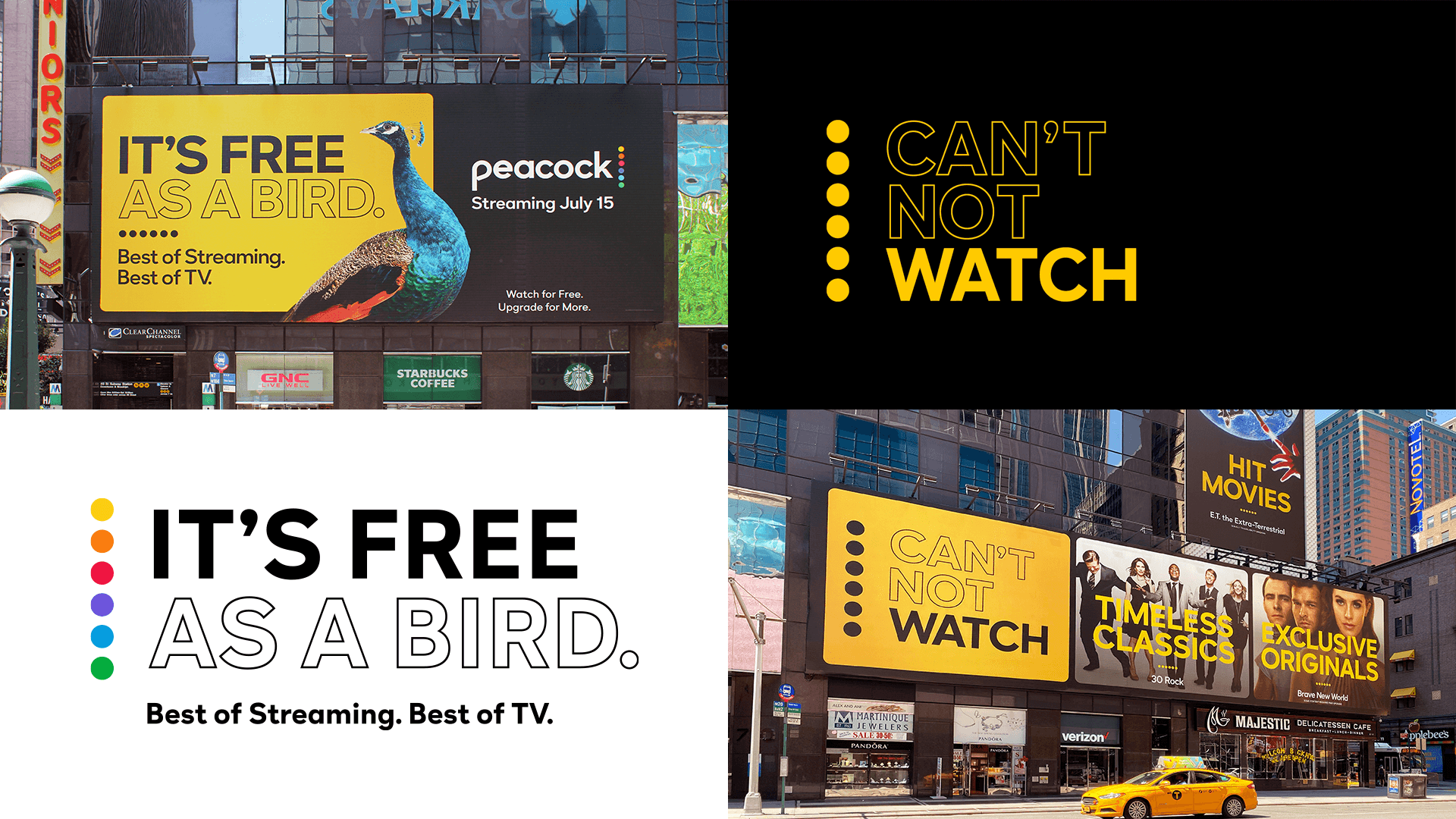
Last year, NBCUniversal launched Peacock, its much-anticipated video streaming platform, sporting a versatile brand system by loyalkaspar. The identity needed to achieve several goals at once, each relating to Peacock’s overall business goals: Stand out from the crowd of streaming services, leverage NBCU’s ultra-recognizable branding, and reference Peacock’s robust library of content.
When NBCUniversal launched Peacock, the identity needed to achieve several goals at once, each relating to Peacock’s overall business goals: Stand out from the crowd of streaming services, leverage NBCU’s ultra-recognizable branding, and reference Peacock’s robust library of content.
Service: Typeface development
Partners: Kerns & Cairns and Victoria Rushton in collaboration with loyalkaspar
Date: 2020
Vital to the brand’s success, along with motion graphics, logo, and other design motifs, was a custom typeface with enough weights and styles to support the behemoth new application. Based on their Peacock wordmark—very geometric with deep ink traps reminiscent of NBCU’s longstanding logo—loyalkaspar drew initial alphabet sketches for what would become Peacock Sans.
To build their sketches into a typeface that was “edgy, modern, and crisp,” loyalkaspar turned to Type Network, where Custom Type Director Dyana Weissman and designer Victoria Rushton began the process of refining the alphabet, filling out the character set, and expanding the styles.
After learning to design type at Font Bureau, Victoria Rushton started her own foundry where she has published beloved faces like Gautreaux, Embury Text, and Marcia.
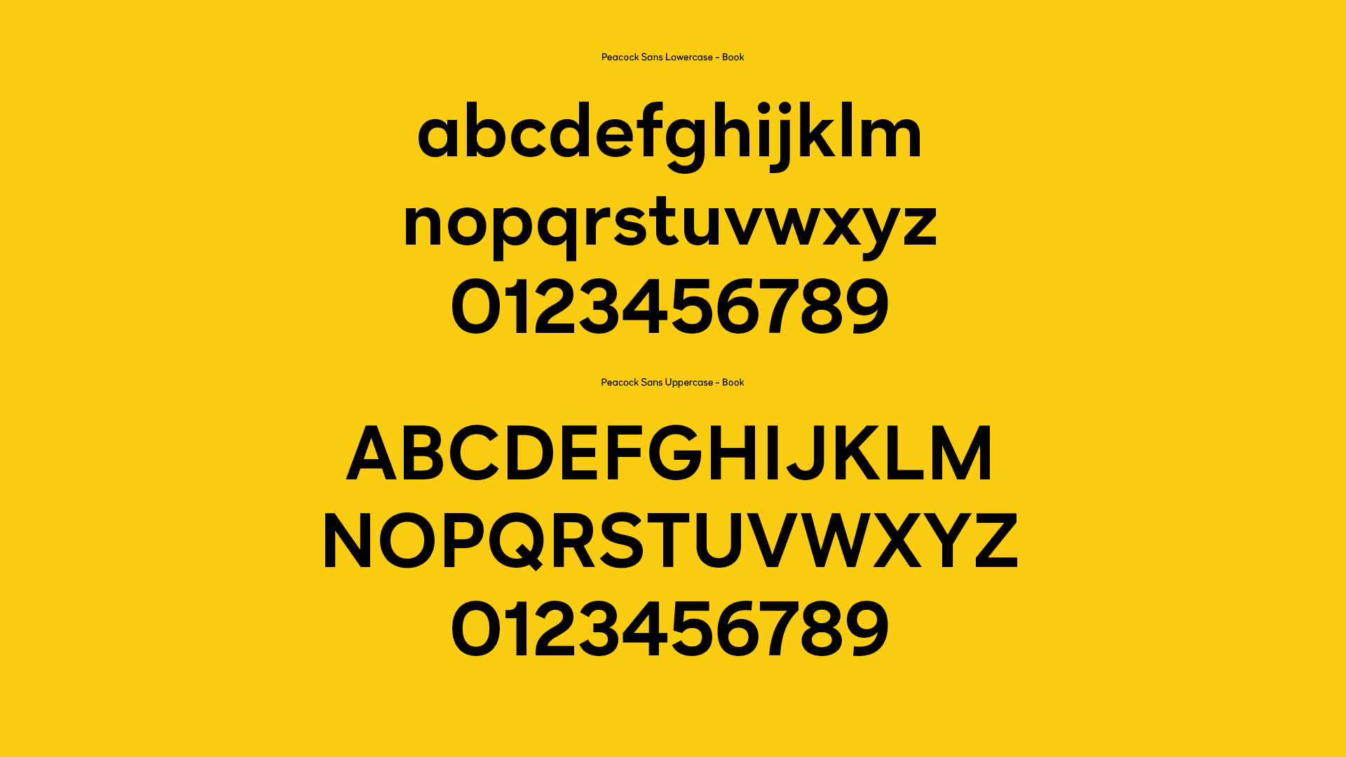
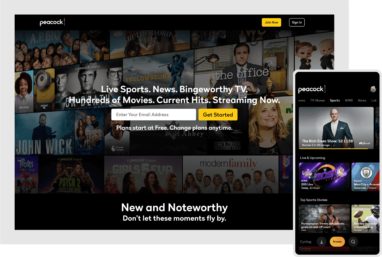
Peacock Sans would be used on both billboards and mobile devices, so flexibility and readability were of top importance. To accomplish this, Weissman and Rushton designed Peacock Sans with open shapes and simple, bold details that were clear in small sizes and character-rich at scale.
To add even more flexibility to the Peacock identity system, Weissman created a clean and functional outline version of the typeface. More than a crude stroke along the edges, Peacock Sans Outline was meticulously designed, engineered, and spaced, solving for the challenges posed by outlining type.

Dyana Weissman helps clients find their way to the logical, beautiful conclusion of whatever their creative challenge is.

Working with loyalkaspar’s capable creative team allowed Weissman and Rushton to experiment and refine quickly, resulting in the typeface now seen on millions of screens worldwide. With five weights plus italics, everyone was pleased with the possibilities created by the custom typeface.
Type Network’s foundry partners can satisfy even the most challenging design briefs: From balancing small screens and billboards to creating unproblematic outline styles. Enhance your brand with custom type; contact us to learn how.