MTV’s new typeface: Gravity Grotesk
How does a type design hold true to such an edgy and identifiable brand as MTV—loaded with cultural history—while making it fresh and legible at all sizes?
During MTV’s 40th anniversary rebranding, loyalkaspar commissioned a new typeface by Type Network partners Dyana Weissman (Kerns and Cairns) and Victoria Rushton. As MTV’s needs grew, Cyrillic characters were added by CSTM Fonts and Condensed Italics by Jacques le Bailly. The typeface needed to work at the myriad sizes necessary for a contemporary media network, ranging from television to desktop and from laptops to mobile screens.
Creating “more of a workhorse than a show pony,” according to Weissman, she and Rushton decided to put usability first, entrusting the talented designers at loyalkaspar and MTV to bring it to life.
Service: Custom licensing and consulting
Partners: Kerns & Cairns, Victoria Rushton and CSTM Fonts in collaboration with loyalkaspar
Date: 2021

Branding Agency: loyalkaspar, Type Agencies: Kerns & Cairns and Victoria Rushton.

Dyana Weissman helps clients find their way to the logical, beautiful conclusion of whatever their creative challenge is.
Music Television crash landed on August 1, 1981 at 12:01 AM EST with a montage of images from the Apollo 11 moon landing. Memories of the MTV flag staking into the moon have lingered in our cultural consciousness for decades since.
On that first day of broadcasting, MTV used a different typeface in each video for their lower third graphics, designating such information as artists, song titles, and record labels in a typographic rainbow. The network eventually settled on Rudolph Koch’s Kabel as their brand typeface, defining much of MTV’s typographical identity for the next 25 years. In the 40 years since launching, MTV has revised their identity only three times, preferring smaller tweaks to large overhauls.

After learning to design type at Font Bureau, Victoria Rushton started her own foundry where she has published beloved faces like Gautreaux, Embury Text, and Marcia.
The most recent revision, which took place this year—led by branding agency loyalkaspar—anticipated the channel’s momentous 40th anniversary. The approach was holistic, addressing everything from the iconic MTV logo to its color palette and, importantly, a custom typeface from our Type Network partners.
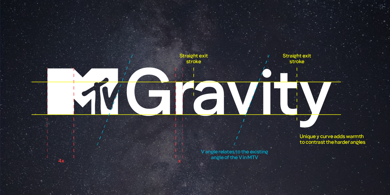
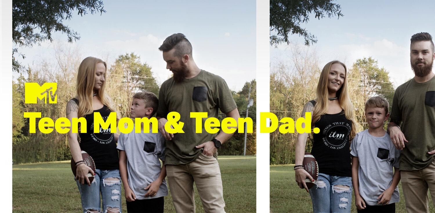
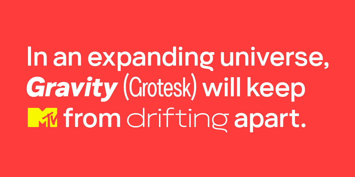
The resulting typeface, MTV Gravity Grotesk, is a straightforward sans serif with an almost imperceptible contrast. The letterforms manage to let the media content shine without sacrificing any of MTV’s dynamic character. As loyalkaspar jokes in their case study, Gravity Grotesk is “business in the front, party in the back.”
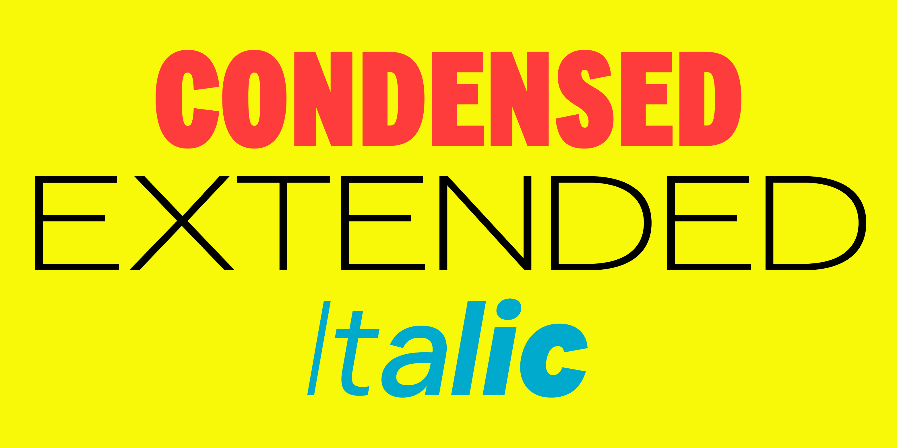
It flexibly functions in 24 styles in three widths and six weights and “has been integral in giving the brand a consistent and ownable design language across all of [MTV’s] platforms,” says Richard Browd, VP of Brand Creative at MTV Entertainment Group: “Whether large or small, on-screen or out of home, this diverse font set is extremely legible without sacrificing any of the brand's personality.”

MTV Gravity Grotesk balances utility and style for one of the most recognizable television channels on earth. Like Rudolph Koch’s Kabel, Gravity Grotesk will play a vital role in MTV’s graphic direction for many decades to come.
If your company wants to revitalize its brand across every kind of screen, there’s no better solution than custom type. Contact us to start the conversation with one of our partner foundries.

Award-winning designers Ilya Ruderman and Yury Ostromentsky founded CSTM Fonts, an independent digital type design and development foundry, in 2014.