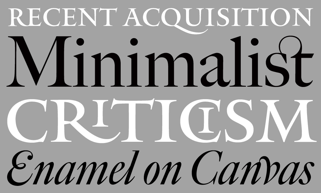
Miller & Interstate in MoMA’s collection
The Museum of Modern Art acknowledges type’s importance to the history of modern art and design.
The Museum of Modern Art announced the acquisition of 23 new digital typefaces for its Architecture and Design Collection, including Font Bureau’s Miller by Matthew Carter and Interstate by Tobias Frere-Jones.
This acquisition is significant because generally graphic design has not figured prominently in the museum’s focus and has been historically limited to posters. Recognizing this, the museum set out to correct what was considered “a lacuna in the collection,” according to Paola Antonelli, Senior Curator of Architecture and Design at MoMA, and typefaces were identified among the new categories to be addressed. In fact, only one other typeface had previously been included in the museum-Helvetica Bold, 36-point lead type from 1956.
According to Antonelli, the digital typefaces were chosen because “they are sublimely elegant responses to the issues of specific media,” whether an innovative solution, an example of technical ingenuity, or an aesthetic reflection of cultural, social, or historical influences. Miller brilliantly addresses the needs of newspaper type and printing, and Interstate imparts the cultural and social ideal of the American road.
The acknowledgment that typefaces hold a fundamental place in the history of modern art and design is a welcome one. We applaud the MoMA and congratulate the type designers whose typefaces have been chosen. Font Bureau is honored to contribute to the museum’s collection with Miller and Interstate and to share the recognition with Carter & Cone for Miller. In addition, two other C&C typefaces chosen for the MoMA’s collection are also in Font Bureau’s library, Mantinia and Big Caslon, both by Matthew Carter:

