Miles Newlyn brings his typefaces to Type Network · Type Network
Miles Newlyn brings his typefaces to Type Network
The London-based designer, known for his identity work crafted for major international brands, finds a new home for his versatile typefaces at Type Network.
By Type Network Staff
The second partner to join Type Network since its June launch, Miles Newlyn’s eponymous one-man foundry is focused on creating a typographic voice for the world’s biggest businesses. Newlyn is a leading specialist in brand typography and has rearranged the face of the business more than once.
Letters as drawings
Letterforms and symbols have always fascinated Newlyn, all the way back to junior school. Immediately upon his 1991 graduation from London’s St. Martins College of Art, Newlyn’s big break in typeface design came when his idiosyncratic faces were published by indie type pioneer Emigre. Missionary was perhaps fifteen years ahead of its time, Newlyn mused, but Democratica became an almost instant hit when it was released that same year. It‘s still a bestseller two decades later.
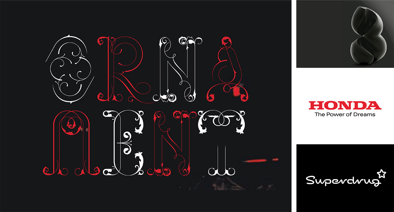
The diverse design life of Miles Newlyn. Pictured clockwise from large image left: Missionary, Newlyn’s first typeface design, published in 1991 by Emigre; personal fetish design; branding for Honda and Superdrug.
After he completed his studies in the British capital, Newlyn returned to his hometown of Leicester, where he spent an idyllic five years teaching. During that time, he designed dozens of typefaces that explored the boundaries of typography. He grouped his fonts into small collections, sending floppy disks to people he thought might like to use his designs. David Carson, renowned graphic designer, responded enthusiastically to his work. From then on, Newlyn sent Carson all of his new typefaces, many of which ended up in the legendary Ray Gun magazine and in other work produced by the 1990s icon.
New Farm, a sprightly typeface in five styles, features cheeky characteristics like raindrop-shaped counters and exuberant alternate forms in glyphs like g and &.
The branding years
Newlyn returned to London in 1997, where he got in touch with type designer Jeremy Tankard, who was then working at Wolff Olins. The brand consultancy invited Newlyn to stand in while Tankard went on sabbatical. During that branding heyday, Newlyn designed logos for multinational corporations on a weekly basis. It was an incredibly productive period, and still very experimental. He gained valuable insight into the role of typography as a tool connecting organizations with their audience—custom type represented a huge return on investment for a business, allowing a brand to become immediately recognizable to its audience across media. Through his branding work, Newlyn honed his type design skills and came to recognize the value of type as brand.
New Rubrik’s clean, rounded forms are warmed by slightly more humanist figures. The seven-weight design is mated with companion italics and a slightly geekier sibling, New Rubrik Edge.
Newlyn, the foundry
In 2009, Newlyn set up his independent foundry, which was briefly called Textpref until he recently reverted to publishing under his moniker. Newlyn deftly injects his signature style into purposeful custom and retail typefaces, all displaying his acute grasp of aesthetics and functionality. Newlyn presents a compact yet varied range of faces engineered for print and online use.
A versatile family in twelve styles, New Frank is open, sturdy, and readable, its precise lines thoughtfully broken by softened terminals and curvy counters, traits especially evident in the heavier weights at larger sizes.
Herold Reklameschrift was designed in 1901 by Hermann Hoffman, then head of the print room at the Berthold AG type foundry. An example of Art Nouveau, or Jugendstil, a style typified by organic typography, Herold was also similar in proportion and texture to the blackletter popular in Germany during that era. Newlyn, with Elena Schneider, revived the historic design as New Herman, reimagining it to be “modernized, but not sanitized.” New Herman was purposely spaced so that line widths would remain consistent between all five weights.
When Newlyn first heard about Type Network, he didn’t hesitate to sign on. “It was an instant decision as soon as I heard about it," he said. ”A friendly partnership of type designers working together with the common goal of helping designers and each other—that’s something I feel privileged to be a part of.”
“We are honored to have Miles Newlyn as our newest foundry partner,” said Type Network general manager Paley Dreier. “His body of work speaks for itself, and I’m sure our customers will find his typefaces a welcome addition to our growing catalog.”