Kamala Harris runs with Type Network type · Type Network
Kamala Harris runs with Type Network type
The Democratic senator’s 2020 presidential bid uses typefaces from Font Bureau, The Ivy Foundry, and DJR. Let the race begin.
By Bald Condensed
As the first presidential hopefuls running for the 2020 US elections started announcing their candidacies, one campaign in particular caught our eye. On Martin Luther King Day, former Attorney General of California and junior United States Senator Kamala Harris jumped into the fray, communicating her message exclusively with Type Network fonts.
Washington, D.C.-based Wide Eye created Harris’ campaign and website. Ben Ostrower founded the agency as a freelance business roughly a decade ago, but has since broadened the scope of its operations. “In 2018,” he asserted, “digital agencies and creative agencies can no longer be neutral. Values Matter.” Wide Eye came up with a striking logo, an unorthodox color scheme, and a refined typographic palette for Harris. These design decisions were deliberate and symbolic: Harris announced her campaign forty-seven years to the day after Shirley Chisholm kicked off her 1972 presidential bid. Chisholm was the first African American woman to be elected to Congress (in 1968), and the first woman and African American to seek the nomination for president of the United States from one of the two major parties.
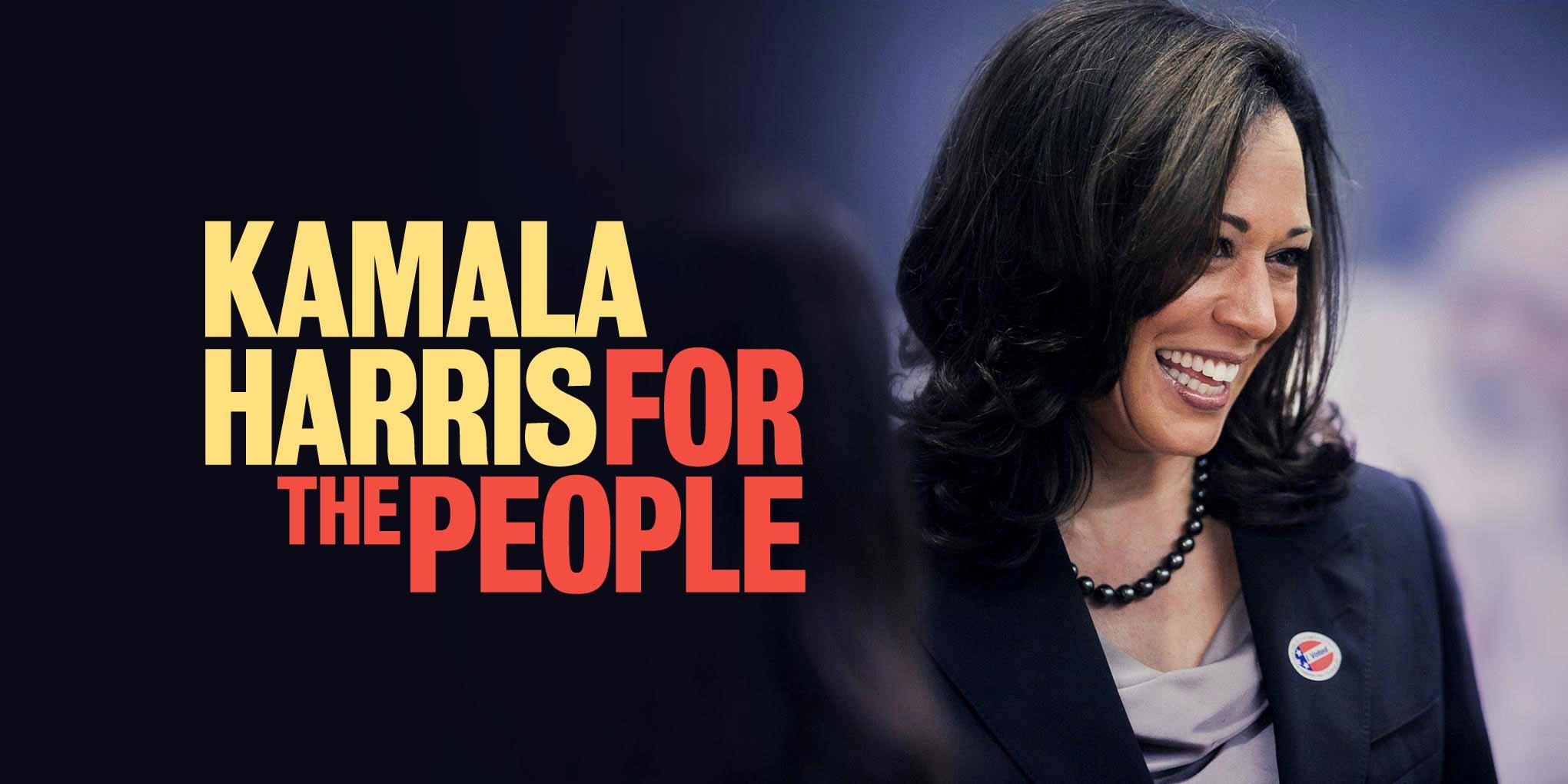
The “Kamala Harris: For the People” design stands out because it doesn’t really look like a logo for a presidential bid. Rather, the asymmetrical composition—two rectangles cleverly intersecting—recalls a seventies editorial lock-up or a title card for a contemporary TV show. It uses the campaign’s primary typeface, Bureau Grot Condensed, set in all caps. The type’s compact features give it a forceful, resolute look—yet the subtle contrast and inward curving stroke endings lend it an underlying warmth and approachability.
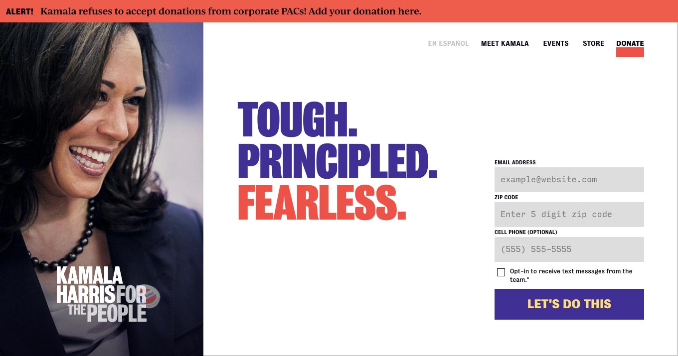
The Kamala Harris campaign homepage exclusively features type families from Type Network foundry partners. Font Bureau’s Bureau Grot is the signature typeface, The Ivy Foundry’s Ivy Journal is used for running text, and DJR’s Input Mono populates the forms.
Beyond the unconventional type treatment, the Harris campaign also adopted an uncommon color scheme. Mellow yellow and red take cues from Chisholm’s 1972 campaign, adding violet accents. The colors are basically the red, white, and blue of the American flag—but warmer and more vibrant. They fit the human aspect of the slogan: it’s “For the People,” after all. When displayed on a white background, the violet part at top left and the red at bottom right make the logo resemble the US flag’s fabled stars and stripes, thanks to the persistent rhythm of the letters’ strokes. On black or violet, Harris’ name changes to yellow; when the logo is overlaid on a photograph, her name is knocked out in white and the slogan becomes translucent.
IvyJournal’s soft, calligraphic finish balances out the forceful Bureau Grot. The abundant mellow yellow gives the Harris campaign a pleasant, sunny vibe.
Selecting Ivy Journal as the text face testifies to Wide Eye’s typographic acumen. Jan Maack’s answer to overused text faces has generous proportions with relatively short ascenders and descenders. It combines clear character shapes with a gentle, calligraphic finish. This makes text set in IvyJournal come across as genuine and approachable—helpful qualities for copy that aims to convince and recruit.
A simple, straightforward design and bold colors give Kamala Harris’ campaign impact and ensure it gets noticed.
The visual identity is sustained in the social-media images. Bureau Grot’s standard width shows up in captions for social media videos, and Bureau Grot Condensed sends out strong slogans as animated GIFs. Social images are adorned with split-color frames.
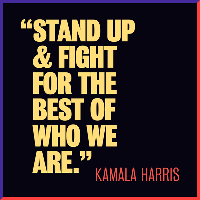
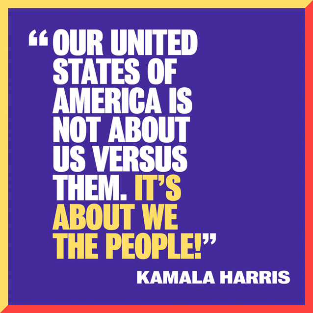
A “Kamala Harris: For the People” social image with a slogan.A “Kamala Harris: For the People” social image with a slogan.
A “Kamala Harris: For the People” social image with a testimonial.
IvyJournal takes over in social images that feature personal testimonials, and is used for the captions in the campaign videos, too. Maack’s typeface gives these messages a human touch and makes them relatable. The frames surrounding social images with a white background bear all four campaign colors.
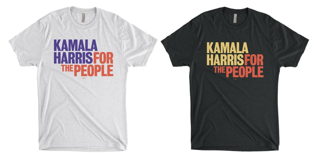
Seeing it on T-shirts drives home the strength of the “Kamala Harris: For the People” logo.
Harris’ 2020 presidential bid adopts a strong, sophisticated, and accessible visual language that breathes fresh air into a stale political arena. The typography plays a major role in crafting the striking design and building a convincing narrative. It’s a pleasure to see typefaces from three Type Network foundry partners used so well, especially when a hidden gem like IvyJournal gets an opportunity to shine and display its undeniable qualities to a larger audience.
Bald Condensed, né Yves Peters, is a Belgian-based rock drummer known for his astute observations on the impact of letterforms in the contemporary culture-sphere. A prolific writer on typography, he has a singular knack for identifying the most obscure typefaces known to humankind.