From mouse type to elephantine heads, one size does not necessarily fit all. Whether you go big or go little, type crafted for specific sizes will give your typography the royal treatment.
By Bald Condensed
Micro, Text, Deck, Display, Headline, Banner, Big. These are some of the names used to describe optical sizes—different cuts of a typeface family that have been designed to work within a certain range. That may sound odd to contemporary ears; digital typefaces are, of course, scalable. Historically, though, when type was cast in metal, a different font had to be created for every size.
Joshua Darden’s sprawling Freight, from GarageFonts, comes in several optical sizes designed to preserve the typeface’s integrity across a wide range of applications.
As Johannes Gutenberg’s movable-type printing system gained traction in fifteenth-century Europe, once a typeface was designed, a punchcutter would physically cut its characters in hard metal to produce punches. These punches, typically cut in steel, were used to stamp glyphs into softer metal to form matrices. A matrix would then be set in a hand mold and filled with molten metal type alloy. Once hardened, individual letters were composed into text for printing. Punchcutters, the unsung heroes of their time, played a crucial role in the production of type. They adapted the character shapes of a typeface design to be as legible and structurally sound as possible at each point size they cut—skillfully, painstakingly, and one letter at a time.
Around the turn of the twentieth century, Linn Boyd Benton’s invention of the pantographic engraving machine for type design marked the first inkling of the change to come. While Benton’s machine sped up production by automating the scaling of letterforms, the different sizes had identical, non-optimized character shapes. The need to produce individual sizes of typefaces declined further with the advent of photocomposition in the mid-twentieth century. Phototypesetting machines made it possible to scale characters on a negative filmstrip simply by magnifying or reducing their size through a lens. The early days of computer typesetting briefly brought back size-specific fonts, since characters had to be constructed on bitmap grids with fixed resolutions. But the emergence of PostScript fonts with scalable outlines in the mid-1980s seemed to seal the fate of optical sizes for good.
So why optical sizes?
A clear hierarchy helps readers navigate page or screen. Designers achieve hierarchy partly through layout and partly through typography; the appearance of the different bits of textual information hints at their function and relative importance. Some designers prefer to structure the type by combining different typefaces. Others turn to coordinated type families whose names advertise their kinship—like Retype’s Laski Slab and Laski Sans, for example. Note that certain faces are less obvious about their family ties, like Kontour’s Odile and Elido (whose names are palindromes of each other), or Occupant Fonts’ Prensa and Amira (whose relationship is more conceptual). A third way designers demarcate hierarchy is by using a single type family in different weights and sizes.
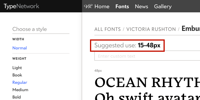
Matthew Carter’s Miller series has a wide optical range. The letterforms in Miller Text are optimized for use in body copy; at the larger end of the spectrum, from the refined Display and Headline sizes to the sparkling Miller Banner, the letterforms’ proportions morph and their contrast increases incrementally.Strictly speaking, we should call them “optical ranges” rather than “optical sizes”—digital fonts can be scaled, so they’re not tied to a single size anymore. For example, the suggested use for Victoria Rushton’s Embury Text ranges from 15 to 48 pixels. These are recommendations, not strict rules; its sturdy and open design makes Embury Text work well in a wide range of sizes.
Almost all typefaces are drawn with specific applications in mind. Text faces prioritize functionality and legibility in small sizes; designs meant for big titles and headlines, on the other hand, favor elegance and impact. Type Network provides recommended size ranges for all fonts to help customers choose wisely. While judicious adjustments in spacing can make a text face shine in large sizes, display fonts tend to break up or clog when used for small(er) body copy. So if you’re going for a minimalist look and limit yourself to a single type family, optical sizes can help you reach an extra level of typographic sophistication.
Text and display
To understand the need for separate text and display cuts for typefaces, I find it helpful to think of footwear. For trekking in the mountains, reach for solid, functional hiking boots that can handle rough terrain and inclement weather. If you’re going to a fancy ball, though, elegant shoes with supple soles will allow you to glide gracefully across the dance floor. And while hiking boots can be dressed up with stylish jeans and a casual jacket, I don’t recommend scaling a mountain in wingtips.
Eight years after the original release of Prensa, Cyrus Highsmith added Display versions in Normal, Condensed, and Compressed widths to accommodate larger type sizes. Note the finer serifs, the slightly increased contrast, and the tighter fit. The later addition of the Display variants explains the absence of a “Text” identifier in the name of the original Prensa.There are no hard-and-fast rules when it comes to proportions in text and display sizes. CJ Dunn’s Dunbar shows how display versions can either have a much taller or a much lower x-height, for example. The only thing that can be said about the text version is that it has “moderate” proportions.
Similarly, text faces have features—like a generous x-height, open apertures, low contrast, sturdy serifs—that improve their legibility in small sizes and/or unfavorable printing or rendering conditions. They sometimes feature short ascenders and descenders to allow for tighter linespacing, and more pronounced ink traps to prevent crotches and joints from clogging. Because these particular traits tend to look coarse in larger sizes, display cuts are typically more refined or expressive versions of the text cuts.
From large, larger, and largest…
Some type designers go the extra mile and further subdivide their display ranges. Consider editorial design: aside from the text size for body copy, you may also need a slightly larger optical size for the deck, a midsized version for pull quotes, a big size for the title, and an even larger variant for a typographic illustration or a masthead. This distinction makes the most sense in serif families like Font Bureau’s Escrow, where each larger optical size allows the designer to further increase the contrast and make hairlines and serifs thinner. Sans serif families like David Jonathan Ross’ Forma DJR, however, can also benefit from discrete optical sizes, since the spacing and details in the letter drawings can be fine-tuned to different optical ranges.
When Richard Lipton reworked his Meno type family, he added new optical sizes for display use in Normal, Condensed, and Extra Condensed widths. Meno Display has a more pronounced contrast and a snugger fit; Meno Banner increases the contrast between thicks and thins still more for maximum elegance in even larger sizes.
…to smallest
At the other end of the spectrum, certain typefaces provide optical sizes (often dubbed Micro) for tiny text. By making the text cuts even more robust and exaggerating some of their features, type designers can anticipate the occasional degradation of letterforms due to ink spread and other mechanical factors. Interestingly, their exaggerated character shapes often turn Micro sizes into successful display faces as well—they can be used both small and large to good effect.
Besides having an optical Display size, David Berlow’s Eldorado was also adapted for use in the smallest imaginable text sizes. While the general character shapes and design details correspond, the proportions of the Micro version differ dramatically from the Text; both are displayed at the exact same point size here.From microcopy to body copy to banner copy, Underware’s Zeitung has you covered. Zeitung Micro, with its spacious x-height and generous overall spacing, works especially well at the tiniest sizes.
Rendering small text on devices poses a comparable, yet divergent, set of problems. To counter those technical challenges, the fonts in Font Bureau’s Reading Edge (RE) series get the most out of the available pixels to optimize their appearance. While their shapes may seem skewed when enlarged, RE fonts beautifully capture the spirit of the original typeface designs and are eminently readable in text sizes on screens.
Optimizing typefaces for screens presents unique challenges. Instead of trying to contort the letterforms to accommodate the available pixels, the design sometimes needs to be significantly rethought to preserve the spirit of the typeface more than its formal attributes, as demonstrated in this juxtaposition of David Berlow’s Giza and Giza RE.
Sans sizes
The absence of serifs and relative lack of thick/thin contrast make sans serifs seem more robust and resistant to scaling. But some sans serifs benefit from having different optical sizes, too. Adapting proportions and spacing, adjusting ink traps, refining design details—while these modifications are barely noticeable to the naked eye, they improve the appearance of sans serifs at specific size ranges.
When Laura Meseguer developed Multi for a publisher of Dutch regional newspapers in 2011, she took a more rational approach to Multi Text, while infusing Multi Display with a lovely calligraphic quality.
Family expansions
Type designers occasionally revisit existing families and add new optical sizes. This explains why some typeface names don’t mention an optical size. If a family like Font Bureau’s Whitman or Carter & Cone’s Stilson only has a subfamily with the “Display” suffix, it’s because the original design was meant for text and the display size was added afterward. Conversely, a typeface like CSTM Fonts’ Kazimir was initially designed for display use, but was subsequently adapted to a text version to better accommodate smaller type sizes.
Because the original Kazimir was drawn for display sizes, Ilya Ruderman and Yury Ostromentsky felt the need to retool it so it could also be used as a text face. Kazimir Text features thoughtful changes to its letterforms that improve its legibility when used for body copy.
In rare cases like Victoria Rushton’s Embury Text, there is only one optical size: the “Text” moniker just means that the typeface was drawn to be used at text sizes, so there’s no use hunting for a display version. Similarly, Font Bureau’s Custer RE only exists as a Reading Edge series face.
Silent partners
Some type designers approach optical sizes from an unusual angle. Type-Ø-Tones’ Rumba, for instance, doesn’t necessarily adapt its character shapes to the intended size, but gradually increases their expressiveness. Richard Lipton’s Canto Brush is accompanied by Canto Brush Open, a version with a more pronounced dry-brush effect for use below 72 points. And Monokrom developed two distinct typefaces that, while not related by name, nevertheless share the same DNA. Satyr and Faunus offer two interpretations of the same core design principles applied for different size ranges: Satyr for 10 to 11 points, and Faunus for 14 to 24 points.
With Rumba, Laura Meseguer took an unconventional approach by making each consecutive optical size more expressive than the last.They have two different names, so it’s perhaps easy to miss that Monokrom’s Satyr and Faunus render the same type design concept at different sizes.
Go forth and be optical
The naming of optical sizes, while logical within type families, is not always consistent across different typefaces. To help unscramble what can seem confusing at first blush, I’ve listed all of the typefaces on Type Network that currently feature optical sizes, each from small to large.
There are almost as many approaches to optical sizes as there are type designers. While typefaces are designed to be used in specific optical ranges, consider these well-founded suggestions. As you gain experience and get better acquainted with the fonts you license, you’ll learn to use your best judgment when composing text. Your eye will tell you whether a typeface works at certain sizes or not. It’s typography, after all—not quantum physics.
Bald Condensed, né Yves Peters, is a Belgian-based rock drummer known for his astute observations on the impact of letterforms in the contemporary culture-sphere. A prolific writer on typography, he has a singular knack for identifying the most obscure typefaces known to humankind.