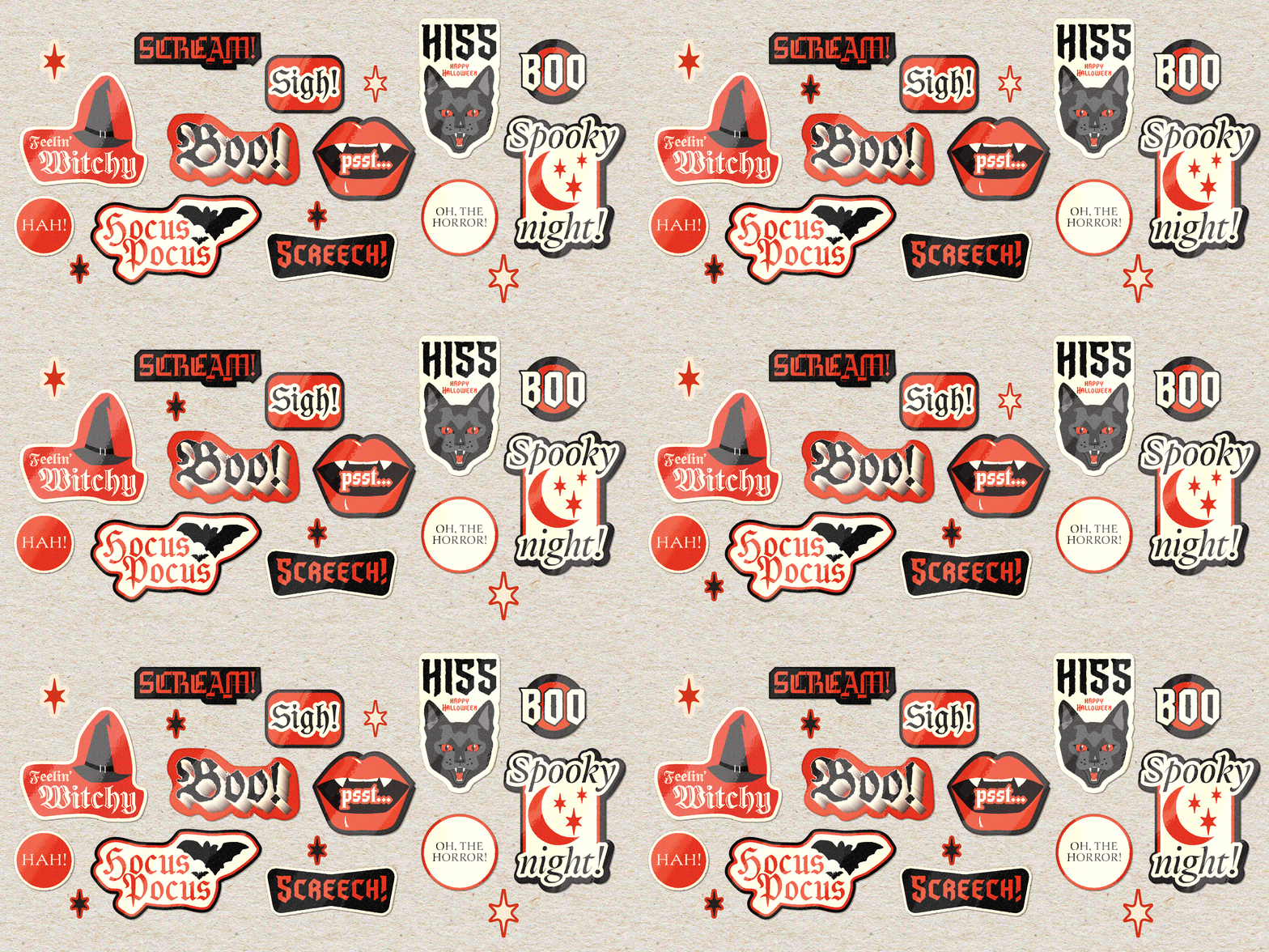
Featuring: Fang · Herzberg Design, Gorgias · PampaType, Leather · Canada Type, Jetsam Collection · Famira Fonts, Dusk Till Dawn · Comicraft
Fonts that go bump in the night
Some letterforms were built for daylight: reading rooms, annual reports, the produce aisle. Others were clearly raised somewhere darker. This collection leans that way : Serifs sharpened to a point, blackletter thick enough to block out the moon, and one custom face drawn expressly for the undead. Here are five fonts (and one blood relative) for anything that needs to look a little more haunted this October.
Horror has always had a house style. Long before movie posters dripped with distressed lettering, blackletter and its jagged cousins were doing the unsettling work: dense, vertical, and built to look ancient even when brand new. The association with darkness isn’t only aesthetic, either. The word “Gothic” started life as an insult, coined by Italian Renaissance scholars as a slight against the Goths, the “barbarians” they blamed for the fall of Rome, and type designers have been quietly reclaiming it ever since.

Elegant, but never entirely at ease
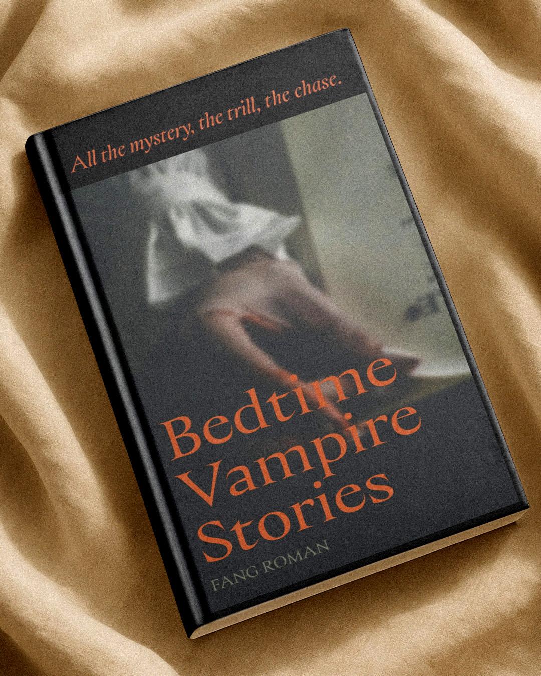
Herzberg Design’s Matthijs Herzberg calls Fang “an honest attempt to make a Roman & Italic display face as elegant as I am capable of,” and the name does the rest of the talking. The letters flow like water and stand like stone: a wide, generously spaced Roman lowercase paired with a tighter, quicker italic drawn from a calligraphic hand rather than the Roman’s slow, deliberate strokes. Subtly concave stems and serif feet keep every straight line just slightly not straight. Elegant, but never entirely at ease.

Matthijs Herzberg
Matthijs Herzberg is a New Orleans-based designer specializing in bold typography, branding, and art direction.
Required reading, preferably by candlelight
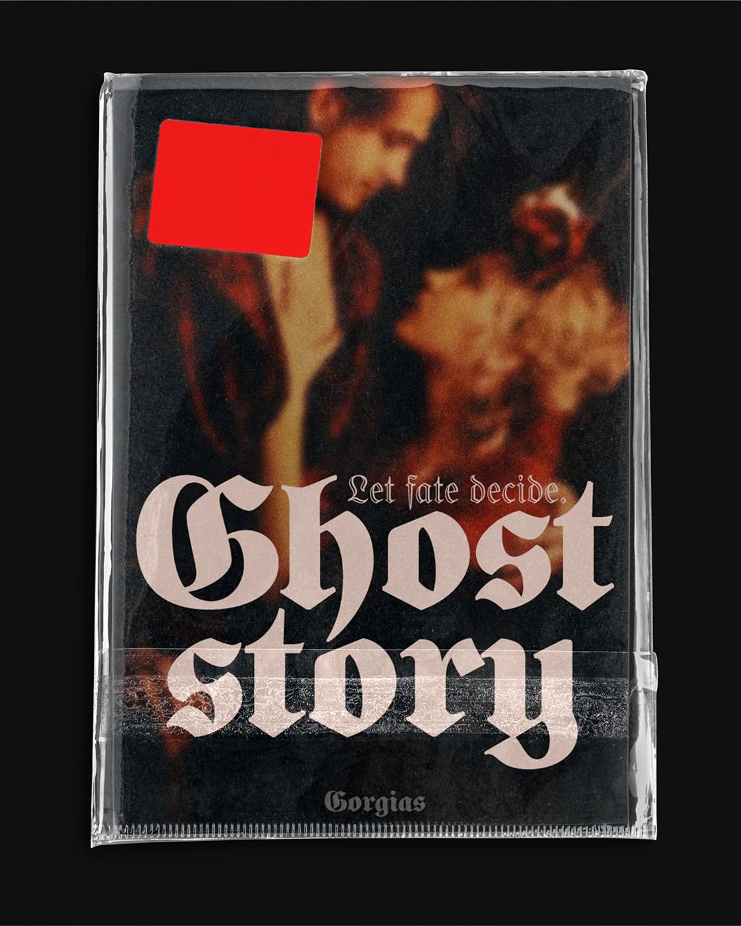
Mexican type designer Manuel López Rocha was exploring old books when he fell for a Schulfraktur, the blackletter that set German schoolbooks in the 19th century. He named his revival Gorgias, after the title of the book where he first found it, and kept it faithful to the original while adding new glyphs, ornaments, and a full set of period initials. Regular and Black come in solid and open versions, so it can read like a library shelf or loom like a ledger in a locked attic. Required reading, preferably by candlelight.

Manuel López Rocha
Manuel López Rocha is a Mexican graphic and type designer specializing in typography for Indigenous languages, while also teaching and practicing type design.
Some designs just needed the right century to come back in
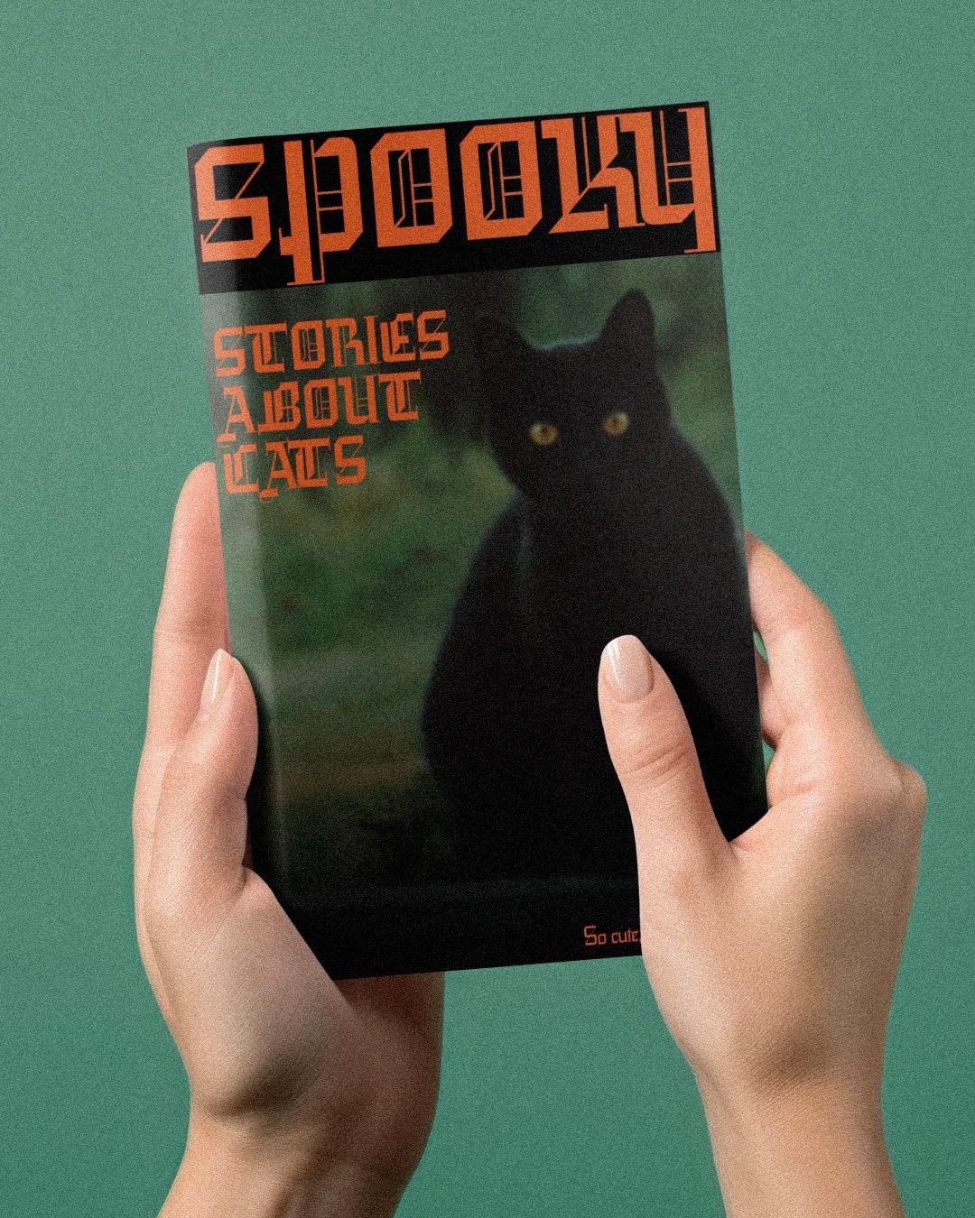
Leather is Canada Type’s digitization of Imre Reiner’s 1933 Gotika, a design so far ahead of its time that metal printing couldn’t keep up. The thin serifs and delicate inner bars kept snapping off the press, and the typeface spent decades as a footnote. Screens don’t have that problem: what’s left is a blackletter uppercase simplified into clean geometric bars, grid-based curves, and just enough Bodoni-thin serif to look dangerous rather than decorative. Some designs just needed the right century to come back in.

Patrick Griffin
Patrick Griffin is a founding partner and creative director of Toronto font development studio Canada Type. He spends his professional time designing type, teaching about type, writing about type, or helping others with type.
Some cargo is better left overboard
Hannes Famira, the designer behind this list’s honorable mention, keeps a stranger stash of letters in his Jetsam Collection, six oddities that include a digitization of his father’s IBM Selectric typewriter. The one to reach for this month is Basilea, a distressed blackletter whose shapes came off a shipping box of T-shirts from Egypt. Its uppercase is solid and bold, while the skinny lowercase fizzles out at the bottom, two moods in one font. It looks like a warning stenciled on a crate nobody should open. Some cargo is better left overboard.
Jetsam Collection
Corrido Light
Starting at $30
Buy
Hannes Famira
Hannes Famira is a Dutch-trained type designer and educator known for his structured, interdisciplinary approach to typography and extensive teaching experience.
Four styles cover everything from tombstones to midnight movie posters
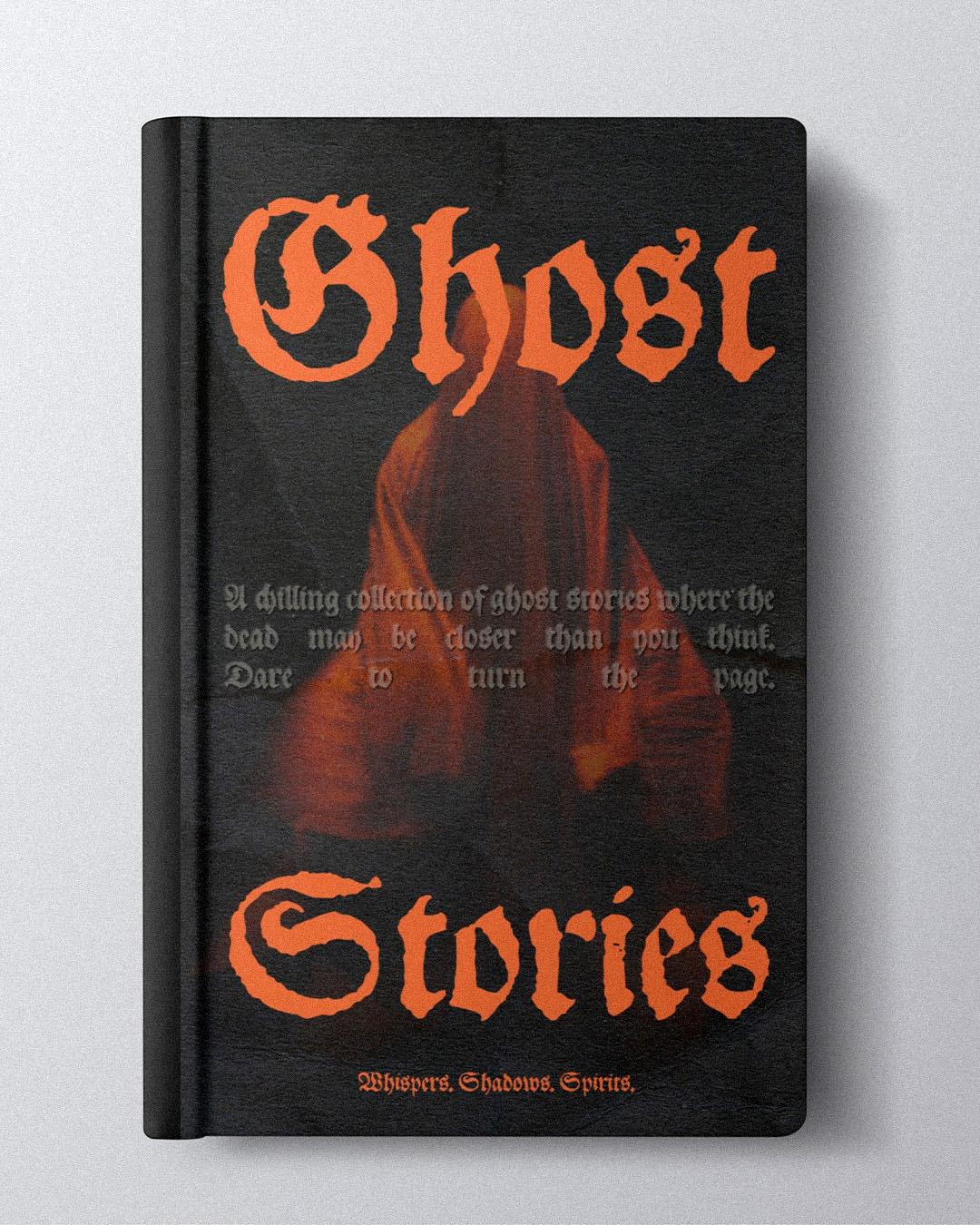
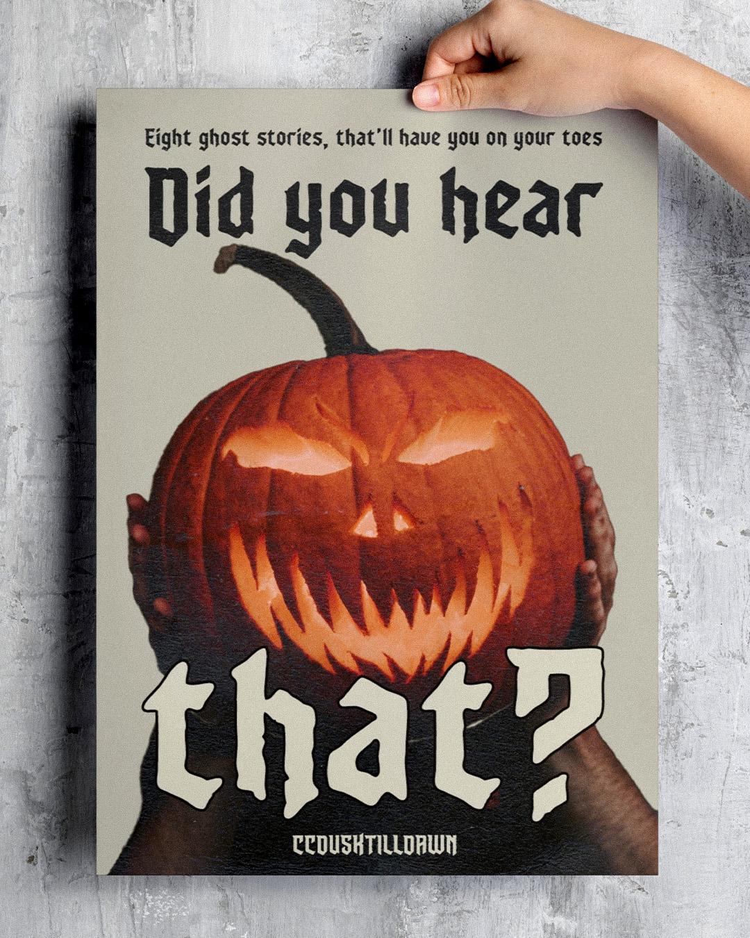
John Roshell drew Dusk Till Dawn for the night the vampires rise from their graves, and Comicraft’s own pitch reads like a survival guide: grab the wooden stakes, silver bullets, and garlic capsules, and hope the farmyard animals make it to morning. The foundry describes it as gothic chic, exhumed and lightly dusted in dry earth for your convenience. Four styles cover everything from tombstones to midnight movie posters. Comicraft calls it a font worth dying for, though it makes no promises about coming back.
Dusk Till Dawn
Buried
Starting at $20
Buy
John Roshell
John Roshell is an award-winning type designer and founder of Swell Type, known for iconic comic lettering and playful, California-inspired fonts.
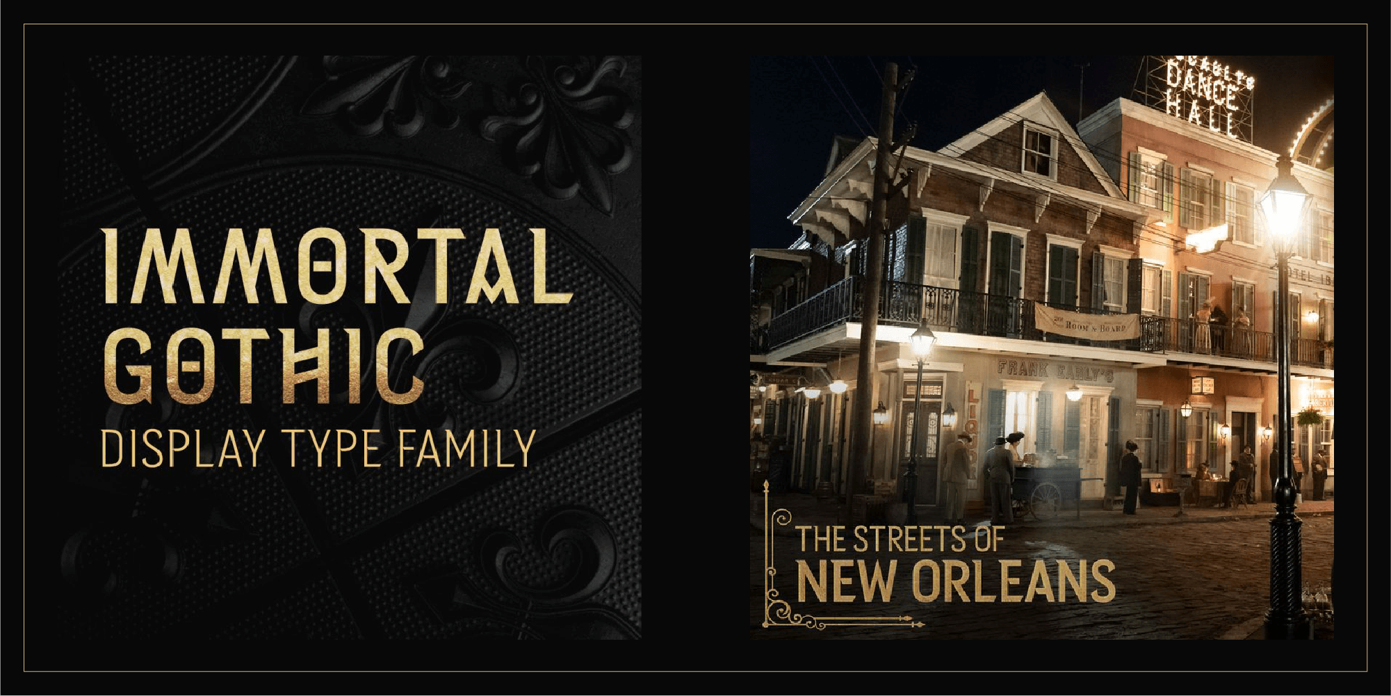
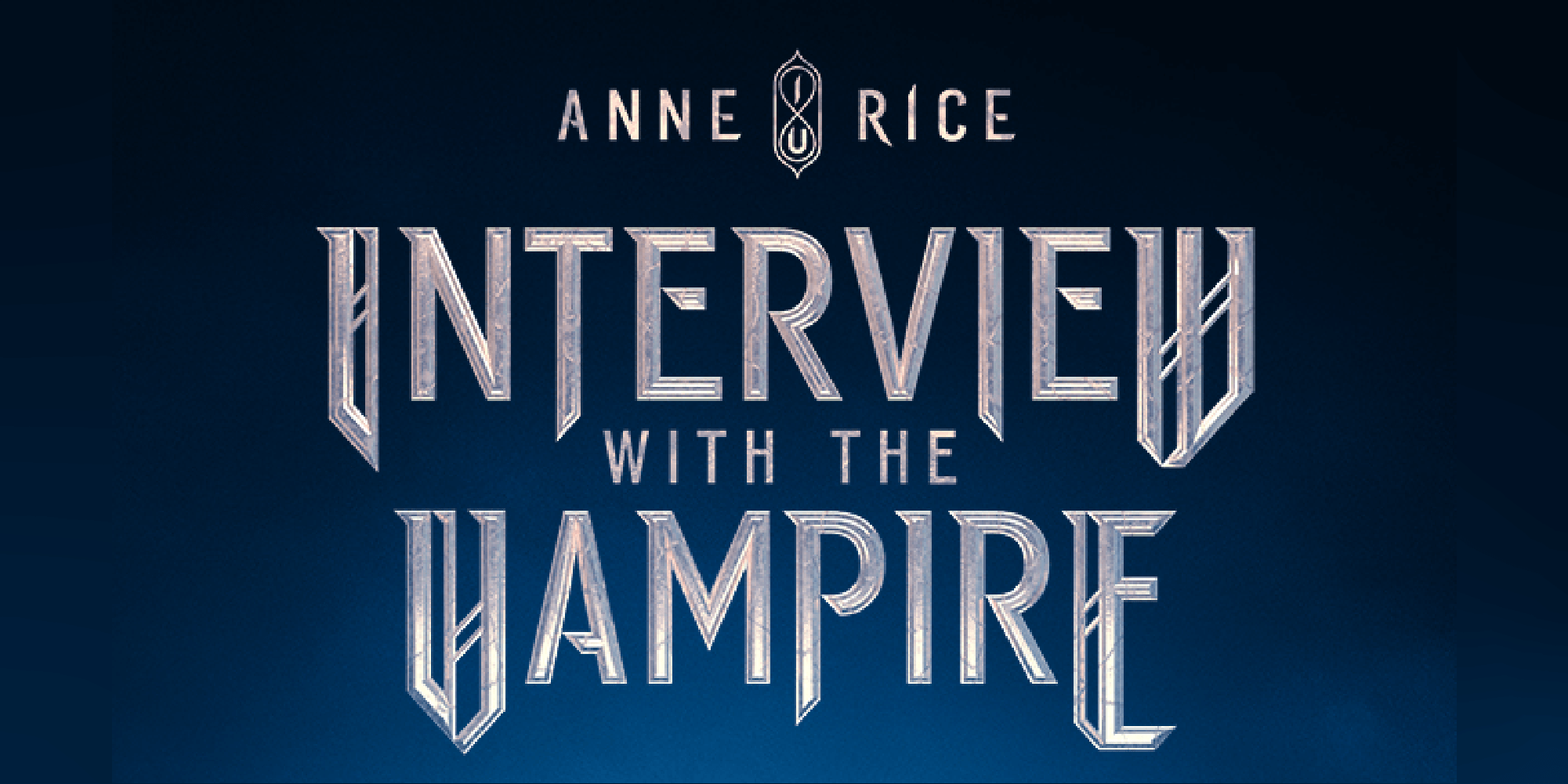
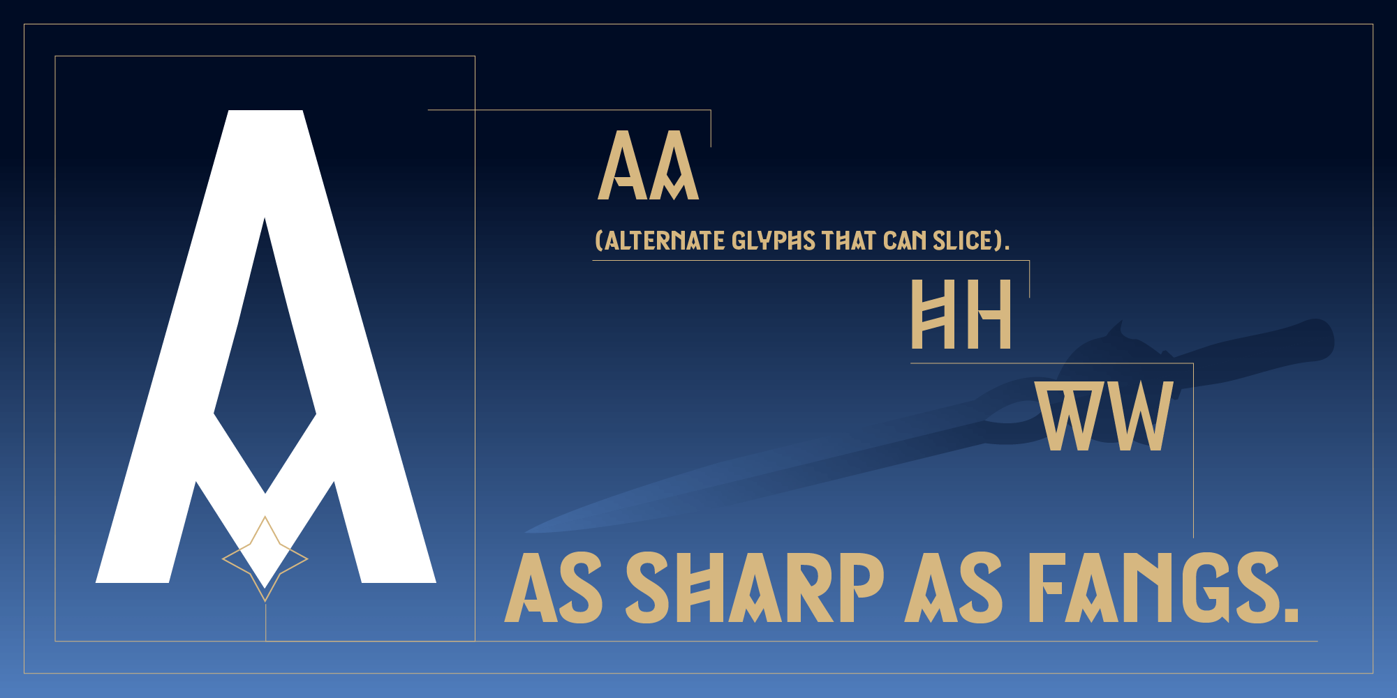
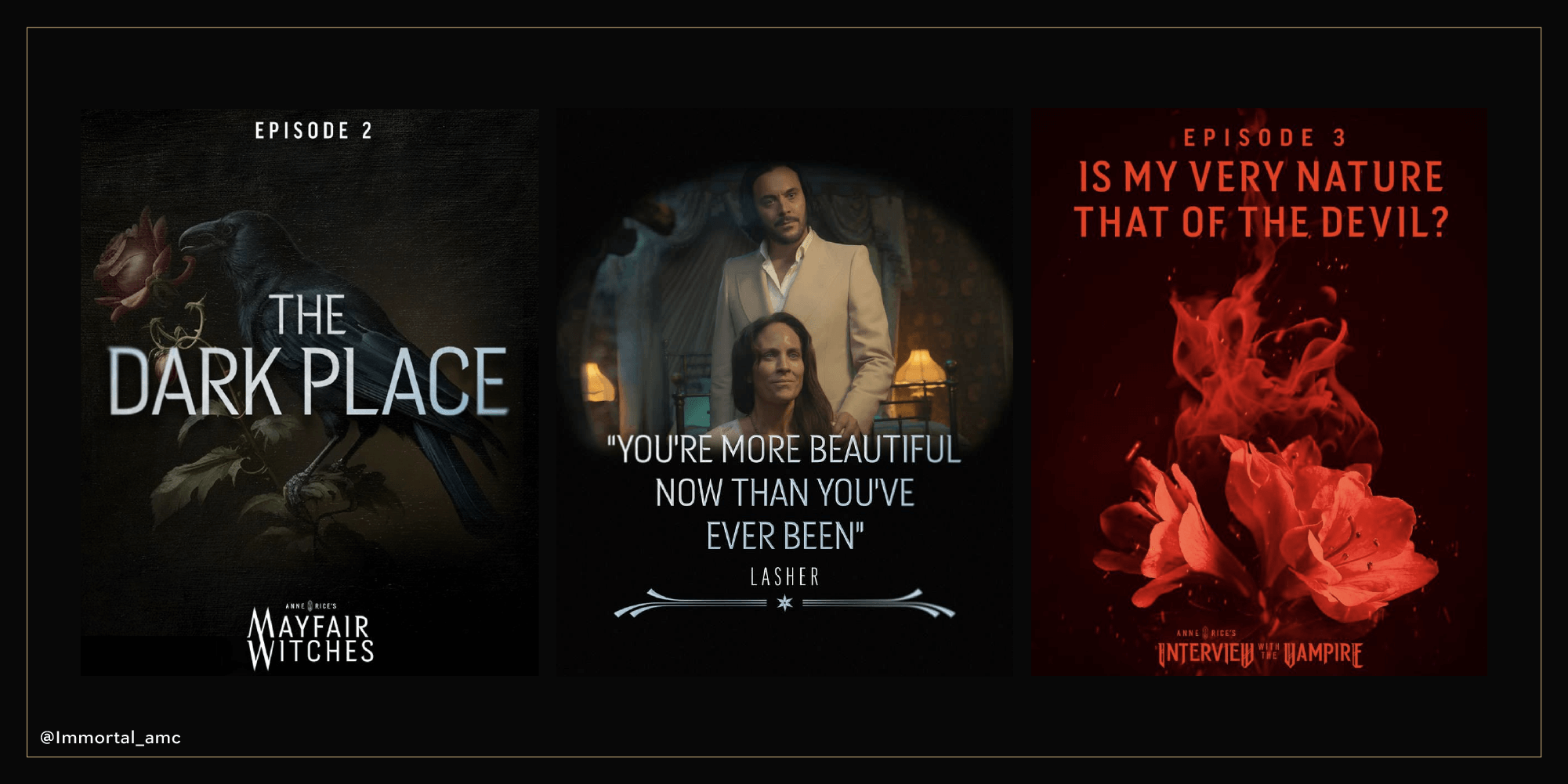
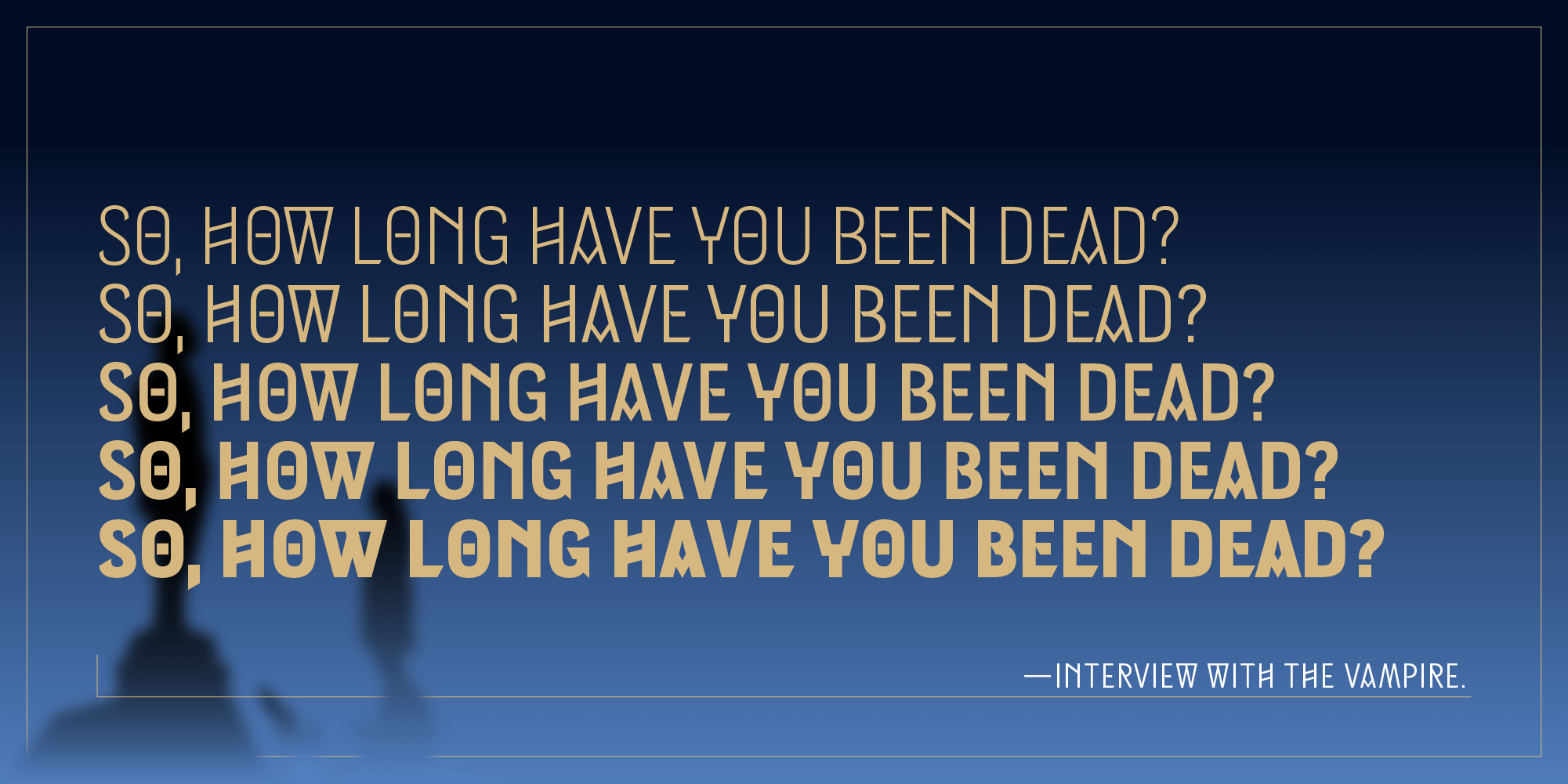
When AMC needed a typeface to match Anne Rice’s Interview with the Vampire, they didn’t go looking in a catalogue; they commissioned one. Working with agency loyalkaspar, Type Network’s Dyana Weissman and foundry partner Hannes Famira of Famira Fonts built Immortal Gothic, a geometric sans with terminals sharpened to a very particular angle. “It must be something you really don’t want in your chest or neck,” Famira said of the brief. The typeface now runs across AMC’s entire vampire universe, including Interview with the Vampire and Mayfair Witches. The one that isn’t for sale. Yet.

Dyana Weissman
For 20 years, Dyana has designed custom typefaces for clients including AMC, Disney, Ford, MoMA, and The Washington Post, guided by a belief in genuine connections and the beauty of imperfection.
Five of these faces are ready to license today. The sixth had to be built from scratch. Either way, backbone isn’t the point this time around: bite is. Meet them all, and the foundries behind them, at
store.typenetwork.com.