DJR launches DJR, names new font after cocktail
David Jonathan Ross first combined his drawing skills and an affinity for coding on the websites he built in middle school. It’s fitting, then, that a type family he developed for computer programmers is what ultimately inspired him to launch his own type foundry.
 Born in Los Angeles in 1985, David Jonathan Ross is the son of an attorney and an accountant. He might have been destined for a career in law or finance were it not for his grandfather—a commercial artist who created intricate store displays from cardboard and worked in speedball and showcard lettering.
“My passion for drawing came from my grandfather.”
Growing up, David hadn’t yet focused on letterforms—he gravitated more toward drawing cartoons. But one childhood project saw him inventing a language, complete with its own writing system. “The first exposure I had to fonts was trying to figure out how to type in my own language—just in case people were worried I wasn’t nerdy enough.” David said. He built a web page that contained an image for each letter, and it could set one image after another. “That was four DJR.com’s ago,” David said. “I’ve had that URL since 1998, when I was in middle school.” David’s page creation skills and artistic leanings came in handy when he was chosen as layout editor of his high school paper. Although the newspaper staff worked in a room that had 15 computers loaded with PageMaker, there were plenty of analog chores, from pasting laser-printed galleys on boards to knifing type. “I designed the masthead,” David said. “We did actual pasteup. It was my job to cut out the descender of the lowercase p so that it would float over the photo [on the front page].”“I got into type in college.”
Although he was interested in design, David didn’t go to art school. “I wanted to go somewhere that would push me to do something more unusual. I was looking to be pushed creatively,” he said. Bypassing Southern California’s prestigious design institutions, David went east to Hampshire College in western Massachusetts. “It was a no tests, no grades, no majors type of place,” he said. “That gave me room to explore. Rather than taking graphic design 101, I really got deep into the things I was interested in.” He soon realized graphic design didn’t focus as much on drawing as he‘d thought it would. “I liked the idea of solving problems. Essentially, type design is solving problems through drawing; drawing at a basic level. You only have black and white. Working within those constraints is interesting.” While at Hampshire, David got to know a letterpress printer and an engraver at Smith College, just down the road from his school. These relationships inspired him typographically. “My senior thesis ended up being a typeface design,” David said. “I bought a copy of FontLab. I did a workshop with Peter Bain. I went on Typophile a lot. I talked to professors at Hampshire, emailed professors at other schools. I just tried to talk to people about my work whenever I could.” While working toward his degree, David served as co-editor of Hampshire’s student newspaper. He shared duties with Emily Richardson, who would become his partner in life as well as in the newsroom.
David Jonathan Ross's senior thesis project, Climax, in use in the Hampshire College student newspaper.
“Because we ran the newspaper, we could sub in any font we wanted,” David said. “I was able to develop this font and to use it live. Every issue could have different versions of the font.” After printing on the less-than-stellar output device they had to work with, David carefully studied how his typeface appeared in ink. "I used to go back and readjust things that didn’t work well.”
For David, this iterative approach to type design gave him valuable insight. “It was all about problem solving,” he said. “Making something that people could actually read entire articles and an entire newspaper in. It ended up being a text and display face. I had a headline cut, too.”
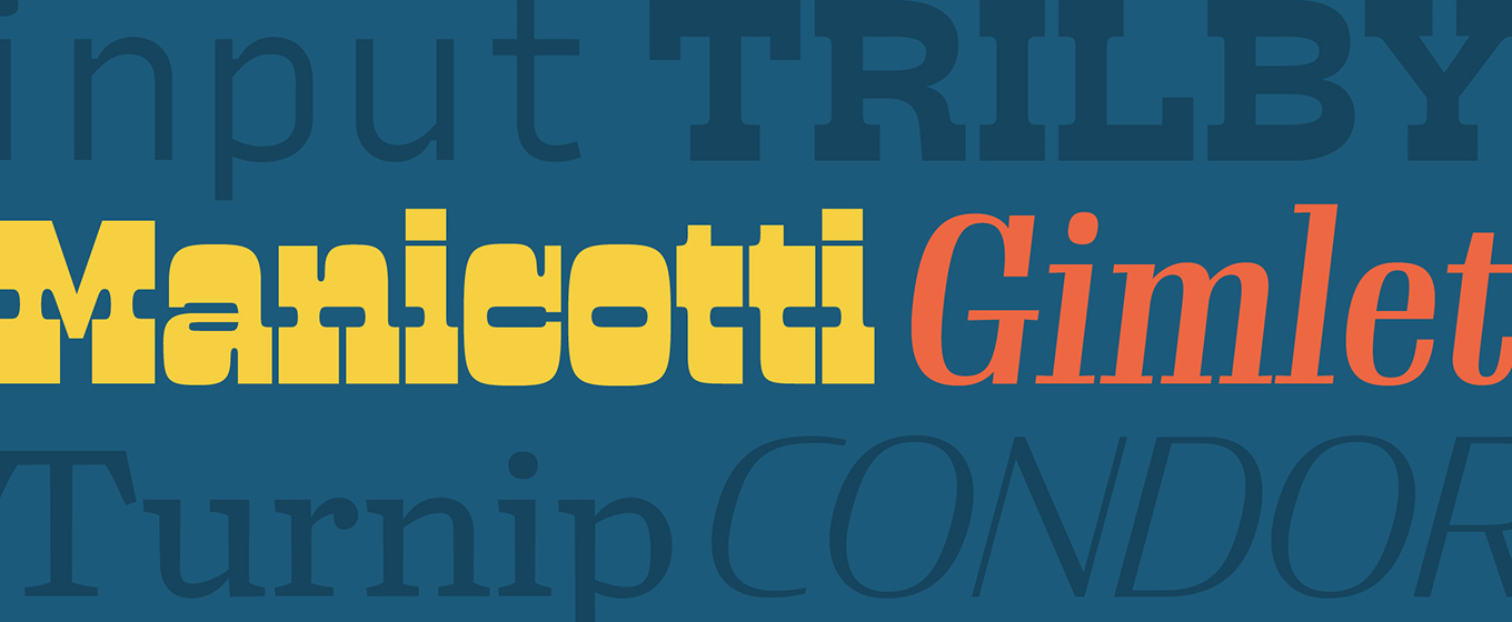
That contemporary humanist serif family, Climax, was never released. “It was a student project—best left that way,” David said. Nearing graduation, David wrote to places he thought might hire him to design typefaces. One of those was Font Bureau. “I don’t know how my letter made it to Sam Berlow [Font Bureau's general manager], but it did.” David was hired as a junior designer in 2007. When he first started at Font Bureau, he worked on production of retail type, then began assisting with custom work. Although David worked remotely, he had plenty of opportunities to learn from his colleagues. “Cyrus Highsmith was—and still is—a big mentor,” David said. “I used to meet with him weekly. He was constantly on top of what I was doing, giving me advice.” He also learned a great deal from Font Bureau co-founder David Berlow and from Jill Pichotta, the foundry's head of production. “It was great for my education,” David said, “I got different viewpoints from different co-workers. When I worked on a Cyrus font, I had to get into Cyrus’s head and see how he organized the hierarchy. Then when I worked on a David font, I had to get into his head; totally different, more intuitive. He just draws and it works—I could take a different approach. Jill is very analytical, so when I was working on projects with her, I was given a lot of proofing and comparison. Becoming familiar with these different approaches was helpful in developing my own approach.” Opportunity knocks, courtesy of Input “Input was a turning point for me,” David said. “It was the first time that I took over not only the development of a font, but the way that it was priced, licensed, and marketed.” Working with developer Chris Lewis and font guru Nick Sherman, David built a minisite focused not on editorial designers but on computer programmers. “In order to do that, we had to rethink everything—pricing, licensing, how it was going to be marketed; how it was going to look. I became very invested in the process, and I’m grateful that Font Bureau gave me the opportunity. I see launching my own foundry as an extension of that. “Input got way more attention than I thought it was going to, and it brought me closer to the users,” David said. “There were a lot more because it was a free font. I fielded questions and feature requests, and issued revisions based on user feedback. Input led the way to me having my own foundry, where I can have a direct connection with users; where I can not only speak to them, but learn from them.”
A page from the Schadow specimen published by C.E. Weber type foundry, Stuttgart, circa 1953. Image courtesy of Nick Sherman.