Building brands with Adobe Originals
From Hotel Monaco to Apple, some of the world’s best—and biggest—companies have chosen to brand themselves with Adobe Originals typefaces. Covering every style without sacrificing quality, their library offers something for each niche within each industry. This is how identity designers around the world are using Adobe Originals to create memorable, influential brands.
By Lucas Czarnecki
Identity design is one of the creative’s greatest missions: To take a faceless (sometimes nameless) organization and craft for it a look and feel that is at once both recognizable and attractive, fitting and memorable. For this task, they have only a few tools at their disposal: color, pattern, imagery, and typography.
While selecting the first three of those has its hurdles, you don’t have to pay a license to use a color, pore over libraries to find a pattern, or call an outside professional to modify an image. Type stands alone as an identity’s core decision and prime asset. For evidence of this, look no further than the copiously available instances of Twitter upheaval anytime a beloved company changes their logotype. Do you remember a time when the public reacted similarly for a color change?
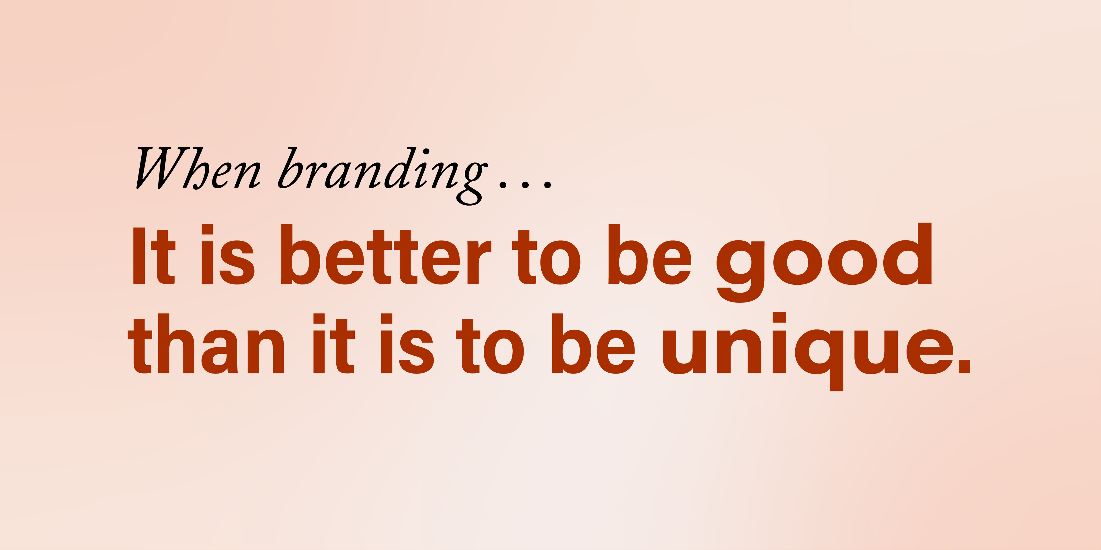
Such is the strength of a good brand. It’s memorable to the point of adoration. And while “unique” might be the popular name of the branding game, those responsible for the best identities will tell you unique means nothing without quality. Clashing colors might put off some customers, but illegible or dysfunctioning text sinks the whole ship.
It’s with quality in mind that identity designers choose Adobe Originals typefaces. They’re known for their character sets, language support, fine detail, and innovative designs. Companies around the world have branded themselves with Adobe Originals, and while it would be impossible to discuss every excellent example, here are some that stand out.
The Apple we know and love
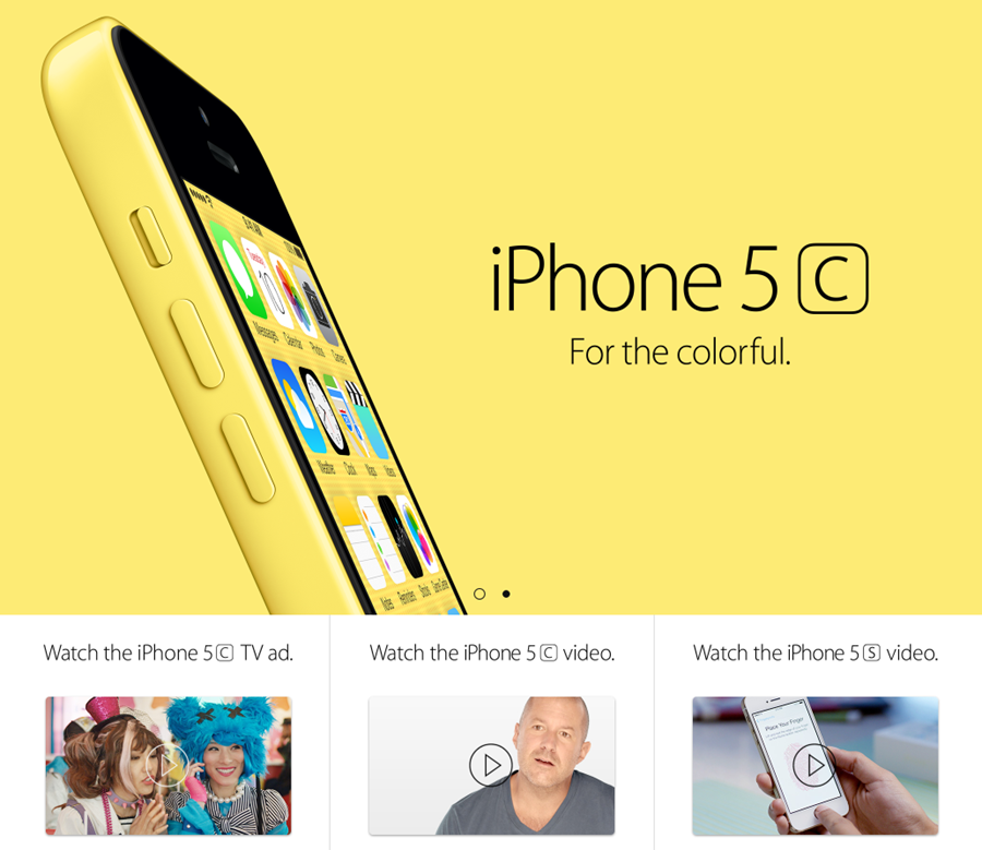
In 2002, when Apple launched the eMac, they also replaced their corporate typeface, Apple Garamond, with Adobe’s Myriad. Designed by Robert Slimbach and Carol Twombly (with some later additions by Fred Brady and our own Christopher Slye), Myriad was released in 1992. It’s a humanist sans serif with handwriting influences. Its open counters, distinctly angled ‘y’ descender, and slanted e finial give Myriad a look that is at once both approachable and quiet.
Myriad worked for Apple because it’s a typeface that can be dressed up or dressed down; it doesn’t bring too much of its own personality. Because of Myriad’s quality, Apple could create confident and colorful ads without worrying about the type: Simple text, photo of iPhone or iPod, bright background, done.
Over the fifteen-years of Apple’s Myriad use, they had the face customized to adjust the spacing and add at least one lighter weight. This kind of font modification that we can help with.
A college course in versatility
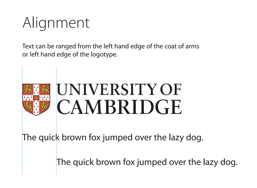
For Apple, Myriad looks sleek and fun; for various universities around the world, it’s human and intellectual. Loyola University Chicago, Cambridge University, University of Delaware, University of Iowa, University of Nevada, Reno, University of Ottawa, George Washington University, Carl von Ossietzky University of Oldenburg, and—my alma mater—University of Virginia all make use of Myriad.
The picture of impactful
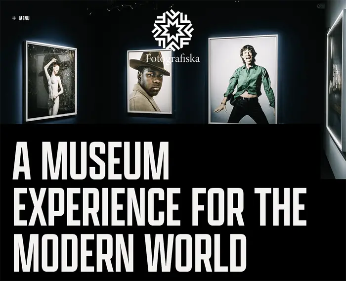
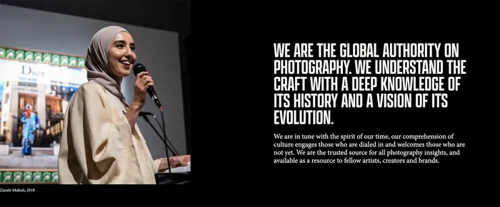
Founded in 2010, Fotografiska is “a destination to discover world-class photography, eclectic programming, elevated dining and surprising new experiences.” With museum locations in New York, Stockholm, and Tallinn (and more opening in Berlin, Shanghai, and Miami) Fotografiska has clearly struck a nerve with the art-patronizing public.
Their logo and body text is set in Adobe’s Minion, with display copy set in Apotek by foundry partner Kerns & Cairns. It’s a surprising and successful pair, balancing Apotek’s tall, solid forms with Minion’s late-Renaissance-era humanism.
Designed by Robert Slimbach and released in 1990, Minion was created specifically for body text. Its most prolific appearance is as a default font in some Adobe applications, but perhaps its most recognizable is in The Elements of Typographic Style by Robert Bringhurst.
Fotografiska’s identity works because it puts the art front-and-center. The black and white backgrounds and lines of text are unassuming, despite their weight. Apotek steals the show in some compositions (not necessarily a problem), but Minion softens this effect and returns attention back to the art. Its success as a readable text typeface helps communicate all the information visitors receive about the work on display.
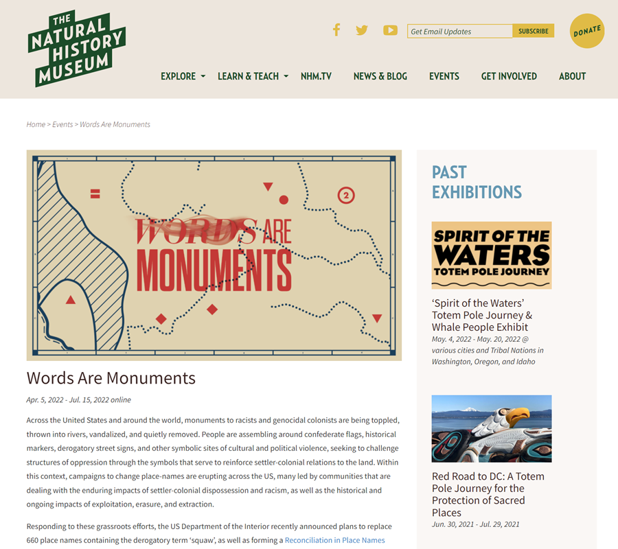
Onboard and online
The Natural History Museum doesn’t have a fixed location. Instead, they host exhibitions, workshops, and more at other museum locations with the help of their museum bus. They also publish digital exhibits online, where they use Relay by partner Occupant Fonts for headlines and Source Sans by Adobe in body text. Relay’s humanist (if exaggerated) structure pairs well with Source Sans’s grotesque forms, which tend to lean humanist in its italics.
Something tasty
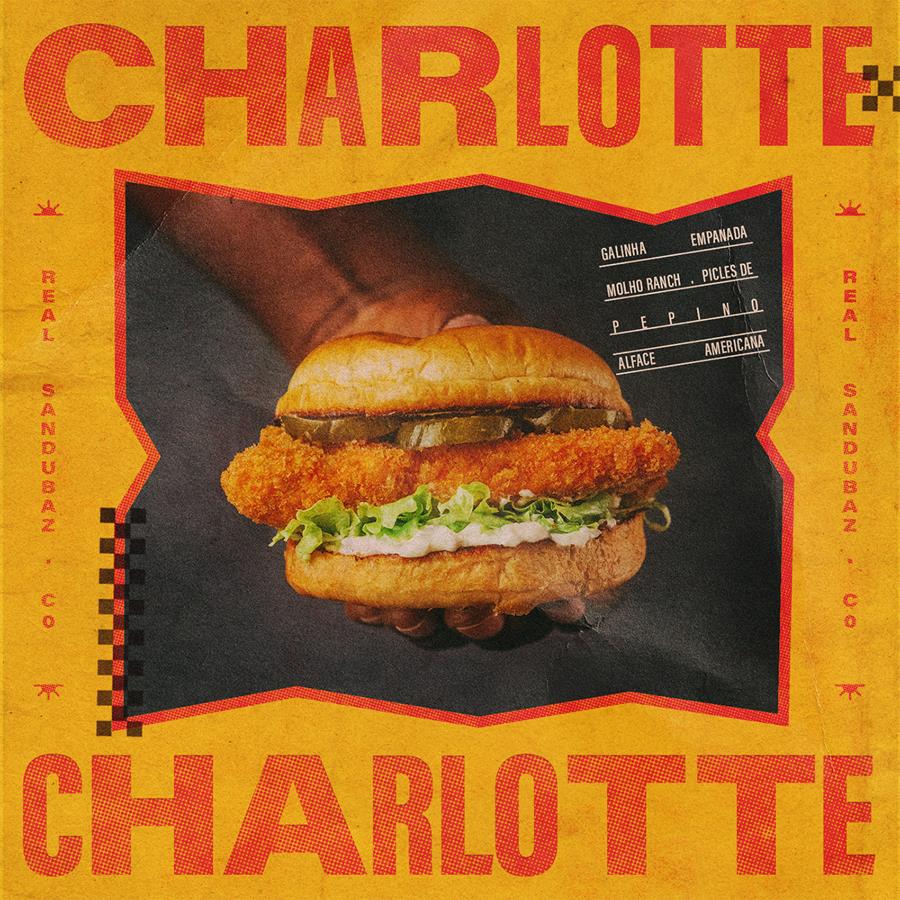
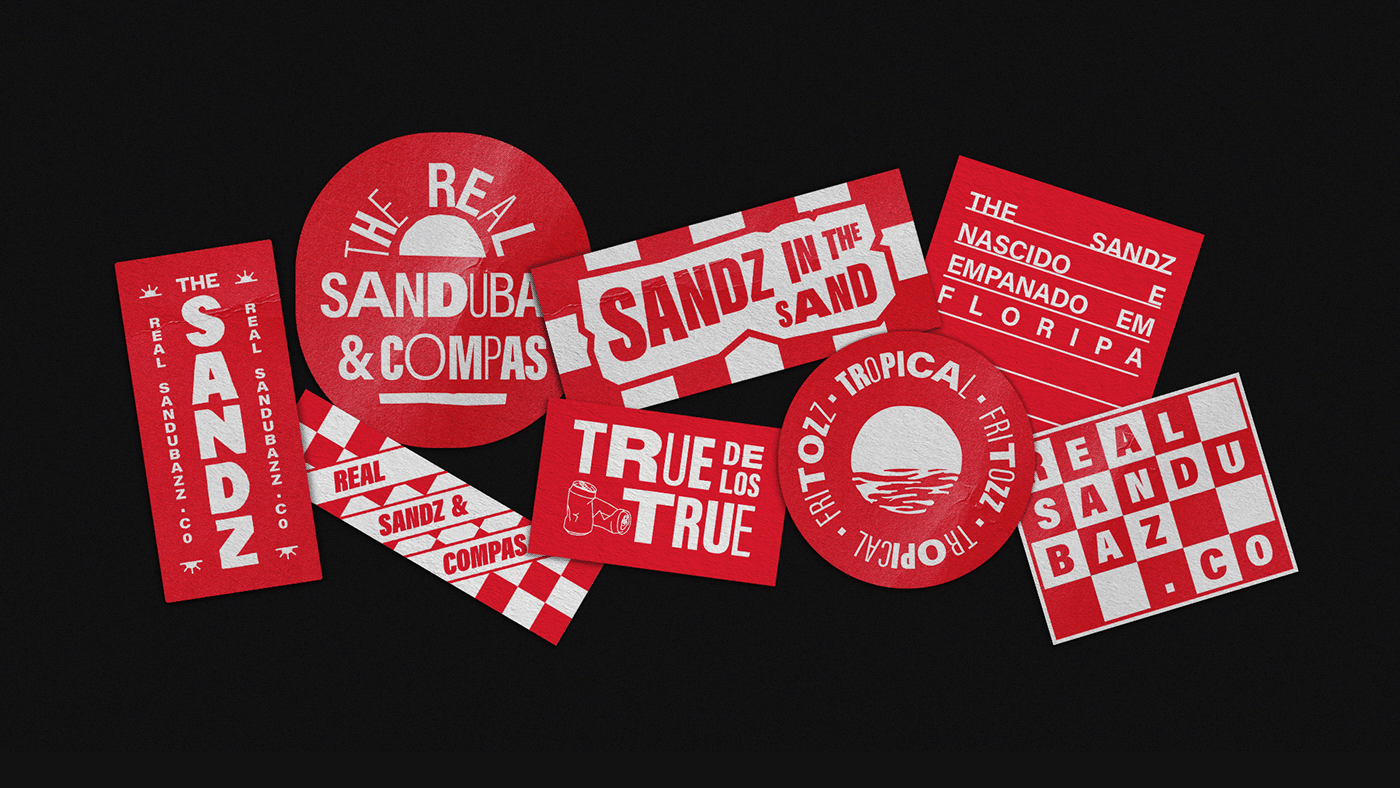
It’s unlikely you’ve heard of Florianópolis-based sandwich restaurant The Sandz, but after seeing their branding, you might be tempted to charter a flight. Reminiscent of “surf and skate culture,” Vogau Studio’s identity design for The Sandz mixes textures, outlines, shapes, and bright colors–not to mention nearly every weight and width of Adobe’s Acumin–to achieve a beachy, collaged aesthetic.
As Robert Slimbach thought about designing Acumin, “a new neo-grotesque, his first impetus was to reinvent the category, to make it ‘much more human,’” according to Adobe. And while its 90 styles across five widths and nine weights (plus italics) might not feel humanist, “he managed to introduce warmth and humanity into it in a very subtle way.”
The Sandz identity proves this warmth. Between the grungy textures and fluctuating letter weights and widths, Acumin–which often appears quite corporate and clean–looks lively and engaging. Add in the identity’s red, yellow, blue, and tan, and you get a sandwich shop that looks as unique as it does tasty.
A stay with style
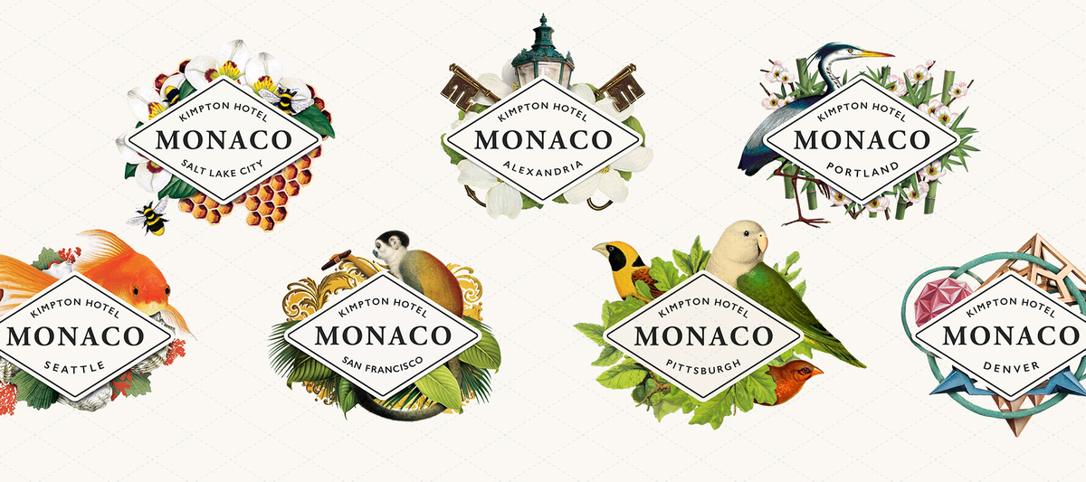
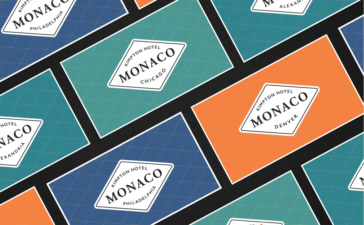
If you’ve stayed at a Hotel Monaco during a trip to Salt Lake City, Seattle, Portland, Pittsburgh, or somewhere else not-named-Monaco, then you surely admired its adventurous identity. Using Adobe Caslon and Gill Sans for its main mark and supporting typography, Hotel Monaco feels like a safari anywhere you stay.
According to the identity designers at FINE Design:
At the visual core of the Monaco brand identity is a consistent mark that unifies the brand’s intent; a core diamond motif logo echoes passport stamps or steamer trunk decals, delivers the name and location, and anchors Hotel Monaco’s story about the world traveler seeking an immersive, fanciful experience in each city.
For its part, Adobe Caslon was designed by Carol Twombly for use in body text; however, blown up large to logotype scale, its fine details appear blunted and antique. Monaco’s brand combines it with the simple diamond stamp, vibrant colors, local wildlife, and plenty of fauna, resulting in something both memorable and legible.
London Design Festival’s big 1-0
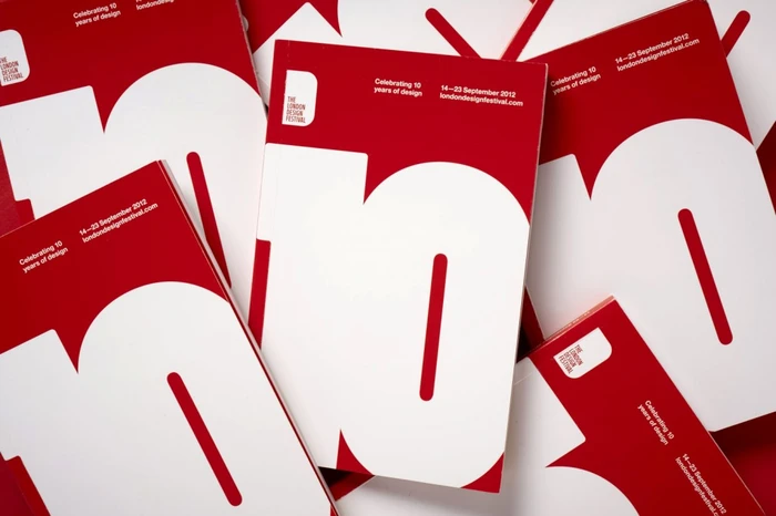
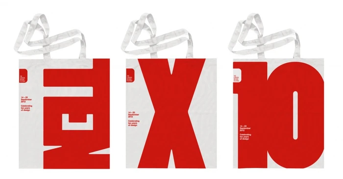
If anything needs good identity design, it’s a design festival. For London Design Festival 2012, Pentagram wanted to keep things simple, according to Domenic Lippa:
The theme for this year was an obvious decision considering it is the Festival’s tenth year. As with previous years we collectively agreed on a strong and bold execution of the theme by just concentrating on different ways of saying 10–whether by using the numerals, symbol or the word itself.
Learn about Adobe Originals
To learn more about Adobe Originals, subscribe to the Type Network Newsletter, where we’ll be sharing articles, case studies, and tutorials explaining everything designers should know about Adobe Originals.
Stark designs like this put even more pressure on the type to perform. It’s unknown how many typefaces they tested before choosing Adobe’s Poplar, but it’s clear they made the correct decision. Poplar, designed by Barbara Lind in 1990 for the Adobe Wood Type series, was created to be big. Its tall forms, heavy strokes, slanted cuts, open apertures, and narrow counters set it apart from the other display faces on the market. Scaling it so it fills (and overfills) each composition reflects the largesse of the event. Furthermore, squishing the type together so the white-or-red letters overlap and form solid blocks recollects wood type itself.
Go forth and brand
Perhaps surprising is that—unlike some other typefaces—none of these Adobe Originals faces were designed specifically for branding. They were made for longform text or to emulate wood type; they were made with an emphasis not necessarily on standing out but on being good: functional, reliable, versatile, and correct in all the behind-the-scenes ways only type designers know but everyone notices. Adobe Originals has always focused on quality, and it is quality typefaces that make quality brands.
There are dozens of fascinating and attractive identities that didn’t make it into this article. Next time you’re looking for inspiration, scroll through the Adobe Originals page on Fonts In Use. Then, the next time you’re designing an identity, scroll through the Adobe Originals fonts on Type Network.
We will be diving deep into the Adobe Originals collection and Adobe Fonts. We'll explore the best of what Adobe has to offer, how to make the most of licensing options, best font pairings, and hidden gems in the library. Type Network provides enterprise, app-embedding, and self-hosting licenses for Adobe Originals (and for all our partner foundries which have typefaces included in Adobe Fonts. Let us show you how to go beyond the single-user licenses that come with Adobe Creative Cloud.