ATypI Warsaw 2016, Day 2, Part I: The return of the Multiple Master · Type Network
ATypI Warsaw 2016, Day 2, Part I: The return of the Multiple Master
On the second day of the ATypI conference at the National Audiovisual Institute (NInA), a huge announcement overshadowed the rest of the proceedings. OpenType 1.8 now supports variable fonts, making this the biggest news in digital type since… well, since the introduction of OpenType.
By Bald Condensed
Registration at NInA on the first day of presentations. Photo by Kaja Słojewska.
The two-track program on the second day at ATypI conferences is always murder. The rapid succession of short presentations causes sensory overload, and you end up feeling exhausted by the end of the day. Also, tightly-scheduled back-to-back programming doesn’t make for easy track-hopping. Whichever track you end up choosing, you always seem to miss that one superb presentation or important announcement. This year, however, I’d heard rumblings that something huge was going to be revealed, so I made sure to switch to the technology track after the first coffee break.
Because I don’t design or produce fonts myself, I decided to start the morning session in the education track. There was no point in sitting through yet another demonstration of the perpetually delayed FontLab VI, though the recent additions for Indic and East Asian font production in Glyphs did pique my interest, even as a layman.
Reading graduate and assistant professor at Kent State UniversityAoife Mooney talked about teaching infographics to second-year students in Synoptic Translations. Starting from the premise that “there is no such thing as a neutral piece of information,” Mooney explained how graphic structures and visual translations transform information from textual form into visual form. Besides historic examples and contemporary work by Francesco Franchi for IL Magazine and by Nicholas Felton, Mooney showed some excellent student work that experimented with new media and multiple levels of narrative. Especially visually arresting was Warped: Cycles of thought, a print piece with distorted typography that reflects the mental state of depression.
Jesús Barrientos showcases his simplified and personalized type classification system during ATypI‘s education track. Photo by Kaja Słojewska.
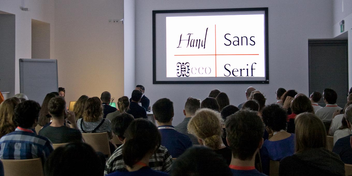
Because Jesús Barrientos had difficulties understanding type classification, finding it deeply confusing as a young designer, he developed a simplified system that he now teaches to his students at Benemérita Universidad Autónoma de Puebla. Four categories in type classification: a strategy to organize type material for graphic designers is a simple method that can be personalized, which means there can be no ‘wrong’ categories. His system is based on the categories Sans, Serif, Hand, and Deco, and can be refined and overlaid on top of existing classifications.
Reading graduate Crystian Cruz discussed his Lessons from the first type exercise. When he was asked to teach a typography module in the Bachelor’s course in Graphic Design in 2003, he set up six modules with the goal to teach how to choose and how to use type: Anatomy, Letterforms, Semantics, Lettering, Legibility, and Composition. In the first module, “Anatomy,” Cruz devised an exercise in which he erased parts of the letters in Franklin Gothic to force his students to study the letterforms and consider the similarities and differences between letters in upper- and lowercase.
Ann Bessemans, Kevin Bormans, and Maarten Renckens presented READSEARCH—A Platform for Reading Research. Reading is one of the most complex and cognitive skills a human can acquire. Once learned, it becomes automatic, and cannot be switched off unless you’re a type designer. Until recently, results in legibility research barely reached type designers. Now, some young type designers are turning into scientists, too. The typographic research group Readsearch combines fine arts and research in looking at type design and typography from a scientific point of view. The project leaders are seeking collaborations, and internships are offered.
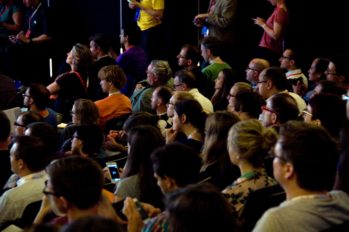
The audience witnessing the announcement of the biggest change in OpenType since OpenType was created. Photo by Kaja Słojewska.
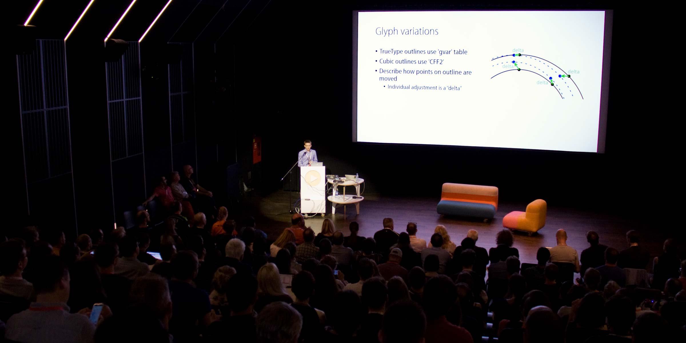
After the coffee break, the highly anticipated Special OpenType Session dropped a bombshell with the biggest change in OpenType since OpenType was created. All the major players were represented—Peter Constable, Senior Program Manager at Microsoft; Ned Holbrook, Senior Software Engineer at Apple; Behdad Esfahbod, Staff Software Engineer, Tech Lead: Fonts and Text Rendering at Google; and David Lemon, Senior Manager of Type Development at Adobe. The excitement in the hall was palpable when they broke the news that the new OpenType 1.8 spec now supports variable fonts.
In layman’s terms, this means that all the weights, widths, and other variations of a typeface can now be incorporated in a single font file. Font variations will be interoperable—the fact that the four major companies were present on stage was a testament to that. This dramatic change in the paradigm has numerous advantages. Because a family of fonts can become one set of glyph outlines, containing all the related kerning and hinting, more can be done with less. The production of fonts can be streamlined, and the resulting variable font files will be considerably smaller, resulting in significant disk and bandwidth savings. The new format also addresses the current challenges of working with responsive typography, as this new ‘fluidity’ can make fonts adapt to different viewports and viewing conditions. This legacy from the days of Multiple Master fonts and TrueType GX never really went away, living on in the font production environment, but for the first time in two decades, the technology comes back to the user side of things.
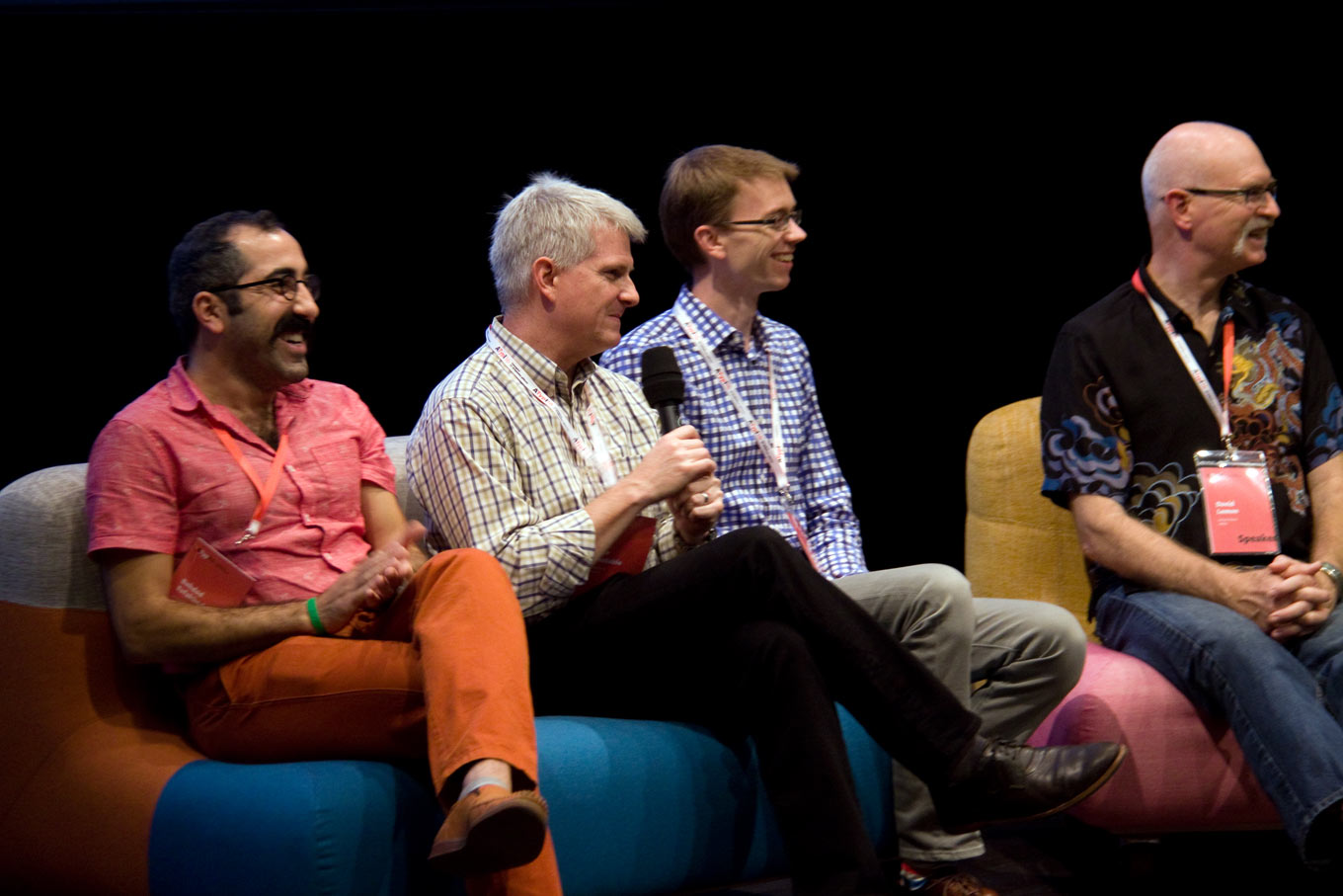
Panelists from ATypI’s Special OpenType Session, visibly pleased, during Q&A. Pictured from left to right: Behdad Esfahbod, Peter Constable, Ned Holbrook, and David Lemon. Photo by Kaja Słojewska.
After the initial announcement by Constable, the other presenters took over. Holbrook delved a little deeper into the specification, showing how actions previously made on individual fonts could now be applied to variable fonts (with that resultant smaller file size). He also hinted at upcoming challenges for typographic user interfaces (hmmm, sounds familiar). Esfahbod showed any number can be interpolated, and any interpolation can switch to an alternate glyph at a specified point to avoid design problems like clogging counters. Because the relationships between node points remain the same, even if their specific x & y positions might change, Holbrook demonstrated how time and effort savings that can be achieved during the arduous task of TrueType hinting.
Lemon listed the advantages of CFF2 over the original Compact Font Format, which was itself an improvement on the PostScript Type 1 font format. The code Adobe contributed to FreeType is being updated, and upgraded font tools should be available by end of month. Adobe is working to include variable font support into its applications. Constable then focused on the style attributes table, making it clear that we will now have to deal with different notions of font “families.”
Another exciting aspect of the announcement surrounded the automatic selection of appropriate optical variants for selected text sizes. Lemon and Esfahbod demonstrated design and tooling workflows for variable fonts. Constable also revealed that the old GX fonts—even though they don’t cover everything that was added to the OpenType 1.8 spec—could be modified and made operable with minimal effort. Constable’s welcome parting message emphasized that the new spec is backed by a large working group with development partners from across all relevant vendors.
The future’s so bright, I gotta wear shades.
Bald Condensed, né Yves Peters, is a Belgian-based rock drummer known for his astute observations on the impact of letterforms in the contemporary culture-sphere. A prolific writer on typography, he has a singular knack for identifying the most obscure typefaces known to man.