Loading...
Please wait while we load the content.
Please wait while we load the content.

Branding Agency: loyalkaspar, Type Agencyies: Type-Ø-Tones and Kerns & Cairns.
AccuWeather refreshed its brand system in 2019, focusing on clarity and efficiency. Matching the goals of AccuWeather’s industry-leading weather forecast platform, branding agency loyalkaspar worked to create a flexible system that would enhance global trust in AccuWeather through consistent, accessible design.
Service: Custom licensing and consulting
Partners: Type-Ø-Tones and Kerns & Cairns in collaboration with loyalkaspar and AccuWeather
Date: 2019

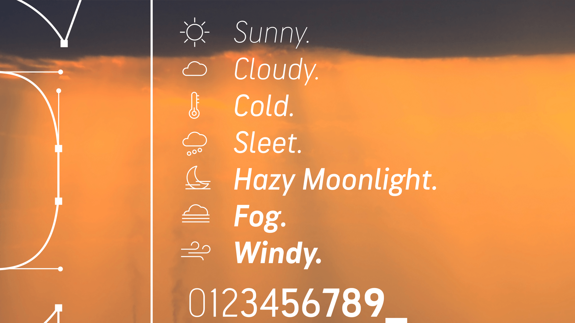
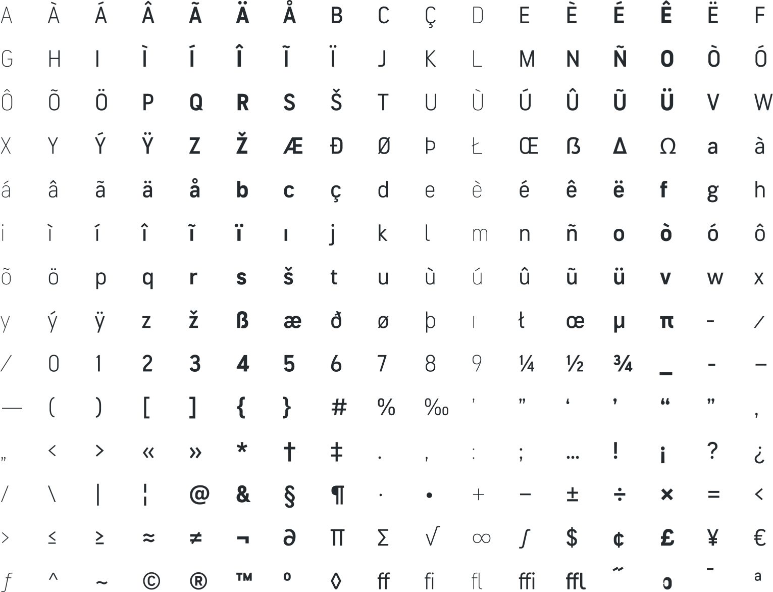
The new brand system included a brand mark, iconography, strategy, and a robust custom typeface named Solis, designed by Type Network foundry partners Laura Meseguer of Type-Ø-Tones and Dyana Weissman of Kerns & Cairns.
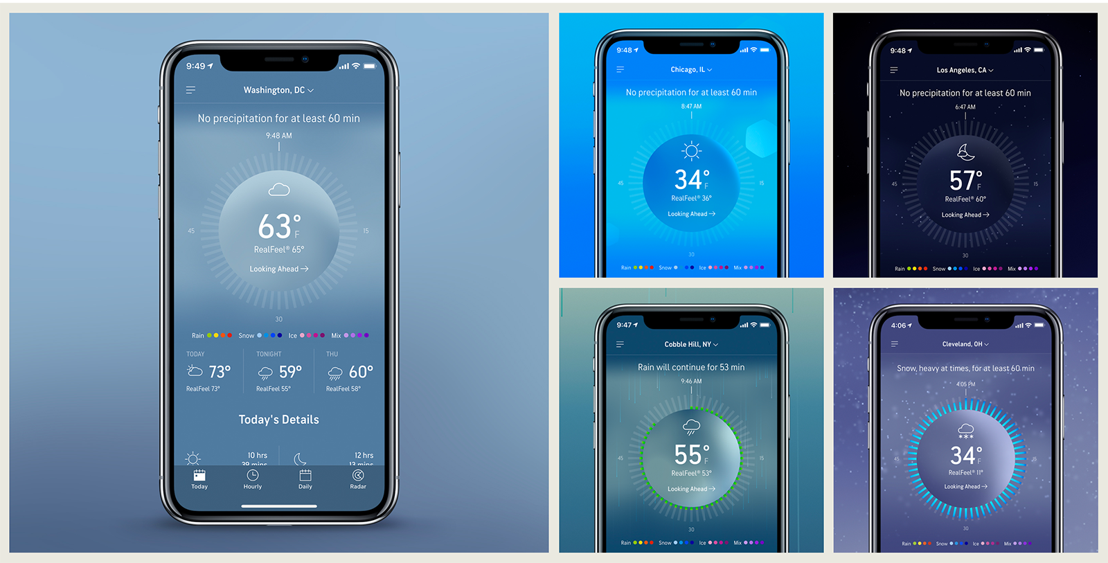
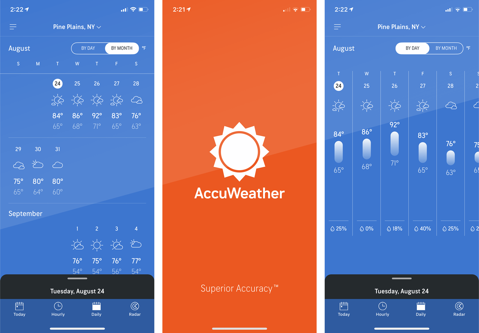
Solis, named after the sun, was developed primarily for use on vertical screens and information-dense settings. The majority of AccuWeather’s billions of users access the platform on their phones, so a tall, thin structure was a natural choice. At the same time, Solis needed to perform at large sizes on the 24/7 AccuWeather Network channel. The AccuWeather screens themselves are often rich with content, so readability in small, camped spaces—even on large screens—was vital.


Type-Ø-Tones is a typographic design company founded in 1990 by Joan Barjau, Enric Jardí, Laura Meseguer and José Manuel Urós.
Meseguer worked within these constraints to deliver six weights, each with accompanying italics. Distinctive and consistent throughout the family is its upward and clear shapes. Reminiscent of the best signage typefaces, Solis features wide open apertures and curves. Looking at the 1, C, J, Q, l, and t reveals Solis’s uniquely branded DNA: According to AccuWeather founder and CEO DR. Joel Myers, “commitment to detail is built into every aspect of our innovation at AccuWeather – right down to our font.”

The result is a type system that is not only clear and legible but also subconsciously identifies AccuWeather content. The decision to use custom type lifts the AccuWeather brand and creates endless possibilities for future branded material.
If your company wants to brand its content across technologies and around the globe, there’s no better solution than custom type. Contact us to start the conversation with one of our partner foundries.