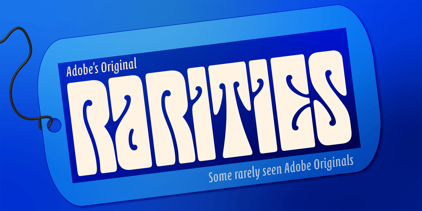
A few from the vault: Some rarely seen Adobe Originals
Over the years, Adobe’s business model has evolved alongside its expanding library. One result is that there are some Adobe Originals—created in collaboration with other designers and lettering artists—that are not currently found in the company’s own Adobe Fonts service. The good news is that you can license them all from Type Network.
By Dan Rhatigan
The Adobe Originals program started in 1989 at Adobe to create original typefaces of exemplary design quality, technical fidelity, and aesthetic longevity.
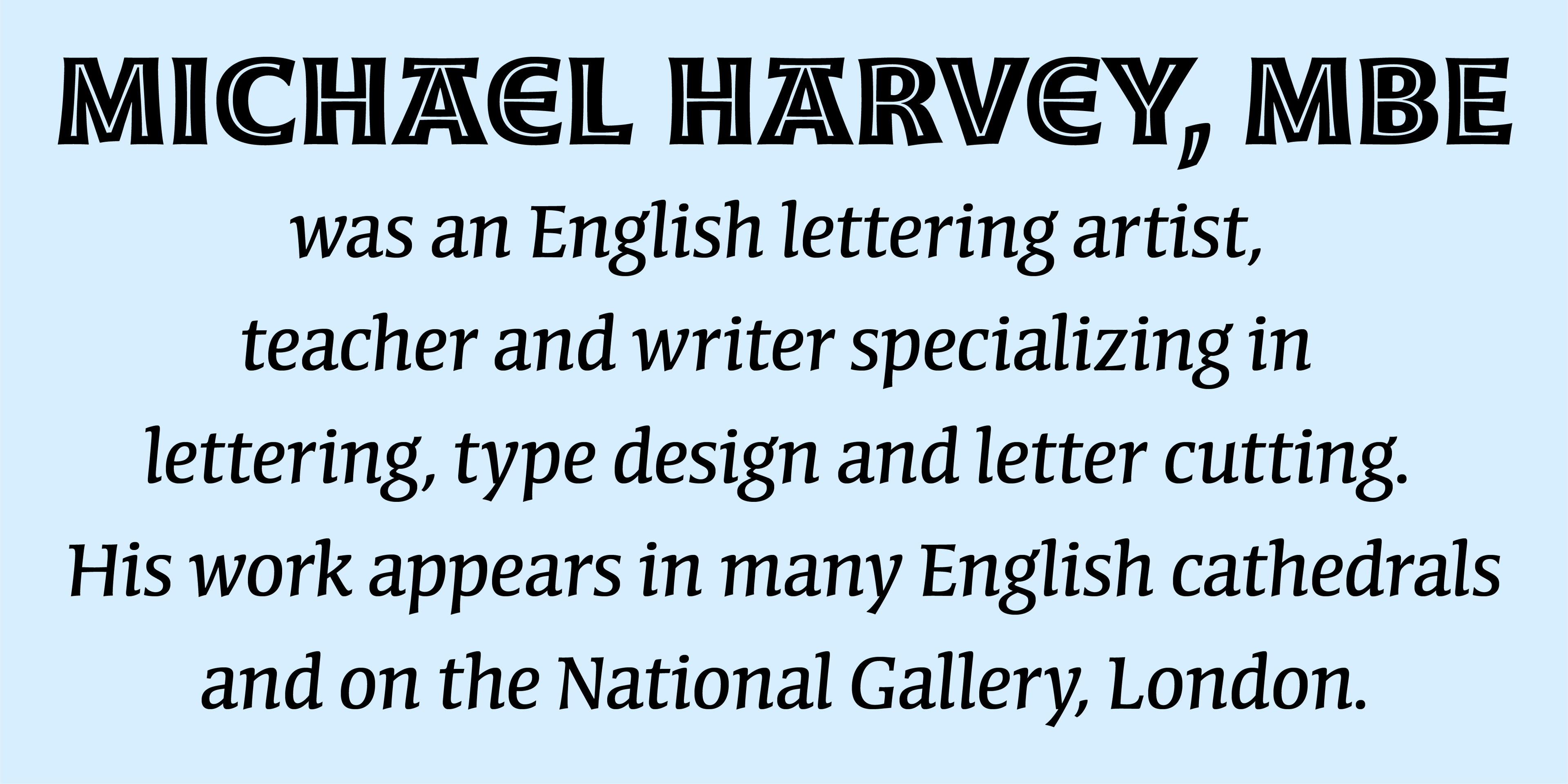
Moonglow and Conga Brava by Michael Harvey

Many of these typefaces come from designers who worked with Adobe in the earlier days of their career and went on to become famous elsewhere. Akira Kobayashi—recently announced as the next recipient of the TDC Medal from the Type Directors Club—designed the experimental Calcite for Adobe. Carl Crossgrove, who helped with the Adobe Wood Type series as an intern, designed Reliq before heading to Monotype for many years. Jeremy Tankard designed Adobe’s ligature-rich Blue Island in the early years of his own eponymous type foundry.
Many of these typefaces come from designers who worked with Adobe in the earlier days of their career and went on to become famous elsewhere. Akira Kobayashi—recently announced as the next recipient of the TDC Medal from the Type Directors Club—designed the experimental Calcite for Adobe. Carl Crossgrove, who helped with the Adobe Wood Type series as an intern, designed Reliq before heading to Monotype for many years. Jeremy Tankard designed Adobe’s ligature-rich Blue Island in the early years of his own eponymous type foundry.


Serbian calligrapher and designer Jovica Veljović contributed three distinctive pen-inspired families with multiple weights: Ex Ponto, Sava, and Silentium. Julian Waters designed the elegant Waters Titling as a multiple master font with a range of weights and widths; it is now available as a conventional OpenType family. (Another multiple master project was Graphite by David Siegel, the designer of Adobe Tekton and an early web guru who went on to become a crypto influencer.)
By the time Adobe commissioned them in the mid-1990s, both Michael Harvey and Jim Parkinson were prominent lettering artists and designers with type experience. Moonglow, Harvey’s family of subtly flared inline styles, complements his crisply italic Conga Brava family. His typeface Studz, on the other hand, puts a novelty spin on medieval manuscript lettering. Parkinson used an early logo of his studio as the seed for Jimbo, his “happy Bodoni” family. Like Jimbo, Montara is a Parkinson family that captures the lively personality of showcard and advertising lettering; meanwhile, his Mojo pays tribute to the psychedelic lettering styles of Wes Wilson, Victor Moscoso, and Rick Griffin.
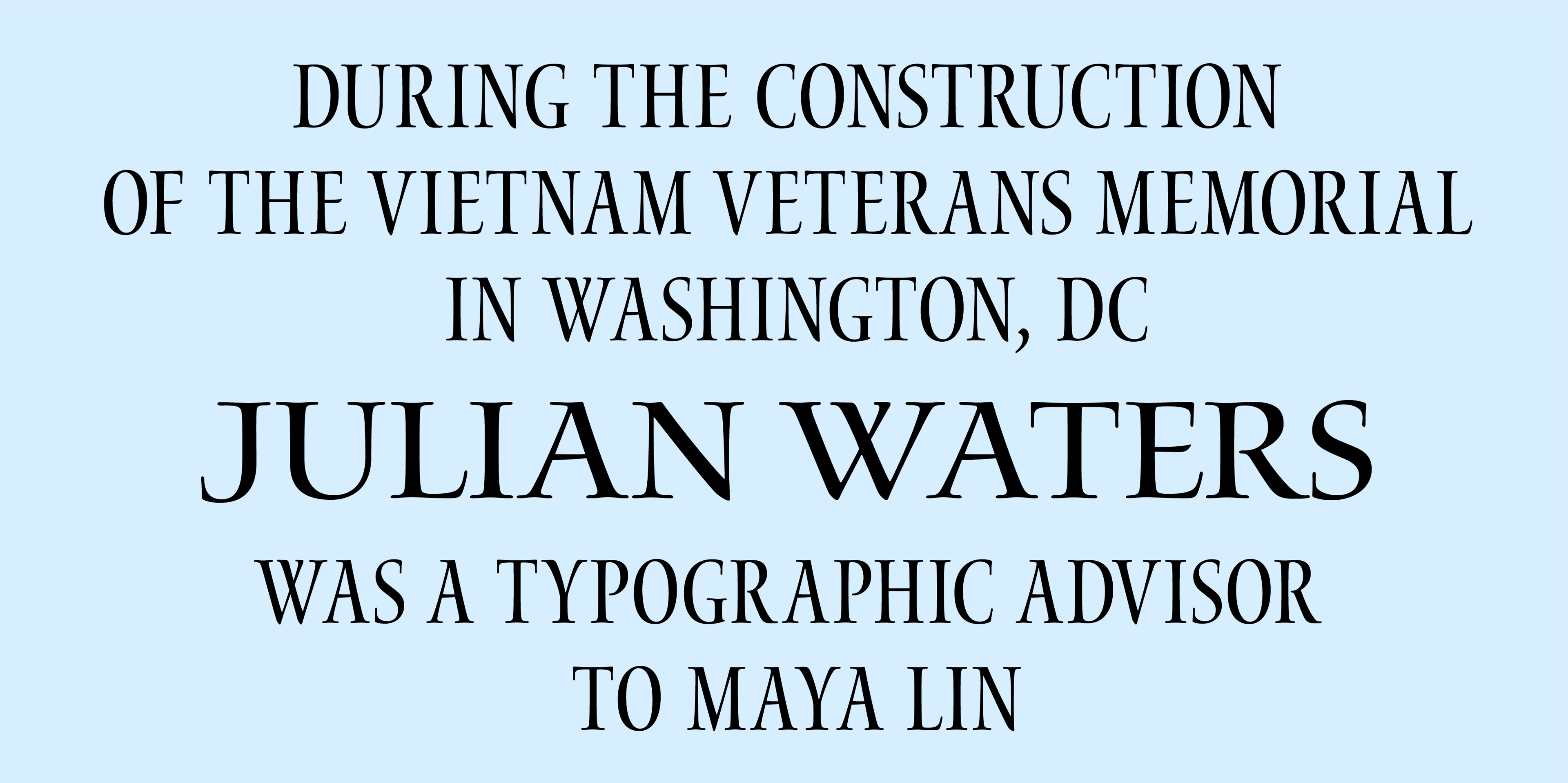
Waters Titling by Julian Waters
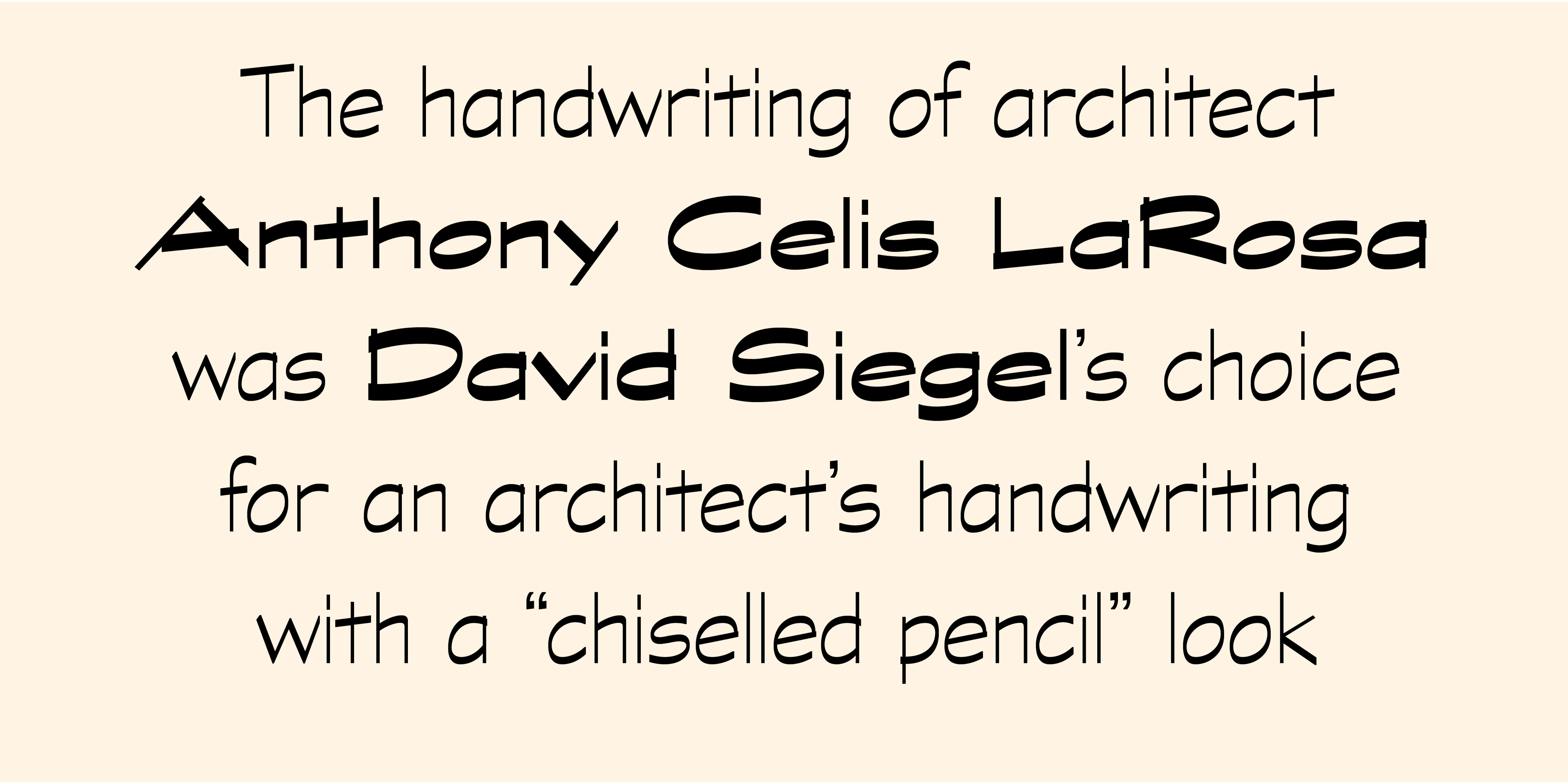
Graphite by David Siegel
This batch of rare fonts includes a few more examples of the novelty illustration that Adobe toyed with for a few years as it attempted to release something for everyone. Coriander is a doodle-like alphabet by Tim Donaldson. Cutout by Gail Blumberg shows the figures from Matisse paintings reshaped into letterforms. Ouch! by Joachim Müller-Lancé and Toolbox by Brian Strysko are a bit less abstract, each containing alphabets made up of themed spot illustrations.
Type Network’s library includes these and all the Adobe Originals, as well as fonts from other foundries whose type can’t be found in Adobe Fonts. So if you’re looking for something off the beaten path, we are here to help.
Type Network provides enterprise, app-embedding, and self-hosting licenses for Adobe Originals (and for all our partner foundries which have typefaces included in Adobe Fonts). Let us show you how to go beyond the single-user licenses that come with Adobe Creative Cloud.