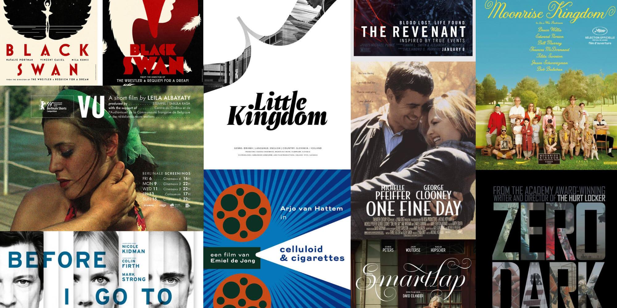
10 great movie posters using TN fonts
Movie posters need to balance studio desires, Hollywood egos, and the fleeting, shifting expectations of audiences; yet it’s the actual title of the film—and the feelings it provokes—that are of highest importance. Here are ten excellent film posters that prove the power of good type.
With so much emphasis in the modern film industry placed on opening weekends and online buzz, the film poster (and film trailer) have grown in importance to—in the case of major releases—influence hundreds of millions of dollars.
Since our foundry partners are in the business of creating the highest quality typefaces, it follows that their work would show up on some of the best movie posters. After looking through our Letterboxd accounts, Type Network staff have picked out ten excellent movie posters that use foundry partner typefaces, all of which are available through our catalog:
Moonrise Kingdom (2012)
Tilda by Font Bureau
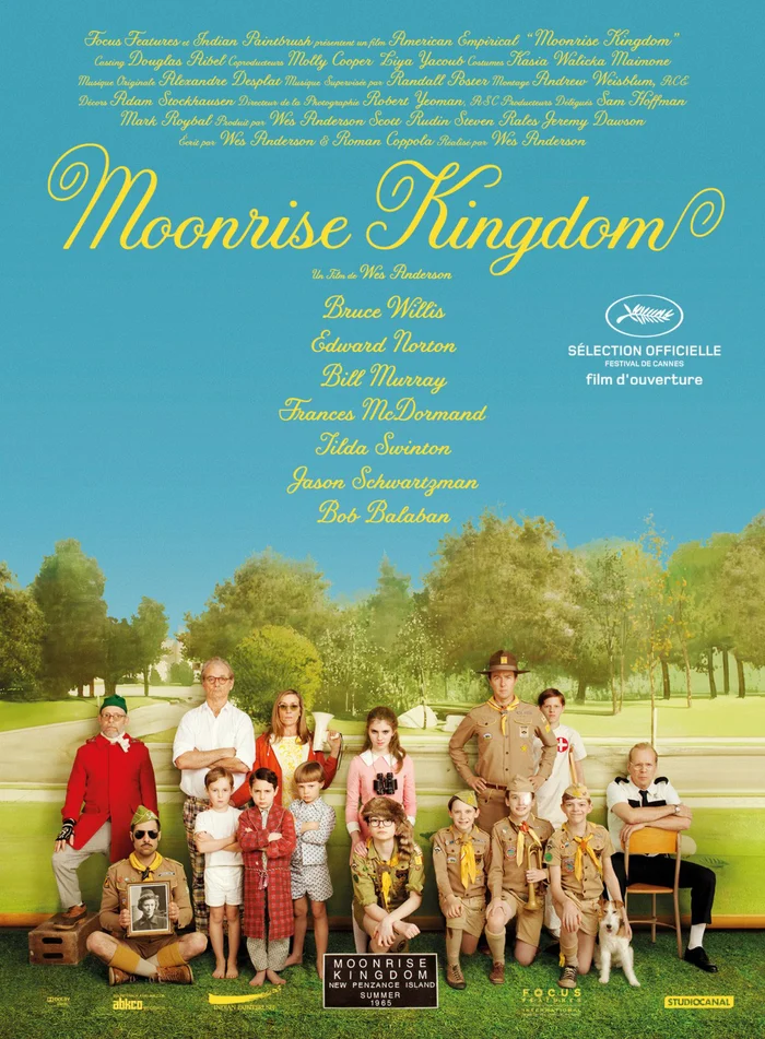
Wes Anderson’s Moonrise Kingdom (2012) charts an improbable (and symmetrical) romance between an orphan boy and his troubled pen-pal girlfriend. The two plan an elaborate escape during his summer camp on her home-island, the fictional New Penzance.
The film’s poster, which leverages Wes Anderson’s well-known whimsy, uses Tilda by Jessica Hische and published by Font Bureau. Set in yellow set against a light-blue sky, the light script and photos of children suggests an innocent movie, yet the cast members’ expressions hint at something serious. Uncommonly, both the title and the supporting text (including production information and cast) are set in the same, highly-stylized script.
Black Swan (2010)
Mostra Nuova by Mark Simonson Studio
Darren Aronofsky’s Black Swan (2010) stars Natalie Portman as an obsessive perfectionist ballet dancer falling over the edge of insanity. As the film progresses, her sense of self and identity split into a sexy and frightening mess that ends in tragedy.
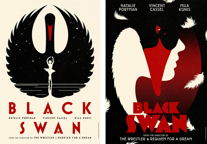
These international posters, designed by design agency La Boca, use Mostra Nuova by Mark Simonson Studio. Designed in 2001, Mostra Nuova was called by Stephen Coles the “most complete digital font interpretation of Italian Art Deco posters and advertising.”
The posters, which show Portman’s character in reverse against a black swan, use a reserved and striking palette of black, red, and off-white. The tracked-out title letters’ elegance mirrors that of the main character, while its bloody color echoes her… I won’t spoil it.
Smartlap (2021)
Krul by ReType
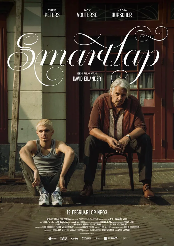
For the Dutch short film Smartlap (2021), the poster designers chose Krul by ReType. The film, which stars Chris Peters and Jack Wouterse, explores the tumultuous relationship between a bar-owner and his son, and shows the pair looking stern on its poster.
The choice of Krul, a delicately flourished script, suggests the unexpected emotion of the film. Almost any other typographic direction would have implied a thoroughly different tone or have been lost among any of the other hard-knocks movies on the market (or worse, both!).
What we get is a juxtaposition of tenderness and coldness, a theme throughout the drama’s central relationship: “When a father and a son make a film together, it must be about … Right, the bond between father and son. The television movie Smartlap was directed by David Eilander (1993), he wrote the screenplay together with his father Jan (1959).” — VPRO Gids
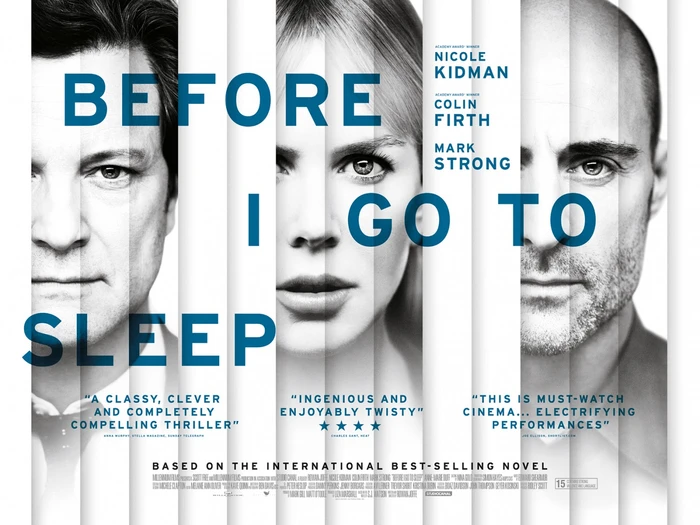
Before I Go to Sleep (2014)
Interstate by Frere-Jones Type
Sporting an all-star cast of Nicole Kidman, Colin Firth, and Mark Strong, Before I Go to Sleep (2014) follows an amnesiac as troubling memories of her past begin to catch up to her untrustworthy present. The thriller, which is based on a best-selling novel, uses Interstate by Tobias Frere-Jones in its poster.
The design, which layers strips of black-and-white images, alludes to the main character’s journey through inaccurate, imperfect memories. The choice to use Interstate, commonly associated with road signage and wayfinding, adds a sense of direction, while its off-kilter typesetting shows that the path isn’t always straight.
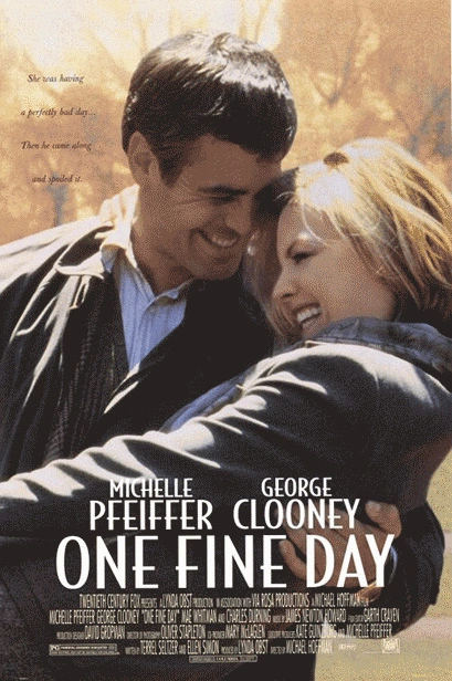
One Fine Day (1996)
Bodega Sans by Greg Thompson
Starring Michelle Pfeiffer and George Clooney, One Fine Day (1996) follows two strangers whose lives are irrevocably changed when they meet one day in New York City. The romantic comedy follows the usual pattern of two quirky-but-loveable characters becoming fast enemies before becoming partners.
The film’s poster, which shows Clooney and Pfeiffer in a laughing, charming embrace, uses Bodega Sans by foundry partner Greg Thompson, in a predictably ’90s layout. It’s effective thanks to its simple presentation and focus on the characters and typography. Bodega Sans adds a levity and interest that other sans serifs lack. (It also doesn’t hurt that Clooney and Pfeiffer were at the top of Hollywood at the time.)
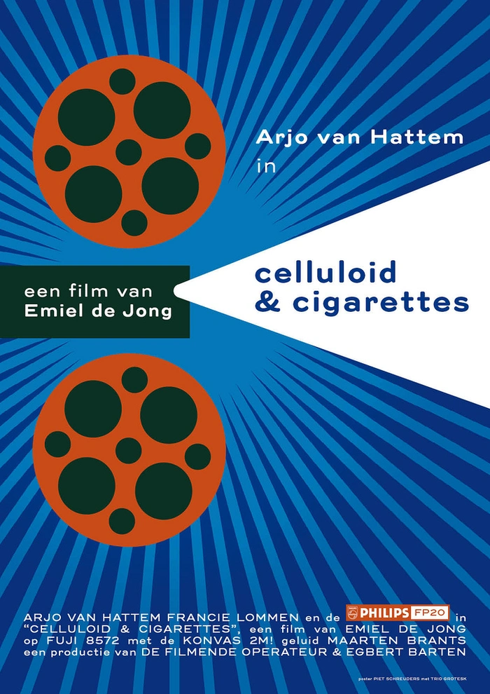
Celluloid & Cigarettes (2012)
Trio Grotesk by Bold Monday
Emiel de Jong’s short film Celluloid & Cigarettes (2012) is a meta picture about films. Its poster, which abstractly renders a projector, illuminates the title set in Trio Grotesk from foundry partner Bold Monday. Designed by Piet Schreuders, the poster is almost a full circle in itself (from Piet to Piet), as Florian Schick designed Trio Grotesk as a personal interpretation of Kaart Antieke, an early 20th century sans serif used by Piet Zwart in his unpublished essay about modern typography.
The typeface features remnants of letterpress printing, with rounded stroke endings and ink spread at the joints, adding a humanist warmth to the modern style of the letters. It’s a sound choice for Celluloid & Cigarettes not only for the Piet connection, but also for its soft and European stylings.
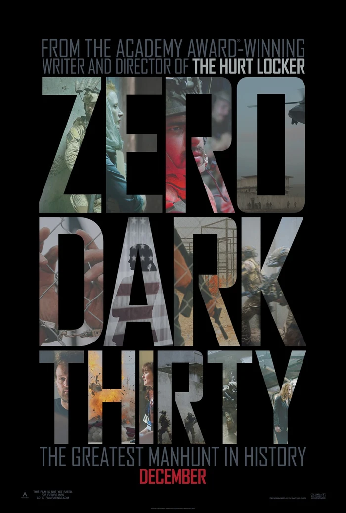
Zero Dark Thirty (2012)
Agency FB by Font Bureau
Based on a true story, Zero Dark Thirty (2012) reveals (and dramatizes) the work of CIA operative Maya as she pursues Al Qaeda’s leader, Osama Bin Laden. The film was favorably reviewed and received several awards. Its 157-minute runtime is appropriately long for how much director Kathryn Bigelow needs to fit to tell the story.
The poster, which uses FB Agency, puts the title in focus, framing shots from the film in each letter. Agency is popular for war and action movies (Mission Impossible, anyone?), as its squarish structure reminds audiences of military stencil type. While others reviewed this poster unfavorably when it was released, its emphasis on typography while teasing (but not revealing) major plot points makes it a success.
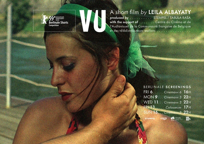
VU (2009)
Metallophile by Mark Simonson Studio
Leila Albayaty’s short film VU (2009) tracks Leila as she tries to outrun her wounds by going to Rome for vacation with her sister. Its poster uses Metallophile Sp8 by partner foundry Mark Simonson Studio. Metallophile Sp8 is a “facsimile of 8-point sans serif type as set on a hot metal typesetting machine.” Unlike similar (yet precise and sterile) sans serif derivations of Futura, Metallophile Sp8 adds warmth, imprecision, and charm.
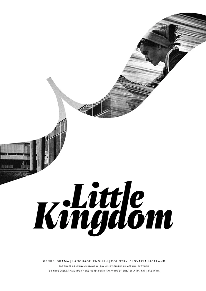
Little Kingdom / Malá Ríša (2018)
Amster by PampaType
Slovakian film Little Kingdom (2018), set in 1944, renders a classic wartime romance with life-and-death drama for a contrasting pair of couples. The poster is set in a modified version of Amster Black Italic by PampaType.
PampaType explained the modifications: “with modified serifs, tight linespacing and letterspacing, as well as an interlinear ligature with the l extended to merge with the ascender of the letter d below.” The curly bracket, too, has been edited slightly to give a glimpse at the main character and setting. The typographic poster overall rebuffs typical film-poster trends by showing less rather than more. It also narrows the audience in a strategic way: Those looking for a blockbuster will steer clear.
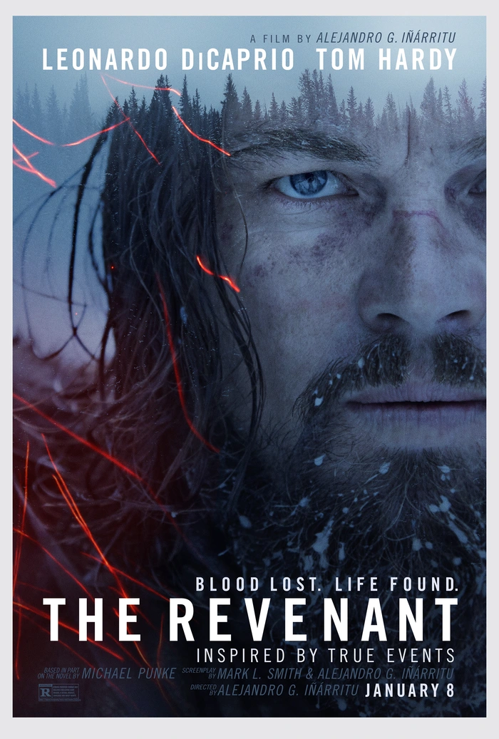
The Revenant (year)
Alternate Gothic from the ATF Collection
Leonardo DiCaprio finally won his first Oscar in 2015 for his leading role in Iñárritu’s The Revenant. The film—inspired by the near-death of Hugh Glass in 1823—used only practical lighting and was filmed on location in the Squamish Valley in British Columbia, Canada.
The poster uses Alternate Gothic from the ATF Collection. Designed as an expansion of Morris Fuller Benton’s classic 1903 design, ATF Alternate Gothic includes 40 styles, with the demibold weight used here. The most notable modification was to the ‘I’ in DiCaprio, which has had the tittle removed and the stem slightly elongated. This isn’t the first time an Iñárritu film has featured a modified ‘I’ either, as the poster for his 2014 Oscar-winner Birdman used a heighted version of the letter amid prolific Bell Gothic.
To stay current on all things TN, subscribe to Type Network News, our email newsletter featuring font analysis, designer profiles, type and design events, and more.